鸿蒙HarMonyOS之Button组件的常用属性
Posted 笔触狂放
tags:
篇首语:本文由小常识网(cha138.com)小编为大家整理,主要介绍了鸿蒙HarMonyOS之Button组件的常用属性相关的知识,希望对你有一定的参考价值。
Button是一种常见的组件,点击可以触发对应的操作,通常由文本或图标组成,也可以由图标和文本共同组成。
图1 文本按钮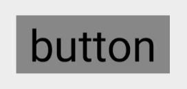
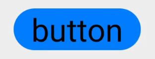
图2 图标按钮
图3 图标和文本共同组成的按钮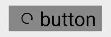
支持的XML属性
Button无自有的XML属性,共有XML属性继承自Text
创建Button
创建如下样式的按钮:
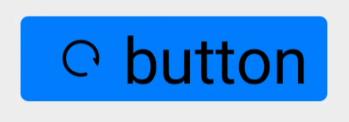
- 在layout目录下的xml文件中创建Button,并设置按钮的背景形状、颜色。
常用的背景如文本背景、按钮背景,通常采用XML格式放置在graphic目录下。
-
<Button ohos:id="$+id:button" ohos:width="match_content" ohos:height="match_content" ohos:text_size="27fp" ohos:text="button" ohos:background_element="$graphic:background_button" ohos:left_margin="15vp" ohos:bottom_margin="15vp" ohos:right_padding="8vp" ohos:left_padding="8vp" ohos:element_left="$media:ic_btn_reload" /> - 在“Project”窗口,打开“entry > src > main > resources > base”,右键点击“graphic”文件夹,选择“New > File”,命名为“background_button.xml”,在该文件中定义按钮的背景形状、颜色
<?xml version="1.0" encoding="utf-8"?>
<shape xmlns:ohos="http://schemas.huawei.com/res/ohos"
ohos:shape="rectangle">
<corners
ohos:radius="10"/>
<solid
ohos:color="#007CFD"/>
</shape>
响应点击事件
按钮的重要作用是当用户单击按钮时,会执行相应的操作或者界面出现相应的变化。实际上用户点击按钮时,Button对象将收到一个点击事件。开发者可以自定义响应点击事件的方法。例如,通过创建一个Component.ClickedListener对象,然后通过调用setClickedListener将其分配给按钮。
Button button = (Button) findComponentById(ResourceTable.Id_button);
// 为按钮设置点击事件回调
button.setClickedListener(new Component.ClickedListener() {
@Override
public void onClick(Component component) {
// 此处添加点击按钮后的事件处理逻辑
}
});
不同类型的按钮
按照按钮的形状,按钮可以分为:普通按钮,椭圆按钮,胶囊按钮,圆形按钮等。
- 普通按钮
普通按钮和其他按钮的区别在于不需要设置任何形状,只设置文本和背景颜色即可,例如:
<Button ohos:width="150vp" ohos:height="50vp" ohos:text_size="27fp" ohos:text="button" ohos:background_element="$graphic:color_blue_element" ohos:left_margin="15vp" ohos:bottom_margin="15vp" ohos:right_padding="8vp" ohos:left_padding="8vp" /> -
color_blue_element.xml:
<?xml version="1.0" encoding="utf-8"?> <shape xmlns:ohos="http://schemas.huawei.com/res/ohos" ohos:shape="rectangle"> <solid ohos:color="#007CFD"/> </shape> - 椭圆按钮

椭圆按钮是通过设置background_element的来实现的,background_element的shape设置为椭圆(oval),例如:
oval_button_element.xml:<Button ohos:width="150vp" ohos:height="50vp" ohos:text_size="27fp" ohos:text="button" ohos:background_element="$graphic:oval_button_element" ohos:left_margin="15vp" ohos:bottom_margin="15vp" ohos:right_padding="8vp" ohos:left_padding="8vp" ohos:element_left="$media:ic_btn_reload" /><?xml version="1.0" encoding="utf-8"?> <shape xmlns:ohos="http://schemas.huawei.com/res/ohos" ohos:shape="oval"> <solid ohos:color="#007CFD"/> </shape> - 胶囊按钮
胶囊按钮是一种常见的按钮,设置按钮背景时将背景设置为矩形形状,并且设置ShapeElement的radius的半径,例如:
capsule_button_element.xml:
<?xml version="1.0" encoding="utf-8"?> <shape xmlns:ohos="http://schemas.huawei.com/res/ohos" ohos:shape="rectangle"> <corners ohos:radius="100"/> <solid ohos:color="#007CFD"/> </shape> - 圆形按钮
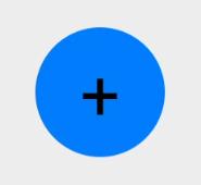
圆形按钮和椭圆按钮的区别在于组件本身的宽度和高度需要相同,例如:
<Button ohos:id="$+id:button" ohos:width="50vp" ohos:height="50vp" ohos:text_size="27fp" ohos:background_element="$graphic:circle_button_element" ohos:text="+" ohos:left_margin="15vp" ohos:bottom_margin="15vp" ohos:right_padding="15vp" ohos:left_padding="15vp" />circle_button_element.xml:
<?xml version="1.0" encoding="utf-8"?>
<shape xmlns:ohos="http://schemas.huawei.com/res/ohos"
ohos:shape="oval">
<solid
ohos:color="#007CFD"/>
</shape>
以上是关于鸿蒙HarMonyOS之Button组件的常用属性的主要内容,如果未能解决你的问题,请参考以下文章
七华为鸿蒙HarmonyOS应用开发之Java UI框架常用Text组件和Button组件使用
鸿蒙HarMonyOS之DirectionalLayout布局的常用属性
鸿蒙HarMonyOS之PositionLayout布局的常用属性