Python + Django + echarts图表展示
Posted Mr.zhou_Zxy
tags:
篇首语:本文由小常识网(cha138.com)小编为大家整理,主要介绍了Python + Django + echarts图表展示相关的知识,希望对你有一定的参考价值。
Python + Django + echarts图表展示
一、准备工作
## 1.python环境安装
## 2.python开发工具PyCharm安装
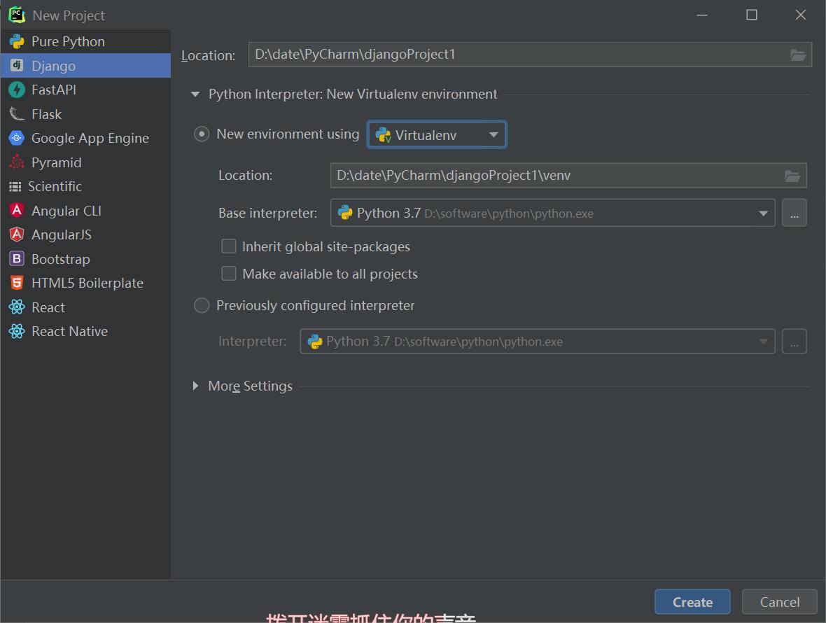
二、创建Django项目
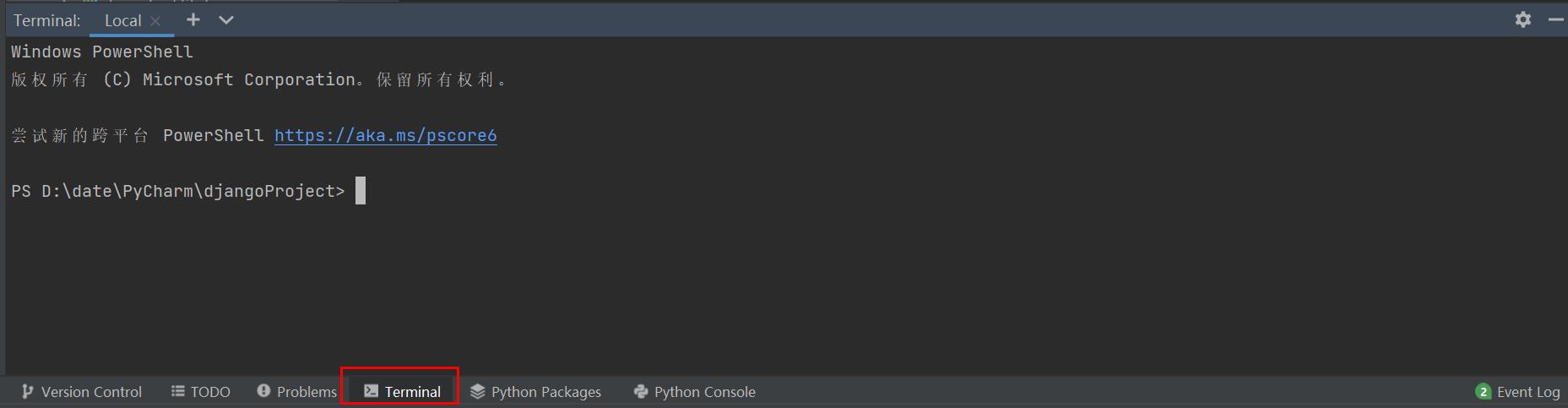
三、Terminal
四、安装Django模块
在terminal下输入命令安装:
可以先使用pip list查看已安装的模块
PS D:\\date\\PyCharm\\djangoProject>  pip list
继续使用pip install django命令安装django模块
PS D:\\date\\PyCharm\\djangoProject>  pip install django
五、创建web项目
# 创建项目目录
PS D:\\date\\PyCharm\\djangoProject>django-admin startproject www

# 打开项目目录
PS D:\\date\\PyCharm\\djangoProject>cd www
项目目录

static目录文件
导入echarts.min.js 和 jquery-2.2.4.js文件
templates目录文件
创建index.html文件
<!DOCTYPE html>
<html lang="en">

<head>
    <meta charset="UTF-8" />
    <meta name="viewport" content="width=device-width, initial-scale=1.0" />
    <title>Document01</title>
    <style>
        .box
            width: 300px;
            height: 300px;
            background-color: rgb(188, 227, 236);

    </style>
</head>
<body>
	<!-- 2.准备具有大小的DOM容器 -->
    <div class="box"></div>

    <script type="text/javascript" src="static/jquery-2.2.4.js"></script>
    <script type="text/javascript" src="static/echarts.min.js"></script>
    <script>
        //3.初始化实例对象 echarts.init(dom容器)
        var myChart = echarts.init(document.querySelector(".box"));
        //4.指定配置项和数据
        var option =
            // 标题组件
            title:
                text: 'ECharts 入门示例'
            ,
            // 提示框组件
            tooltip: ,
            //图例组件
            legend:
                data:['销量']
            ,
            // 直角坐标系grid中的x轴
            // -boundaryGap:坐标轴两边留白策略true,这时候刻度只是作为分割线,标签和数据点都会在两个刻度之间带(band)中间
            xAxis:
                data: ["衬衫","羊毛衫","雪纺衫","裤子","高跟鞋","袜子"]
            ,
            // 直角坐标系grid的y轴
            yAxis: ,
            // 系列列表,每个系列通过type决定自己的图标类型
            // 通俗的理解:图标数据,通过什么类型的图标,可以多个图标重叠
            series: [
                name: '销量',
                type: 'bar',
                data: [5, 20, 36, 10, 10, 20]
            ]
            // grid:直角坐标系内绘图网格
            // color:调色盘颜色列表
            // stack:数据堆叠,同个类目轴上系列配置相同的stack值后,后一个系列的值会在前一个系列的值上相加
        ;
        //5.将配置项设置给echarts实例对象,使用刚指定的配置项和数据显示图表。
        myChart.setOption(option);
    </script>
</body>
</html>
www目录文件调整
views.py_视图文件
from django.shortcuts import render

'''调用HTML模版'''
def index(request):
    title = "漏刻有时数据可视化-主线图"
    return render(request, 'index.html', "name": title)
urls.py_路径映射
'''导入视图'''
from django.urls import path
from . import views

'''配置url规则'''
urlpatterns = [
    path('', views.index),
]
settings.py_配置文件
修改以下内容:模版文件路径配置
TEMPLATES = [

        'BACKEND': 'django.template.backends.django.DjangoTemplates',
        'DIRS': [os.path.join(BASE_DIR, 'templates')],  # 修改目录位置
        'APP_DIRS': True,
        'OPTIONS':
            'context_processors': [
                'django.template.context_processors.debug',
                'django.template.context_processors.request',
                'django.contrib.auth.context_processors.auth',
                'django.contrib.messages.context_processors.messages',
            ],
        ,
    ,
]
修改以下内容:静态文件路径配置
# 配置静态文件路径;
STATIC_URL = '/static/'
STATICFILES_DIRS = [os.path.join(BASE_DIR, 'static')]
六、启动项目
PS D:\\date\\PyCharm\\djangoProject> cd www
PS D:\\date\\PyCharm\\djangoProject\\www> python manage.py runserver
Watching for file changes with StatReloader
Performing system checks...

System check identified no issues (0 silenced).
Run 'python manage.py migrate' to apply them.
March 29, 2022 - 21:03:14
Django version 3.2.12, using settings 'www.settings'
Starting development server at http://127.0.0.1:8000/
Quit the server with CTRL-BREAK.
http://127.0.0.1:8000/

七、更换模板
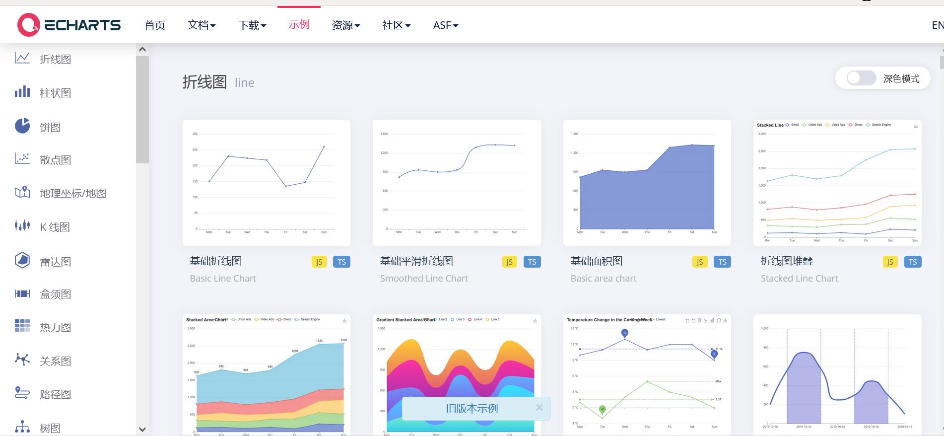

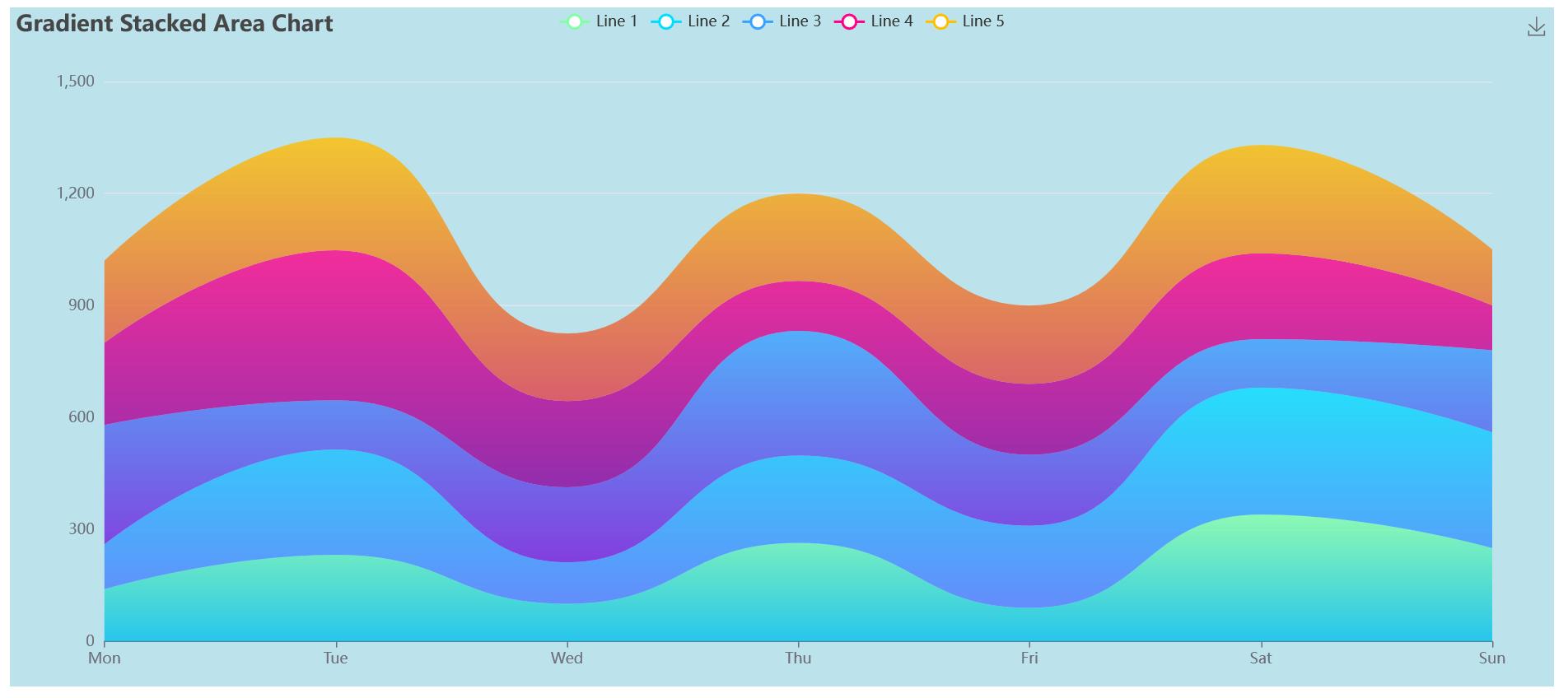
举例:
例如我们想使用这个模板

点进去后,复制左边的代码
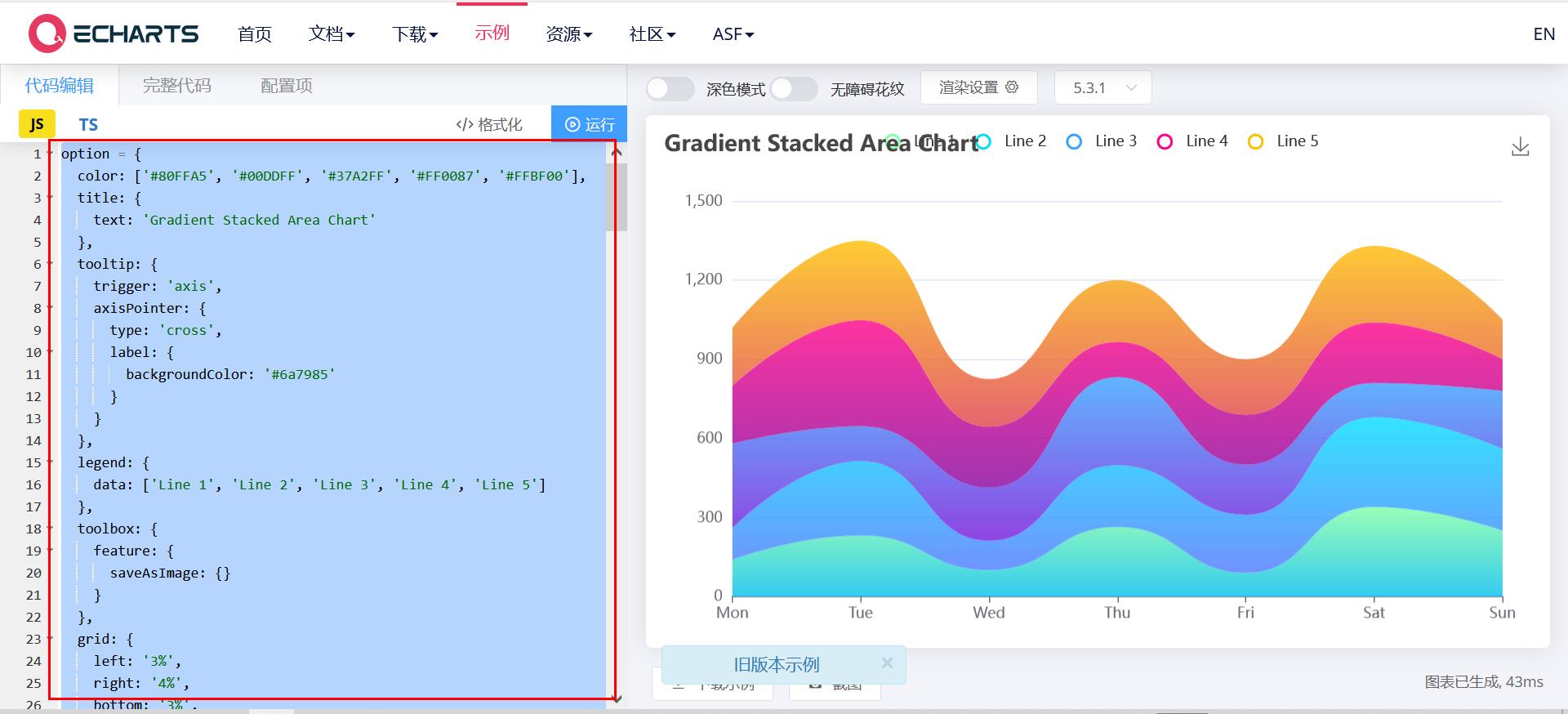
只需替换index.html中option的代码块就可以
<!DOCTYPE html>
<html lang="en">

<head>
    <meta charset="UTF-8" />
    <meta name="viewport" content="width=device-width, initial-scale=1.0" />
    <title>Document01</title>
    <style>
        .box
            width: 1250px;
            height: 550px;
            background-color: rgb(188, 227, 236);

    </style>
</head>
<body>
	<!-- 2.准备具有大小的DOM容器 -->
    <div class="box"></div>

    <script type="text/javascript" src="static/jquery-2.2.4.js"></script>
    <script type="text/javascript" src="static/echarts.min.js"></script>
    <script>
        //3.初始化实例对象 echarts.init(dom容器)
        var myChart = echarts.init(document.querySelector(".box"));
        //4.指定配置项和数据
        var option =
          color: ['#80FFA5', '#00DDFF', '#37A2FF', '#FF0087', '#FFBF00'],
          title:
            text: 'Gradient Stacked Area Chart'
          ,
          tooltip:
            trigger: 'axis',
            axisPointer:
              type: 'cross',
              label:
                backgroundColor: '#6a7985'


          ,
          legend:
            data: ['Line 1', 'Line 2', 'Line 3', 'Line 4', 'Line 5']
          ,
          toolbox:
            feature:
              saveAsImage:

          ,
          grid:
            left: '3%',
            right: '4%',
            bottom: '3%',
            containLabel: true
          ,
          xAxis: [

              type: 'category',
              boundaryGap: false,
              data: ['Mon', 'Tue', 'Wed', 'Thu', 'Fri', 'Sat', 'Sun']

          ],
          yAxis: [

              type: 'value'

          ],
          series: [

              name: 'Line 1',
              type: 'line',
              stack: 'Total',
              smooth: true,
              lineStyle:
                width: 0
              ,
              showSymbol: false,
              areaStyle:
                opacity: 0.8,
                color: new echarts.graphic.LinearGradient(0, 0, 0, 1, [

                    offset: 0,
                    color: 'rgb(128, 255, 165)'
                  ,

                    offset: 1,
                    color: 'rgb(1, 191, 236)'

                ])
              ,
              emphasis:
                focus: 'series'
              ,
              data: [140, 232, 101, 264, 90, 340, 250]
            ,

              name: 'Line 2',
              type: 'line',
              stack: 'Total',
              smooth: true,
              lineStyle:
                width: 0
              ,
              showSymbol: false,
              areaStyle:
                opacity: 0.8,
                color: new echarts.graphic.LinearGradient(0, 0, 0, 1, [

                    offset: 0,
                    color: 'rgb(0, 221, 255)'
                  ,

                    offset: 1,
                    color: 'rgb(77, 119, 255)'

                ])
              ,
              emphasis:
                focus: 'series'
              ,
              data: [120, 282, 111, 234, 220, 340, 310]
            ,

              name: 'Line 3',
              type: 'line',
              stack: 'Total',
              smooth: true,
              lineStyle:
                width: 0
              ,
              showSymbol: false,
              areaStyle:
                opacity: 0.8,
                color: new echarts.graphic.LinearGradient(0, 0, 0, 1, [

                    offset: 0,
                    color: 'rgb(55, 162, 255)'
                  ,

                    offset: 1,
                    color: 'rgb(116, 21, 219)'

                ])
              ,
              emphasis:
                focus: 'series'
              ,
              data: [320, 132, 201, 334, 190, 130, 220]
            ,

              name: 'Line 4',
              type: 'line',
              stack: 'Total',
              smooth: true,
              lineStyle:
                width: 0
              ,
              showSymbol: false,
              areaStyle:
                opacity: 0.8,
                color: new echarts.graphic.LinearGradient(0, 0, 0, 1, [

                    offset: 0,
                    color: 'rgb(255, 0, 135)'
                  ,

                    offset: 1,
                    color: 'rgb(135, 0, 157)'

                ])
              ,
              emphasis:
                focus: 'series'
              ,
              data: [220, 402, 231, 134, 190, 230, 120]
            ,

              name: 'Line 5',
              type: 'line',
              stack: 'Total',
              smooth: true,
              lineStyle:
                width: 0
              ,
              showSymbol: false,
              label:
                show: true,
                position: 'top'
              ,
              areaStyle:
                opacity: 0.8,
                color: new echarts.graphic.LinearGradient(0, 0, 0, 1, [

                    offset: 0,
                    color: 'rgb(255, 191, 0)'
                  ,

                    offset: 1,
                    color: 'rgb(224, 62, 76)'

                ])
              ,
              emphasis:
                focus: 'series'
              ,
              data: [220, 302, 181, 234, 210, 290, 150]

          ]
        ;
        myChart.setOption(option);
    </script>
</body>
</html>
运行
PS D:\\date\\PyCharm\\djangoProject\\www> python manage.py runserver
以上是关于Python + Django + echarts图表展示的主要内容,如果未能解决你的问题,请参考以下文章
python测试开发django-149.ECharts 生成柱状图
python测试开发django-147.ECharts 生成饼图
python测试开发django-150.ECharts 生成折线图
python测试开发django-148.ECharts 生成环状图(饼图)