Matplotlib实例教程(十三)小提琴图
Posted K同学啊
tags:
篇首语:本文由小常识网(cha138.com)小编为大家整理,主要介绍了Matplotlib实例教程(十三)小提琴图相关的知识,希望对你有一定的参考价值。
前言
- 🔗 运行环境:python3
- 🚩 作者:K同学啊
- 🥇 精选专栏:《深度学习100例》
- 🔥 推荐专栏:《小白入门深度学习》
- 📚 选自专栏:《Matplotlib教程》
- 🧿 优秀专栏:《Python入门100题》
你可能需要安装的包
- statsmodels
- seaborn
安装命令(在cmd中输入该命令即可)
pip install seabornpip install statsmodels
如果你不知道如何打开命令行,请看这里:如何打开CMD命令行
代码实现
import pandas  as pd
import numpy   as np
import seaborn as sns
sns.set_style("white")

import matplotlib.pyplot as plt
plt.rcParams['font.sans-serif'] = ['SimHei']  # 用来正常显示中文标签
plt.rcParams['axes.unicode_minus'] = False  # 用来正常显示负号

import warnings
warnings.filterwarnings("ignore")#忽略警告信息
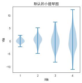
简单案例
# 创建测试数据
np.random.seed(1)
data = [sorted(np.random.normal(0, std, 100)) for std in range(1, 5)]

# 1行 1列 ,长4英寸 宽4英寸
fig, ax1= plt.subplots(nrows=1, ncols=1, figsize=(4, 4), sharey=True)

ax1.set_title('默认的小提琴图')
ax1.set_xlabel('X轴')
ax1.set_ylabel('Y轴')
ax1.violinplot(data)

plt.show()
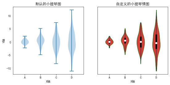
稍复杂案例
def adjacent_values(vals, q1, q3):
    upper_adjacent_value = q3 + (q3 - q1) * 1.5
    upper_adjacent_value = np.clip(upper_adjacent_value, q3, vals[-1])

    lower_adjacent_value = q1 - (q3 - q1) * 1.5
    lower_adjacent_value = np.clip(lower_adjacent_value, vals[0], q1)
    return lower_adjacent_value, upper_adjacent_value

def set_axis_style(ax, labels):
    ax.get_xaxis().set_tick_params(direction='out')
    ax.xaxis.set_ticks_position('bottom')
    ax.set_xticks(np.arange(1, len(labels) + 1))
    ax.set_xticklabels(labels)
    ax.set_xlim(0.25, len(labels) + 0.75)
    ax.set_xlabel('X轴')

# 创建测试数据
np.random.seed(1)
data = [sorted(np.random.normal(0, std, 100)) for std in range(1, 5)]

# 1行 2列 ,长9英寸 宽4英寸
fig, (ax1, ax2) = plt.subplots(nrows=1, ncols=2, figsize=(9, 4), sharey=True)

ax1.set_title('默认的小提琴图')
ax1.set_ylabel('Y轴')
ax1.violinplot(data)

ax2.set_title('自定义的小提琴情图')
parts = ax2.violinplot(
        data, showmeans=False, showmedians=False,
        showextrema=False)

for pc in parts['bodies']:
    pc.set_facecolor('#D43F3A')
    pc.set_edgecolor('green')
    pc.set_alpha(1)

quartile1, medians, quartile3 = np.percentile(data, [25, 50, 75], axis=1)
whiskers = np.array([
    adjacent_values(sorted_array, q1, q3)
    for sorted_array, q1, q3 in zip(data, quartile1, quartile3)])
whiskersMin, whiskersMax = whiskers[:, 0], whiskers[:, 1]

inds = np.arange(1, len(medians) + 1)
ax2.scatter(inds, medians, marker='o', color='white', s=30, zorder=3)
ax2.vlines(inds, quartile1, quartile3, color='k', linestyle='-', lw=5)
ax2.vlines(inds, whiskersMin, whiskersMax, color='k', linestyle='-', lw=1)

# 设置X轴
labels = ['A', 'B', 'C', 'D']
for ax in [ax1, ax2]:
    set_axis_style(ax, labels)

plt.show()
以上是关于Matplotlib实例教程(十三)小提琴图的主要内容,如果未能解决你的问题,请参考以下文章
数据可视化实例(十三): 发散型条形图 (matplotlib,pandas)
数据可视化实例(十三): 发散型条形图 (matplotlib,pandas)
Python使用matplotlib可视化小提琴图seaborn中的violinplot函数可视化多分类变量的小提琴图(Violin Plot)