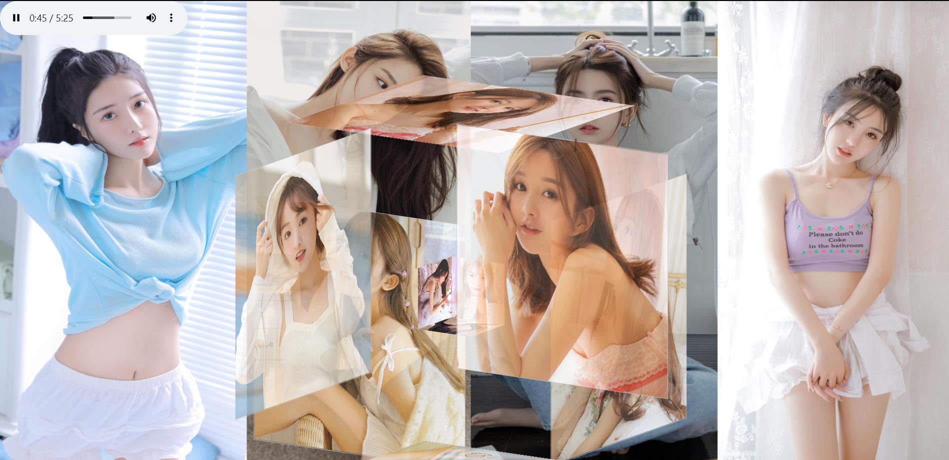
搭载3D立体相册网页 加入背景音乐 真香!
Posted 叶庭云
tags:
篇首语:本文由小常识网(cha138.com)小编为大家整理,主要介绍了搭载3D立体相册网页 加入背景音乐 真香!相关的知识,希望对你有一定的参考价值。

一、3D立体相册
html代码
<!DOCTYPE html>
<html lang="en">
	<head>
		<meta charset="UTF-8">
		<title>纯CSS实现鼠标经过3D立体动态展示图片特效</title>
		<link type="text/css" href="css/style.css" rel="stylesheet"/>
	</head>

	<body background="img/bg1.jpg"
		  style="background-repeat: no-repeat;background-size: 100% 100%;background-attachment: fixed;">
		<audio autoplay="autoplay" loop="loop" controls="controls">
    		<source src="./bg_songs/美丽的神话.mp3" type="audio/mpeg">
		</audio>
		<div class="box">
			<ul class="minbox">
				<li></li>
				<li></li>
				<li></li>
				<li></li>
				<li></li>
				<li></li>
			</ul>
			<ol class="maxbox">
				<li></li>
				<li></li>
				<li></li>
				<li></li>
				<li></li>
				<li></li>
			</ol>
		</div>
	</body>

</html>
CSS层叠样式表
@charset "utf-8";
*{
	margin:0;
	padding:0;
}
body{
	max-width: 100%;
	min-width: 100%;
	height: 100%;
	background-size: cover;
	background-repeat: no-repeat;
	background-attachment: fixed;
	background-size:100% 100%;
	position: absolute;
	margin-left: auto;
	margin-right: auto;
}
li{
	list-style: none;
}
.box{
	width:200px;
	height:200px;
	background-size: cover;
	background-repeat: no-repeat;
	background-attachment: fixed;
	background-size:100% 100%;
	position: absolute;
	margin-left: 42%;
	margin-top: 22%;
	-webkit-transform-style:preserve-3d;
	-webkit-transform:rotateX(13deg);
	-webkit-animation:move 5s linear infinite;
}
.minbox{
	width:100px;
	height:100px;
	position: absolute;
	left:50px;
	top:30px;
	-webkit-transform-style:preserve-3d;
}
.minbox li{
	width:100px;
	height:100px;
	position: absolute;
	left:0;
	top:0;
}
.minbox li:nth-child(1){
	background: url(../img/01.png) no-repeat 0 0;
	-webkit-transform:translateZ(50px);
}
.minbox li:nth-child(2){
	background: url(../img/02.png) no-repeat 0 0;
	-webkit-transform:rotateX(180deg) translateZ(50px);
}
.minbox li:nth-child(3){
	background: url(../img/03.png) no-repeat 0 0;
	-webkit-transform:rotateX(-90deg) translateZ(50px);
}
.minbox li:nth-child(4){
	background: url(../img/04.png) no-repeat 0 0;
	-webkit-transform:rotateX(90deg) translateZ(50px);
}
.minbox li:nth-child(5){
	background: url(../img/05.png) no-repeat 0 0;
	-webkit-transform:rotateY(-90deg) translateZ(50px);
}
.minbox li:nth-child(6){
	background: url(../img/06.png) no-repeat 0 0;
	-webkit-transform:rotateY(90deg) translateZ(50px);
}
.maxbox li:nth-child(1){
	background: url(../img/1.png) no-repeat 0 0;
	-webkit-transform:translateZ(50px);
}
.maxbox li:nth-child(2){
	background: url(../img/2.png) no-repeat 0 0;
	-webkit-transform:translateZ(50px);
}
.maxbox li:nth-child(3){
	background: url(../img/3.png) no-repeat 0 0;
	-webkit-transform:rotateX(-90deg) translateZ(50px);
}
.maxbox li:nth-child(4){
	background: url(../img/4.png) no-repeat 0 0;
	-webkit-transform:rotateX(90deg) translateZ(50px);
}
.maxbox li:nth-child(5){
	background: url(../img/5.png) no-repeat 0 0;
	-webkit-transform:rotateY(-90deg) translateZ(50px);
}
.maxbox li:nth-child(6){
	background: url(../img/6.png) no-repeat 0 0;
	-webkit-transform:rotateY(90deg) translateZ(50px);
}
.maxbox{
	width: 800px;
	height: 400px;
	position: absolute;
	left: 0;
	top: -20px;
	-webkit-transform-style: preserve-3d;

}
.maxbox li{
	width: 200px;
	height: 200px;
	background: #fff;
	border:1px solid #ccc;
	position: absolute;
	left: 0;
	top: 0;
	opacity: 0.2;
	-webkit-transition:all 1s ease;
}
.maxbox li:nth-child(1){
	-webkit-transform:translateZ(100px);
}
.maxbox li:nth-child(2){
	-webkit-transform:rotateX(180deg) translateZ(100px);
}
.maxbox li:nth-child(3){
	-webkit-transform:rotateX(-90deg) translateZ(100px);
}
.maxbox li:nth-child(4){
	-webkit-transform:rotateX(90deg) translateZ(100px);
}
.maxbox li:nth-child(5){
	-webkit-transform:rotateY(-90deg) translateZ(100px);
}
.maxbox li:nth-child(6){
	-webkit-transform:rotateY(90deg) translateZ(100px);
}
.box:hover ol li:nth-child(1){
	-webkit-transform:translateZ(300px);
	width: 400px;
	height: 400px;
	opacity: 0.8;
	left: -100px;
	top: -100px;
}
.box:hover ol li:nth-child(2){
	-webkit-transform:rotateX(180deg) translateZ(300px);
	width: 400px;
	height: 400px;
	opacity: 0.8;
	left: -100px;
	top: -100px;
}
.box:hover ol li:nth-child(3){
	-webkit-transform:rotateX(-90deg) translateZ(300px);
	width: 400px;
	height: 400px;
	opacity: 0.8;
	left: -100px;
	top: -100px;
}
.box:hover ol li:nth-child(4){
	-webkit-transform:rotateX(90deg) translateZ(300px);
	width: 400px;
	height: 400px;
	opacity: 0.8;
	left: -100px;
	top: -100px;
}
.box:hover ol li:nth-child(5){
	-webkit-transform:rotateY(-90deg) translateZ(300px);
	width: 400px;
	height: 400px;
	opacity: 0.8;
	left: -100px;
	top: -100px;
}
.box:hover ol li:nth-child(6){
	-webkit-transform:rotateY(90deg) translateZ(300px);
	width: 400px;
	height: 400px;
	opacity: 0.8;
	left: -100px;
	top: -100px;
}
@keyframes move{
	0%{
		-webkit-transform: rotateX(13deg) rotateY(0deg);
	}
	100%{
		-webkit-transform:rotateX(13deg) rotateY(360deg);
	}
}
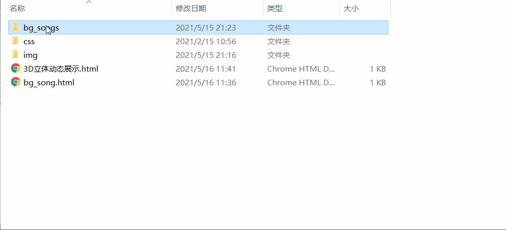
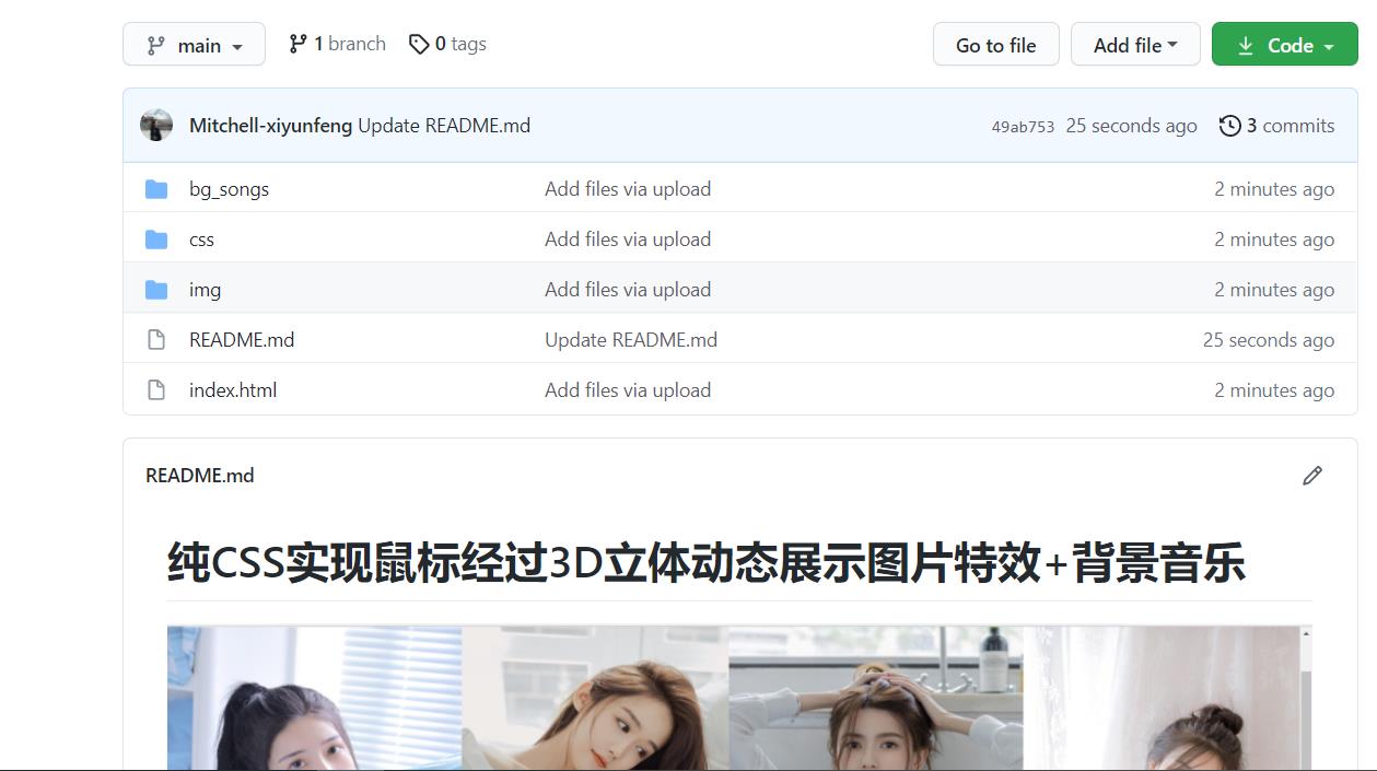
文件目录如下所示:
二、插入背景音乐
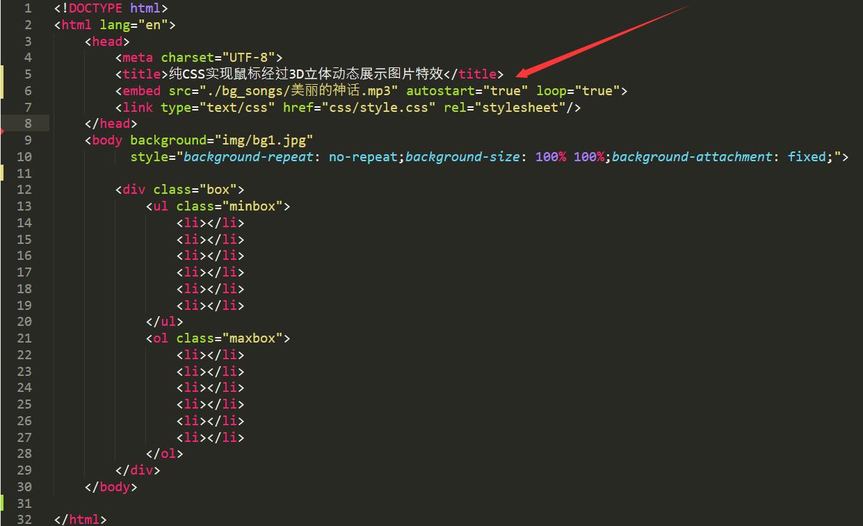
1. 方式一
src=“你的背景音乐的路径”
<embed src="./bg_songs/美丽的神话.mp3" autostart="true" loop="true">
- src:音乐路径替换成相应的路径,路径要填绝对路径。
- hidden=“true”:隐藏播放器按钮hidden="false"开启
- autostart=“true”:打开网页加载完后自动播放
- loop=“true”:循环播放,如仅播放一次代码为:loop=“false”
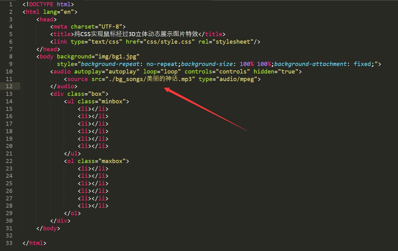
2. 方式二
<audio autoplay="autoplay" loop="loop" controls="controls" hidden="true">
    <source src="./bg_songs/美丽的神话.mp3" type="audio/mpeg">
</audio>
- autoplay=“autoplay”,则背景音乐将在网页打开后就自动马上播放。
- controls=“controls”,则为了在页面内显示显示控件,如播放按钮。
- "loop=“loop”,则是为了是背景音乐循环播放。
- preload=“auto”,则音频在页面加载的同时进行加载,并预备播放。
- src=" “,即是在” “内加入背景音乐的保存路径,如:src=”./bg_songs/美丽的神话.mp3"。
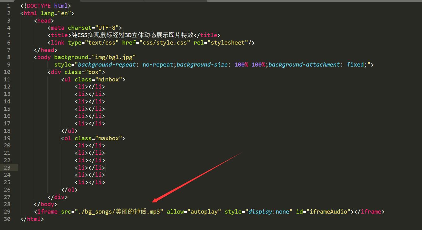
3. 方式三
<iframe src="./bg_songs/美丽的神话.mp3" allow="autoplay" style="display:none" id="iframeAudio"></iframe>
4. 说明
我测试过在谷歌和火狐浏览器中,设置了 autoplay 自动播放音频,但点进去也不能自动播放我插入的背景音乐,IE浏览器打开可以自动播放。
参考了很多资料如下:
https://developers.google.com/web/updates/2017/09/autoplay-policy-changes
https://blog.csdn.net/qq_36765367/article/details/78073442
https://blog.csdn.net/DoWhatYouSay/article/details/80306109
https://blog.csdn.net/zhangvalue/article/details/104321024
https://blog.csdn.net/lalalalalala_/article/details/77934247
https://blog.csdn.net/debimeng/article/details/102594386
https://blog.csdn.net/ysy950803/article/details/87894170
三、搭载在Github Pages上
要有一个 Github 账号,新建一个仓库。可以参考如下文章:
https://www.jianshu.com/p/3a0714c7eddf
https://www.jianshu.com/p/958b17522d12
https://blog.csdn.net/pspgbhu/article/details/51205264
https://blog.csdn.net/lililuni/article/details/83144090
https://blog.csdn.net/qq_40184012/article/details/82386561
进入仓库,上传文件,拖拽文件进去。
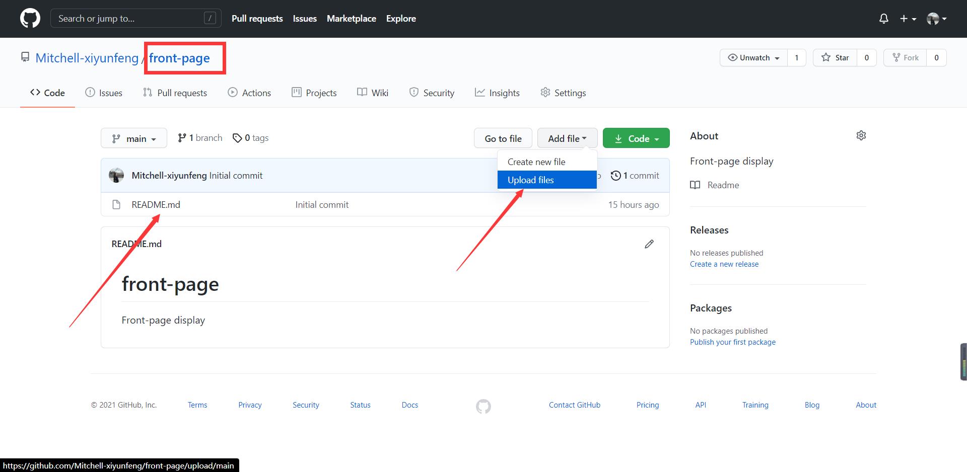
上传文件好了之后,刷新。
访问链接如下:
以上是关于搭载3D立体相册网页 加入背景音乐 真香!的主要内容,如果未能解决你的问题,请参考以下文章
七夕表白程序:3D 立体表白相册(素材+源码),用它的都成功了!
MATLAB竟也能制作3D相册?教你用MATLAB制作立体动态相册