Echarts 简单报表系列二:折线图
Posted 黄洪波写点东西的地方
tags:
篇首语:本文由小常识网(cha138.com)小编为大家整理,主要介绍了Echarts 简单报表系列二:折线图相关的知识,希望对你有一定的参考价值。
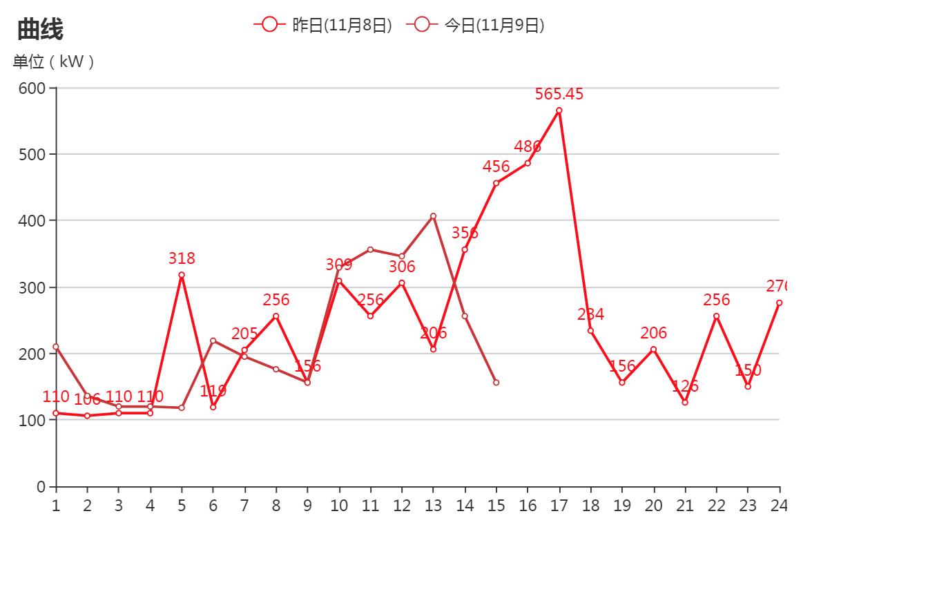
<!DOCTYPE html>
<html lang="en">
<head>
    <meta charset="UTF-8">
    <title>Document</title>
</head>
<body>
    <div id="pic4" style="width: 600px;height:400px;"></div>
    <script src="https://cdn.bootcss.com/echarts/4.0.2/echarts.js"></script>
    <script>
        var myChart13 = echarts.init(document.getElementById(\'pic4\'));
        var data = [];
        option15 = {
                title: {
                    text: \'曲线\',
                },
                tooltip: {
                    trigger: \'axis\',

                },
                legend: {
                    data:[\'昨日(11月8日)\',\'今日(11月9日)\']
                },
                grid: {
                    left: \'1%\',
                    right: \'1%\',
                    bottom: \'3%\',
                    containLabel: true
                },
                toolbox: {
                    show: false,
                    feature: {
                        dataZoom: {
                            yAxisIndex: \'none\'
                        },
                        dataView: {readOnly: false},
                        magicType: {type: [\'line\', \'bar\']},
                        restore: {},
                        saveAsImage: {}
                    }
                },
                color:["red","#CD3333"],
                xAxis:  {
                    type: \'category\',
                    boundaryGap: false,
                    data : [\'1\',\'2\',\'3\',\'4\',\'5\',\'6\',\'7\',\'8\',\'9\',\'10\',\'11\',\'12\',\'13\',\'14\',\'15\',\'16\',\'17\',\'18\',\'19\',\'20\',\'21\',\'22\',\'23\',\'24\']
                },
                yAxis: {
                    type: \'value\',
                    name: \'单位(kW)\',
                    axisLabel: {
                        formatter: \'{value}\'
                    }
                },
                series: [
                    {
                        name:\'昨日(11月8日)\',
                        type:\'line\',
                        data:[110,106,110,110,318,119,205,256,156,309,256,306,206,356,456,486,565.45,234,156,206,126,256,150,276],
                        itemStyle: {
                            normal: {
                                //color: function(params) {
                          //    var colorList = [\'#2eddc1\',\'#FCCE10\',\'#E87C25\',\'#277bbb\',\'#E87fff\',\'#277aaa\'];
                                //    //若返回的list长度不足,不足部分自动显示为最后一个颜色
                          //      return colorList[params.dataIndex]
                          //   },
                                label: {
                                    show: true,
                                    position: \'top\'
                                }
                            }
                        }
                    },
                    {
                        type:\'line\',
                        name : \'今日(11月9日)\',
                        data:[210,136,120,120,118,219,195,176,156,329,356,346,406.54,256,156],
                    }
                        ]
            };

        myChart13.setOption(option15);
    </script>
</body>
</html>
效果如下:
以上是关于Echarts 简单报表系列二:折线图的主要内容,如果未能解决你的问题,请参考以下文章
二基础平滑面积折线图与折线堆叠面积堆叠《手把手教你 ECharts 数据可视化详解》
1Echarts系列Vue中设置echarts折线图样式(图表网格标签提示标题文字),手把手教程系列