css 水平垂直居中
Posted 风吹De麦浪
tags:
篇首语:本文由小常识网(cha138.com)小编为大家整理,主要介绍了css 水平垂直居中相关的知识,希望对你有一定的参考价值。
水平居中
行内元素
行内元素:(img、span、文字等行内元素),通过在父级元素设置 text-align:center 使元素水平居中。
块级元素
块级元素:(div、p、h1...h6、ul、li等块级元素),通过在要居中元素设置 margin:0 auto(上、右、下、左),这里表示上下0 左右自适应,达到元素水平居中。
垂直居中
行内元素
行内元素:(img、span、文字等行内元素),通过在父级元素设置display: table-cell;vertical-align: middle; 使元素垂直居中,如果是单行文字或者其他 可以设置line-height:容器高;
块级元素
高度固定通常是使用
- 绝对定位与负边距
- 绝对定位与margin
- display table-cell
高度不固定
- display table-cell
- translate
- flex 布局
还是上代码比较实在
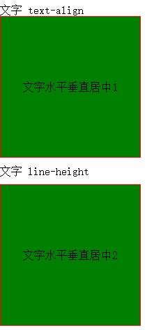
行内元素水平、垂直居中
文字、图片水平、垂直居中
主要是利用
- text-align: center; //水平对齐方式
- display: table-cell;//以td形式渲染
- vertical-align: middle;//垂直对齐方式

<!DOCTYPE html>
<html>
<head lang="en">
    <meta charset="UTF-8">
    <title></title>
</head>
<style>
    * {
        padding: 0;
        margin: 10px 0 0 0;
    }

    div {
        width: 200px;
        height: 200px;
        border: solid 1px red;
    }

    img {
        width: 100px;
        height: 100px;
        border: 0px;
    }

    span {
        border: solid 1px blue
    }

    .div1 {
        text-align: center;
        display: table-cell;
        vertical-align: middle;
    }

    .div2 {
        line-height: 200px;
        text-align: center;
        margin: 0 auto;
    }
</style>
<body>

<p>文字</p>
<div class="div1" title="行内元素水平垂直居中">
    文字水平垂直居中1
</div>

<p>文字</p>
<div class="div2" title="行内元素水平垂直居中">
    文字水平垂直居中2
</div>

<p>图片水平垂直居中</p>
<div class="div1" title="行内元素水平垂直居中">
    <img src="images/pro_1.jpg">
</div>

<p>span水平垂直居中</p>
<div class="div1" title="行内元素水平垂直居中">
    <span>this is span</span>
</div>
</body>
</html>
块级元素水平、垂直居中
固定高度水平、垂直居中
固定高度水平垂直居中一般思路:

绝对定位与负边距
脱离文档流之后,在通过设置负的边距来达到水平、垂直居中效果;
  <style>
        * {
            padding: 0;
            margin: 0 0 0 0;
            box-sizing: border-box;
        }

        p{margin:20px 0 0 20px;}

        /*绝对定位与负边距实现*/
        .divBox {

            height: 200px;
            border: solid 1px red;
            position: relative;
        }
        .divContentBox{
            width: 100px;
            height: 100px;
            border: solid 1px blue;
            text-align: center;
            position: absolute;
            top: 50%;
            left: 50%;
            margin-top: -50px;
            margin-left: -50px;

        }

    </style>

<p>绝对定位与负边距实现</p>
<div class="divBox">
    <div class="divContentBox">固定宽度、高度水平垂直居中</div>
</div>
如果不能脱离文档流就增加一个空的容器
<style>
  /*增加空容器与margin */

        #divBox{
            width: 200px;
            height: 200px;
            border: solid 1px red;

        }
       #nullBox{
           width: 100%;
           height: 50%;
           background-color: blue;
         }
        #divContentBox {
            width: 100px;
            height: 100px;
                margin: -50px auto;
            border: solid 1px red;

        }

</style>

<p>增加一个空的容器</p>
<div id="divBox">
    <div id="nullBox"></div>
    <div id="divContentBox">固定宽度、高度水平垂直居中</div>
</div>
利用绝对定位与margin
<style>
#div1Box{
           /*width: 200px;*/
           height: 200px;
           border: solid 1px red;
           position: relative;
       }
        #ContentBox{

            height: 100px;
           display: inline;
            border: solid 1px blue;
            position: absolute;
            margin: auto;
            left: 0;
            right: 0;
            top: 0;
            bottom: 0;
        }
</style>

<p>绝对定位与margin</p>
<div id="div1Box">
    <div id="ContentBox">固定高度水平垂直居中</div>
</div>
css3 transform
<style>

 #container{
            height: 300px;
            position:relative;
            border: solid 1px red;
        }
        #center{
            position: absolute;
            width:100px;
            height:100px;
            border: solid 1px red;
            top: 50%;
            left: 50%;
            transform: translate(-50%, -50%);
        }
</style>

<p>css3 transform</p>
<div id="container">
    <div id="center">固定高度水平垂直居中</div>
</div>
display table-cell
<style>
#container1{
            width: 600px;
            text-align: center;
            vertical-align: middle;
            border: solid 1px red;
            display: table-cell;
            height: 300px;
        }
        #center2{
            width: 100px;
            height: 100px;
            border: solid 1px red;
            display: inline-block;
        }
    </style>
<p>display table-cell</p>
<div id="container1">
    <div id="center2">>固定高度水平垂直居中</div>
</div>
高度不固定水平、垂直居中
display:table-cell
-
父元素设置 display: table-cell;
-
text-align: center;
-
vertical-align: middle; 可以达到垂直居中;
-
子元素设置margin: 0 auto;可以达到水平居中;
translate
-
子元素脱离稳档流
-
top、left 偏移 50%
-
transform: translate(-50%, -50%);返回自身负的50%
flex布局
-
子元素设置水平、垂直对齐方式justify-content: center;align-items: center;
完整代码:
<!DOCTYPE html> <html> <head lang="en"> <meta charset="UTF-8"> <title></title> <style> /*-- display table-cell */ #root { width: 100%; display: table; } .bigBox { width: 100%; height: 200px; border: solid 1px red; display: table-cell; text-align: center; vertical-align: middle; } .content { width: 300px; background-color: green; margin: 0 auto; } /*translate */ .parent { width: 100%; height: 200px; border: 1px solid red; position: relative; } .child { position: absolute; top: 50%; left: 50%; -webkit-transform: translate(-50%, -50%); -ms-transform六种实现元素水平居中