利用beforeafter制作提示框
Posted
tags:
篇首语:本文由小常识网(cha138.com)小编为大家整理,主要介绍了利用beforeafter制作提示框相关的知识,希望对你有一定的参考价值。
提示框由两部分组成,框+箭头,箭头则利用伪元素before、after写成。
根据提示框的样式可以看出,上面的箭头由两部分组成:灰色大箭头+蓝色小箭头,蓝色嵌套在灰色里面,于是箭头就有了边框,整体搭配起来也比较好看。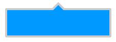
那么这部分是怎么写的呢?
首先把箭头以外的部分写出来,下面是html代码以及它的css样式:
<!DOCTYPE html>
<html>
<head>
    <meta charset="UTF-8">
    <title>Document</title>
    <style type="text/css">
        .demo{
            width: 200px;
            height: 60px;
            background-color: #09f;
            border:4px solid #ccc;
            position: relative;
        }
    </style>
</head>
<body>
    <div class="demo"></div>
</body>
</html>
显然我们还要用before、after为它加上箭头,这样才能起到提示作用,我们先来写外部箭头和内部箭头公共部分:
<!DOCTYPE html>
<html>
<head>
    <meta charset="UTF-8">
    <title>Document</title>
    <style type="text/css">.demo:before,.demo:after{
            position: absolute;
            width: 0;
            height: 0;
            content: ‘‘;
            border:10px solid transparent;
            bottom: 100%;
        }
    </style>
</head>
<body>
    <div class="demo"></div>
</body>
</html>
由于这是一个箭头向上的提示框,所以箭头紧贴着上边框,于是就有了bottom:100%的设置;同理,箭头向下,bottom:-100%;箭头向右,left:100%;箭头向左,left:-100%;
我们这里用before写外部箭头,after写内部箭头
下面是外部箭头的写法:
<!DOCTYPE html>
<html>
<head>
    <meta charset="UTF-8">
    <title>Document</title>
    <style type="text/css">
        .demo:before{
            border-bottom-color: #ccc;
            border-width: 16px;
            left: 50%;
            margin-left: -16px;
        }
    </style>
</head>
<body>
    <div class="demo"></div>
</body>
</html>
现在呈现在页面上的效果是这样的:
没问题,下面把内部箭头写出来
<!DOCTYPE html>
<html>
<head>
    <meta charset="UTF-8">
    <title>Document</title>
    <style type="text/css">
    .demo:after{
            border-bottom-color: #09f;
            border-width: 10px;
            left: 50%;
            margin-left: -10px;
        }
    </style>
</head>
<body>
    <div class="demo"></div>
</body>
</html>
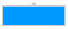
完成,最终效果就是这样了
下面是全部代码:
<!DOCTYPE html>
<html>
<head>
    <meta charset="UTF-8">
    <title>Document</title>
    <style type="text/css">
        .demo{
            width: 200px;
            height: 60px;
            background-color: #f56;
            border:4px solid #ccc;
            position: relative;
        }
        .demo:before,.demo:after{
            position: absolute;
            width: 0;
            height: 0;
            content: ‘‘;
            border:10px solid transparent;
            bottom: 100%;
        }
        .demo:before{
            border-bottom-color: #ccc;
            border-width: 16px;
            left: 50%;
            margin-left: -16px;
        }
        .demo:after{
            border-bottom-color: #f56;
            border-width: 10px;
            left: 50%;
            margin-left: -10px;
        }
    </style>
</head>
<body>
    <div class="demo"></div>
</body>
</html>
这是一个箭头向上的提示框,只要修改一下,箭头想朝哪朝那,老方便了似不似<( ̄︶ ̄)>
以上是关于利用beforeafter制作提示框的主要内容,如果未能解决你的问题,请参考以下文章