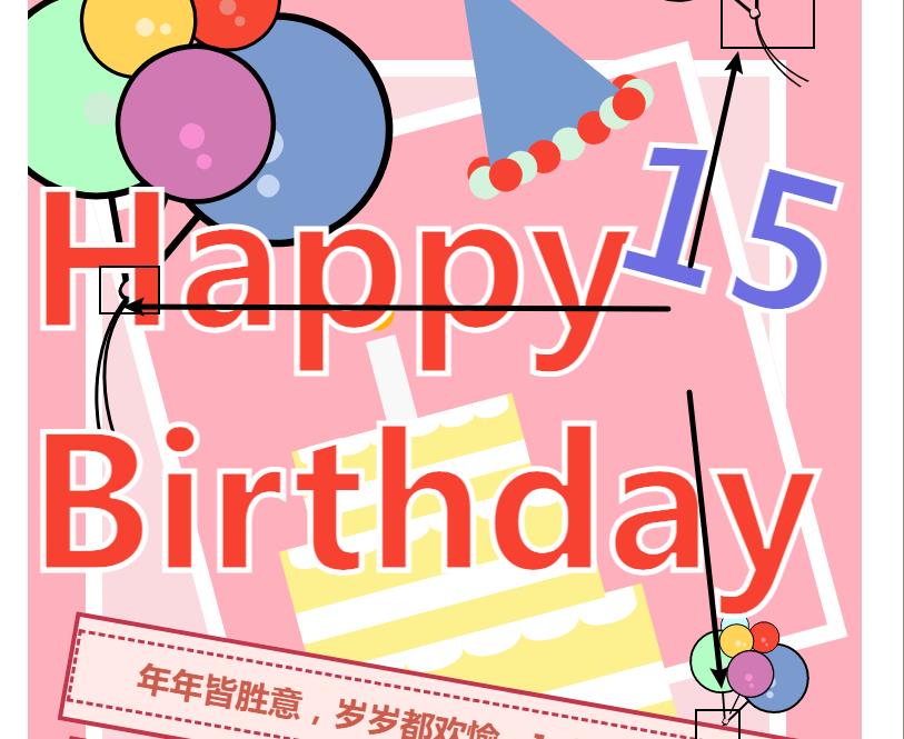
一张图不用,纯CSS 做个生日贺卡
Posted 1_bit
tags:
篇首语:本文由小常识网(cha138.com)小编为大家整理,主要介绍了一张图不用,纯CSS 做个生日贺卡相关的知识,希望对你有一定的参考价值。
朋友生日了,直接画,炫技并且表示本人闲的全身疼才会去拿CSS画画,以此嘲弄对方的加班:
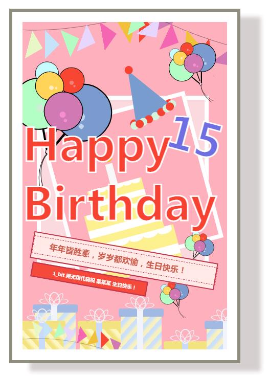
既然贺卡做出来了,那就顺便介绍一下贺卡制作流程吧,其实也不是什么技术,也就是CSS 拼拼拼就可以了,简简单单。
注:本篇内容无法逐一进行讲解,只是讲一下大概思路,之后会单独把元素作为讲解内容并且完善元素使其更加美观。
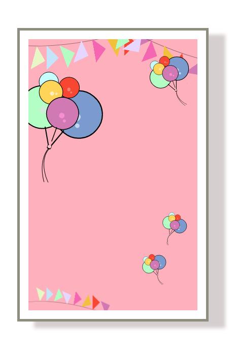
一、基础布局
首先这个贺卡是网页居中的,那么直接给予一个 flex 不就好了?直接给 body :
body
    display: flex;
    justify-content: center;
    align-items: center;
    height: 100vh;
    width: 100vw;
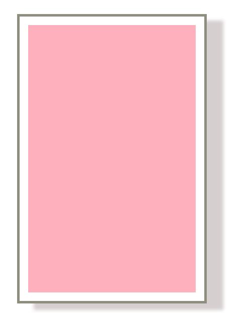
那么接下来我们的海报是有一个外边框的,这个做起来也和粘单,直接先给予外部一个 div,然后写一个样式叫做 happy-border :
.happy-border
    background-color: white;
    height: 850px;
    width: 550px;
    display: flex;
    align-items: center;
    justify-content: center;
    border: 8px solid #72705bca;
    box-shadow: 50px 20px 10px rgb(213, 207, 207);
以上样式其实就是定义了一个背景色,然后给予一个 flex 布局。
为啥要给一个 flex?
当然是等下里面的内容我要居中显示,留一定的白底,这样不就像一张卡片了?你说对不对?
说到这,有些朋友可能又会说你给 border 那么厚干啥?给那么厚肯定是因为是要边框厚一点,这样不就看起来更像一张卡片了?如果还觉得不像,我不是还给了一个 box shadow 做阴影吗?
这样不就做好了?你看下面的呈现效果:
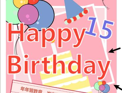
那么到了这一步是不是还看不到内部的白框?那怎么办?那现在就给里面的元素添加一个父容器呗,父容器再给一个小于外面最大的这个容器的宽高就可以有白色边缘了,上样式:
.happy
    height: 800px;
    width: 500px;
    position: relative;
    background-color: #feb0bd;
    overflow: hidden;
其实上面样式就是给了一个div 一个大小,设置了 position,因为等下里面全部用 abslute ,这样里面的内容就可以重重叠叠了,接下来再调用:
<div class="happy-border">
     <div class="happy">

     </div>
 </div>
效果就是下面这样了:
二、烘托气氛的旗子
基础内容搞定了我们给这个贺卡加点装饰吧,首先就从旗子开始。
这个旗子呢就是一个三角形和一根线,那怎么搞这个呢?
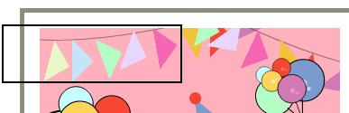
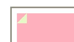
这个很简单,咱们先画个三角形嘛,那三角形怎么画?三角形很有多方式画,咱们直接用一个渐变背景来画:
/*棋子的三角形*/

.triangle
    width: 50px;
    height: 50px;
    background: linear-gradient(to bottom right, transparent 0%, transparent 50%, #e7f7c5 50%, #e7f7c5 100%);
你看上面的样式,就定义一个大小后直接给予背景为渐变就好了,你渐变一部分为透明 transparent 一部分为一种颜色不就ok了?并且在这里我压根就没有进行渐变,因为我渐变到的颜色都是一致的,所以直接就会呈现一种颜色,并且渐变方向是左上角到右下角,那么斜对角分一半,肯定是三角形。
那么接下来直接调用:
<!--小旗子-->
<div class="ribbon">
    <div class="triangle"></div>
</div>
效果:
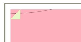
那么接下来就给一根线吧,那线段怎么做?其实线段你就直接给予一个 div,然后背景色透明,边缘圆角超出边框则 hidden 不就ok了?这样只有一个圆的边框一部分,那就是一条弧线,完美:
.cord
   width: 800px;
   height: 300px;
   left: -180px;
   top: -310px;
   background-color: transparent;
   border: 1px solid rgba(41, 41, 41, 0.5);
   border-radius: 100%;
   transform: rotate(-15deg);
以上样式还用了 rotate,如果你觉得角度不对你就 rotate 就ok了,效果:
在此一定要注意还要给这线段和三角形 position 为 absolute,因为接下来还要定位。定位这一个过程我就不再赘述了,不就是left bottom 给值不久好了?下面是这一段的代码:
/*旗子的三角形*/

.triangle
    width: 50px;
    height: 50px;
    background: linear-gradient(to bottom right, transparent 0%, transparent 50%, #e7f7c5 50%, #e7f7c5 100%);


.triangle-1
    top: 30px;
    left: -10px;
    transform: rotate(-30deg);


.triangle-2
    top: 30px;
    left: 30px;
    transform: rotate(-45deg);
    background: linear-gradient(to bottom right, transparent 0%, transparent 50%, #c5e4f9 50%, #c5e4f9 100%);


.triangle-3
    top: 27px;
    left: 80px;
    transform: rotate(-65deg);
    background: linear-gradient(to bottom right, transparent 0%, transparent 50%, #b3fdc4 50%, #b3fdc4 100%);


.triangle-4
    top: 13px;
    left: 120px;
    transform: rotate(-25deg);
    background: linear-gradient(to bottom right, transparent 0%, transparent 50%, #e7d7ff 50%, #e7d7ff 100%);


.triangle-5
    top: 10px;
    left: 170px;
    transform: rotate(-55deg);
    background: linear-gradient(to bottom right, transparent 0%, transparent 50%, #f466b1 50%, #f466b1 100%);


.triangle-6
    top: -3px;
    left: 220px;
    transform: rotate(-75deg);
    background: linear-gradient(to bottom right, transparent 0%, transparent 50%, #f1c13b 50%, #f1c13b 100%);


.triangle-7
    top: -11px;
    left: 260px;
    transform: rotate(-45deg);
    background: linear-gradient(to bottom right, transparent 0%, transparent 50%, #f74631 50%, #f74631 100%);


.triangle-8
    top: -36px;
    left: 310px;
    transform: rotate(-25deg);
    background: linear-gradient(to bottom right, transparent 0%, transparent 50%, #d279b3 50%, #d279b3 100%);
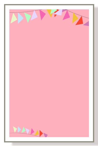
效果就是如下呈现了:
三、烘托气氛的气球
接下来就开始画气球吧。
气球咋一看就简单多了,但是你又没有注意这里:
这几个节的形状要怎么做?有点像一个椭圆。
这个先不急,咱们先把简单的气球搞定吧,也就是一个div 设置为圆里面有两个亮点而已,然后就竖着的一个 div 当作一个线就完毕了。
首先是一个圆:
.balloon>.circle
    width: 60px;
    height: 60px;
    border-radius: 100%;
    background-color: #f74631;
    border: 2px solid black;
这个很简单,就真的是个圆,接下来就直接使用这个元素的 after 和 before 做亮点就好了:
.balloon>.circle::after
    position: absolute;
    content: "";
    width: 10px;
    height: 10px;
    left: 25px;
    top: 30px;
    background-color: #ee8377;
    border-radius: 100%;


.balloon>.circle::before
    position: absolute;
    content: "";
    width: 6px;
    height: 6px;
    left: 35px;
    top: 40px;
    background-color: #ee8377;
    border-radius: 100%;
以上亮点没有什么技术含量,一样的操作只不过移动了一下位置而已,随后就是气球的线段了:
.balloon-line
    height: 30px;
    width: 2px;
    background-color: black;
    left: 30px;
    top: 62px;
那气球下面的结怎么做呢?咱们先看看这个结节:
懂的朋友一看就知道,这不就是一个div 然后给予圆角不就好了?对呀,就是这样,下面是这个结节的 CSS:
.balloon-cord
    position: absolute;
    height: 10px;
    width: 10px;
    top: 305px;
    left: 82px;
    background-color: pink;
    border-radius: 100%;
    transform: rotate(20deg);
    border-bottom: 3px solid black;
    border-left: 2px solid black;
    border-right: 2px solid black;
    z-index: 3;
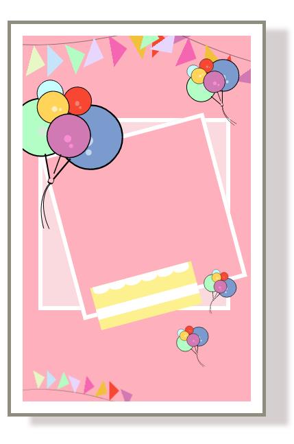
当然你还要调整角度,所以在上面的代码中我还用了 rotate,那么跟旗子一样,咱们创建多个气球拼接在一起,并且绘制一下弧线,拼接在一起,布局到整个页面之上,那么此时页面就是这样了:
气球定位及气球的样式代码:
/*气球*/

.balloon-main,
.balloon,
.balloon>.circle,
.balloon-line,
.balloon-cord,
.balloon-cord1
    position: absolute;


.balloon-main
    transform: rotate(5deg);
    z-index: 3;


.balloon-main1
    top: 50px;
    right: 190px;
    transform: rotate(-35deg) scale(0.5);


.balloon-main2
    top: 480px;
    right: 90px;
    transform: rotate(11deg) scale(0.3);


.balloon-main3
    top: 630px;
    right: 190px;
    transform: rotate(-31deg) scale(0.3);


.balloon>.circle
    width: 60px;
    height: 60px;
    border-radius: 100%;
    background-color: #f74631;
    border: 2px solid black;


.balloon>.circle::after
    position: absolute;
    content: "";
    width: 10px;
    height: 10px;
    left: 25px;
    top: 30px;
    background-color: #ee8377;
    border-radius: 100%;


.balloon>.circle::before
    position: absolute;
    content: "";
    width: 6px;
    height: 6px;
    left: 35px;
    top: 40px;
    background-color: #ee8377;
    border-radius: 100%;


.balloon1,
.balloon2,
.balloon3,
.balloon4
    z-index: 3;


.balloon1
    top: 100px;
    left: 100px;


.balloon2
    top: 120px;
    left: 30px;
    transform: rotate(-45deg) scale(0.9);


.balloon2>.circle
    background-color: #c6feff;


.balloon2>.circle::after,
.balloon2>.circle::before
    background-color: #a3e7f8;


.balloon3
    top: 150px;
    left: 30px;
    transform: rotate(-45deg) scale(1.1);


.balloon3>.circle
    background-color: #ffd458;


.balloon3>.circle::after,
.balloon3>.circle::before
    background-color: #ffedbe;


.balloon4
    top: 150px;
    left: 85px;
    transform: rotate(15deg) scale(1.5);


.balloon4>.circle
    background-color: #d179b3;


.balloon4>.circle::after,
.balloon4>.circle::before
    background-color: #f78ed2;


.balloon5
    top: 150px;
    left: -20px;
    transform: rotate(-15deg) scale(2);
    z-index: 2;


.balloon5>.circle
    background-color: #b3fec4;


.balloon5>.circle::after,
.balloon5>.circle::before
    background-color: #ceeed5;


.balloon6
    top: 110px;
    left: 150px;
    transform: rotate(35deg) scale(2.2);
    z-index: 1;


.balloon6>.circle
    background-color: #7b9bce;


.balloon6>.circle::after,
.balloon6>.circle::before
    background-color: #c2d6f2;


.balloon-line
    height: 30px;
    width: 2px;
    background-color: black;
    left: 30px;
    top: 62px;

/*绑气球的线*/

.balloon-cord
    height: 10px;
    width: 10px;
    top: 305px;
    left: 82px;
    background-color: pink;
    border-radius: 100%;
    transform: rotate(20deg);
    border-bottom: 3px solid black;
    border-left: 2px solid black;
    border-right: 2px solid black;
    z-index: 3;


.balloon-cord1
    height: 100px;
    width: 100px;
    top: 315px;
    left: 65px;
    z-index: 3;
    background-color: transparent;
    overflow: hidden;


.balloon-cord1>.line
    position: absolute;


.balloon-cord1>.line1,
.balloon-cord1>.line2
    width: 120px;
    height: 180px;
    border: 2px solid black;
    border-radius: 100%;


.balloon-cord1>.line1
    top: -23px;
    left: 10px;
    transform: rotate(-15deg);


.balloon-cord1>.line2
    top: -23px;
    left: 20px;
    transform: rotate(-30deg);
四、背景相框
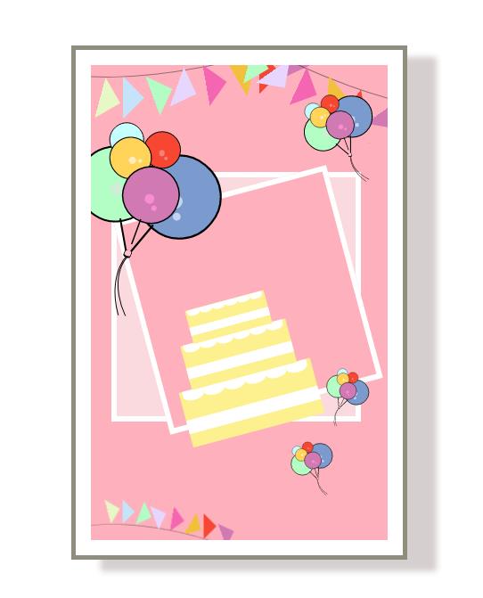
相框制作就很简单了,咱们可以先看看相框的样子:
这个相框制作就很简单,两个白色边框的div重叠,其中一个旋转不就好了?简单先上样式:
/*相框*/

.frame,
.frame>.box1,
.frame>.box2
   position: absolute;


.frame
   top: 180px;
   left: 35px;
   z-index: 1;


.frame>.box1
   width: 400px;
   height: 400px;
   border: 10px solid white;
   background-color: #fbdadf;


.frame>.box2
   top: 30px;
   left: 45px;
   width: 350px;
   height: 350px;
   border: 10px solid white;
   background-color: #feb0bd;
   transform: rotate(-15deg);
下面就是相框的 html 代码了:
<!--相框-->
<div class="frame">
    <div class="box1"></div>
    <div class="box2"></div>
</div>
几个 div 轻松解决。
五、蛋糕
其实蛋糕也是相对于比较简单,就是不同的 div 进行叠加:
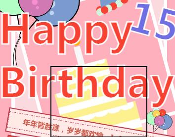
咱们可以先做最下面一层蛋糕:
这样一看不就是一个黄色 div 上面拼白色的div 和一些小半圆?对的,下面就是样式:
.cake-main
    transform: rotate(-15deg) scale(1.2);
    right: -85px;


.cake
    height: 80px;
    width: 190px;
    background-color: #fcf18e;


.cream
    background-color: white;
    height: 20px;
    width: 100%;
    top: 40px;


.icing
    background-color: white;
    height: 15px;
    width: 30px;
    border-radius: 0 0 100% 100%;


.icing1
    left: 5px;


.icing2
    left: 35px;


.icing3
    left: 65px;


.icing4
    left: 95px;


.icing5
    left: 125px;


.icing6
    left: 155px;
cream 样式就是简单的一个白色 div,而 icing 从样式看也就是一个半圆,剩下的 icing1-6 也只是定位不同而已。
那么此时就完成了这个样式制作,剩下的几层只需要给予一个属性 scale 使其缩小并且移动位置即可:
.cake1
    top: -70px;
    transform: scale(0.8);


.cake2
    top: -125px;
    transform: scale(0.6);
你看上面的 cake1 和 cake2 就是这样写的,此时页面如下:
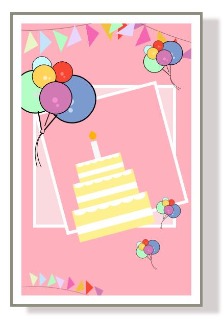
那么接下来的蜡烛就是一个白色 div 加一个有点像火苗的圆角 div:
.candle
    background-color: #f8f8f8;
    height: 50px;
    width: 15px;
    z-index: -3;
    bottom: 60px;
    left: 88px;
    top: -152px;


.flame
    background-color: #fbb200;
    height: 18px;
    width: 18px;
    border-radius: 0 50% 50% 50%;
    top: -22px;
    transform: rotate(45deg);
六、礼物盒
礼物盒制作也就是几个 div 的拼凑,本质上还是很简单的。
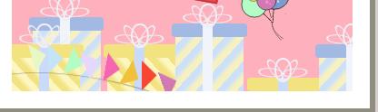
上面的系带就是几个圆角 div 透明背景色并且移动转换,并且这些部分一共有头部、底
以上是关于一张图不用,纯CSS 做个生日贺卡的主要内容,如果未能解决你的问题,请参考以下文章