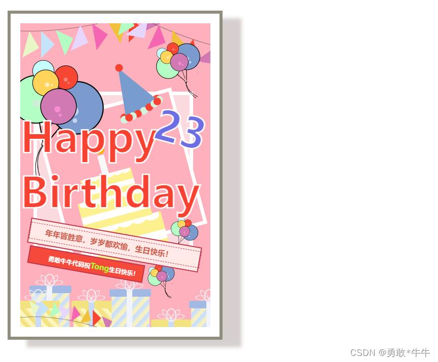
纯html+css打造一款特殊的生日贺卡
Posted 勇敢*牛牛
tags:
篇首语:本文由小常识网(cha138.com)小编为大家整理,主要介绍了纯html+css打造一款特殊的生日贺卡相关的知识,希望对你有一定的参考价值。
效果显示:
<!DOCTYPE html>
<html lang="en">
<head>
<meta charset="UTF-8">
<meta http-equiv="X-UA-Compatible" content="IE=edge">
<meta name="viewport" content="width=device-width, initial-scale=1.0">
<title>Happy</title>
<style>
body
display: flex;
justify-content: center;
align-items: center;
height: 100vh;
width: 100vw;
.happy-border
background-color: white;
height: 850px;
width: 550px;
display: flex;
align-items: center;
justify-content: center;
border: 8px solid #72705bca;
box-shadow: 50px 20px 10px rgb(213, 207, 207);
.happy
height: 800px;
width: 500px;
position: relative;
background-color: #feb0bd;
background-position: 0 0, 100px 100px;
background-size: 200px 200px;
overflow: hidden;
/*absolute 定位*/
.triangle,
.cord
position: absolute;
/*菜带*/
.ribbon,
.ribbon1,
.ribbon2,
.ribbon3,
.ribbon4
position: absolute;
.ribbon1
top: -105px;
left: 210px;
transform: rotate(35deg);
.ribbon2
top: 505px;
left: 10px;
transform: rotate(-90deg) scale(0.5);
.ribbon4
top: 705px;
left: -60px;
width: 400px;
height: 100px;
transform: rotate(0deg) scale(0.6) rotateX(180deg);
z-index: 5;
/**绳子*/
.cord
width: 800px;
height: 300px;
left: -180px;
top: -310px;
background-color: transparent;
border: 1px solid rgba(41, 41, 41, 0.5);
border-radius: 100%;
transform: rotate(-15deg);
/*旗子的三角形*/
.triangle
width: 50px;
height: 50px;
background: linear-gradient(to bottom right, transparent 0%, transparent 50%, #e7f7c5 50%, #e7f7c5 100%);
.triangle-1
top: 30px;
left: -10px;
transform: rotate(-30deg);
.triangle-2
top: 30px;
left: 30px;
transform: rotate(-45deg);
background: linear-gradient(to bottom right, transparent 0%, transparent 50%, #c5e4f9 50%, #c5e4f9 100%);
.triangle-3
top: 27px;
left: 80px;
transform: rotate(-65deg);
background: linear-gradient(to bottom right, transparent 0%, transparent 50%, #b3fdc4 50%, #b3fdc4 100%);
.triangle-4
top: 13px;
left: 120px;
transform: rotate(-25deg);
background: linear-gradient(to bottom right, transparent 0%, transparent 50%, #e7d7ff 50%, #e7d7ff 100%);
.triangle-5
top: 10px;
left: 170px;
transform: rotate(-55deg);
background: linear-gradient(to bottom right, transparent 0%, transparent 50%, #f466b1 50%, #f466b1 100%);
.triangle-6
top: -3px;
left: 220px;
transform: rotate(-75deg);
background: linear-gradient(to bottom right, transparent 0%, transparent 50%, #f1c13b 50%, #f1c13b 100%);
.triangle-7
top: -11px;
left: 260px;
transform: rotate(-45deg);
background: linear-gradient(to bottom right, transparent 0%, transparent 50%, #f74631 50%, #f74631 100%);
.triangle-8
top: -36px;
left: 310px;
transform: rotate(-25deg);
background: linear-gradient(to bottom right, transparent 0%, transparent 50%, #d279b3 50%, #d279b3 100%);
/*气球*/
.balloon-main,
.balloon,
.balloon>.circle,
.balloon-line,
.balloon-cord,
.balloon-cord1
position: absolute;
.balloon-main
transform: rotate(5deg);
z-index: 3;
.balloon-main1
top: 50px;
right: 190px;
transform: rotate(-35deg) scale(0.5);
.balloon-main2
top: 480px;
right: 90px;
transform: rotate(11deg) scale(0.3);
.balloon-main3
top: 630px;
right: 190px;
transform: rotate(-31deg) scale(0.3);
.balloon>.circle
width: 60px;
height: 60px;
border-radius: 100%;
background-color: #f74631;
border: 2px solid black;
.balloon>.circle::after
position: absolute;
content: "";
width: 10px;
height: 10px;
left: 25px;
top: 30px;
background-color: #ee8377;
border-radius: 100%;
.balloon>.circle::before
position: absolute;
content: "";
width: 6px;
height: 6px;
left: 35px;
top: 40px;
background-color: #ee8377;
border-radius: 100%;
.balloon1,
.balloon2,
.balloon3,
.balloon4
z-index: 3;
.balloon1
top: 100px;
left: 100px;
.balloon2
top: 120px;
left: 30px;
transform: rotate(-45deg) scale(0.9);
.balloon2>.circle
background-color: #c6feff;
.balloon2>.circle::after,
.balloon2>.circle::before
background-color: #a3e7f8;
.balloon3
top: 150px;
left: 30px;
transform: rotate(-45deg) scale(1.1);
.balloon3>.circle
background-color: #ffd458;
.balloon3>.circle::after,
.balloon3>.circle::before
background-color: #ffedbe;
.balloon4
top: 150px;
left: 85px;
transform: rotate(15deg) scale(1.5);
.balloon4>.circle
background-color: #d179b3;
.balloon4>.circle::after,
.balloon4>.circle::before
background-color: #f78ed2;
.balloon5
top: 150px;
left: -20px;
transform: rotate(-15deg) scale(2);
z-index: 2;
.balloon5>.circle
background-color: #b3fec4;
.balloon5>.circle::after,
.balloon5>.circle::before
background-color: #ceeed5;
.balloon6
top: 110px;
left: 150px;
transform: rotate(35deg) scale(2.2);
z-index: 1;
.balloon6>.circle
background-color: #7b9bce;
.balloon6>.circle::after,
.balloon6>.circle::before
background-color: #c2d6f2;
.balloon-line
height: 30px;
width: 2px;
background-color: black;
left: 30px;
top: 62px;
/*绑气球的线*/
.balloon-cord
height: 10px;
width: 10px;
top: 305px;
left: 82px;
background-color: pink;
border-radius: 100%;
transform: rotate(20deg);
border-bottom: 3px solid black;
border-left: 2px solid black;
border-right: 2px solid black;
z-index: 3;
.balloon-cord1
height: 100px;
width: 100px;
top: 315px;
left: 65px;
z-index: 3;
background-color: transparent;
overflow: hidden;
.balloon-cord1>.line
position: absolute;
.balloon-cord1>.line1,
.balloon-cord1>.line2
width: 120px;
height: 180px;
border: 2px solid black;
border-radius: 100%;
.balloon-cord1>.line1
top: -23px;
left: 10px;
transform: rotate(-15deg);
.balloon-cord1>.line2
top: -23px;
left: 20px;
transform: rotate(-30deg);
/*相框*/
.frame,
.frame>.box1,
.frame>.box2
position: absolute;
.frame
top: 180px;
left: 35px;
z-index: 1;
.frame>.box1
width: 400px;
height: 400px;
border: 10px solid white;
background-color: #fbdadf;
.frame>.box2
top: 30px;
left: 45px;
width: 350px;
height: 350px;
border: 10px solid white;
background-color: #feb0bd;
transform: rotate(-15deg);
/*蛋糕*/
.cake-main,
.cake1,
.icing,
.candle,
.cream,
.cake,
.flame
position: absolute;
.cake-main
transform: rotate(-15deg) scale(1.2);
right: -85px;
.cake
height: 80px;
width: 190px;
background-color: #fcf18e;
.cake1
top: -70px;
transform: scale(0.8);
.cake2
top: -125px;
transform: scale(0.6);
.cake-main
left: 180px;
top: 490px;
z-index: 3;
.cream
background-color: white;
height: 20px;
width: 100%;
top: 40px;
.icing
background-color: white;
height: 15px;
width: 30px;
border-radius: 0 0 100% 100%;
.icing1
left: 5px;
.icing2
left: 35px;
.icing3
left: 65px;
.icing4
left: 95px;
.icing5
left: 125px;
.icing6
left: 155px;
.candle
background-color: #f8f8f8;
height: 50px;
width: 15px;
z-index: -3;
bottom: 60px;
left: 88px;
top: -152px;
.flame
background-color: #fbb200;
height: 18px;
width: 18px;
border-radius: 0 50% 50% 50%;
top: -22px;
transform: rotate(45deg);
/*礼盒*/
.gift-main,
.gift-main>.box-bottom,
.gift-main>.box-top,
.gift-main>.cord,
.gift-main>.gift-cord,
.gift-main>.gift-flower
position: absolute;
.gift-main
top: 690px;
left: 30px;
.gift-main>.box-bottom
width: 100px;
height: 110px;
background: repeating-linear-gradient(to right bottom, #cce1f9 0%, #cce1f9 5%, #f7f1c1 10%, #f7f1c1 15%);
.gift-main>.box-top
width: 110px;
height: 20px;
background-color: #a2b9e3;
left: -5px;
border-radius: 5px;
.gift-main>.gift-cord
height: 130px;
width: 15px;
background-color: #f1f4fb;
left: 40px;
.gift-main>.gift-flower
height: 30px;
width: 20px;
background-color: transparent;
border: 3px #efeff4 solid;
top: -30px;
left: 35px;
border-radius: 100%;
.gift-main>.gift-flower1
left: 45px;
transform: rotate(35deg) rotateY(60deg);
.gift-main>.gift-flower2
left: 23px;
transform: rotate(-35deg) rotateY(-60deg);
.gift-main>.gift-flower3
top: -25px;
left: 16px;
transform: rotate(-85deg) rotateY(-60deg);
.gift-main>.gift-flower4
top: -25px;
left: 52px;
transform: rotate(85deg) rotateY(60deg);
.gift-main1
top: 730px;
left: 140px;
.gift-main1>.box-bottom,
.gift-main3>.box-bottom,
.gift-main5>.box-bottom
background: repeating-linear-gradien以上是关于纯html+css打造一款特殊的生日贺卡的主要内容,如果未能解决你的问题,请参考以下文章