AndroidUI控件switch使用方法
Posted
tags:
篇首语:本文由小常识网(cha138.com)小编为大家整理,主要介绍了AndroidUI控件switch使用方法相关的知识,希望对你有一定的参考价值。
参考技术A 首先添加控件:<Switch
android:id="@+id/sw_sfktmmzf"
android:layout_width="match_parent"
android:layout_height="wrap_content"
android:layout_marginRight="15dp"
android:showText="false"
android:switchMinWidth="50dp"
android:thumb="@drawable/thumb"
android:track="@drawable/track" />
以下是该控件的常用属性:
textOn:控件打开时显示的文字
textOff:控件关闭时显示的文字
thumb:控件开关的图片(设置小圆圈颜色)
track:控件开关的轨迹图片(设置小圆圈背景颜色)
typeface:设置字体类型
switchMinWidth:开关最小宽度
switchPadding:设置开关 与文字的空白距离
switchTextAppearance:设置文本的风格
checked:设置初始选中状态
splitTrack:是否设置一个间隙,让滑块与底部图片分隔(API 21及以上)
showText:设置是否显示开关上的文字(API 21及以上)
创建北京控制文件在drawable文件下
1、thumb.xml
<?xml version="1.0" encoding="utf-8"?><!-- 按钮的选择器,可以设置按钮在不同状态下的时候,按钮不同的颜色 -->
<selector xmlns:android="http://schemas.android.com/apk/res/android">
<item android:drawable="@drawable/green_thumb" android:state_checked="true" />
<item android:drawable="@drawable/gray_thumb" />
颜色文件:
green_thumb.xml
<?xml version="1.0" encoding="utf-8"?>
<shape xmlns:android="http://schemas.android.com/apk/res/android"
android:shape="rectangle" >
<!-- 高度40 -->
<size android:height="@dimen/switch_height" android:width="@dimen/switch_height"/>
<!-- 圆角弧度 20 -->
<corners android:radius="20dp"/>
<!-- 变化率 -->
<gradient
android:endColor="#eeeeee"
android:startColor="#eeeeee" />
<stroke android:width="1dp"
android:color="@color/home_text1"/>
</shape>
gray_thumb.xml
<?xml version="1.0" encoding="utf-8"?>
<shape xmlns:android="http://schemas.android.com/apk/res/android"
android:shape="rectangle" >
<!-- 高度40 -->
<size android:height="@dimen/switch_height" android:width="@dimen/switch_height"/>
<!-- 圆角弧度 20 -->
<corners android:radius="20dp"/>
<!-- 变化率 -->
<gradient
android:endColor="#eeeeee"
android:startColor="#eeeeee" />
<stroke android:width="1dp"
android:color="@color/text_color03"/>
</shape>
2、track.xml
<?xml version="1.0" encoding="utf-8"?><!-- 底层下滑条的样式选择器,可控制Switch在不同状态下,底下下滑条的颜色 -->
<selector xmlns:android="http://schemas.android.com/apk/res/android">
<item android:drawable="@drawable/green_track" android:state_checked="true" />
<item android:drawable="@drawable/gray_track" />
</selector>
颜色文件:
green_track.xml
<?xml version="1.0" encoding="utf-8"?>
<shape xmlns:android="http://schemas.android.com/apk/res/android"
android:shape="rectangle">
<!-- 高度40 -->
<size android:height="@dimen/switch_height"/>
<!-- 圆角弧度 20 -->
<corners android:radius="15dp"/>
<!-- 变化率 -->
<gradient
android:endColor="@color/home_text1"
android:startColor="@color/home_text1" />
</shape>
gray_track.xml
<?xml version="1.0" encoding="utf-8"?>
<shape xmlns:android="http://schemas.android.com/apk/res/android"
android:shape="rectangle">
<!-- 高度30 此处设置宽度无效-->
<size android:height="@dimen/switch_height" />
<!-- 圆角弧度 15 -->
<corners android:radius="15dp" />
<!-- 变化率 定义从左到右的颜色不变 -->
<gradient
android:endColor="@color/text_color03"
android:startColor="@color/text_color03" />
</shape>
switch 控件监听事件:
aSwitch.setOnCheckedChangeListener(newCompoundButton.OnCheckedChangeListener()
@Override
public void onCheckedChanged(CompoundButton buttonView, boolean isChecked)
//控制开关字体颜色
if(isChecked)
//打开
else
//关闭
);
Android UI控件的使用
Android UI控件的使用
一、实验目的
1.掌握Android基本布局的使用方法;
2.掌握常用Android UI控件的使用方法;
3.创建相应的Android应用程序实现各类控件的功能;
二、实验要求
1.掌握线性布局(Linearlayout)和相对布局(Relativelayout)的使用方法;
2.掌握文本框(TextView)、按钮(Button)、EditText(可编辑文本)和CheckBox(复选框)控件的使用方法;
3.掌握下拉列表(Spinner)控件的使用方法;
4.掌握列表(ListView)控件的使用方法;
5.掌握进度条(ProgressBar)控件的使用方法;
6.掌握缩放按钮(ZoomButton&ZoomControl)控件的使用方法;
7.独立完成实验内容,完成实验报告。
三、实验内容
1. 掌握线性布局(linearlayout)和相对布局(relativelayout)的使用方法
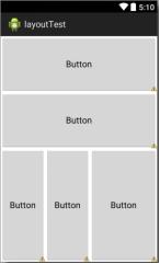
(1)新建一个安卓工程,在默认的layout界面中设置布局为线性布局水平,在布局中添加5个按钮控件和一个线性布局垂直控件,其布局如下图所示:
<?xml version="1.0" encoding="utf-8"?>
<androidx.constraintlayout.widget.ConstraintLayout xmlns:android="http://schemas.android.com/apk/res/android"
    xmlns:app="http://schemas.android.com/apk/res-auto"
    xmlns:tools="http://schemas.android.com/tools"
    android:layout_width="match_parent"
    android:layout_height="match_parent"
    android:showDividers="middle"
    android:dividerPadding="10dp"
    tools:context=".MainActivity">

    <?xml version="1.0" encoding="utf-8"?>

    <LinearLayout
        android:orientation="vertical"
        android:layout_width="match_parent"
        android:layout_height="match_parent">

        <Button
            android:layout_width="fill_parent"
            android:layout_height="0dp"
            android:layout_weight="1"
            android:text="Button"
            app:backgroundTint="#757171" />

        <Button
            android:layout_width="fill_parent"
            android:layout_height="0dp"
            android:layout_weight="1"
            android:text="Button"
            app:backgroundTint="#757171" />

        <LinearLayout
            android:layout_width="match_parent"
            android:layout_height="0dp"
            android:layout_weight="2"
            android:orientation="horizontal" >

            <Button
                android:layout_width="0dp"
                android:layout_height="match_parent"
                android:layout_weight="2"
                android:text="Button"

                app:backgroundTint="#757171" />

            <Button
                android:layout_width="0dp"
                android:layout_height="fill_parent"
                android:layout_weight="2"
                android:text="Button"

                app:backgroundTint="#757171" />

            <Button
                android:layout_width="0dp"
                android:layout_height="fill_parent"
                android:layout_weight="3"
                android:text="Button"

                app:backgroundTint="#757171" />

        </LinearLayout>

    </LinearLayout>


</androidx.constraintlayout.widget.ConstraintLayout>
(2)其中水平线性布局中的两个按钮和垂直线性布局的高度比例为:1:1:2,垂直线性布局内三个按钮的宽度比例为:2:2:3。
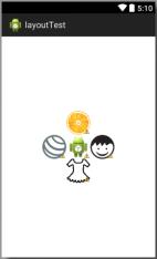
(3)新建一个相对布局界面,在其中添加5个ImageView控件,使用相对布局属性使其形成如下图所示的梅花型图案(其中中间控件位于界面居中位置),各个控件所使用的图片资源见实验资源文件,需要先导入到工程项目的drawable中再使用。
<?xml version="1.0" encoding="utf-8"?>
<androidx.constraintlayout.widget.ConstraintLayout xmlns:android="http://schemas.android.com/apk/res/android"
    xmlns:app="http://schemas.android.com/apk/res-auto"
    xmlns:tools="http://schemas.android.com/tools"
    android:layout_width="match_parent"
    android:layout_height="match_parent"
    tools:context=".MainActivity2">

    <ImageView
        android:id="@+id/imageView"
        android:layout_width="0dp"
        android:layout_height="100dp"
        android:layout_marginTop="100dp"
        android:layout_marginEnd="56dp"
        android:layout_marginRight="56dp"
        android:layout_marginBottom="100dp"
        app:layout_constraintBottom_toBottomOf="@+id/imageView3"
        app:layout_constraintEnd_toEndOf="parent"
        app:layout_constraintStart_toEndOf="@+id/imageView7"
        app:layout_constraintTop_toTopOf="@+id/imageView2"
        app:srcCompat="@drawable/child" />

    <ImageView
        android:id="@+id/imageView2"
        android:layout_width="100dp"
        android:layout_height="0dp"
        android:layout_marginStart="100dp"
        android:layout_marginLeft="100dp"
        android:layout_marginTop="187dp"
        android:layout_marginEnd="100dp"
        android:layout_marginRight="100dp"
        app:layout_constraintBottom_toTopOf="@+id/imageView7"
        app:layout_constraintEnd_toEndOf="@+id/imageView"
        app:layout_constraintStart_toStartOf="@+id/imageView4"
        app:layout_constraintTop_toTopOf="parent"
        app:srcCompat="@drawable/arancia_fruit" />

    <ImageView
        android:id="@+id/imageView3"
        android:layout_width="100dp"
        android:layout_height="0dp"
        android:layout_marginStart="100dp"
        android:layout_marginLeft="100dp"
        android:layout_marginEnd="100dp"
        android:layout_marginRight="100dp"
        android:layout_marginBottom="244dp"
        app:layout_constraintBottom_toBottomOf="parent"
        app:layout_constraintEnd_toEndOf="@+id/imageView"
        app:layout_constraintStart_toStartOf="@+id/imageView4"
        app:layout_constraintTop_toBottomOf="@+id/imageView7"
        app:srcCompat="@drawable/dress2" />

    <ImageView
        android:id="@+id/imageView4"
        android:layout_width="0dp"
        android:layout_height="100dp"
        android:layout_marginStart="55dp"
        android:layout_marginLeft="55dp"
        android:layout_marginTop="100dp"
        android:layout_marginBottom="100dp"
        app:layout_constraintBottom_toBottomOf="@+id/imageView3"
        app:layout_constraintEnd_toStartOf="@+id/imageView7"
        app:layout_constraintStart_toStartOf="parent"
        app:layout_constraintTop_toTopOf="@+id/imageView2"
        app:srcCompat="@drawable/fitness_ball" />

    <ImageView
        android:id="@+id/imageView7"
        android:layout_width="0dp"
        android:layout_height="0dp"
        android:layout_centerInParent="true"
        app:layout_constraintBottom_toTopOf="@+id/imageView3"
        app:layout_constraintEnd_toStartOf="@+id/imageView"
        app:layout_constraintStart_toEndOf="@+id/imageView4"
        app:layout_constraintTop_toBottomOf="@+id/imageView2"
        app:srcCompat="@android:mipmap/sym_def_app_icon" />

</androidx.constraintlayout.widget.ConstraintLayout>
2. 掌握文本框(TextView)、按钮(Button)、EditText(可编辑文本)和CheckBox(复选框)控件的使用方法
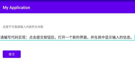
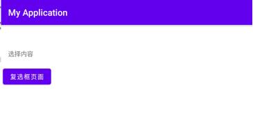
(1)新建一个安卓工程,在默认的layout界面中分别添加一个文本框(TextView)、按钮(Button)和EditText(可编辑文本)控件。
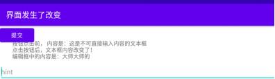
(2)TextView包含了一段提示文字,作为另一个控件的搭配说明,Button则是相应点击事件,可以将Button理解为可以点击的TextView,而EditText则用于接受用户的输入。
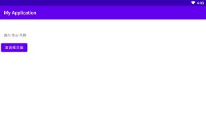
(3)程序初始化时给TextView设置默认值,在按钮被点击后会出现的响应,使得文本框内容发生改变(改变后的内容将包含在EditText中输入的信息)。
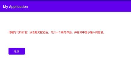
(4)请编写代码实现:点击提交按钮后,打开一个新的界面,并在其中显示输入的信息。
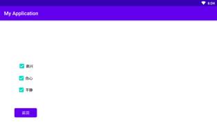
(5)在新的界面中再添加一个CheckBox(复选框)控件(复选框应有3个以上可选择项,内容不限)和一个Button(按钮)控件。请编写代码实现:当点击按钮时,关闭当前界面并将复选框选择的内容信息返回至第一个界面并显示。

<?xml version="1.0" encoding="utf-8"?>
<androidx.constraintlayout.widget.ConstraintLayout xmlns:android="http://schemas.android.com/apk/res/android"
    xmlns:app="http://schemas.android.com/apk/res-auto"
    xmlns:tools="http://schemas.android.com/tools"
    android:layout_width="match_parent"
    android:layout_height="match_parent"
    tools:context=".MainActivity">

    <TextView
        android:id="@+id/textView2"
        android:layout_width="wrap_content"
        android:layout_height="wrap_content"
        android:layout_marginStart="16dp"
        android:layout_marginLeft="16dp"
        android:layout_marginBottom="18dp"
        android:text="选择内容"
        app:layout_constraintBottom_toTopOf="@+id/button"
        app:layout_constraintStart_toStartOf="parent" />

    <Button
        android:id="@+id/button"
        android:layout_width="wrap_content"
        android:layout_height="wrap_content"
        android:layout_marginStart="4dp"
        android:layout_marginLeft="4dp"
        android:layout_marginTop="93dp"
        android:text="复选框页面"
        app:layout_constraintStart_toStartOf="parent"
        app:layout_constraintTop_toTopOf="parent" />

</androidx.constraintlayout.widget.ConstraintLayout>
<?xml version="1.0" encoding="utf-8"?>
<androidx.constraintlayout.widget.ConstraintLayout xmlns:android="http://schemas.android.com/apk/res/android"
    xmlns:app="http://schemas.android.com/apk/res-auto"
    xmlns:tools="http://schemas.android.com/tools"
    android:layout_width="match_parent"
    android:layout_height="match_parent"
    tools:context=".MainActivity2">

    <Button
        android:id="@+id/but"
        android:layout_width="wrap_content"
        android:layout_height="wrap_content"
        android:layout_marginStart="57dp"
        android:layout_marginLeft="57dp"
        android:layout_marginTop="42dp"
        android:text="返回"
        app:layout_constraintStart_toStartOf="parent"
        app:layout_constraintTop_toBottomOf="@+id/checkBox3" />

    <CheckBox
        android:id="@+id/checkBox1"
        android:layout_width="wrap_content"
        android:layout_height="wrap_content"
        android:layout_marginStart="2dp"
        android:layout_marginLeft="2dp"
        android:text="高兴"
        app:layout_constraintBottom_toTopOf="@+id/checkBox2"
        app:layout_constraintStart_toStartOf="@+id/checkBox2" />

    <CheckBox
        android:id="@+id/checkBox2"
        android:layout_width="wrap_content"
        android:layout_height="wrap_content"
        android:layout_marginStart="68dp"
        android:layout_marginLeft="68dp"
        android:layout_marginTop="205dp"
        android:text="伤心"
        app:layout_constraintStart_toStartOf="parent"
        app:layout_constraintTop_toTopOf="parent" />

    <CheckBox
        android:id="@+id/checkBox3"
        android:layout_width="wrap_content"
        android:layout_height="wrap_content"
        android:layout_marginTop="46dp"
        android:text="平静"
        app:layout_constraintStart_toStartOf="@+id/checkBox2"
        app:layout_constraintTop_toTopOf="@+id/checkBox2" />


</androidx.constraintlayout.widget.ConstraintLayout>
package com.example.myapplication;

import androidx.annotation.Nullable;
import androidx.appcompat.app.AppCompatActivity;

import android.content.Intent;
import android.os.Bundle;
import android.view.View;
import android.widget.Button;
import android.widget.EditText;
import android.widget.TextView;

public class MainActivity extends AppCompatActivity {

        /** Called when the activity is first created. */
        @Override
        public void onCreate(Bundle savedInstanceState)
        {
            super.onCreate(savedInstanceState);
            setContentView(R.layout.activity_main);

            Button button = (Button) findViewById(R.id.button);
            button.setOnClickListener(new View.OnClickListener() {
                @Override
                public void onClick(View v) {
                    Intent intent = new Intent(MainActivity.this,MainActivity2.class);
                    startActivityForResult(intent,0x11);
                }
            });
        }

    @Override
    protected void onActivityResult(int requestCode, int resultCode, @Nullable Intent data) {
        super.onActivityResult(requestCode, resultCode, data);
        TextView textView=(TextView) findViewById(R.id.textView2);
        if (requestCode==0x11 && resultCode==0x11){
            Bundle bundle =data.getExtras();
            String string= bundle.getString("check");
            textView.setText(string);
        }
    }
}
package com.example.myapplication;

import androidx.appcompat.app.AppCompatActivity;

import android.content.Intent;
import android.os.Bundle;
import android.view.View;
import android.widget.Button;
import android.widget.CheckBox;
import android.widget.EditText;
import android.widget.TextView;
import android.widget.Toast;

import java.util.ArrayList;
import java.util.List;

public class MainActivity2 extends AppCompatActivity {

    @Override
    protected void onCreate(Bundle savedInstanceState) {
        super.onCreate(savedInstanceState);
        setContentView(R.layout.activity_main2);
        Button button = (Button) findViewById(R.id.but);
        // 初始化控件
        CheckBox checkBox1, checkBox2, checkBox3;
        List<CheckBox> checkBoxList = new ArrayList<CheckBox>();
        checkBox1 = (CheckBox) findViewById(R.id.checkBox1);
        checkBox2 = (CheckBox) findViewById(R.id.checkBox2);
        checkBox3 = (CheckBox) findViewById(R.id.checkBox3);

        // 将所有的checkbox放到一个集合中
        checkBoxList.add(checkBox1);
        checkBoxList.add(checkBox2);
        checkBoxList.add(checkBox3);

        button.setOnClickListener(new View.OnClickListener() {
            @Override
            public void onClick(View v) {
            Intent intent = getIntent();
            Bundle bundle = new Bundle();
                StringBuffer sb = new StringBuffer();
                //遍历集合中的checkBox,判断是否选择,获取选中的文本
                for (CheckBox checkbox : checkBoxList) {
                    if (checkbox.isChecked()){
                        sb.append(checkbox.getText().toString() + " ");
                    }
                }
                String s = sb.toString();
                if (sb!=null && "".equals(sb.toString())){
                    Toast.makeText(getApplicationContext(), "请至少选择一个", Toast.LENGTH_SHORT).show();
                }else{
                    Toast.makeText(getApplicationContext(), sb.toString(), Toast.LENGTH_SHORT).show();
                }

                bundle.putCharSequence("check",s);
                intent.putExtras(bundle);
                setResult(0x11,intent);
                finish();
            }

        });
    }
}
3. 掌握下拉列表(Spinner)控件的使用方法
(1)ArrayAdapter可称为
以上是关于AndroidUI控件switch使用方法的主要内容,如果未能解决你的问题,请参考以下文章
Android Jetpack Compose学习—— 各种控件的用法
Android Jetpack Compose学习—— 各种控件的用法