HTML+CSS 旋转照片墙!源代码(简易动画干货快收藏!!)
Posted 正八想吃泡面
tags:
篇首语:本文由小常识网(cha138.com)小编为大家整理,主要介绍了HTML+CSS 旋转照片墙!源代码(简易动画干货快收藏!!)相关的知识,希望对你有一定的参考价值。
拿走请三连,并注明出处
新手上路,路过的大佬请多多指教~
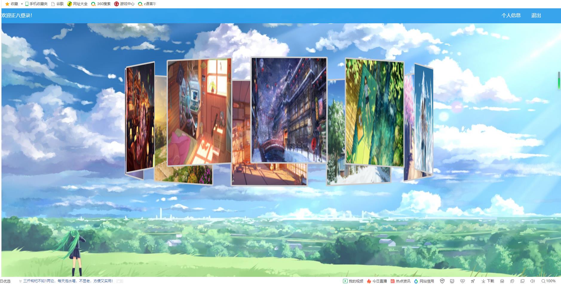
动画特效为11张照片,环绕着旋转(照片可自改添加,源代码中用到的照片未上传)
<!DOCTYPE html>
<html lang="en">
<head>
<meta charset="UTF-8">
<meta http-equiv="X-UA-Compatible" content="IE=edge">
<meta name="viewport" content="width=device-width, initial-scale=1.0">
<title>照片墙</title>
<style>
body
margin: 0px;
#div1
width: 100%;
height: 50px;
background: rgba(50, 161, 235, 0.966);
#div2
background-image: url(w3.jpeg);
position:fixed;
top: 0;
left: 0;
width:100%;
height:100%;
min-width: 1000px;
z-index:-10;
zoom: 1;
background-color: #fff;
background-repeat: no-repeat;
background-size: cover;
-webkit-background-size: cover;
-o-background-size: cover;
background-position: center 0;
#photo_box
width: 280px;
height: 400px;
position: fixed;
left: 0;
right: 0;
top:0;
bottom: 0;
margin: 200px auto;
transform-style: preserve-3d;/*表示所有子元素在3D空间中呈现*/
transform: rotateX(-5deg) rotateY(0deg);
animation: run 30s linear infinite;/*循环执行run动画,每30秒执行一次*/
/*设置图像大小、边框、圆角、位置*/
#photo_box img
width: 250px;
height: 350px;
border: 5px solid #ccc;
border-radius: 5px;
position: absolute;
left: 0;
top: 0;
/*依次设置图像盒子中每个图像旋转后位置*/
#photo_box img:nth-child(1)
transform: rotateY(0deg) translateZ(500px);
#photo_box img:nth-child(2)
transform: rotateY(36deg) translateZ(500px);
#photo_box img:nth-child(3)
transform: rotateY(72deg) translateZ(500px);
#photo_box img:nth-child(4)
transform: rotateY(108deg) translateZ(500px);
#photo_box img:nth-child(5)
transform: rotateY(144deg) translateZ(500px);
#photo_box img:nth-child(6)
transform: rotateY(180deg) translateZ(500px);
#photo_box img:nth-child(7)
transform: rotateY(216deg) translateZ(500px);
#photo_box img:nth-child(8)
transform: rotateY(252deg) translateZ(500px);
#photo_box img:nth-child(9)
transform: rotateY(288deg) translateZ(500px);
#photo_box img:nth-child(10)
transform: rotateY(324deg) translateZ(500px);
#photo_box img:nth-child(11)
transform: rotateY(360deg) translateZ(500px);
/*采用@keyframes 规则创建run动画。*/
@keyframes run
0%transform: rotateX(0deg) rotateY(0deg);
25%transform: rotateX(10deg) rotateY(90deg);
50%transform: rotateX(0deg) rotateY(180deg);
75%transform: rotateX(-10deg) rotateY(270deg);
100%transform: rotateX(0deg) rotateY(360deg);
#text1
float: left;
color:#fff;
width: 150px;
padding:12px 0;
height: 50px;
#text2
float: right;
width: 100px;
color:#fff;
padding:12px 0;
height: 50px;
#text3
float: right;
width: 100px;
color:#fff;
padding:12px 0;
height: 50px;
</style>
</head>
<body>
<div id="div1">
<div id="text1">欢迎登录!</div>
<div id="text2" οnclick="outclick()" >退出</div>
<div id="text3">个人信息</div>
</div>
<div id="div2">
<div id="photo_box">
<img src="image/1.jpg">
<img src="image/2.jpg">
<img src="image/3.jpg">
<img src="image/4.jpg">
<img src="image/5.jpg">
<img src="image/6.jpg">
<img src="image/7.jpg">
<img src="image/8.jpg">
<img src="image/9.jpg">
<img src="image/10.jpg">
<img src="image/11.jpg">
</div>
</div>
</body>
/*简单设置页面*/
<script>
var name=localStorage.getItem("username");
var div1=document.getElementById("text1");
div1.innerHTML="欢迎"+name+"登录!";
function outclick()
localStorage.clear();
window.location.href="登录页面.html";
</script>
</html>
记得点赞关注喔~
以上是关于HTML+CSS 旋转照片墙!源代码(简易动画干货快收藏!!)的主要内容,如果未能解决你的问题,请参考以下文章
利用perspective 和 transform 里面的几个参数来实现旋转照片墙