Qt之使用QSS设置QPushButton图标和文本的位置
Posted 草上爬
tags:
篇首语:本文由小常识网(cha138.com)小编为大家整理,主要介绍了Qt之使用QSS设置QPushButton图标和文本的位置相关的知识,希望对你有一定的参考价值。
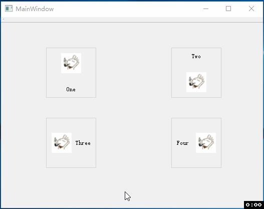
一.效果
二.实现
常用的QPushButton样式表
QPushButton
    outline: 0px                             /* 去掉获取焦点时的虚线 */
    background-color: gray;		             /* 背景颜色 */
    border-radius: 6px;		                 /* 按钮边框的圆角设置 */

    /* 按钮背景图标设置 */
    background-image: url(:/configIcon.png); /* 背景图片 */
    background-origin: content;
    background-position: center;	         /* 背景图片的位置 */
    padding-right: 2px;
    padding-bottom: 2px;
    background-repeat: no-repeat;	         /* 设置背景图像的平铺模式 */

    /* 按钮文本设置 */
    text-align: top;			             /* 文本的位置 */
    padding-left: 2px;
    padding-top: 2px;
    font-size: 12px;
    color: #FFFFFF;			                 /* 文本颜色 */
1.图标在上
QPushButton

    outline: 0px;
    border: 1px solid lightgray;
    background-image: url(:/icons/test.png);
    background-origin: content;
    background-position: top;
    background-repeat: no-repeat;
    padding-top: 10px;
    text-align: bottom;
    padding-bottom: 10px;
    font-size: 12px;


QPushButton:hover

    background-color: lightgray;


QPushButton:pressed

    background-color: gray;
2.图标在下
QPushButton

    outline: 0px;
    border: 1px solid lightgray;
    background-image: url(:/icons/test.png);
    background-origin: content;
    background-position: bottom;
    background-repeat: no-repeat;
    padding-top: 10px;
    text-align: top;
    padding-bottom: 10px;
    font-size: 12px;


QPushButton:hover

    background-color: lightgray;


QPushButton:pressed

    background-color: gray;
3.图标在左
QPushButton

    outline: 0px;
    border: 1px solid lightgray;
    background-image: url(:/icons/test.png);
    background-origin: content;
    background-position: left;
    background-repeat: no-repeat;
    padding-left: 10px;
    text-align: right;
    padding-right: 10px;
    font-size: 12px;


QPushButton:hover

    background-color: lightgray;


QPushButton:pressed

    background-color: gray;
4.图标在右
QPushButton

    outline: 0px;
    border: 1px solid lightgray;
    background-image: url(:/icons/test.png);
    background-origin: content;
    background-position: right;
    background-repeat: no-repeat;
    padding-left: 10px;
    text-align: left;
    padding-right: 10px;
    font-size: 12px;


QPushButton:hover

    background-color: lightgray;


QPushButton:pressed

    background-color: gray;
图片和文字与边框的距离通过padding参数来控制,关于padding参数,不得不说一下QSS的盒子模型(box model)
使用样式表时,每个widget都被视为包含四个同心矩形的框:边距矩形(margin rectangle)、边框矩形(border rectangle)、填充矩形(padding rectangle)和内容矩形(content rectangle)。盒子模型如下图所示:
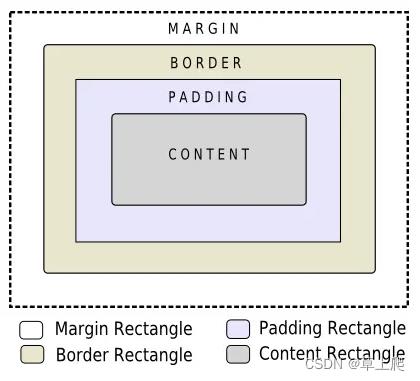
边距(margin)、边框(border)宽度和填充(padding)属性都默认为零。在这种情况下,所有四个矩形(边距、边框、填充和内容)完全重合。
可以使用background-image(背景图片)属性指定widget的背景。默认情况下,仅为边框内的区域绘制背景图像,但是可以通过background-clip(背景剪裁)属性进行更改。可以使用background-repeat(背景重复)和background-origin(背景原点)来控制背景图像的重复和原点。
背景图像不随widget的大小缩放。要实现随 widget 大小缩放的“皮肤”或背景,必须使用border-image(边框图像)。由于 border-image 属性提供了备用背景,因此在指定border-image 时不需要指定 background-image。当两者都被设置时,border-image 绘制在 background-image 上。
此外,图像属性可用于在 border-image 上绘制图像。当指定的图像大小与 widget 的大小不匹配时,图像不会平铺(tile)或拉伸(stretch),需要使用image-position属性指定其对齐方式。与background-image和border-image不同,您可以在 image 属性中指定SVG,在这种情况下,图像会根据 widget 的大小自动缩放。
原文链接:https://blog.csdn.net/caoshangpa/article/details/126278008
以上是关于Qt之使用QSS设置QPushButton图标和文本的位置的主要内容,如果未能解决你的问题,请参考以下文章