flutter+dart仿微信App界面聊天实例
Posted Andy前端
tags:
篇首语:本文由小常识网(cha138.com)小编为大家整理,主要介绍了flutter+dart仿微信App界面聊天实例相关的知识,希望对你有一定的参考价值。
Flutter 是 谷歌 开源的 UI 框架,旨在帮助开发者通过一套代码库高效构建多平台精美应用,支持移动、Web、桌面和嵌入式平台。
相比较目前的混合开发方案,Flutter 提供了大量的文档,能非常快速且友好的让你加入到这个大家庭,针对移动端,Flutter 提供了符合 android 风格的 Material 和符合 ios 风格的 Cupertino,同时对不同平台也做了不同的兼容。比如 闲鱼,美团,腾讯 等大厂都有相关案例使用。
感兴趣的同学可以关注:
https://github.com/flutter/flutter
https://flutter.cn/
https://flutterchina.club/
https://pub.flutter-io.cn/
https://www.dartcn.com/
项目介绍
框架技术
编码/技术:VS + Flutter 1.12.13/Dart 2.7.0
图片/拍照:image_picker: ^0.6.6+1
图片预览组件:photo_view: ^0.9.2
视频组件:chewie: ^0.9.7
存储组件:shared_preferences: ^0.5.7+1
字体图标:阿里iconfont字体图标库
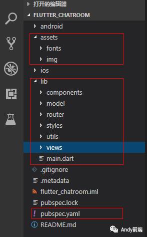
flutter项目结构/主入口main.dart配置
/*** @tpl Flutter入口页面配置*/import 'package:flutter/material.dart';// 引入公共样式import 'styles/common.dart';// 引入底部Tabbar页面导航import 'components/tabbar.dart';// 引入地址路由import 'router/routes.dart';void main() => runApp(MyApp());class MyApp extends StatelessWidget {@overrideWidget build(BuildContext context) {return MaterialApp(title: 'Flutter App',debugShowCheckedModeBanner: false,theme: ThemeData(primaryColor: GStyle.appbarColor,),home: TabBarPage(),onGenerateRoute: onGenerateRoute,);}}


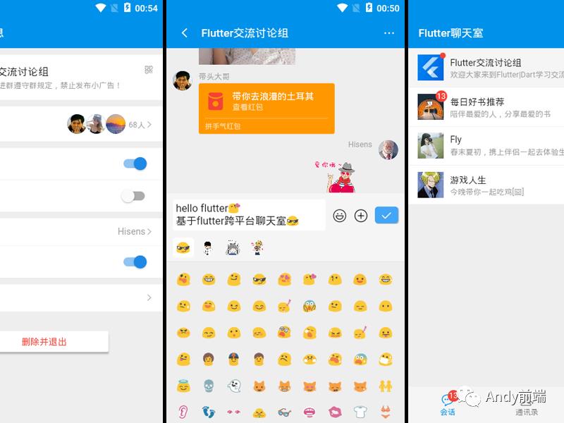
会话、通讯录、我三大模块,通过flutter导航切换BottomNavigationBar组件封装到tabbar页面
底部tab是放在 Scaffold 的 bottomNavigationBar 中,顶部tab是放在 AppBar 的 bottom 中,也就是标题栏之下
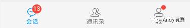
bottomNavigationBar: BottomNavigationBar(backgroundColor: GStyle.tabbarColor,fixedColor: GStyle.primaryColor,type: BottomNavigationBarType.fixed,elevation: 1.0,unselectedFontSize: 12.0,selectedFontSize: 12.0,currentIndex: _currentTabIndex,items: [BottomNavigationBarItem(icon: Stack(alignment: Alignment(6,-4),children: <Widget>[GStyle.iconfont(0xe62a, size: 21.0), GStyle.badge(13),],),title: Text('会话')),BottomNavigationBarItem(icon: GStyle.iconfont(0xe600, size: 21.0),title: Text('通讯录')),BottomNavigationBarItem(icon: Stack(alignment: Alignment(1.5, -1.5),children: <Widget>[GStyle.iconfont(0xe6b4, size: 21.0), GStyle.badge(0, isdot: true),],),title: Text('我')),],onTap: (int index) {setState(() {_currentTabIndex = index;});},)
appBar: new AppBar(...///tabBar控件bottom: new TabBar(///顶部时,tabBar为可以滑动的模式isScrollable: true,///必须有的控制器,与pageView的控制器同步controller: _tabController,///每一个tab item,是一个List<Widget>tabs: _tabItems,///tab底部选中条颜色indicatorColor: _indicatorColor,),...)
flutter中使用阿里iconfont字体图标
由于flutter自带图标不能满足项目需求,所以项目中使用的图标是阿里iconfont字体图标库
在pubspec.yaml里添加字体配置
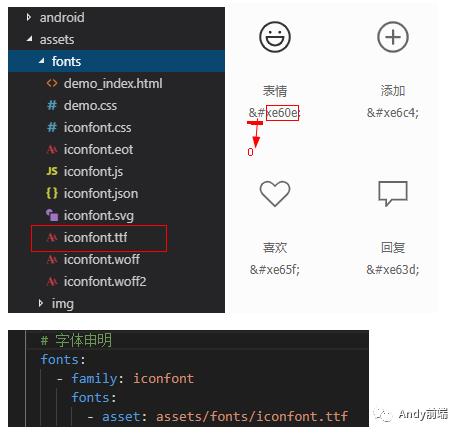
Icon(IconData(0xe60e, fontFamily:'iconfont'), size:24.0)IconData第一个参数是字体code,到这一步自定义字体图标就好了,每次都这样调用显得不优雅,只能作如下抽离封装。
class GStyle {// __ 自定义图标static iconfont(int codePoint, {double size = 16.0, Color color}) {return Icon(IconData(codePoint, fontFamily: 'iconfont', matchTextDirection: true),size: size,color: color,);}}
这样调用的时候只需传入字体code就行,支持自定义图标大小、颜色
GStyle.iconfont(0xe60e)GStyle.iconfont(0xe60e, color: Colors.orange, size: 21.0)
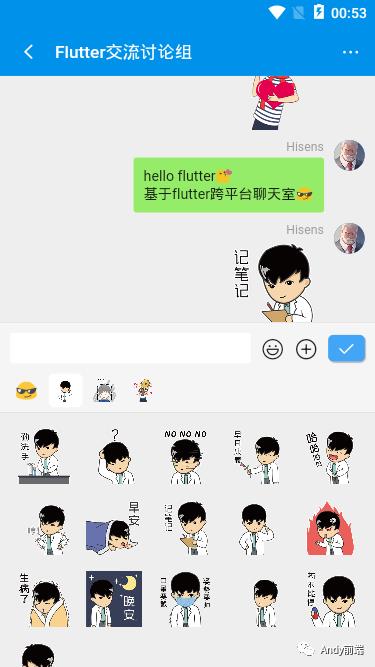
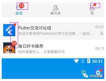
flutter未读信息圆形数字提示|红点提醒
如下图:类似这种未读消息提醒,在app中很常见,给人很直观的消息提示。在flutter中并没有提供这个组件,只能自行封装。
class GStyle {// 消息红点static badge(int count, {Color color = Colors.red, bool isdot = false, double height = 18.0, double width = 18.0}) {final _num = count > 99 ? '···' : count;return Container(alignment: Alignment.center, height: !isdot ? height : height/2, width: !isdot ? width : width/2,decoration: BoxDecoration(color: color, borderRadius: BorderRadius.circular(100.0)),child: !isdot ? Text('$_num', style: TextStyle(color: Colors.white, fontSize: 12.0)) : null);}}
默认背景色是红色、大小为18,数字超过99会以...显示。
//红点GStyle.badge(0, isdot:true)//默认数字13圆形GStyle.badge(13)//默认数字68, 橘色 大小15GStyle.badge(68, color: Colors.orange, height: 15.0, width: 15.0)
flutter自定义修改弹窗
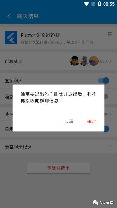
flutter中提供了多种丰富的弹窗组件:对话框AlertDialog、底部弹出框showModalBottomSheet、底部弱提示框SnackBar
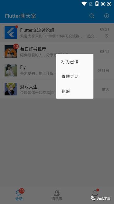
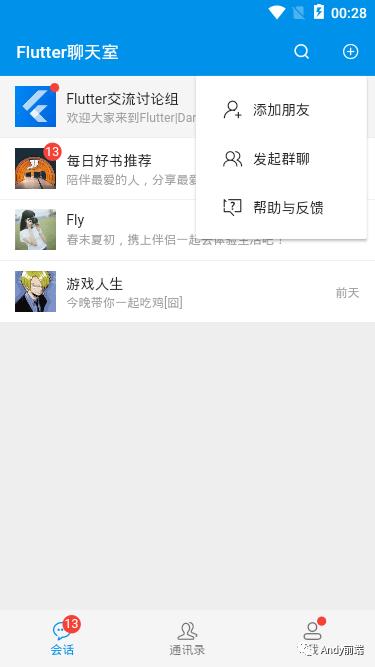
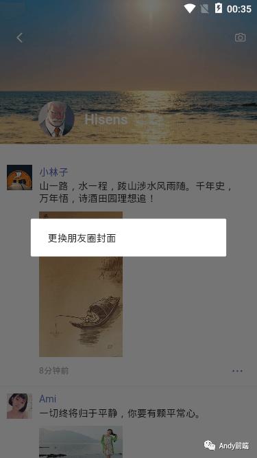
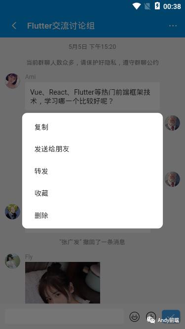
flutter实现类似微信在长按位置弹出菜单
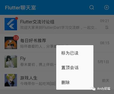
可通过flutter中InkWell组件提供的onTapDown获取长按坐标点,onLongPress长按事件弹出菜单
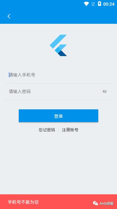
/*** @tpl 首页模板*/import 'package:flutter/material.dart';import '../../styles/common.dart';import '../../components/headerbar.dart';class IndexPage extends StatefulWidget {@override_IndexPageState createState() => _IndexPageState();}class _IndexPageState extends State<IndexPage> {double _globalPositionX = 0.0; //点击位置的横坐标double _globalPositionY = 0.0; //点击位置的纵坐标@overrideWidget build(BuildContext context) {return Scaffold(backgroundColor: GStyle.backgroundColor,appBar: HeaderBar('Flutter聊天室'),body: Container(child: ListView(children: <Widget>[InkWell(splashColor: Colors.grey[200],child: Container(...),onTap: () {...},//获取长按坐标点onTapDown: (TapDownDetails details) {_globalPositionX = details.globalPosition.dx;_globalPositionY = details.globalPosition.dy;},onLongPress: () {_showPopupMenu(context);},),],),),);}// 弹出长按菜单void _showPopupMenu(BuildContext context) {bool isLeft = _globalPositionX > MediaQuery.of(context).size.width/2 ? false : true;bool isTop = _globalPositionY > MediaQuery.of(context).size.height/2 ? false : true;showDialog(context: context,builder: (context) {return Stack(children: <Widget>[Positioned(top: isTop ? _globalPositionY : _globalPositionY - 200,left: isLeft ? _globalPositionX : _globalPositionX - 120,width: 120,child: Material(shape: RoundedRectangleBorder(borderRadius: BorderRadius.circular(2.0)), //圆角child: Column(children: <Widget>[...组件内容],),),)],);});}}
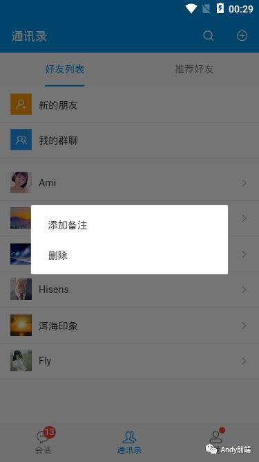
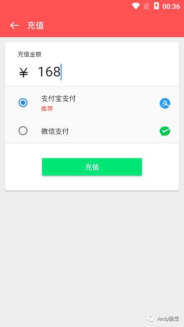
flutter对话框SimpleDialog,可以显示附加的提示和操作,通常配合SimpleDialogOption一起使用
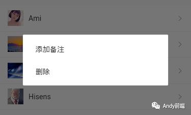
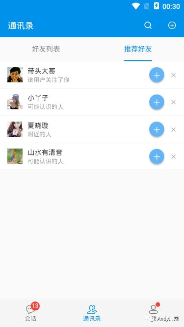
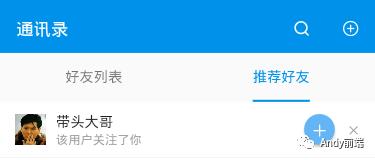
/*** @tpl 通讯录页面*/import 'package:flutter/material.dart';import '../../styles/common.dart';import '../../components/headerbar.dart';class ContactPage extends StatelessWidget {@overrideWidget build(BuildContext context) {return Scaffold(backgroundColor: GStyle.backgroundColor,appBar: HeaderBar('通讯录'),body: DefaultTabController(length: 2,child: Scaffold(appBar: TabBar(tabs: <Widget>[Tab(text: '好友列表'),Tab(text: '推荐好友'),],unselectedLabelColor: Colors.black54,labelColor: GStyle.c_0091ea,indicatorColor: GStyle.c_0091ea,indicatorSize: TabBarIndicatorSize.label,),body: TabBarView(children: <Widget>[//tab1页面Container(child: ListView(children: <Widget>[InkWell(splashColor: Colors.grey[200],child: Container(...),onTap: () {Navigator.pushNamed(context, '/uinfo');},onLongPress: () {_showSimplePopMenu(context);},),],),),//tab2页面Container(...),],))),);}void _showSimplePopMenu(BuildContext context) {showDialog(context: context,builder: (context) {return SimpleDialog(// title: Text('标题'),contentPadding: EdgeInsets.symmetric(vertical: 5.0),elevation: 0,children: <Widget>[SimpleDialogOption(child: Padding(padding: EdgeInsets.symmetric(vertical: 5.0), child: Text('添加备注')),onPressed: () {},),...],);});}}
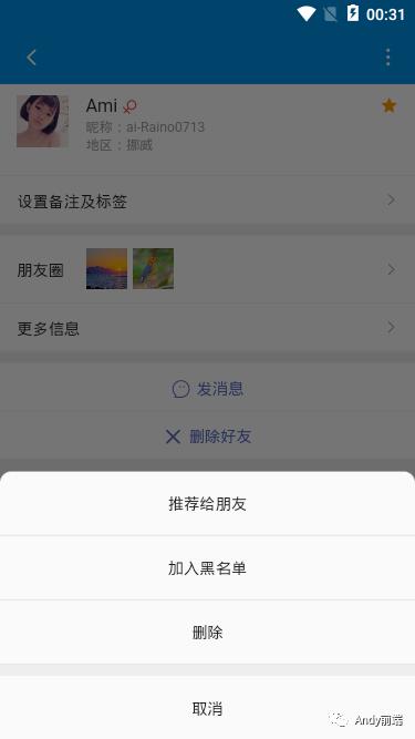
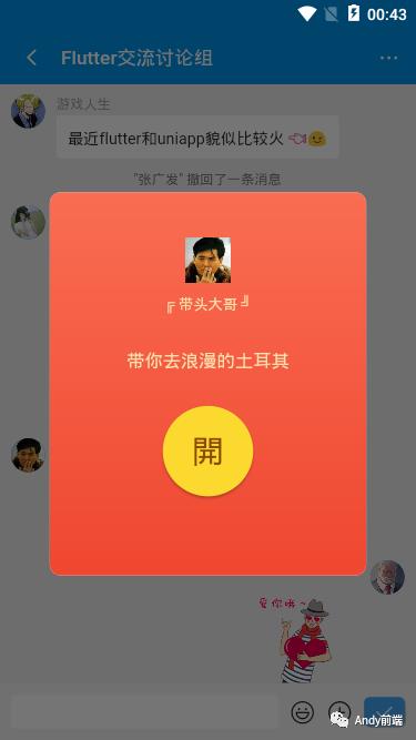
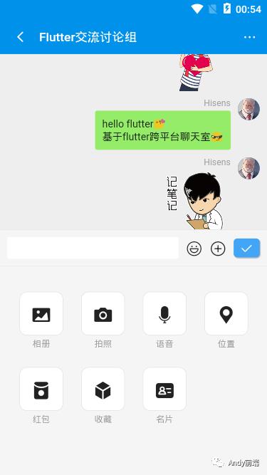
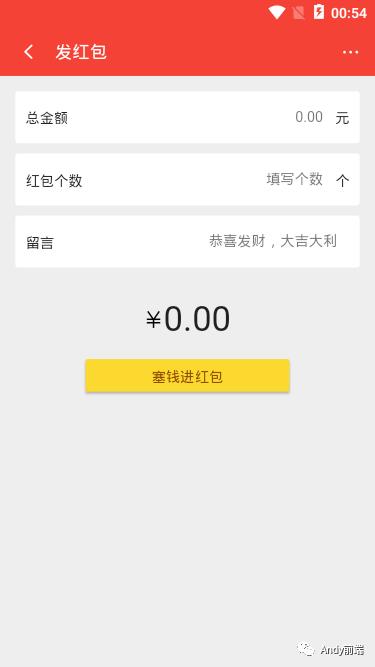
flutter底部面板showModalBottomSheet对话框,相当于弹出了一个新页面
/*** @tpl 好友信息页面*/import 'package:flutter/material.dart';import '../../styles/common.dart';import '../../components/headerbarNav.dart';class UinfoPage extends StatelessWidget {@overrideWidget build(BuildContext context) {return Scaffold(backgroundColor: GStyle.backgroundColor,appBar: HeaderBarNav('',leading: IconButton(icon: GStyle.iconfont(0xe65c, size: 17.0), onPressed: () {Navigator.pop(context);}),actions: [IconButton(icon: GStyle.iconfont(0xe93e, size: 17.0), onPressed: () {_showBottomSheet(context);}),]),body: Container(...),);}// 底部弹窗void _showBottomSheet(BuildContext context) {showModalBottomSheet(context: context,builder: (context) {return Column(mainAxisSize: MainAxisSize.min, //主轴方向占有空间的值,默认是maxchildren: <Widget>[ListTile(title: Row(mainAxisAlignment: MainAxisAlignment.center,children: <Widget>[Text('推荐给朋友', style: TextStyle(fontSize: 14))]),onTap: () {},),...],);},// 圆角shape: RoundedRectangleBorder(borderRadius: BorderRadius.only(topLeft: Radius.circular(10.0), topRight: Radius.circular(10.0))));}}
flutter中AlertDialog对话框
在flutter中AlertDialog弹窗默认大小是固定的,如何去掉宽高限制?
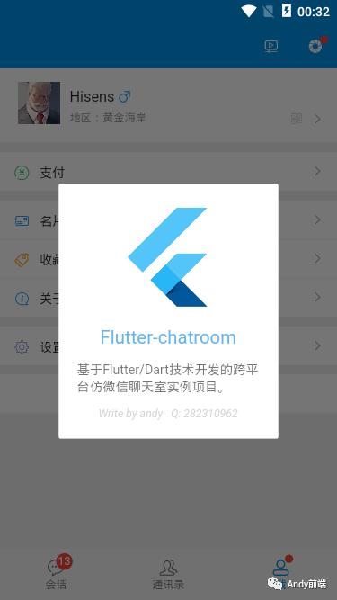
通过SizedBox和无限制容器UnconstrainedBox组件配合实现,如下图宽度设置为260,高度是自适应
void _showCardPopup(BuildContext context) {showDialog(context: context,builder: (context) {return UnconstrainedBox(constrainedAxis: Axis.vertical,child: SizedBox(width: 260,child: AlertDialog(content: Container(...),elevation: 0,contentPadding: EdgeInsets.symmetric(horizontal: 10.0, vertical: 20.0),),),);});}
行,到这里基于flutter/dart开发聊天实例就介绍完了,希望这些分享能有些许帮助!!
最后附上两个最近实例项目
以上是关于flutter+dart仿微信App界面聊天实例的主要内容,如果未能解决你的问题,请参考以下文章