CSS:响应式设计——REM
Posted WebJ2EE
tags:
篇首语:本文由小常识网(cha138.com)小编为大家整理,主要介绍了CSS:响应式设计——REM相关的知识,希望对你有一定的参考价值。
目录1. 响应式设计 VS. 自适应设计2. 何时选择响应式设计?3. 响应式设计的技术手段?4. 详解 REM4.1. 什么是 REM?4.2. REM 布局的本质?4.3. 辅助工具?4.4. 协作模式?4.5. 一个例子
Both responsive and adaptive design attempt to optimize the user experience across different devices, adjusting for different viewport sizes, resolutions, usage contexts, control mechanisms, and so on.
Responsive design works on the principle of flexibility - a single fluid website that can look good on any device. Responsive websites use media queries, flexible grids, and responsive images to create a user experience that flexes and changes based on a multitude of factors.
Adaptive design is more like the modern definition of progressive enhancement. Instead of one flexible design, adaptive design detects the device and other features, and then provides the appropriate feature and layout based on a predefined set of viewport sizes and other characteristics.
For Web developers, it is now fairly common to be called upon to create a Web site or app that changes its user interface depending on the browser or device accessing the site to provide an optimized experience. One approach to this is to create different versions of your site/app for different platforms or browsers and serve them appropriately after detecting which browser or platform is looking at your site. But this is increasingly inefficient: browser sniffing is inherently error prone, and maintaining multiple copies of your code can turn out to be a nightmare.
It is usually much better to create a single version of your code which doesn't care about what browser or platform is accessing the site, but instead uses feature tests to find out what code features the browser supports or what the values of certain browser features are, and then adjusts the code appropriately. This tends to be termed responsive design or adaptive design, two related but different approaches. For a discussion on the differences between the two, read Responsive design versus adaptive design.
This is much more reliable, more maintainable, and more future proof. You don't get caught in the situation of having to bring out more new site versions as more new browsers and platforms come out, and adjust code as feature support in existing browsers changes.
There are disadvantages to this approach as well. If the content, layout, and functionality need to change greatly for different devices, it may not be such a good approach. Also, taking an existing site and adding responsiveness to it, to make it mobile/tablet friendly, can be a lot more effort than just creating a separate mobile site or app, especially if it is a sprawling enterprise site.
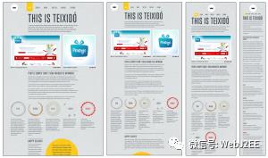
Fluid grids
The best place to start is with fluid measurements for our application layout — essentially, this means using a combination of percentages and ems/rems to size your containers and text, not fixed widths such as pixels.
Media queries
Fluid grids are a great start, but you'll notice that at certain points (known as breakpoints) the layout starts to break down. At these points you'll want to change the layout to rectify the layout problem, and this can be done using media queries.
Viewport
In short, mobile browsers lie. They don't render web pages at their true viewport width. Instead, they render pages at a higher assumed viewport width (something approaching a laptop screen), and then shrink the result down to fit inside the mobile screen. This is a sensible defensive mechanism — most old school sites that don't have media queries would look terrible when rendered at say, 320px or 480px wide. But this doesn't help us responsible web developers, who have written small screen layouts into our CSS using media queries and want mobile devices to display those!
Responsive images/video
Another problem that comes up more and more these days is making image/video weight (size in KB) responsive as well as the dimensions of the image on screen. Yes, you want the images to be contained inside the app UI whether you are using it on desktop or mobile, but you should also consider that mobile apps have much smaller viewport dimensions available than desktop apps, so you should try to give mobile devices a smaller image to download. Mobiles in general (more commonly in some parts of the world than others) are on lower bandwidth connections and have less memory available than desktop devices, so yes, those extra kilobytes really do count.
Another challenge is dealing with high resolution screens — raster graphics designed for low resolutions are in danger of appearing tiny when displayed on a high resolution screen, so devices often apply a default zoom factor to rendered pages to avoid this. The trouble with this, then, is that raster images are zoomed in and as a result can start to look pixellated.
4.1. 什么是 REM?
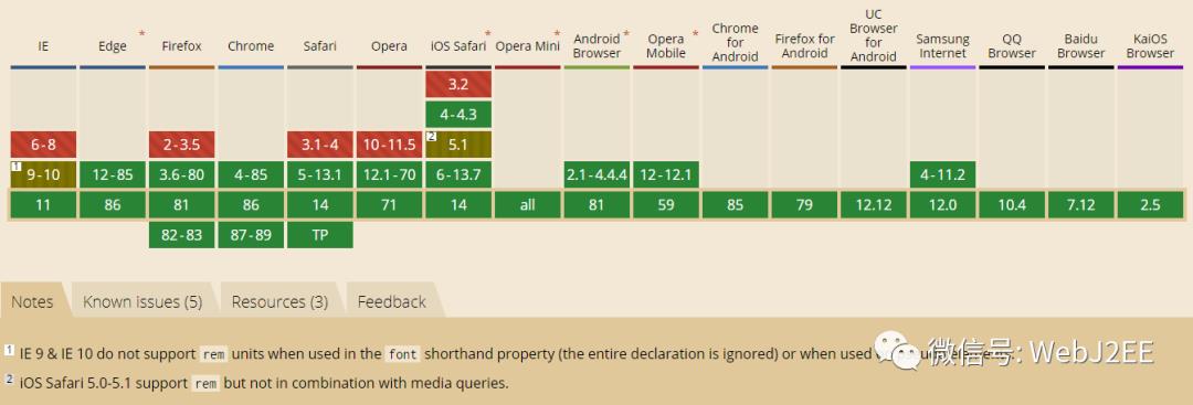
Represents the font-size of the root element (typically <html>). When used within the root element font-size, it represents its initial value (a common browser default is 16px, but user-defined preferences may modify this).
兼容性:
示例:
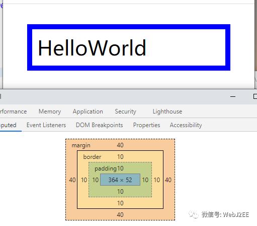
<!DOCTYPE html><html><head><title></title><style type="text/css">html {font-size: 20px;}body {font-size: 16px;}p {font-size: 2rem;border: .5rem solid blue;padding: .5rem;margin: 2rem;}</style></head><body><p>HelloWorld</p></body></html>
4.2. REM 布局的本质?
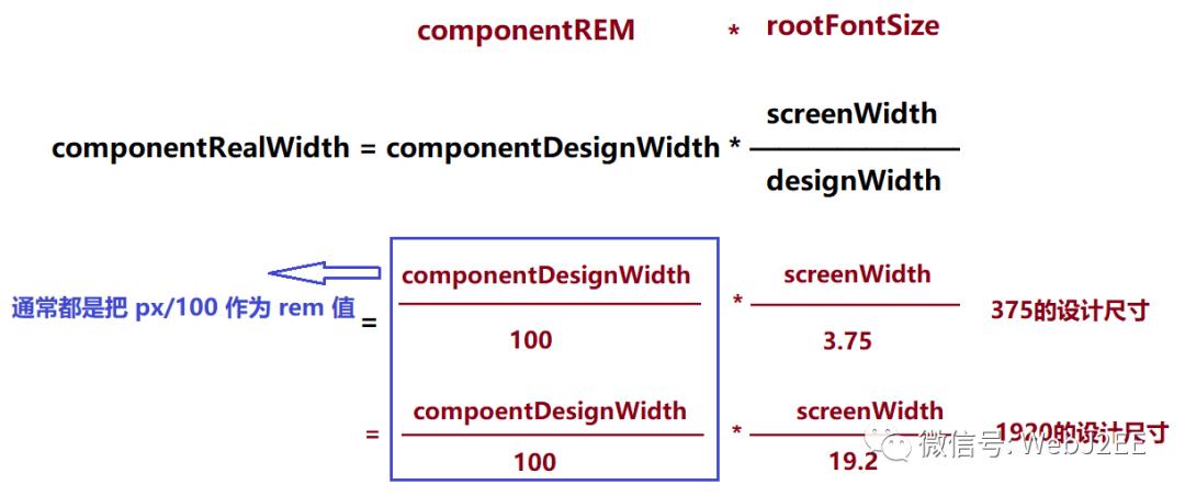
REM 布局的本质是等比缩放,一般是基于宽度。
4.3. 辅助工具?
浏览器缩放时,按比例调整 html 元素的 font-size:
https://github.com/amfe/lib-flexible
px 转 rem(不想手动一个一个把 px 转成 rem):
postcss-pxtorem
4.4. 协作模式?
下面这张图是淘宝设计师分享的他们的工作流程:
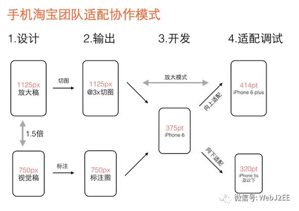
解释:
第一步,视觉设计阶段,设计师按宽度750px(iPhone 6)做设计稿,除图片外所有设计元素用矢量路径来做。设计定稿后在750px的设计稿上做标注,输出标注图。同时等比放大1.5倍生成宽度1125px的设计稿,在1125px的稿子里切图。
第二步,输出两个交付物给开发工程师:一个是程序用到的@3x切图资源,另一个是宽度750px的设计标注图。
第三步,开发工程师拿到750px标注图和@3x切图资源,完成iPhone 6(375pt)的界面开发。
第四步,适配调试阶段,基于iPhone 6的界面效果,分别向上向下调试iPhone 6 plus(414pt)和iPhone 5S及以下(320pt)的界面效果。
由此完成大中小三屏适配。
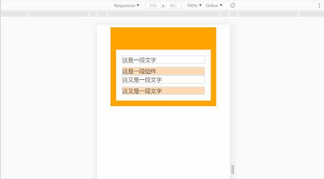
4.5. 一个例子
<html><head><title></title><meta name="viewport" content="width=device-width,initial-scale=1.0,maximum-scale=1.0,user-scalable=0" /><style>* {box-sizing: border-box;}p {margin: 0;}.rem-demo{width: 3rem;padding: 0.64rem 0.16rem 0.16rem 0.16rem;margin: auto;background-color: orange;}.rem-demo-content {padding: .16rem;background-color: #fff;}.rem-demo-content > .text {border: 2px solid #E4E4E4;height: .24rem;margin-bottom: .08rem;}.rem-demo-content > .item {border: 2px solid #E4E4E4;height: .24rem;background-color: #FFDAB4;}</style></head><body><div class="rem-demo"><div class="rem-demo-content"><p class="text">这是一段文字</p><div class="item">这是一段组件</div><p class="text">这又是一段文字</p><div class="item">这又是一段文字</div></div></div><script type="text/javascript">!function(e, t) {var n = t.documentElement;function i() {var e = n.clientWidth / 3.75;n.style.fontSize = e + "px"}t.body.style.fontSize = "16px";i();e.addEventListener("resize", i);e.addEventListener("pageshow", function(e) {e.persisted && i()});} (window, document)</script></body></html>
参考:
Responsive design versus adaptive design:
https://developer.mozilla.org/en-US/docs/Archive/Apps/Design/UI_layout_basics/Responsive_design_versus_adaptive_design
The building blocks of responsive design:
https://developer.mozilla.org/en-US/docs/Web/Progressive_web_apps/Responsive/responsive_design_building_blocks
响应式设计:
https://developer.mozilla.org/zh-CN/docs/Web_Development/Mobile/Responsive_design
CSS Device Adaptation Module Level 1:
https://drafts.csswg.org/css-device-adapt/
The Ultimate Guide To iPhone Resolutions:
https://www.paintcodeapp.com/news/ultimate-guide-to-iphone-resolutions
caniuse——rem:
https://www.caniuse.com/?search=rem
amfe-flexible:
https://github.com/amfe/lib-flexible/blob/2.0/index.js
postcss-pxtorem:
https://github.com/cuth/postcss-pxtorem#readme
以上是关于CSS:响应式设计——REM的主要内容,如果未能解决你的问题,请参考以下文章