初学福音,手把手带你vue封装弹框组件并全局注册使用~
Posted 北极光之夜。
tags:
篇首语:本文由小常识网(cha138.com)小编为大家整理,主要介绍了初学福音,手把手带你vue封装弹框组件并全局注册使用~相关的知识,希望对你有一定的参考价值。
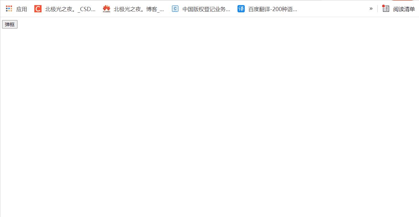
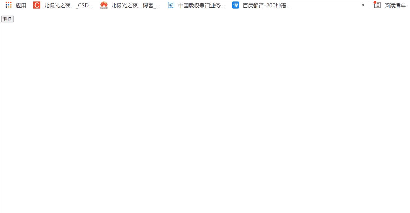
一.话不多,先上效果:
大家好呀,好久不见,最近还好吗?今天分享个vue封装弹框组件的内容,并全局注册它,虽然内容比较简单,但是刚入门vue的小伙伴可以友好的了解组件封装思想~ (最后有完整源码)
基本效果:
弹框里内容可以自定义内容放入标签等:
二.具体实现:
1.先确定弹框组件有什么功能:
 <SpringFrame
      :title="'江湖'"
      :isShow="true"
      @cancel="cancel"
      @confirm="confirm"
    >
     xxxx自定义内容
</SpringFrame>
组件名就叫SpringFrame,可以自定义传个标题title的值;isShow是一个布尔值,控制弹框是否显示隐藏,一般用变量;cancel是点击确认触发的事件;confirm是点击取消触发的事件;
2.开始SpringFrame写组件:
新建一个vue文件,先接收props父传过来的参数:
export default
  name: "SpringFrame",
  props:
    title:
      type: String,  // 变量类型
      default: "标题",   //默认值
    ,
    isShow:
      type: Boolean,
      default: false,
    ,
  ,
  data()
    return ;
  ,
;
3.定义基本标签与样式:
标签:
<template>
<!-- 绑定isShow,是否显示,同时绑定点击事件,相当点击空白区域,占满整个屏幕 -->
  <div class="app" v-if="isShow" @click="blank">
    <!-- .card为真正显示的弹框盒子 -->
    <div class="card">
        <!-- 标题 -->
      <h2> title </h2>
      <hr />
      <!-- 内容区 -->
      <div class="text">
        <!-- 插槽,接收自定义在内容框的内容 -->
        <slot></slot>
      </div>
      <br />
      <!-- 按钮 -->
      <div class="btn">
        <button @click="cancel">取消</button>
        <button @click="confirm">确认</button>
      </div>
    </div>
  </div>
</template>
css样式,比较简单就不详细说了:
.app
  position: fixed;
  inset: 0;
  z-index: 10000;
  background-color: rgba(194, 194, 194, 0.2);

.card
  position: absolute;
  top: 50%;
  left: 50%;
  min-width: 250px;
  transform: translate(-50%, -50%);
  box-shadow: 0 0 8px rgb(219, 219, 219);
  background-color: #fff;
  padding: 10px 15px;

.card > h2
  text-align: center;
  font-size: 20px;
  line-height: 25px;

.text
  min-height: 100px;
  max-height: 70vh;
  max-width: 70vw;
  overflow: auto;

.btn > button
  padding: 5px;
  margin-left: 5px;
  float: right;
  text-align: center;
  font-family: "fangsong";
  font-weight: bold;
  font-size: 18px;
  border: none;
  color: rgb(114, 114, 114);
  background-image: linear-gradient(135deg, rgba(0, 0, 0, 0.1), white);
  box-shadow: -2px -2px 8px -2px white, 2px 2px 8px -2px rgba(0, 0, 0, 0.15);
  border-radius: 5px;
  cursor: pointer;

button:active
  box-shadow: inset -2px -2px 8px -2px white,
    inset 2px 2px 8px -2px rgba(0, 0, 0, 0.15);
inset: 0; 相当于 top、left、right、bottom:0,
4.定义事件:
export default
  name: "SpringFrame",
  props:
    title:
      type: String,
      default: "标题",
    ,
    isShow:
      type: Boolean,
      default: false,
    ,
  ,
  data()
    return ;
  ,
  computed: ,
  methods:
    //点击确认时通过$emit传递事件过去
    cancel()
      this.$emit("cancel");
    ,
    confirm()
    //点击取消时通过$emit传递事件过去
      this.$emit("confirm");
    ,
    //点击空白区域相当于点击取消事件
    blank(e)
      /* 看点击的节点是不是最外层 */
      if (e.target.className == "app")
        this.cancel();

    ,
  ,
;
以上组件就定义好啦~
5.全局注册该组件:
在SpringFrame.vue文件同级下新建一个index.js文件,内容如下:
// 导入组件
import SpringFrame from './SpringFrame.vue';
// 放数组里,以后有多个组件可以方便点
const arr = [SpringFrame]

const assembly =
// vue提供install可供我们开发新的插件及全局注册组件等
  //install方法第一个参数是vue的构造器,第二个参数是可选的选项对象
    install(Vue)
       arr.forEach((item)=>
       // 注册组件
           Vue.component(item.name,item)
       )

;
// 记得导出
export default assembly;
在main.js文件里使用:
这个路径你们看你们index的文件放那,我放components目录下:
import assembly from './components/index'
Vue.use(assembly)
5.使用该组件:
我就在App.vue里使用:
<template>
  <div id="app">
    <button @click="tan">弹框</button>
    <SpringFrame
      :title="'江湖'"
      :isShow="show"
      @cancel="cancel"
      @confirm="confirm"
    >
      <!-- 自定义放点内容 -->
      <div>北极光之夜。</div>
      <img
        src="https://img0.baidu.com/it/u=1584587589,1038748006&fm=26&fmt=auto"
        alt=""
      />
    </SpringFrame>
  </div>
</template>
<script>
export default
  data()
    return
      show: false,
    ;
  ,
  methods:
    tan()
      console.log(this.show);
      this.show = true;
    ,
    confirm()
      this.show = false;
    ,
    cancel()
      this.show = false;
    ,
  ,
;
</script>

<style>
</style>
效果就跟上面一样
6.完整代码:
组件的完整代码:
<template>
<!-- 绑定isShow,是否显示,同时绑定点击事件,相当点击空白区域 -->
  <div class="app" v-if="isShow" @click="blank">
    <!-- .card为真正显示的弹框盒子 -->
    <div class="card">
      <!-- 标题 -->
      <h2> title </h2>
      <hr />
      <!-- 内容区 -->
      <div class="text">
        <!-- 插槽,接收自定义在内容框的内容 -->
        <slot></slot>
      </div>
      <br />
      <!-- 按钮 -->
      <div class="btn">
        <button @click="cancel">取消</button>
        <button @click="confirm">确认</button>
      </div>
    </div>
  </div>
</template>

<script>
export default
  name: "SpringFrame",
  props:
    title:
      type: String,
      default: "标题",
    ,
    isShow:
      type: Boolean,
      default: false,
    ,
  ,
  data()
    return ;
  ,
  computed: ,
  methods:
    //点击确认时通过$emit传递事件过去
    cancel()
      this.$emit("cancel");
    ,
    confirm()
    //点击取消时通过$emit传递事件过去
      this.$emit("confirm");
    ,
    //点击空白区域相当于点击取消事件
    blank(e)
      /* 看点击的节点是不是最外层 */
      if (e.target.className == "app")
        this.cancel();

    ,
  ,
  watch: ,
  created() ,
  mounted() ,
;
</script>
<style scoped>
.app
  position: fixed;
  inset: 0;
  z-index: 10000;
  background-color: rgba(194, 194, 194, 0.2);

.card
  position: absolute;
  top: 50%;
  left: 50%;
  min-width: 250px;
  transform: translate(-50%, -50%);
  box-shadow: 0 0 8px rgb(219, 219, 219);
  background-color: #fff;
  padding: 10px 15px;

.card > h2
  text-align: center;
  font-size: 20px;
  line-height: 25px;

.text
  min-height: 100px;
  max-height: 70vh;
  max-width: 70vw;
  overflow: auto;

.btn > button
  padding: 5px;
  margin-left: 5px;
  float: right;
  text-align: center;
  font-family: "fangsong";
  font-weight: bold;
  font-size: 18px;
  border: none;
  color: rgb(114, 114, 114);
  background-image: linear-gradient(135deg, rgba(0, 0, 0, 0.1), white);
  box-shadow: -2px -2px 8px -2px white, 2px 2px 8px -2px rgba(0, 0, 0, 0.15);
  border-radius: 5px;
  cursor: pointer;

button:active
  box-shadow: inset -2px -2px 8px -2px white,
    inset 2px 2px 8px -2px rgba(0, 0, 0, 0.15);

</style>
三.总结:
上面就是全部内容啦,是比较简单的,有不明白的可以评论区留言哈~
下次见啦~
我的哔哩哔哩空间
Gitee仓库地址:全部特效源码
Q群聊(欢迎):629596039
其它文章:
~关注我看更多简单创意特效:
文字烟雾效果 html+css+js
环绕倒影加载特效 html+css
气泡浮动背景特效 html+css
简约时钟特效 html+css+js
赛博朋克风格按钮 html+css
仿网易云官网轮播图 html+css+js
水波加载动画 html+css
导航栏滚动渐变效果 html+css+js
书本翻页 html+css
3D立体相册 html+css
霓虹灯绘画板效果 html+css+js
记一些css属性总结(一)
Sass总结笔记
…等等
进我主页看更多~
以上是关于初学福音,手把手带你vue封装弹框组件并全局注册使用~的主要内容,如果未能解决你的问题,请参考以下文章