小程序自定义弹窗,子组件的按钮受父组件控制
Posted yun382657988
tags:
篇首语:本文由小常识网(cha138.com)小编为大家整理,主要介绍了小程序自定义弹窗,子组件的按钮受父组件控制相关的知识,希望对你有一定的参考价值。
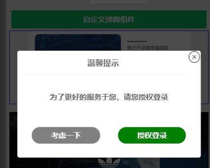
以上为效果图。废话不多说,上代码
1,在components下新建popup组件
popup.js
Component(
    options:
      multipleSlots: true // 在组件定义时的选项中启用多slot支持
    ,
    /*组件的属性列表*/
    properties:
      title:
        type: String,
        value: '标题'
      ,
      // 弹窗内容
      content:
        type: String,
        value: '内容'
      ,
      // 弹窗取消按钮文字
      btn_no:
        type: String,
        value: '取消'
      ,
      // 弹窗确认按钮文字
      btn_ok:
        type: String,
        value: '确定'
      ,
      //是否显示取消按钮
      isShowCancel:
        type:Boolean,
        value:true
      ,
      //是否显示右上角关闭按钮
      isShowClose:
        type:Boolean,
        value:true
      ,
      //应用于某些场景的button的open-type属性
      sureButtonType:
        type: String,
        value: ''
      ,
      //控制弹窗的显示
      flag:
        type:Boolean,
        value:true
      ,
    ,
    /* 组件的初始数据 */
    data:

      bgOpacity:0,
      wrapAnimate:'wrapAnimate',
      popupAnimate:'popupAnimate'
    ,
    /* 组件的方法列表 */
    methods:
      /* 内部私有方法建议以下划线开头 triggerEvent 用于触发事件 */
      _error() //触发取消回调
        this.triggerEvent("error")
      ,
      _success() //触发成功回调
        this.triggerEvent("success");


  )
popup.wxml
<view wx:if="flag" class='container' style=''>
  <view bindtap='_error' class='wrap wrapAnimate' style='background:rgba(0,0,0,bgOpacity);'></view>
  <view class='popup-container popupAnimate'>
    <view class="v_title">
      <view class="wx-popup-title">title</view>
      <image bindtap='_error' src='../../images/close.gif' mode='widthFix' class='btn-colse' wx:if="isShowClose"></image>
    </view>
    <view class="wx-popup-con">content</view>
    <view class="wx-popup-btn">
      <button class="btn-no" bindtap='_error' wx:if="isShowCancel">btn_no</button>
      <button class="btn-ok" bindtap='_success' open-type="sureButtonType">btn_ok</button>
    </view>
  </view>
</view>
popup.wxss
.container
  font-size: 15px;
  color: #666;
  font-weight: bold;
  z-index: 2;
  position: fixed;
  width: 100vw;
  height: 100vh;

.wrap
  position: fixed;
  top: 0;
  left: 0;
  bottom: 0;
  right: 0;

.popup-container
  position: fixed;
  left: 50%;
  top: 100%;
  width: 90%;
  border: 2rpx solid #ccc;
  border-radius: 10rpx;
  box-sizing: bordre-box;
  transform: translate(-50%, -50%);
  background: #fff;
  opacity: 0;

.wx-popup-title
  width: 100%;
  padding: 20rpx 0;
  text-align: center;
  font-size: 30rpx;
  border-bottom: 2rpx solid #f6f6f6;

.wx-popup-con
  margin: 60rpx 10rpx;
  text-align: center;

.wx-popup-btn
  display: flex;
  justify-content: space-around;
  margin-bottom: 20rpx;
  margin-left: 20rpx;
  margin-right: 20rpx;
  align-items: center;

.btn-no
  display: flex;
  align-items: center;
  justify-content: center;
  height: 65rpx;
  border: 2rpx solid #ccc;
  border-radius: 100rpx;
  margin: 30rpx;
  width: 40% !important;
  background: gray;
  color: #fff;

.btn-ok
  display: flex;
  align-items: center;
  justify-content: center;
  height: 65rpx;
  border: 2rpx solid #ccc;
  border-radius: 100rpx;
  margin: 30rpx;
  width: 40% !important;
  background: green;
  color: #fff;

.v_title
  display: flex;

.btn-colse
  width: 25px;
  height: 25px;
  display: flex;
  justify-content: flex-end;

.wrapAnimate
  animation: wrapAnimate 1s linear forwards

@keyframes wrapAnimate
  0%
  100%
    background: rgba(0, 0, 0, 0.7);


.wrapAnimateOut
  animation: wrapAnimateOut 1s 0.2s linear forwards

@keyframes wrapAnimateOut
  0%
    background: rgba(0, 0, 0, 0.7);

  100%
    background: rgba(0, 0, 0, 0);


.popupAnimate
  animation: popupAnimate 1.2s linear forwards

@keyframes popupAnimate
  0%
  60%
    top: 47%;
    opacity: 1;

  80%
    top: 53%;
    opacity: 1;

  100%
    top: 50%;
    opacity: 1;


.popupAnimateOut
  animation: popupAnimateOut 1.2s linear forwards

@keyframes popupAnimateOut
  0%
    top: 50%;
    opacity: 1;

  20%
    top: 47%;
    opacity: 1;

  100%
2、在需要用到的页面调用
test.js
Page(
  /**
   * 页面的初始数据
   */
  data:
    // //弹窗相关
    title:'温馨提示',
    content:'为了更好的服务于您,请您授权登录',
    btn_no:'考虑一下',
    btn_ok:'授权登录',
    isShowCancel: true,//控制取消按钮的显示
    isShowClose: true,//是否显示关闭按钮
    sureButtonType: 'getUserInfo',//确定按钮的open-type,用于某些特殊操作,如申请用户登录授权等
    isShowFlag: false,//弹窗的显示
  ,

  showDialog()
    //获得popup组件
    this.popup = this.selectComponent("#popup");
    this.setData(
      isShowFlag:true
    )
  ,
  showPopup()
    this.popup.showPopup();
  ,
  //取消事件
  _error()
    wx.showToast(
      title: '你点击了取消',
      icon:'none'
    )
    this.setData(
      isShowFlag:false
    )
  ,
  //确认事件
  _success()
    wx.showToast(
      title: '你点击了确定',
      icon:'none'
    )
    this.setData(
      isShowFlag:false
    )

)
test.wxml
<button type="primary" bindtap="showDialog"> 自定义弹窗组件</button>
<!-- 弹窗组件 -->
<popup id='popup'
      title="title"
      content="content"
      btn_no="btn_no"
      btn_ok="btn_ok"
      bind:error="_error"
      bind:success="_success"
      isShowCancel="isShowCancel"
      isShowClose = "isShowClose"
      sureButtonType = "sureButtonType"
      flag = "isShowFlag"
      >
  </popup>
test.json
  "usingComponents":
    "popup":"../../components/popup/popup"
以上即是自定义弹窗内容
以上是关于小程序自定义弹窗,子组件的按钮受父组件控制的主要内容,如果未能解决你的问题,请参考以下文章