CSS布局相关——盒模型和浮动
Posted
tags:
篇首语:本文由小常识网(cha138.com)小编为大家整理,主要介绍了CSS布局相关——盒模型和浮动相关的知识,希望对你有一定的参考价值。
参考技术A在CSS中,所有元素被“ 盒子 ”所包围,利用盒模型的基本原理来实现CSS准确布局,元素排列等处理
CSS广泛使用的两种盒子,其在页面流和元素之间的关系表现为不同的行为:
对于定义为块级盒子(block)的元素会表现出以下行为:
对于定义为内联盒子(inline)的元素会表现出以下行为:
通过对盒子设置display的属性值,来控制盒子的外部显示类型
外部显示类型与内部显示类型
外部显示类型:决定盒子是块级还是内联,即决定了盒子之间的布局方式
内部显示类型:决定了盒子内部的元素是如何布局的,默认情况是按照正常文档流布局,也可以通过设置display值为flex和grid来改变内部元素之间的布局方式
不同显示类型的例子
block:
图中段落里的 <span> word </span> 被设置为 display:block
因此其独占一行,宽度填满整个父元素
flex:
图中的列表被设置为 display:block ,每个列表是一个块级元素 —— 像段落一样 —— 会充满整个容器的宽度并且换行
inline-flex与inline
图中的列表被设置为 display:inline-flex ,使得在一些flex元素外创建一个内联框
最后设置两个段落为 display: inline , inline flex 容器和两个段落在同一行上,而不是像块级元素一样换行
CSS组成一个盒模型需要以下几个部分:
在标准模型中,如果你给盒设置 width 和 height,实际设置的是 content box。 padding 和 border 再加上设置的宽高一起决定整个盒子的大小
如果使用标准模型宽度 = 410px (350 + 25 + 25 + 5 + 5),高度 = 210px (150 + 25 + 25 + 5 + 5),padding 加 border 再加 content box
如果使用替代模型,一切都将变得简单很多,此时的 width 和 height 就是盒子可见的宽度与高度,无论怎么改变 padding 或 border 的值,都会通过压缩 conten box 的大小来保持 width 和 height 的值不变
如需使用,只需要声明以下CSS样式:
外边距是盒子周围一圈看不到的空间。它会把其他元素从盒子旁边推开。 外边距属性值可以为正也可以为负。设置负值会导致和其他内容重叠。无论使用标准模型还是替代模型,外边距总是在计算可见部分后额外添加
CSS:
html:
结果如下:因为上外边距设置为负值,所以两个边框会重叠
外边距折叠
理解外边距的一个关键是外边距折叠的概念。如果你有两个外边距相接的元素,这些外边距将合并为一个外边距,即最大的单个外边距的大小
结果如下,中间间隔的部分为50px
如下图所示,对内联盒子设置 width 和 height 都不会生效,虽然margin,padding和border会生效,但不会改变与其它内联盒子的关系,因此其内边距和边框会与段落的其它元素重叠
要避免上述情况,只需要将内联盒子的display值设置为inline-block即可
设置之后的效果为:
但因其保留有inline的特征,所以它不会跳转到新行
float可以使得当前元素脱离正常文本流,并吸附到父元素的左边(left)或者右边(right)正常布局中位于该浮动元素之下的内容,此时会围绕着浮动元素进行排列
基本的常见用途在于图片与文字环绕排版以及首字母下沉:
重点是这个,元素浮动具有一定的规则与限制
设置如下三个盒子(均以块级元素方式呈现):
将box1设置为向右浮动:
因为box1脱离正常文档流,所以box2和box3会向上填补box1的空位,box1浮动到父元素(body)的最右边
设置box1向左浮动:
同理,box1脱离正常文档流,box2与box3向上填补box1的空位,此时box1浮动到父元素(body)的最左边,所以会覆盖掉box2(浮动元素在正常流文档的上方)
设置box2向左浮动:
可以看到box3因为box2脱离正常文档流而向上填充其空位,box2因为浮动到左边覆盖了box3,然而box1仍处于正常文档流中,并且在html文件中最先声明,所以box2只能在box1的下方进行浮动(即使box2设置为向右浮动也是一样)
设置box1、box2与box3都向左浮动:
可以看到三个盒子均向左浮动,直到碰到前一个浮动框的边缘为止(对于box1来说是碰到父元素的边缘),因此呈现如此的排列状况
如果当父元素太窄,无法包含三个盒子的宽度,则无法容纳的元素向下移动,直到有足够的空间使得其能向某个方向浮动,如下图所示:
如果浮动元素的高度不同,那么当它们向下移动时可能被其它浮动元素“卡住”
相关参考:
https://zhuanlan.zhihu.com/p/21286019?refer=miaomiaoji
https://www.jianshu.com/p/fe1052f1a8b6
浮动的规则先讨论到此
高度塌陷
在父元素container内设置一个盒子box1,此时没有设置浮动,box1会撑起父元素container的高度
如果此时设置box1浮动,因为其脱离了正常文档流,无法撑起盒子的高度,所以将发生高度塌陷:
为了解决这个问题,在此提供三种方法:
1. 添加额外标签
首先在父元素内添加空白内容的额外标签clearfix
然后再CSS规则中添加以下内容:
通过清除父元素内空白元素的浮动,使得父元素边框重新包含浮动内容
2. 父级元素添加overflow属性
直接在父元素内添加overflow属性:
同样可以清除浮动,结果如下:
3. after伪元素
html文档改为:
在CSS规则里添加:
HTML|CSS之布局相关总结?
知识内容:
1.浮动相关
2.display属性
3.居中显示
4.盒模型和box-sizing
5.position属性
6.响应式设计
7.flexbox布局
8.其他
1.浮动相关
(1)float
float可以让一个元素浮动起来,可以让其向左浮动或者向右浮动
float实例:


 1 <!--__author__ = "wyb"-->
 2 <!DOCTYPE html>
 3 <html lang="en">
 4 <head>
 5     <meta charset="UTF-8">
 6     <title>文字环绕图形</title>
 7     <style>
 8         img{
 9             float: right;
10             width: 100px;
11             height: 100px;
12             margin: 5px;
13         }
14     </style>
15 </head>
16 <body>
17
18 <p style="margin: 0 auto; width: 333px;">
19     <img src="1.jpg" alt="">
20     This is some text. This is some text. This is some text.
21     This is some text. This is some text. This is some text.
22     This is some text. This is some text. This is some text.
23     This is some text. This is some text. This is some text.
24     This is some text. This is some text. This is some text.
25     This is some text. This is some text. This is some text.
26     This is some text. This is some text. This is some text.
27     This is some text. This is some text. This is some text.
28     This is some text. This is some text. This is some text.
29     This is some text. This is some text. This is some text.
30 </p>
31
32 </body>
33 </html>
(2)clear
clear用于控制浮动,一般是用来清除浮动,浮动会引发一些不好的后果,见下面的实例1,这些后果可以用实例2中的方法消除,即清除浮动
clear实例1:
 1 <!--__author__ = "wyb"-->
 2 <!DOCTYPE html>
 3 <html lang="en">
 4 <head>
 5     <meta charset="UTF-8">
 6     <title>clear</title>
 7     <style>
 8         .box {
 9             float: left;
10             width: 200px;
11             height: 100px;
12             margin: 1em;
13         }
14         .border1{
15             border: 1px solid red;
16         }
17         .border2 {
18             border: 1px solid darkgreen;
19         }
20     </style>
21 </head>
22 <body>
23
24 <div class="box border1">Box: 我浮起来了 浪啊</div>
25 <section class="border2" style="height: 50px; text-align: center">
26     Section: 在这个例子中, section 元素实际上是在 div 之后的(DOM结构上)。然而 div 元素是浮动到左边的,于是 section 中的文字
27     就围绕了 div ,并且 section 元素包围了整个元素。如果我们想让 section 显示在浮动元素之后呢?
28 </section>
29
30 </body>
31 </html>
clear实例2:
 1 <!--__author__ = "wyb"-->
 2 <!DOCTYPE html>
 3 <html lang="en">
 4 <head>
 5     <meta charset="UTF-8">
 6     <title>clear</title>
 7     <style>
 8         .box {
 9             float: left;
10             width: 200px;
11             height: 100px;
12             margin: 1em;
13         }
14         .border1{
15             border: 1px solid red;
16         }
17         .border2 {
18             border: 1px solid darkgreen;
19         }
20         .clear{
21             clear: left;
22         }
23     </style>
24 </head>
25 <body>
26
27 <div class="box border1">Box: 我浮起来了 浪啊</div>
28 <section class="border2 clear" style="height: 50px; text-align: center">
29     Section: 使用 clear 我们就可以将这个段落移动到浮动元素 div 下面;  用 left 清除元素的向左浮动;
30     还可以用 right 或 both 来清除向右浮动或同时清除向左向右浮动
31 </section>
32
33 </body>
34 </html>
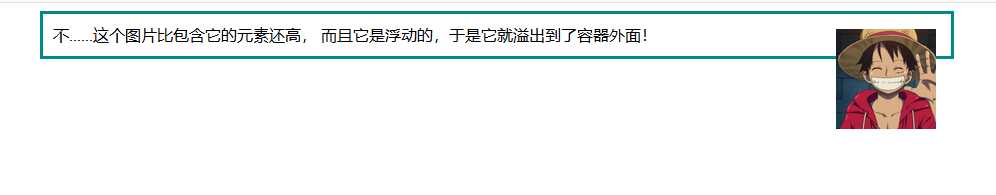
(3)清除浮动(图片溢出容器)
清除浮动实例1:
 1 <!--__author__ = "wyb"-->
 2 <!DOCTYPE html>
 3 <html lang="en">
 4 <head>
 5     <meta charset="UTF-8">
 6     <title>清除浮动</title>
 7     <style>
 8         img{
 9             float: right;
10             width: 100px;
11             height: 100px;
12             margin: 5px;
13         }
14         div{
15             margin: 0 auto;
16             width: 888px;
17             border: 3px solid darkcyan;
18             padding: 10px;
19         }
20     </style>
21 </head>
22 <body>
23
24 <div>
25     这个图片比包含它的元素还高, 而且它是浮动的,于是它就溢出到了容器外面!
26     <img src="1.jpg" alt="">
27 </div>
28
29 </body>
30 </html>
最后效果:
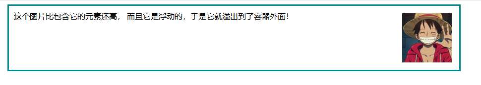
清除浮动实例2:
 1 <!--__author__ = "wyb"-->
 2 <!DOCTYPE html>
 3 <html lang="en">
 4 <head>
 5     <meta charset="UTF-8">
 6     <title>清除浮动</title>
 7     <style>
 8         img{
 9             float: right;
10             width: 100px;
11             height: 100px;
12             margin: 5px;
13         }
14         div{
15             margin: 0 auto;
16             width: 888px;
17             border: 3px solid darkcyan;
18             padding: 10px;
19         }
20         .clearfix {
21             overflow: auto;
22         }
23     </style>
24 </head>
25 <body>
26
27 <div class="clearfix">
28     这个图片比包含它的元素还高, 而且它是浮动的,于是它就溢出到了容器外面!
29     <img src="1.jpg" alt="">
30 </div>
31
32 </body>
33 </html>
最后效果:
清除浮动实例3
上述实例2的方法可以在现代浏览器上工作。如果想要支持IE6,就需要将实例2中的clearfix样式改成下面这个样子:
1 .clearfix {
2   overflow: auto;
3   zoom: 1;
4 }
(4)浮动布局
完全使用 float 来实现页面的布局是很常见的,下面是一个使用float实现布局的实例:
 1 <!--__author__ = "wyb"-->
 2 <!DOCTYPE html>
 3 <html lang="en">
 4 <head>
 5     <meta charset="UTF-8">
 6     <title>浮动布局</title>
 7     <style>
 8         nav {
 9             float: left;
10             width: 200px;
11             border: 3px solid darkblue;
12         }
13         section {
14             margin-left: 200px;
15             border: 3px solid darkred;
16         }
17         .container{
18             width: 888px;
19             margin: 0 auto;
20             border: 3px dotted #8628ff;
21         }
22         .clearfix{
23             overflow: auto;
24             zoom: 1;
25         }
26     </style>
27 </head>
28 <body>
29
30 <div class="container clearfix">
31     <nav>
32         nav:
33         <ul>
34             <li><a href="">首页</a></li>
35             <li><a href="">登录</a></li>
36             <li><a href="">注册</a></li>
37             <li><a href="">注册</a></li>
38             <li><a href="">注册</a></li>
39             <li><a href="">注册</a></li>
40             <li><a href="">注册</a></li>
41         </ul>
42     </nav>
43
44     <section>
45         section:
46         注意在容器上做了“清除浮动”!
47         当 nav 比非浮动的内容还要高时就需要清除浮动,否则可以不清除浮动
48     </section>
49
50     <section>
51         section:
52         this is some text.this is some text.this is some text.
53         this is some text.this is some text.this is some text.
54         this is some text.this is some text.this is some text.
55         this is some text.this is some text.this is some text.
56         this is some text.this is some text.this is some text.
57         this is some text.this is some text.this is some text.
58         this is some text.this is some text.this is some text.
59         this is some text.this is some text.this is some text.
60     </section>
61 </div>
62
63 </body>
64 </html>
2.display属性
(1)display
display 是CSS中最重要的用于控制布局的属性。每个元素都有一个默认的 display 值,这与元素的类型有关。对于大多数元素它们的默认值通常是 block 或 inline 。一个 block 元素通常被叫做块级元素。一个 inline 元素通常被叫做行内元素
(2)块级标签和内联标签
- 行内标签(内联标签):无法设置高度,宽度,padding,margin -> 例如span标签、a标签
- 块级标签:可以设置高度,宽度,padding ,margin -> 例如div标签、p标签
(3)display属性的值
- display: none; -- 让标签消失
- display: inline; -- 内联标签(行内标签)
- display: block; -- 块级标签
- display: inline-block; -- 既有inline的属性也有block属性
- 具有inline,默认自己有多少占多少
- 具有block,可以设置高度,宽度,padding margin
 1 <!--__author__ = "wyb"-->
 2 <!DOCTYPE html>
 3 <html lang="en">
 4 <head>
 5     <meta charset="UTF-8">
 6     <title>行内标签和块级标签通过display转换</title>
 7     <style>
 8         .inline{
 9             background: red;
10             display: inline;
11         }
12         .block{
13             background: red;
14             display: block;
15         }
16     </style>
17 </head>
18 <body>
19     <!--将块级标签变成行内标签-->
20     <div class="inline">div</div>
21     <!--将行内标签变成块级标签-->
22     <span class="block">span</span>
23 </body>
24 </html>
3.居中显示
(1)margin
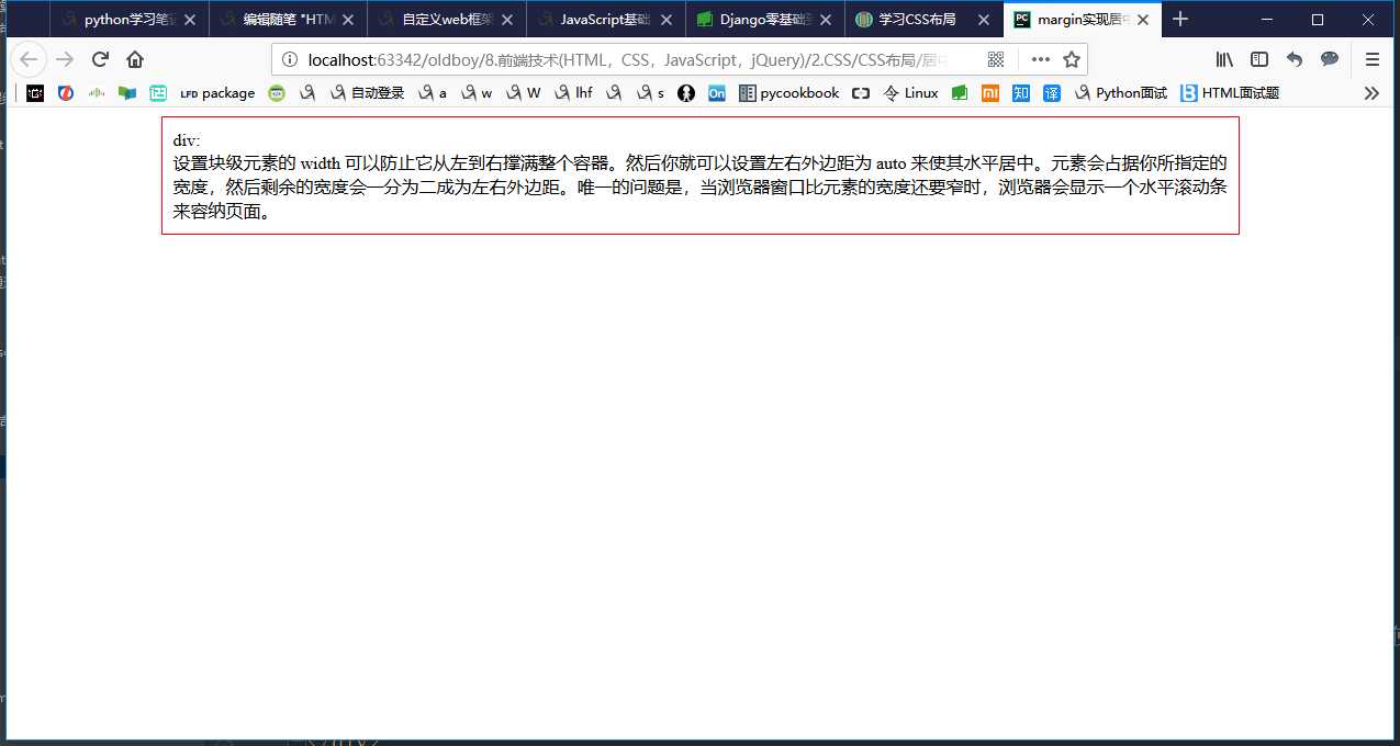
 1 <!--__author__ = "wyb"-->
 2 <!DOCTYPE html>
 3 <html lang="en">
 4 <head>
 5     <meta charset="UTF-8">
 6     <title>margin实现居中</title>
 7     <style>
 8         .container{
 9             width: 960px;
10             margin: 0 auto;
11             border: 1px solid red;
12             padding: 10px;
13         }
14     </style>
15 </head>
16 <body>
17
18 <div class="container">
19     div: <br/>
20     设置块级元素的 width 可以防止它从左到右撑满整个容器。然后你就可以设置左右外边距为 auto 来使其水平居中。元素会占据你所指定的宽度,
21     然后剩余的宽度会一分为二成为左右外边距。
22     唯一的问题是,当浏览器窗口比元素的宽度还要窄时,浏览器会显示一个水平滚动条来容纳页面。
23 </div>
24
25 </body>
26 </html>
效果:
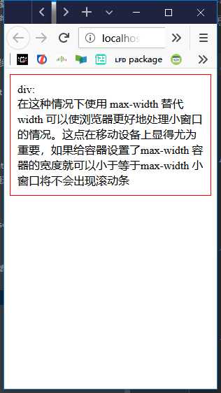
(2)max-width
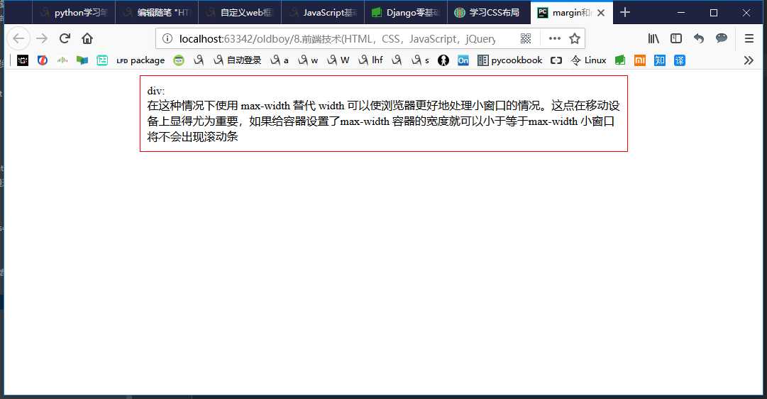
 1 <!--__author__ = "wyb"-->
 2 <!DOCTYPE html>
 3 <html lang="en">
 4 <head>
 5     <meta charset="UTF-8">
 6     <title>margin和max-width结合实现居中</title>
 7     <style>
 8         .container{
 9             max-width: 666px;
10             margin: 0 auto;
11             border: 1px solid red;
12             padding: 10px;
13         }
14     </style>
15 </head>
16 <body>
17
18 <div class="container">
19     div: <br/>
20     在这种情况下使用 max-width 替代 width 可以使浏览器更好地处理小窗口的情况。这点在移动设备上显得尤为重要,
21     如果给容器设置了max-width 容器的宽度就可以小于等于max-width 小窗口将不会出现滚动条
22 </div>
23
24 </body>
25 </html>
效果:
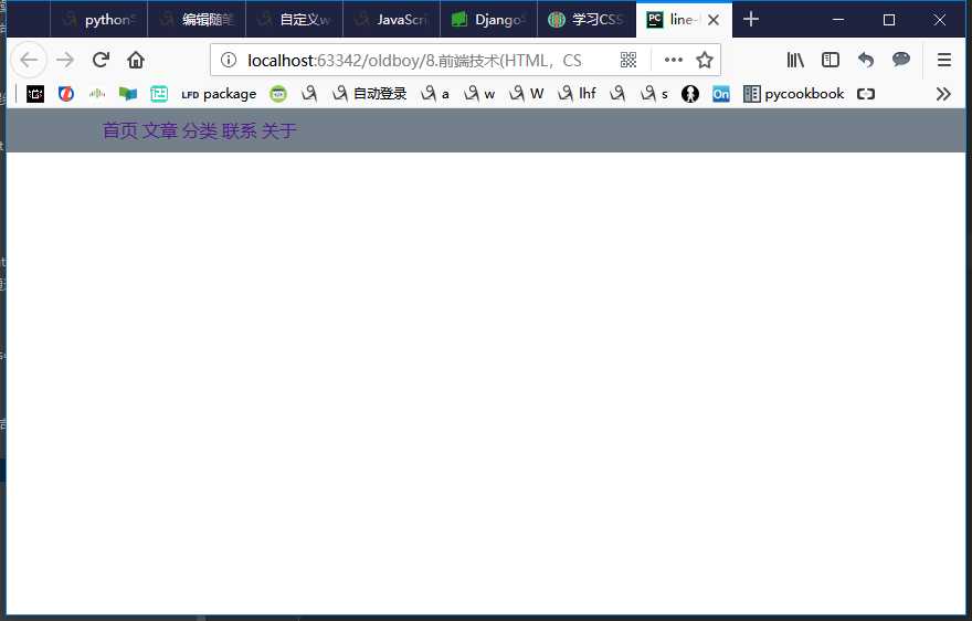
(3)line-height -> 设置垂直居中
 1 <!--__author__ = "wyb"-->
 2 <!DOCTYPE html>
 3 <html lang="en">
 4 <head>
 5     <meta charset="UTF-8">
 6     <title>line-height</title>
 7     <style>
 8         *{
 9             margin: 0;
10             padding: 0;
11         }
12         a{
13             text-decoration: none;
14         }
15         .content-box{
16             height: 40px;
17             background: #747F8C;
18         }
19         .content{
20             margin: 0 auto;
21             width: 80%;
22             /*下面实现上下居中*/
23             height: 40px;
24             line-height: 40px;
25         }
26     </style>
27 </head>
28 <body>
29 <div class="content-box">
30     <div class="content">
31         <a href="">首页</a>
32         <a href="">文章</a>
33         <a href="">分类</a>
34         <a href="">联系</a>
35         <a href="">关于</a>
36     </div>
37 </div>
38 </body>
39 </html>
效果:
(4)vertical-align -> 设置垂直居中
(5)text-align -> 设置水平居中
4.盒模型和box-sizing
(1)盒模型
- padding -> 内边距(控制内容与边框之间的距离)
- margin -> 外边距(控制元素与元素之间的距离)
- border -> 边框(围绕在内边距和内容外的边框)
- content -> 盒子中的内容,显示文本和图像
元素的大小由其中的内容和padding和border决定,margin是元素与元素之间的距离
注:两个挨着的margin浏览器最后会取其中的最大值
(2)box-sizing
人们意识到传统的盒子模型不直接,所以新增了一个叫做 box-sizing 的CSS属性。当你设置一个元素为 box-sizing: border-box; 时,此元素的内边距和边框不再会增加它的宽度
 1 <!--__author__ = "wyb"-->
 2 <!DOCTYPE html>
 3 <html lang="en">
 4 <head>
 5     <meta charset="UTF-8">
 6     <title>box-sizing</title>
 7     <style>
 8         .container{
 9             max-width: 960px;
10             margin: 0 auto;
11         }
12         .simple {
13             width: 500px;
14             margin: 20px auto;
15             padding: 20px;
16             border: solid red 3px;
17             -webkit-box-sizing: border-box;
18             -moz-box-sizing: border-box;
19             box-sizing: border-box;
20         }
21
22         .fancy {
23             width: 500px;
24             margin: 20px auto;
25             padding: 50px;
26             border: solid blue 3px;
27             -webkit-box-sizing: border-box;
28             -moz-box-sizing: border-box;
29             box-sizing: border-box;
30         }
31     </style>
32 </head>
33 <body>
34
35 <div class="container">
36     <div class="simple">
37         div.simple: <br/>
38         我们现在一样大了
39     </div>
40
41     <div class="fancy">
42         div.fancy <br/>
43         666
44     </div>
45
46 </div>
47
48 </body>
49 </html>
如果想要页面上所有的元素都有如此表现,可以写上以下CSS代码:
1 * {
2   -webkit-box-sizing: border-box;
3      -moz-box-sizing: border-box;
4           box-sizing: border-box;
5 }
这样可以确保所有的元素都会用这种更直观的方式排版。
5.position属性(用于定位)
(1)fixed -> 固定在页面某个位置
一个固定定位(position属性的值为fixed)元素会相对于视窗来定位,这意味着即便页面滚动,它还是会停留在相同的位置
 1 <!--__author__ = "wyb"-->
 2 <!DOCTYPE html>
 3 <html lang="en">
 4 <head>
 5     <meta charset="UTF-8">
 6     <title>position_fixed</title>
 7     <style>
 8         .pg-header{
 9             position: fixed;
10             top: 0;
11             left: 0;
12             right: 0;
13             width: 100%;
14             height: 48px;
15             background-color: #2459a2;
16         }
17         .pg-body{
18             background-color: #ededed;
19             height: 3000px;
20             margin-top: 58px;
21             margin-left: 30px;
22             margin-right: 30px;
23         }
24         .return_top{
25             position: fixed;
26             right: 0;
27             bottom: 50px;
28             width: 80px;
29             height: 40px;
30             line-height: 40px;
31             background-color: #747F8C;
32         }
33     </style>
34 </head>
35 <body>
36
37 <div class="pg-header">
38     头部
39 </div>
40 <div class="pg-body">
41     内容
42 </div>
43
44 <div class="return_top">返回顶部</div>
45
46 </body>
47 </html>
(2)relative/absolute -> 联合使用进行相对定位
详细解释:https://segmentfault.com/a/1190000006924181
 1 <!--__author__ = "wyb"-->
 2 <!DOCTYPE html>
 3 <html lang="en">
 4 <head>
 5     <meta charset="UTF-8">
 6     <title>relative and absolute</title>
 7     <style>
 8         .container{
 9             position: relative;
10             width: 60%;
11             height: 200px;
12             border: 1px solid red;
13             margin: 0 auto;
14         }
15         .box{
16             position: absolute;
17             width: 70px;
18             height: 70px;
19             background: black;
20         }
21         .left_bottom{
22             left: 0;
23             bottom: 0;
24         }
25         .right_bottom{
26             right: 0;
27             bottom: 0;
28         }
29         .right_top{
30             right: 0;
31             top: 0;
32         }
33     </style>
34 </head>
35 <body>
36
37 <div class="container">
38     <div class="box left_bottom"></div>
39 </div>
40
41 <div class="container">
42     <div class="box right_bottom"></div>
43 </div>
44
45 <div class="container">
46     <div class="box right_top"></div>
47 </div>
48
49 </body>
50 </html>
6.响应式设计
7.flexbox布局
8.其他
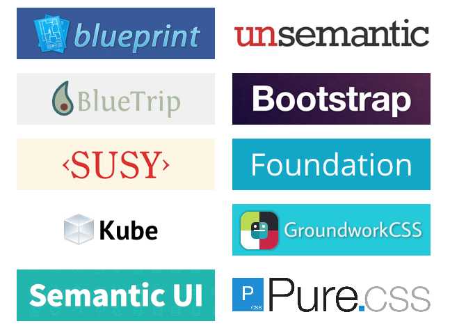
(1)CSS框架
CSS 布局很难使用,故催生了不少 CSS 框架来帮助开发者快速开发。只有在框架的功能满足你的需求时,使用框架才是个好主意。掌握CSS的工作方式是无可替代的。常用的框架如下:
(2)column属性
以上是关于CSS布局相关——盒模型和浮动的主要内容,如果未能解决你的问题,请参考以下文章