OpenHarmony - ArkUI(TS)开发之下拉选择菜单
Posted 开源基础软件社区官方
tags:
篇首语:本文由小常识网(cha138.com)小编为大家整理,主要介绍了OpenHarmony - ArkUI(TS)开发之下拉选择菜单相关的知识,希望对你有一定的参考价值。
作者:何贝
前言
鸿蒙3.0推出了一种新的开发方式ETS,本文通过采用ETS实现我们项目开发中比较常见的下拉选择菜单组件来初步了解和体验下ETS的开发规范和方法,主要用到的TS知识点有Flex布局、文本展示、样式绑定、图片引入、父子组件变量共享、参数传递、ForEach循环遍历、事件绑定。
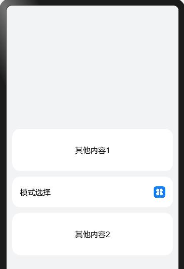
实现效果
用到的装饰器
| 装饰器 | 装饰内容 | 说明 |
|---|---|---|
| @Component | struct | 结构体在装饰后具有基于组件的能力,需要实现build方法来更新UI。 |
| @Entry | struct | 组件被装饰后作为页面的入口,页面加载时将被渲染显示。 |
| @Builder | 方法 | 在@Builder装饰的方法用通过声明式UI描述,可以在一个自定义组件内快速生成多个布局内容。 |
| @Provide | 基本数据类型,类,数组 | @Provide作为数据的提供方,可以更新其子孙节点的数据,并触发页面渲染。 |
| @Consume | 基本数据类型,类,数组 | @Consume装饰的变量在感知到@Provide装饰的变量更新后,会触发当前自定义组件的重新渲染。 |
创建ETS工程
- 在DevEco Studio中新建一个ETS工程,语言选择ets。


- 在entry -> src -> main -> ets -> default -> pages目录下新建自己的.ets文件,即可以开始编写ets代码。

功能分解
- 创建一个Flex布局的卡片
Flex(justifyContent: FlexAlign.SpaceBetween, alignItems: ItemAlign.Center)

.height(64)
.width(100%)
.backgroundColor(#fff)
.borderRadius(16)
.padding(
  left: 16,
  right: 16
)- 在卡片中填充内容
Column()
    Text(模式选择)
        .fontSize(16)
    Text(清洁模式)
        .fontSize(12)
        .alignSelf(ItemAlign.Start)
        .fontColor(rgba(0, 0, 0, 0.6))
        .margin(
        top: 2
    )
- 图片资源的引入,icon.png存在resources->base->media目录下
Column()
    Flex()
        Image($r(app.media.icon))
        .objectFit(ImageFit.Contain)

    .height(24)
    .width(24)
- 绑定点击事件
.onClick(() =>
    this.showSelector = !this.showSelector;
    console.log(showSelector===+this.showSelector)
)- 循环输出标签
ForEach(this.modesData, item =>
    Flex()
        ModeItem( mode: item )

    // 为每一项绑定点击事件
    .onClick(() =>
        if (this.modeId !== item.id)
            this.modeId = item.id
            console.info(this.modeId===+this.modeId)

        this.showSelector = false
    )

, item => item.id.toString())- 父子组件共享变量
父组件中使用@Provide修饰变量,子组件使用@Consume修饰同一个变量名,即可以实现共享。
// 父组件
@Entry
@Component
struct SelectorIndex
  @Provide modeId: number = 0 // 定义当前选中项id
  build()
      Flex()
          SelectorList() // 显示子组件


// 子组件
@Component
struct SelectorList
  @Consume modeId: number // 共享父组件属性
  build()
      Flex()

      .onClick(() =>
          console.log(this.modeId) // 打印当前选中项id
      )
完整代码
// 数据类型定义
export class ModeType
  id: number
  name: string
  constructor(id: number, name: string)
    this.id = id;
    this.name = name;


// 单个选择项的渲染
@Component
struct ModeItem
  private mode: ModeType
  @Consume modeId : number

  @Builder renderModeItem(fontColor: string, bgColor: string, value: string)
    Flex(direction: FlexDirection.Column)
      Flex()
        Text(value)
          .fontSize(16)
          .fontColor(fontColor)

      .height(100%)
      .width(100%)
      .backgroundColor(bgColor)
      .borderRadius(12)
      .padding(
        left: 14,
        top: 14,
        bottom: 14
      )
      // 最后一项不显示分隔线
      if (this.mode.id != 5)
        Flex()
          Flex()
          .height(1).width(100%).backgroundColor(#F3F3F3)

        .padding(
          left: 12,
          right: 12
        )


  build()
    Flex()
      // 选中项和其他选项的样式有不同
      if (this.modeId == this.mode.id)
        this.renderModeItem(#0A59F7, #E6EEFF, this.mode.name)
       else
        this.renderModeItem(rgba(0,0,0,0.9), , this.mode.name)

    .height(48)


// 下拉菜单组件
@Component
struct SelectorList
  @Consume modesData: any // 共享父组件属性
  @Consume modeId: number // 共享父组件属性
  @Consume showSelector: boolean // 共享父组件属性
  build()
    Flex(direction: FlexDirection.Column, justifyContent: FlexAlign.Start)
      // 循环产生下拉菜单
      ForEach(this.modesData, item =>
        Flex()
            ModeItem( mode: item )

        // 为每一项绑定点击事件
        .onClick(() =>
          if (this.modeId !== item.id)
            this.modeId = item.id
            console.info(this.modeId===+this.modeId)

          this.showSelector = false
        )

      , item => item.id.toString())

    .height(248)
    .width(100%)
    .backgroundColor(#fff)
    .borderRadius(16)
    .shadow(
      radius: 50,
      color: rgba(0,0,30,0.1500)
    )
    .padding(
      left: 4,
      right: 4,
      top: 4,
      bottom: 4
    )
    .position(
      x: 0,
      y: -260
    )
    .zIndex(1)


// 入口组件
@Entry
@Component
struct SelectorIndex
  @Provide showSelector: boolean = false // 是否展开下拉菜单
  @Provide modesData: any = [id: 1,name: 节能模式,id: 2,name: 强劲模式,id: 3,name: 深层模式,id: 4,name: 清洁模式,id: 5,name: 敏感模式]
  @Provide modeId: number = 0 // 当前选中项id
  build()
    Flex(direction: FlexDirection.Column, justifyContent: FlexAlign.Center, alignItems: ItemAlign.Center)
      Flex(justifyContent: FlexAlign.Center, alignItems: ItemAlign.Center)
        Text(其他内容1).fontSize(16)
      .height(88).width(100%).backgroundColor(#fff).borderRadius(16)

      Flex(direction: FlexDirection.Column, alignItems: ItemAlign.Center)
        if (this.showSelector)
          SelectorList()

        Flex(justifyContent: FlexAlign.SpaceBetween, alignItems: ItemAlign.Center)
          Column()
            Text(模式选择)
              .fontSize(16)
            if (this.getSelectedText())
              Text(this.getSelectedText())
                .fontSize(12)
                .alignSelf(ItemAlign.Start)
                .fontColor(rgba(0, 0, 0, 0.6))
                .margin(
                  top: 2
                )


          Column()
            Flex()
              Image($r(app.media.icon))
                .objectFit(ImageFit.Contain)

            .height(24)
            .width(24)


        .height(64)
        .width(100%)
        .backgroundColor(#fff)
        .borderRadius(16)
        .padding(
          left: 16,
          right: 16
        )
        .onClick(() =>
          this.showSelector = !this.showSelector;
          console.log(showSelector===+this.showSelector)
        )


      .height(64)
      .margin(
        top: 12,
        bottom: 12
      )

      Flex(justifyContent: FlexAlign.Center, alignItems: ItemAlign.Center)
        Text(其他内容2).fontSize(16)
      .height(88).width(100%).backgroundColor(#fff).borderRadius(16)

    .height(100%)
    .width(100%)
    .backgroundColor(#f1f3f5)
    .padding(
      left: 12,
      right: 12,
      top: 16,
      bottom: 16
    )
    .onClick(() =>
      this.showSelector = false
    )

  // 获取选中项的内容
  getSelectedText()
    const selectedItem = this.modesData.find(item =>
      return item.id == this.modeId
    )
    if (selectedItem)
      return selectedItem.name

    return
总结
从上面的示例我们可以感受到基于TS扩展的声明式开发范式的方舟开发框架,采用链式调用的编程方式,可以更直观地描述UI界面,不必关心框架如何实现UI绘制和渲染,另外也提供了丰富的系统能力接口,真正实现极简高效开发。大家感兴趣的话可以通过TS开发官方文档进行详细的了解和学习。华为鸿蒙官方也发布了3 个超级实用的基于 TS 扩展的声明式开发范式示例,分别是eTSBuildCommonView 创建简单视图示例、eTSDefiningPageLayoutAndConnection 页面布局和连接示例、eTSDrawingAndAnimation 绘图和动画示例,可以下载代码体验和学习。
更多原创内容请关注:中软国际 HarmonyOS 技术团队
入门到精通、技巧到案例,系统化分享HarmonyOS开发技术,欢迎投稿和订阅,让我们一起携手前行共建鸿蒙生态。
以上是关于OpenHarmony - ArkUI(TS)开发之下拉选择菜单的主要内容,如果未能解决你的问题,请参考以下文章
OpenHarmony - ArkUI(TS)声明式开发之底部导航栏
#打卡不停更# OpenHarmony-ArkUI(TS)声明式开发之列表拖动排列
#夏日挑战赛# OpenHarmony - ArkUI(TS)开发翻页时钟
OpenHarmony - ArkUI(TS)开发之下拉选择菜单