Vue学习总结21.Vue-UI框架之Mint UI的使用
Posted
tags:
篇首语:本文由小常识网(cha138.com)小编为大家整理,主要介绍了Vue学习总结21.Vue-UI框架之Mint UI的使用相关的知识,希望对你有一定的参考价值。
接上篇《20.Vue路由中的嵌套》
上一篇我们讲解了Vue路由中的嵌套,本篇我们来介绍Vue的UI框架————Mint UI的使用。
本系列博文使用的Vue版本:2.6.11
一、基于Vue的UI框架
之前我们讲解了Vue的主要基本框架和使用方法,但是我们做出的页面不够美观,组件调用不够便捷。像在之前不使用前端框架时,往往会使用像bootstrap、easyUI等UI框架,使用其包装好的前端组件,来美化界面。Vue也可以使用一些包装好的UI框架,来丰富其显示效果和实现一些组件功能,国内常用的有“Element UI”和“Mint UI”,它们都是饿了么公司基于Vue开发的第三方UI组件库,其中“Element UI”是基于PC端的UI框架,“Mint UI”是基于移动端的UI框架。
“Element UI”的官方主页为:https://element.eleme.cn/#/zh-CN

“Mint UI”的官方主页为:https://github.com/ElemeFE/mint-ui(http://mint-ui.github.io/#!/en挂了)
Mint UI 中文文档:https://www.w3cschool.cn/mintui/

在下面的README中可以看到英文的安装操作介绍。
本篇我们主要来讲解“Mint UI”。
二、引入Mint UI
引入Mint UI十分简单,只需要两步:
1、安装Mint UI组件
npm i mint-ui -S
其中的“-S”表示“--save”

2、引入Mint UI组件
我们在main.js中引入该组件和其css样式文件:
import Mint from mint-ui;
import mint-ui/lib/style.css;

Vue.use(Mint);
这里要注意,“Vue.use(Mint)”要在“Vue.use(VueResource)”之后(最好放在最后use),因为需要先新建VUE实例再注册组件,不能注册反了!
完成以上两步,就可以使用Mint UI组件了。
三、Mint UI常用组件介绍
为了展示Mint UI效果,我们在原来的工程上新建了一个MintUI.vue文件,专门用来展示Mint UI效果:

并配置了路由和前台导航:
router.js:
//上列代码省略...
import MintUI from @/components/UI/MintUI
Vue.use(Router)

const routes = [
  //上列代码省略...
  path:/mint_ui,component: MintUI
]

//下列代码省略...
App.vue:
<template>
  <div id="app">
    <h2>msg</h2>
    <div class="header-css">
      <router-link to="/helloWorld">首页</router-link>
      <router-link to="/news">新闻</router-link>
      <router-link to="/user">用户</router-link>
      <router-link to="/mint_ui">Mint-UI</router-link>
    </div>
      <router-view></router-view>
  </div>
</template>

下面开始讲解和展示Mint UI常用组件
1、CSS组件
(1)Header - 顶部导航栏
使用Header可以实现手机端常见的顶部导航栏,效果:

样例代码:
<template>
  <div id="MintUI">
    <h1>msg</h1>
        <h2>固定在页面顶部</h2>
        <mt-header fixed title="固定在顶部"></mt-header>
        <h2>设置 left 或 right slot</h2>
        <mt-header title="标题过长会隐藏后面的内容啊哈哈哈哈">
            <router-link to="/" slot="left">
                <mt-button icon="back">返回</mt-button>
            </router-link>
            <mt-button icon="more" slot="right"></mt-button>
        </mt-header>
        <h2>设置多个按钮</h2>
        <mt-header title="多个按钮">
            <router-link to="/" slot="left">
                <mt-button icon="back">返回</mt-button>
                <mt-button @click="handleClose">关闭</mt-button>
            </router-link>
            <mt-button icon="more" slot="right"></mt-button>
        </mt-header>
  </div>
</template>

<script>
export default
  name: MintUI,
  data ()
      return
        msg: Mint-UI

  ,
  methods:
      handleClose()
          alert("boom!!");


</script>

<style scoped>
</style>
效果

API:

(2)Button按钮
Mint UI的按钮使用“<mt-button></mt-button>”来展示,以下是在原来工程中输入一些样例来展示按钮的几种效果:
<template>
  <div id="MintUI">
    <h1>msg</h1>
        <h2>改变颜色</h2>
        <mt-button type="default">default</mt-button>
        <mt-button type="primary">primary</mt-button>
        <mt-button type="danger">danger</mt-button>
        <h2>改变大小</h2>
        <mt-button size="small">small</mt-button>
        <mt-button size="large">large</mt-button>
        <mt-button size="normal">normal</mt-button>
        <h2>禁用按钮</h2>
        <mt-button disabled>disabled</mt-button>
        <h2>幽灵按钮</h2>
        <mt-button plain>plain</mt-button>
        <h2>带图标</h2>
        <mt-button icon="back">back</mt-button>
        <mt-button icon="more">更多</mt-button>
        <h2>自定义图标</h2>
        <mt-button>
        <img src="../../assets/logo.png"   slot="icon">
        <h2>带自定义图标</h2>
        </mt-button>
        <h2>绑定 click 事件</h2>
        <mt-button @click.native="handleClick">点击触发 handleClick</mt-button>
  </div>
</template>

<script>
export default
  name: MintUI,
  data ()
      return
        msg: Mint-UI

  ,
  methods:
      handleClick()
          alert("boom!!");


</script>

<style scoped>
</style>
效果:

下表是Button按钮组件的API参数和可选值:

除了上面介绍的几种,Mint UI还有Tabbar(底部选项卡)、Navbar(顶部选项卡)、Cell(单元格)、Cell Swipe(可滑动的单元格)、Spinner(加载动画)、tab-container(面板)、Search(搜索框)等CSS组件,可以至Mint UI 中文文档中(https://www.w3cschool.cn/mintui/)继续学习。
2、JS组件
(1)Action sheet操作表
Action sheet操作表,会显示一个从屏幕下方移入的操作表。
样例代码:
<template>
  <div id="MintUI">
    <h1>msg</h1>
        <h2>固定在页面顶部</h2>
        <mt-header fixed title="固定在顶部"></mt-header>
        <h2>设置 left 或 right slot</h2>
        <mt-header title="标题过长会隐藏后面的内容啊哈哈哈哈">
            <router-link to="/" slot="left">
                <mt-button icon="back">返回</mt-button>
            </router-link>
            <mt-button icon="more" slot="right"></mt-button>
        </mt-header>
        <h2>设置多个按钮</h2>
        <mt-header title="多个按钮">
            <router-link to="/" slot="left">
                <mt-button icon="back">返回</mt-button>
                <mt-button @click="handleClose">关闭</mt-button>
            </router-link>
            <mt-button icon="more" slot="right"></mt-button>
        </mt-header>
  </div>
</template>

<script>
export default
  name: MintUI,
  data ()
      return
        msg: Mint-UI

  ,
  methods:
      handleClose()
          alert("boom!!");


</script>

<style scoped>
</style>
其中的actions 属性绑定一个由对象组成的数组,每个对象有 name 和 method 两个键,name 为菜单项的文本,method 为点击该菜单项的回调函数。将 v-model 绑定到一个本地变量,通过操作这个变量即可控制 actionsheet 的显示与隐藏。
效果

API:

(2)Toast - 简短的消息提示框
简短的消息提示框,支持自定义位置、持续时间和样式。
例子:
<template>
  <div id="MintUI">
    <h1>msg</h1>
    <h2>例子</h2>
    <mt-button type="default" @click.native="doToast1">点击弹出Toast</mt-button><br/>
    <mt-button type="default" @click.native="doToast2">点击弹出带有图标的Toast</mt-button><br/>
    <mt-button type="default" @click.native="doToast3">自定义Toast位置</mt-button><br/>
  </div>
</template>

<script>
export default
  name: MintUI,
  data ()
      return
        msg: Mint-UI

  ,
  methods:
      doToast1()
          this.$toast("操作成功!!");
      ,
      doToast2()
          this.$toast(
            message: 操作成功,
            iconClass: icon icon-success
          );
      ,
      doToast3()
          this.$toast(
            message: 提示,
            position: bottom,
            duration: 5000
          );


</script>

<style scoped>
</style>
效果:

API:

除了上面介绍的几种,Mint UI还有Indicator(加载提示框)、Loadmore(下拉/上拉刷新)、Infinite scroll (无限滚动指令)、Message box(弹出式提示框)、Popup(弹出框)、Swipe(轮播图)、Lazy load(图片懒加载指令)、Range(滑块)、Progress(进度条)、Picker(选择器)、Datetime picker(日期时间选择器)、Index List(索引列表)、Palette Button(调色板按钮)等JS组件,可以至Mint UI 中文文档中(https://www.w3cschool.cn/mintui/)继续学习。
3、Form组件
1、Switch - 开关
例子:
<template>
  <div id="MintUI">
    <h1>msg</h1>
    <h2>例子</h2>
    <mt-switch v-model="value1"></mt-switch>
    <p>带显示内容</p>
    <mt-switch v-model="value2">开关</mt-switch>
  </div>
</template>

<script>
export default
  name: MintUI,
  data ()
      return
        msg: Mint-UI,
        value1:false,
        value2:true


</script>

<style scoped>
</style>
效果:

API:

剩余还有很多组件,想详细学习,建议大家直接参考Mint UI 中文文档(https://www.w3cschool.cn/mintui/)即可,这里不再详细赘述。
参考:
《IT营:itying.com-2018年Vue2.x 5小时入门视频教程》
基于VUE.JS的移动端框架Mint UI
Mint UI
GitHub:github.com/ElemeFE/mint
项目主页:mint-ui.github.io/#
由饿了么前端团队推出的 Mint UI 是一个基于 Vue.js 的移动端组件库。自 6 月初开源以来,根据社区和团队内部的反馈,修复了一些 bug 并新增了部分组件,于本周发布了 0.2.0 版本。本文介绍如何从零开始构建一个使用 Mint UI 的 Vue 项目。
脚手架
随着 Vue.js 的迅速发展,目前搭建一个 Vue 项目的脚手架已经有不少选择了。比如可以使用官方提供的 vue-cli。本文使用饿了么自己的构建工具 cooking 来完成这个任务。
首先,全局安装 cooking:
npm i cooking -g
新建项目文件夹:
mkdir mint-ui-example
进入项目文件夹,使用 cooking 进行构建:
cooking init vue
最后的参数 vue 表示构建的是基于 Vue.js 的脚手架。
在构建过程中,cooking 需要如下一些参数:
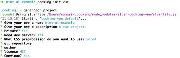
其中“使用何种 CSS 预处理”这里选择的是 Salad,它是一套基于 PostCSS 的解决方案,有兴趣的同学可以了解一下。当然,你也可以选择其他的预处理器。
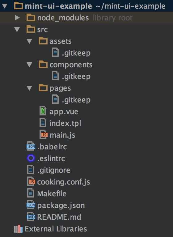
完成构建后的项目结构为:
接下来安装 Mint UI:
npm i mint-ui --save
引入 Mint UI
好了,之后的工作可以分为两种情况:
1. 引入全部组件
如果你的项目会用到 Mint UI 里较多的组件,最简单的方法就是把它们全部引入。此时需要在入口文件 main.js 中:
import MintUI from ‘mint-ui‘;
import ‘mint-ui/lib/style.css‘;

Vue.use(MintUI);
2. 按需引入
如果你只需要使用某个组件,可以仅引入这个组件,Mint UI 能够保证在代码打包时,与这个组件无关的文件不会出现在最终代码里。比如需要引入 Button 组件,则在 main.js 中:
import Button from ‘mint-ui/lib/button‘;
import ‘mint-ui/lib/button/style.css‘;

Vue.component(Button.name, Button);
可以看出,上面两种引入方法都要单独引入相应的 CSS 文件。这很不方便,尤其当你使用按需引入的方法引入多个组件时。为了避免这个问题,可以使用 babel-plugin-component 插件。首先当然是安装它:
npm i babel-plugin-component -D
然后在 .babelrc 中配置它:
{
  "plugins": ["other-plugin", ["component", [
    { "libraryName": "mint-ui", "style": true }
  ]]]
}
这样上述两种引入方法就可以简化为:
import MintUI from ‘mint-ui‘;

Vue.use(MintUI);
和
import Button from ‘mint-ui/lib/button‘;

Vue.component(Button.name, Button);
插件会自动引入相应的 CSS 文件。
使用
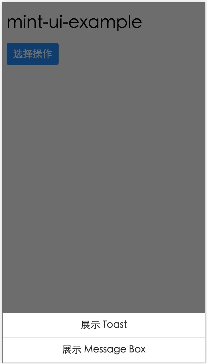
每个组件的使用方法请阅读文档,这里只举一个微小的例子。在 app.vue 中:
<template>
  <h1>mint-ui-example</h1>
  <mt-button
    type="primary"
    @click="sheetVisible = true">
    选择操作
  </mt-button>
  <mt-actionsheet
    cancel-text=""
    :actions="actions"
    :visible.sync="sheetVisible">
  </mt-actionsheet>
</template>

<script>
  import { Toast, MessageBox } from ‘mint-ui‘;
  export default {
    name: ‘app‘,

    data() {
      return {
        sheetVisible: false,
        actions: [{
          name: ‘展示 Toast‘,
          method: this.showToast
        }, {
          name: ‘展示 Message Box‘,
          method: this.showMsgbox
        }]
      };
    },

    methods: {
      showToast() {
        Toast(‘这是一个 Toast‘);
      },

      showMsgbox() {
        MessageBox(‘提示‘, ‘这是一个 Message Box‘);
      }
    }
  };
</script>
则会得到如下页面:
预告
以上就是 Mint UI 的使用方法介绍。如果在使用的过程中遇到任何问题,或者是想给我们一些建议,欢迎大家去 GitHub 仓库提 issue。
可能有些同学知道,除了这个移动端组件库以外,饿了么还有一套桌面端组件库 vue-desktop。目前我们正在对它进行重构,这次有了 UED 的介入,整体视觉有了很大的提升。完成后也会开源,而且会有两个版本,分别支持 vue 1.0.x 和 vue 2.0。当然,Mint UI 也会考虑支持 vue 2.0。
以上是关于Vue学习总结21.Vue-UI框架之Mint UI的使用的主要内容,如果未能解决你的问题,请参考以下文章