echarts图表变形解决方案
Posted zhzhair-codestyle
tags:
篇首语:本文由小常识网(cha138.com)小编为大家整理,主要介绍了echarts图表变形解决方案相关的知识,希望对你有一定的参考价值。
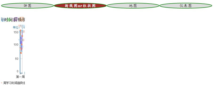
在同一页面的多个echarts图在查询或切换图片时可能会变形,如图
解决方案是添加以下几行代码
/*在查询或切换统计图时图片有可能会变形,于是每次调getEchartsData()都给每个chart的宽度定义成初始值*/
    $("#myChart2").css( \'width\', $("#myChart2").width());
    $("#myChart3").css( \'width\', $("#myChart3").width());
    $("#myChart4").css( \'width\', $("#myChart4").width());
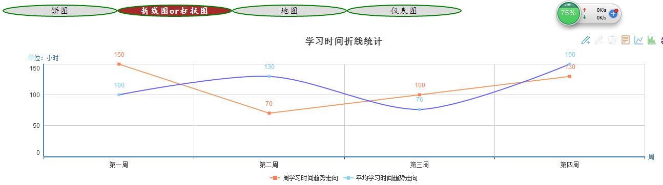
解决后的图片
代码
<head>
<title>学习时间记录统计</title>
<meta http-equiv="Content-Type" content="text/html; charset=utf-8" />
<script    src="echarts/echarts.js" type="text/javascript"></script>
<script    src="jquery/jquery-2.1.3.min.js" type="text/javascript"></script>
<style type="text/css">
h2 {
    width: 100%;
    height: 18px;
}

h2 span {
    width: 220px;
    height: 20px;
    line-height: 20px;
    text-align: center;
    float: left;
    font-size: 0.7em;
    font-family:楷体;
    font-weight: normal;
    cursor: pointer;
    background-color: #dddddd;
    border:2px solid green;
    border-top-left-radius:50%;
    border-top-right-radius:50%;
    border-bottom-left-radius:50%;
    border-bottom-right-radius:50%;
}

#tab .tab {
    color: white;
    background-color: brown;
    font-weight: bold;
    cursor: auto;
}
</style>
</head>
<body>
     <div id="this_page">
         <h2 id="tab">
            <span id="s1" class="tab">饼图</span>
            <span id="s2">折线图or柱状图</span>
            <span id="s3">地图</span>
            <span id="s4">仪表图</span>
        </h2><br>
        <div id="ct1">
             <div id="myChart1" style="height:300px;width:100%;"></div><br><br>
        </div>
        <div id="ct2">
            <div id="myChart2" style="height:300px;width:100%;"></div><br><br>
        </div>
        <div id="ct3">
            <div id="myChart3" style="height:500px;width:100%;"></div><br><br>
        </div>
        <div id="ct4">
            <div id="myChart4" style="height:300px;width:100%;"></div>
        </div>
     </div>
</body>
<script type="text/javascript"> window.onload=function(){ getEchartsData(); changetab(); $("#ct1").show(); $("#ct2").hide(); $("#ct3").hide(); $("#ct4").hide(); } function changetab() { //选中要显示的页面数据 var tabs = document.getElementById("tab").getElementsByTagName("span"); for (var i = 0; i < tabs.length; i++) { tabs[i].onclick = tab; } } function tab() { if("s1" == this.id) { $("#ct1").show(); $("#ct2").hide(); $("#ct3").hide(); $("#ct4").hide(); }else if("s2" == this.id) { $("#ct2").show(); $("#ct1").hide(); $("#ct3").hide(); $("#ct4").hide(); }else if("s3" == this.id){ $("#ct3").show(); $("#ct1").hide(); $("#ct2").hide(); $("#ct4").hide(); }else if("s4" == this.id){ $("#ct4").show(); $("#ct1").hide(); $("#ct2").hide(); $("#ct3").hide(); } var $tabs = $("#tab span"); for (var i = 0; i < $tabs.length; i++) { $($tabs.get(i)).removeClass("tab"); if ($tabs.get(i) == this) { $(this).addClass("tab"); } } } function getEchartsData(){ /*在查询或切换统计图时图片有可能会变形,于是每次调getEchartsData()都给每个chart的宽度定义成初始值*/ $("#myChart2").css( \'width\', $("#myChart2").width()); $("#myChart3").css( \'width\', $("#myChart3").width()); $("#myChart4").css( \'width\', $("#myChart4").width()); //配置echarts的路径 require.config({ paths: { echarts: \'echarts\' } }); //初始化echarts插件 require( [ \'echarts\', \'echarts/chart/pie\',//饼图 \'echarts/chart/line\',//折线图 \'echarts/chart/bar\',//柱状图 \'echarts/chart/map\',//地图 \'echarts/chart/gauge\'//仪表图 ], drawEcharts//调定义的函数获取参数 ); //学习时间样例数据,也可以是json数据 var arr1 = new Array(100,130,76,150); //平均学习时间样例数据,也可以是json数据 var arr2 = new Array(150,70,100,130); //省份样例数据,也可以是json数据 var provic = new Array(\'北京\',\'上海\',\'天津\',\'重庆\',"河北","山西","内蒙古","辽宁","吉林","黑龙江","江苏","浙江","安徽","福建","江西","山东","河南","湖北","湖南","广东","广西","海南","四川","贵州","云南","西藏","陕西","甘肃","青海","宁夏","新疆","香港","澳门","台湾"); //销售额样例数据,也可以是json数据 var toCash = new Array(500,400,30,200,200,40,10,160,50,280,300,180,100,20,270,100,330,350,10,160,50,280,300,180,100,20,3,180,169,150,180,55,66,38); function drawEcharts(ec){ drawPie(ec);//饼图 drawLineOrBar(ec);//折线图或柱状图,可以相互转换 drawMap(ec);//地图 drawGauge(ec);//仪表图 } function drawPie(ec){ //初始化chart myChart1 = ec.init(document.getElementById(\'myChart1\')); //option1为类似于json的一个对象,data可以写一个while循环赋值(见地图的数据) var option1 = { title : { text: \'上个月每周的学习时间分布\', //subtext: \'饼图(Pie Chart)\', x:\'center\' }, tooltip : { trigger: \'item\', //trigger: \'axis\', formatter: "{a} <br/>{b} : {c} ({d}%)" }, legend: { orient : \'vertical\', x : \'left\', y : \'center\', data:[\'第一周\'+arr1[0]+\'学时\', \'第二周\'+arr1[1]+\'学时\', \'第三周\'+arr1[2]+\'学时\', \'第四周\'+arr1[3]+\'学时\' ] }, toolbox: { show : true, feature : { //mark : {show: true}, dataView : {show: true, readOnly: false}, restore : {show: true}, saveAsImage : {show: true} } }, calculable : true, series : [ { //name:\'饼图实例-------------------------------\',-------------\', type:\'pie\', radius : \'75%\', center: [\'50%\', \'60%\'], data:[ {value:arr1[0], name:\'第一周\'+arr1[0]+\'学时\'}, {value:arr1[1], name:\'第二周\'+arr1[1]+\'学时\'}, {value:arr1[2], name:\'第三周\'+arr1[2]+\'学时\'}, {value:arr1[3], name:\'第四周\'+arr1[3]+\'学时\'} ] } ] }; // 为echarts对象加载数据 myChart1.setOption(option1); } function drawLineOrBar(ec){ var myChart2 = ec.init(document.getElementById("myChart2")); var option2 = { //图表标题 title: { text: \'学习时间折线统计\', //正标题 //link: "https:www.baidu.com", /* 正标题链接 点击可在新窗口中打开 */ x: "center" //标题水平方向位置 /* subtext: "From:http://www.xxx.com", */ //副标题 /* sublink: "http://www.xxx.com", //副标题链接 */ //正标题样式 //textStyle: { // fontSize:24 //}, //副标题样式 /* subtextStyle: { fontSize:12, color:"red" } */ }, //数据提示框配置 tooltip: { trigger: \'axis\' //触发类型,默认数据触发,见下图,可选为:\'item\' | \'axis\' 其实就是是否共享提示框 }, //图例配置 legend: { data: [\'周学习时间趋势走向\',\'平均学习时间趋势走向\'], //这里需要与series内的每一组数据的name值保持一致 y:"bottom" }, //工具箱配置 toolbox: { show : true, feature : { mark : {show: true}, // 辅助线标志,上图icon左数1/2/3,分别是启用,删除上一条,删除全部 dataView : {show: true, readOnly: false},// 数据视图,上图icon左数8,打开数据视图 magicType : {show: true, type: [\'line\', \'bar\']},// 图表类型切换,当前仅支持直角系下的折线图、柱状图转换,上图icon左数6/7,分别是切换折线图,切换柱形图 restore : {show: true}, // 还原,复位原始图表,上图icon左数9,还原 saveAsImage : {show: true} // 保存为图片,上图icon左数10,保存 } }, calculable: true, //x轴配置 xAxis: [ { type: \'category\', //boundaryGap: false, data: [\'第一周\', \'第二周\', \'第三周\', \'第四周\'], name: "周" } ], //Y轴配置 yAxis: [ { type: \'value\', splitArea: {show: false}, name:"单位:小时" } ], //图表Series数据序列配置 series: [ { name: \'平均学习时间趋势走向\', type: \'line\', smooth:true, itemStyle: {normal:{ label : {show:true,formatter:\'{c}\'}, lineStyle : {color:\'#6666FF\'} } }, data:arr1 }, { name: \'周学习时间趋势走向\', type: \'line\', itemStyle: {normal:{ label : {show:true,formatter:\'{c}\'}, lineStyle : {color:\'#F09D65\'} } }, data:arr2 } ] } myChart2.setOption(option2); } function drawMap(ec) { var myChart3 = ec.init(document.getElementById("myChart3")); var mapParams = { title : { text : \'销售额\', subtext : \'单位(元)\', left : \'center\' }, tooltip : { trigger : \'item\' }, legend : { orient : \'vertical\', left : \'left\', data : [ \'销售额\' ] }, toolbox : { show : true, orient : \'vertical\', left : \'right\', top : \'center\', feature : { dataView : { readOnly : true }, restore : {}, saveAsImage : {} } }, /** * @Parms:visualMap是echarts3中展示的格式 * @Parms:dataRange是echarts2中展示的格式 */ visualMap : { min : 0, max : 500, text : [ \'High\', \'Low\' ], realtime : false, calculable : true, inRange : { color : [ \'brown\', \'yellow\', \'#71C671\' ] } }, dataRange : { min : 0, max : 200, x : \'left\', selectedMode : false, y : \'bottom\', text : [ \'High\', \'Low\' ], // 文本,默认为数值文本 calculable : true, color : [ \'brown\', \'yellow\', \'#71C671\'] }, series : [ { name : \'销售额\', type : \'map\', mapType : \'china\', roam : false, itemStyle : { normal : { label : { show : true } }, emphasis : { label : { show : true } } }, data : (function() { var res = []; var len = provic.length; while (len--) { res.push({ name : provic[len], value : toCash[len] }); } return res; })(), itemStyle : { normal : { color : \'#BF3EFF\', borderWidth : 0.5, borderColor : \'black\', label : { show : true } } } }] }; myChart3.setOption(mapParams); } function drawGauge(ec) { var myChart4 = ec.init(document.getElementById(\'myChart4\')); var option4 = { tooltip : { formatter: "{a} : {c}%" }, toolbox: { show : true, feature : { saveAsImage : {show: true} } }, series : [ { name:\'销售额\', type:\'gauge\', center : [\'15%\', \'50%\'], // 默认全局居中 axisLine: { // 坐标轴线 lineStyle: { // 属性lineStyle控制线条样式 color: [[0.2, \'#ff4500\'],[0.8, \'#48b\'],[1, \'#228b22\']], width: 3 } }, axisTick: { // 坐标轴小标记 splitNumber: 10, // 每份split细分多少段 length :8, // 属性length控制线长 lineStyle: { // 属性lineStyle控制线条样式 color: \'auto\' } }, axisLabel: { // 坐标轴文本标签,详见axis.axisLabel textStyle: { // 其余属性默认使用全局文本样式,详见TEXTSTYLE color: \'auto\' } }, splitLine: { // 分隔线 show: true, // 默认显示,属性show控制显示与否 length :15, // 属性length控制线长 lineStyle: { // 属性lineStyle(详见lineStyle)控制线条样式 color: \'auto\' } }, pointer : { width : 3 }, title : { show : true, offsetCenter: [0, \'90%\'] }, detail : { textStyle: { // 其余属性默认使用全局文本样式,详见TEXTSTYLE color: \'auto\', fontWeight: \'bolder\' } }, detail : {formatter:\'{value}%\'}, data:[{value: 45, name: \'目标净销售额\'+100+\'万元,\\n累计完成\'+45+\'万元\'}] }, { name:\'回款情况\', type:\'gauge\', center : [\'50%\', \'50%\'], // 默认全局居中 axisLine: { // 坐标轴线 lineStyle: { // 属性lineStyle控制线条样式 color: [[0.2, \'#ff4500\'],[0.8, \'#48b\'],[1, \'#228b22\']], width: 3 } }, axisTick: { // 坐标轴小标记 splitNumber: 10, // 每份split细分多少段 length :8, // 属性length控制线长 lineStyle: { // 属性lineStyle控制线条样式 color: \'auto\' } }, axisLabel: { // 坐标轴文本标签,详见axis.axisLabel textStyle: { // 其余属性默认使用全局文本样式,详见TEXTSTYLE color: \'auto\' } }, splitLine: { // 分隔线 show: true, // 默认显示,属性show控制显示与否 length :15, // 属性length控制线长 lineStyle: { // 属性lineStyle(详见lineStyle)控制线条样式 color: \'auto\' } }, pointer : { width : 3 }, title : { show : true, offsetCenter: [0, \'90%\'] }, detail : { textStyle: { // 其余属性默认使用全局文本样式,详见TEXTSTYLE color: \'auto\', fontWeight: \'bolder\' } }, detail : {formatter:\'{value}%\'}, data:[{value: 79, name: \'目标净回款\'+200+\'万元,\\n累计净回款\'+158+\'万元\'}] }, { name:\'预算\', type:\'gauge\', detail : {formatter:\'50%\'}, center : [\'85%\', \'50%\'], // 默认全局居中 axisLine: { // 坐标轴线 lineStyle: { // 属性lineStyle控制线条样式 color: [[0.2, \'#228b22\'],[0.8, \'#48b\'],[1, \'#ff4500\']], width: 3 } }, axisTick: { // 坐标轴小标记 splitNumber: 10, // 每份split细分多少段 length :8, // 属性length控制线长 lineStyle: { // 属性lineStyle控制线条样式 color: \'auto\' } }, axisLabel: { // 坐标轴文本标签,详见axis.axisLabel textStyle: { // 其余属性默认使用全局文本样式,详见TEXTSTYLE color: \'auto\' } }, splitLine: { // 分隔线 show: true, // 默认显示,属性show控制显示与否 length :15, // 属性length控制线长 lineStyle: { // 属性lineStyle(详见lineStyle)控制线条样式 color: \'auto\' } }, pointer : { width : 3 }, title : { show : true, offsetCenter: [0, \'90%\'] }, detail : { textStyle: { // 其余属性默认使用全局文本样式,详见TEXTSTYLE color: \'auto\', fontWeight: \'bolder\' } }, detail : {formatter:\'{value}%\'}, data:[{value: 88, name: \'预算\'+100+\'万元,\\n累计发生\'+88+\'万元\'}] } ] }; myChart4.setOption(option4); } } </script>
以上是关于echarts图表变形解决方案的主要内容,如果未能解决你的问题,请参考以下文章