2016/2/24 css画三角形 border的上右下左的调整 以及内区域的无限变小 背景透明
Posted
tags:
篇首语:本文由小常识网(cha138.com)小编为大家整理,主要介绍了2016/2/24 css画三角形 border的上右下左的调整 以及内区域的无限变小 背景透明相关的知识,希望对你有一定的参考价值。
网页因为 CSS 而呈现千变万化的风格。这一看似简单的样式语言在使用中非常灵活,只要你发挥创意就能实现很多比人想象不到的效果。特别是随着 CSS3 的广泛使用,更多新奇的 CSS 作品涌现出来。
今天给大家带来 CSS 三角形绘制方法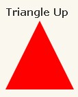 代码如下:
代码如下:
1 #triangle-up {
2     width: 0;
3     height: 0;
4     border-left: 50px solid transparent;
5     border-right: 50px solid transparent;
6     border-bottom: 100px solid red;
7 }
 代码如下:
代码如下:
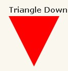
#triangle-down {
    width: 0;
    height: 0;
    border-left: 50px solid transparent;
    border-right: 50px solid transparent;
    border-top: 100px solid red;
}
 代码如下:
代码如下:
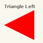
1 #triangle-left {
2     width: 0;
3     height: 0;
4     border-top: 50px solid transparent;
5     border-right: 100px solid red;
6     border-bottom: 50px solid transparent;
7 }
 代码如下:
代码如下:
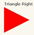
1 #triangle-right {
2     width: 0;
3     height: 0;
4     border-top: 50px solid transparent;
5     border-left: 100px solid red;
6     border-bottom: 50px solid transparent;
7 }
 代码如下:
代码如下:
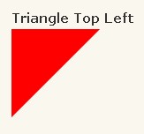
1 #triangle-topleft {
2     width: 0;
3     height: 0;
4     border-top: 100px solid red;
5     border-right: 100px solid transparent;
6 }
 代码如下:
代码如下:
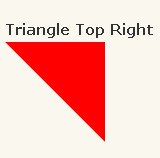
1 #triangle-topright {
2     width: 0;
3     height: 0;
4     border-top: 100px solid red;
5     border-left: 100px solid transparent;
6 }
7
 代码如下:
代码如下:
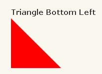
1 #triangle-bottomleft {
2     width: 0;
3     height: 0;
4     border-bottom: 100px solid red;
5     border-right: 100px solid transparent;
6 }
 代码如下:
代码如下:
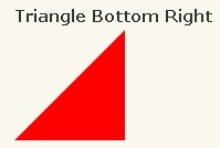
1 #triangle-bottomright {
2     width: 0;
3     height: 0;
4     border-bottom: 100px solid red;
5     border-left: 100px solid transparent;
6 }
以上是关于2016/2/24 css画三角形 border的上右下左的调整 以及内区域的无限变小 背景透明的主要内容,如果未能解决你的问题,请参考以下文章