EChart 标题 title 样式,x轴y轴坐标显示,调整图表位置等
Posted shuilangyizu
tags:
篇首语:本文由小常识网(cha138.com)小编为大家整理,主要介绍了EChart 标题 title 样式,x轴y轴坐标显示,调整图表位置等相关的知识,希望对你有一定的参考价值。
示例里工作一般情况是够用了,更复杂的可以查询教程:
title 官方解说:http://echarts.baidu.com/option.html#title
坐标相关: X轴:http://echarts.baidu.com/option.html#xAxis
坐标相关: Y轴:http://echarts.baidu.com/option.html#yAxis
表格部分:http://echarts.baidu.com/option.html#grid
<script>
function getChartsLine()
var myChart = echarts.init(document.getElementById(‘progress‘),‘macarons‘);
var option =
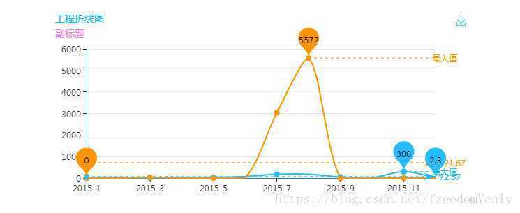
title:
text: ‘工程折线图‘, //主标题
textStyle:
color:‘#0DB9F2‘, //颜色
fontStyle:‘normal‘, //风格
fontWeight:‘normal‘, //粗细
fontFamily:‘Microsoft yahei‘, //字体
fontSize:14, //大小
align:‘center‘ //水平对齐
,
subtext:‘副标题‘, //副标题
subtextStyle: //对应样式
color:‘#F27CDE‘,
fontSize:14
,
itemGap:7
,
grid: //显示数据的图表位于当前canvas的坐标轴
x:50,
y:55,
x2:50,
y2:60,
borderWidth:1
,
tooltip:
trigger: ‘axis‘
,
legend:
data:["计划完成","实际完成"]
,
toolbox:
show: true,
feature:
saveAsImage:
,
xAxis:
type: ‘category‘,
boundaryGap: false,
data: ["2015-1", "2015-2", "2015-3", "2015-4", "2015-5", "2015-6", "2015-7", "2015-8", "2015-9", "2015-10", "2015-11", "2015-12"]
,
yAxis:
type: ‘value‘,
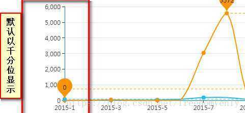
//默认以千分位显示,不想用的可以在这加一段
axisLabel : //调整左侧Y轴刻度, 直接按对应数据显示
show:true,
showMinLabel:true,
showMaxLabel:true,
formatter: function (value)
return value;
,
series: [
name:"计划",
type:‘line‘,
data: [2.6, 5.9, 9.0, 26.4, 28.7, 70.7, 175.6, 182.2, 48.7, 18.8, 300, 2.3],
markPoint:
data: [
type: ‘max‘, name: ‘最大值‘,
type: ‘min‘, name: ‘最小值‘
]
,
markLine:
data: [
type: ‘average‘, name: ‘平均值‘,
[
symbol: ‘none‘,
x: ‘90%‘,
yAxis: ‘max‘
,
symbol: ‘circle‘,
label:
normal:
position: ‘start‘,
formatter: ‘最大值‘
,
type: ‘max‘,
name: ‘最高点‘
]
]
,
name:"实际",
type:‘line‘,
data:[0, 0, 37, 0, 0, 15, 3036, 5572, 0, 0, 0, 0],
markPoint:
data: [
type: ‘max‘, name: ‘最大值‘,
type: ‘min‘, name: ‘最小值‘
]
,
markLine:
data: [
type: ‘average‘, name: ‘平均值‘,
[
symbol: ‘none‘,
x: ‘90%‘,
yAxis: ‘max‘
,
symbol: ‘circle‘,
label:
normal:
position: ‘start‘,
formatter: ‘最大值‘
,
type: ‘max‘,
name: ‘最高点‘
]
]
]
;
myChart.setOption(option);
getChartsLine();
</script>
修改后:
以上是关于EChart 标题 title 样式,x轴y轴坐标显示,调整图表位置等的主要内容,如果未能解决你的问题,请参考以下文章