css 实现矩形四个边角加粗的方法
Posted horizong
tags:
篇首语:本文由小常识网(cha138.com)小编为大家整理,主要介绍了css 实现矩形四个边角加粗的方法相关的知识,希望对你有一定的参考价值。
<body>
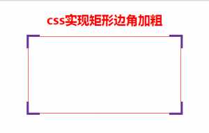
<h1 style="color: red">css实现矩形边角加粗</h1>
<div class="main">
<span></span>
<span></span>
<span></span>
<span></span>
</div>
</body>
body
    display: flex;
    justify-content: center;
    flex-direction: column;
    align-items: center;

.main
    position: relative;
    width: 400px;
    height: 200px;
    border: 1px solid red;

.main span:nth-child(1)
    position: absolute;
    left: -5px;
    top: -5px;
    padding: 15px;
    border-style: solid;
    border-color: rebeccapurple;
    border-width: 5px 0 0 5px;

.main span:nth-child(2)
    position: absolute;
    right: -5px;
    top: -5px;
    padding: 15px;
    border-style: solid;
    border-color: rebeccapurple;
    border-width: 5px 5px 0 0;

.main span:nth-child(3)
    position: absolute;
    right: -5px;
    bottom: -5px;
    padding: 15px;
    border-style: solid;
    border-color: rebeccapurple;
    border-width: 0 5px 5px 0;

.main span:nth-child(4)
    position: absolute;
    left: -5px;
    bottom: -5px;
    padding: 15px;
    border-style: solid;
    border-color: rebeccapurple;
    border-width: 0 0 5px 5px;
以上是关于css 实现矩形四个边角加粗的方法的主要内容,如果未能解决你的问题,请参考以下文章