p24 响应式导航栏 关闭按钮
Posted apelles
tags:
篇首语:本文由小常识网(cha138.com)小编为大家整理,主要介绍了p24 响应式导航栏 关闭按钮相关的知识,希望对你有一定的参考价值。
css引入
<link href="//netdna.bootstrapcdn.com/font-awesome/4.7.0/css/font-awesome.min.css" rel="stylesheet">
body主体结构
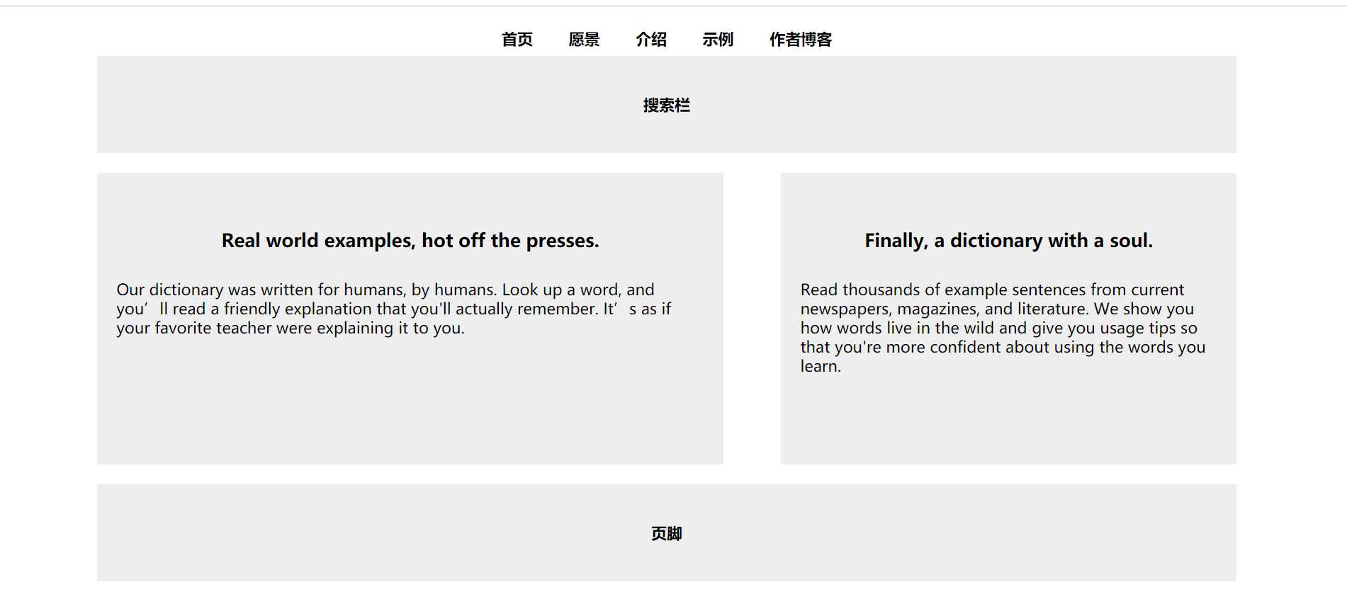
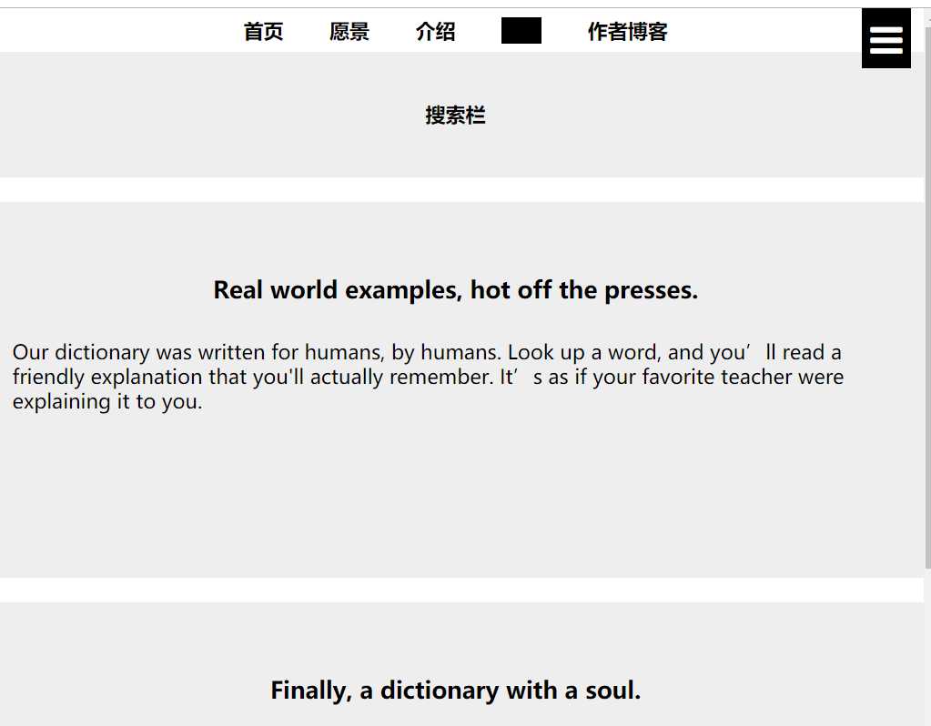
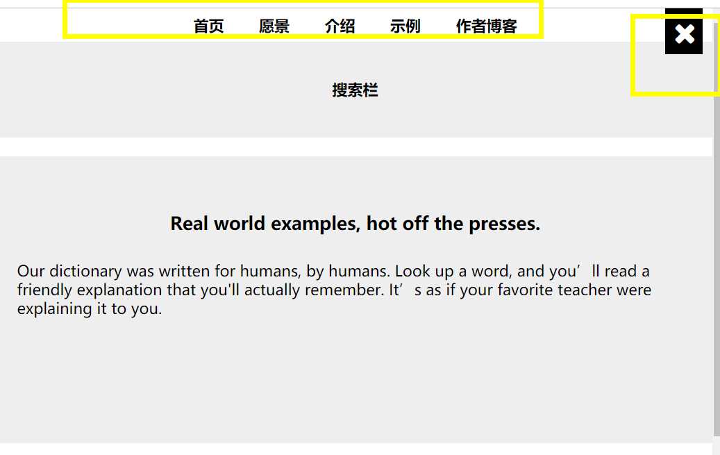
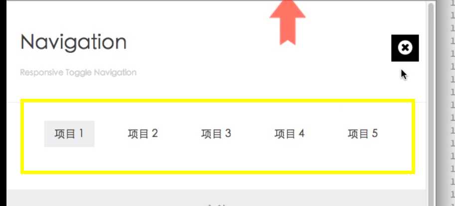
<body id="top">
    <div class="container">
        <a href="#nav" class="open toggle-btn"><i class="fa fa-reorder"></i></a>
        <nav id="nav">
            <ul>
                <li>
                    <a href="#">首页</a>
                </li>
                <li>
                    <a href="#">愿景</a>
                </li>
                <li>
                    <a href="#">介绍</a>
                </li>
                <li>
                    <a href="#">示例</a>
                </li>
                <li>
                    <a href="#">作者博客</a>
                </li>
            </ul>
            <a href="#top" class="close toggle-btn"><i class="fa fa-remove"></i></a>
        </nav>
        <header>搜索栏</header>
        <section>
            <h3>Real world examples, hot off the presses.</h3>
            <p>Our dictionary was written for humans, by humans. Look up a word, and you’ll read a friendly explanation that you‘ll actually remember. It’s as if your favorite teacher were explaining it to you.</p>
        </section>
        <aside>
            <h3>Finally, a dictionary with a soul.</h3>
            <p>Read thousands of example sentences from current newspapers, magazines, and literature. We show you how words live in the wild and give you usage tips so that you‘re more confident about using the words you learn.</p>
        </aside>
        <footer>页脚</footer>
    </div>
</body>
* {
margin: 0;
border: 0;
padding: 0;
font-weight: bold;
}
body {
text-align: center;
}
.container {
width: 960px;
margin: 15px auto 0 auto;
}
header,
footer {
height: 100px;
background: #eee;
margin-bottom: 20px;
line-height: 100px;
}
section,
aside {
height: 300px;
background: #eee;
line-height: 20px;
margin-bottom: 20px;
}
section {
float: left;
width: 55%;
margin-right: 15px;
background: #eee;
overflow: hidden;
}
h3 {
margin-top: 60px;
margin-bottom: 30px;
}
p {
font-weight: normal;
text-align: left;
margin: 0 20px;
}
aside {
float: right;
width: 40%;
background: #eee;
overflow: hidden;
}
footer {
clear: both;
margin-bottom: 0px;
}
@media screen and (min-width:1200px) {
.container {
width: 1170px;
}
}
@media screen and (max-width:960px) {
.container {
width: 100%;
}
section {
width: 55%;
}
aside {
width: 40%;
}
}
@media screen and (max-width:800px) {
.container {
width: 100%;
}
section {
width: 55%;
}
aside {
width: 40%;
}
}
@media screen and (max-device-width: 414px) {
.container {
margin: 0;
width: 100%;
}
section,
aside {
float: none;
width: 100%;
}
footer {
margin-bottom: 0px;
}
}
/* 导航菜单 */
#nav ul li {
list-style: none;
display: inline-block;
padding: 7px 16px;
}
a {
color: black;
text-decoration: none;
}
#nav ul li a:hover {
background: black;
}
.toggle-btn {
display: none;
}
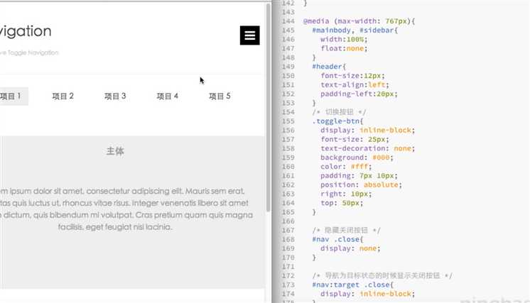
@media screen and (max-width: 768px) {
.container {
margin: 0;
}
section,
aside {
float: none;
width: 100%;
}
/* 切换按钮 */
.toggle-btn {
display: inline-block;
font-size: 30px;
padding: 4px 7px;
background: black;
color: white;
position: absolute;
right: 10px;
top: 0px;
}
.container .close {
display: none;
}
#nav:target .close {
display: inline-block;
}
}
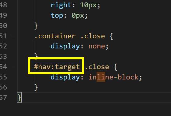
注意这个部分
以上是关于p24 响应式导航栏 关闭按钮的主要内容,如果未能解决你的问题,请参考以下文章