网页布局——三列布局(左侧和右侧固定,中间自适应)
Posted ruilin
tags:
篇首语:本文由小常识网(cha138.com)小编为大家整理,主要介绍了网页布局——三列布局(左侧和右侧固定,中间自适应)相关的知识,希望对你有一定的参考价值。
一:flex弹性布局
<!DOCTYPE>
<html lang="en">
<head>
<meta charset="UTF-8">
<title>Document</title>
<style>
*{padding: 0;margin: 0;}
body{
    display: flex;
}
.left,.center,.right{
    height: 200px;
}
.left {
    width: 200px;
    background-color: blue;

}
.center {
    flex:1;
    background-color: red;
}
.right{
    width: 200px;
    background-color: pink;
}
</style>
</head>
<body>
    <div class="left">left</div>
    <div class="center">center</div>
    <div class="right">right</div>
</body>
</html>
二:float和margin
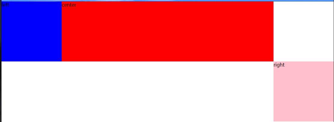
这里需要注意center盒子和right盒子的位置,因为如果还是按照上一种的方法的文档位置会出现下图的情况,这是因为未浮动的块级盒子会独占一行。
<!DOCTYPE>
<html lang="en">
<head>
<meta charset="UTF-8">
<title>Document</title>
<style>
*{padding: 0;margin: 0;}
.left,.center,.right{
    height: 200px;
}
.left {
    float: left;
    width: 200px;
    background-color: blue;
}
.center {
    margin: 0 200px;
    background-color: red;
}
.right{
    float: right;
    width: 200px;
    background-color: pink;
}
</style>
</head>
<body>
    <div class="left">left</div>
    <div class="right">right</div>
    <div class="center">center</div>
</body>
</html>
三:绝对定位
<!DOCTYPE html>
<html lang="en">
<head>
    <style>
        *{
            padding: 0px;
            margin: 0px;
        }
        .left,.center,.right{
            height: 200px;
        }
        .left {
            position: absolute;
            width: 200px;
            left: 0;
            top: 0;
            background-color: blue;
        }
        .center {
            margin: 0px 200px;
            background-color: red;
        }
        .right {
            position: absolute;
            width: 200px;
            right: 0;
            top: 0;
            background-color: pink;
        }
    </style>
</head>
<body>
<div class="container">
    <div class="left"></div>
    <div class="center"></div>
    <div class="right"></div>
</div>
</body>
</html>
四:table布局
<!DOCTYPE html>
<html lang="en">
<head>
    <style>
        *{
            margin: 0px;
            padding: 0px;
        }
        .container{
            display: table;
            width: 100%;
        }
        .left,.center,.right{
            height: 200px;
            display: table-cell;
        }
        .left{
            width: 200px;
            background-color: blue;
        }
        .center{
            background-color: red;
        }
        .right{
            width: 200px;
            background-color: pink;
        }
    </style>
</head>
<body>
<div class="container">
    <div class="left"></div>
    <div class="center"></div>
    <div class="right"></div>
</div>
</body>
</html>
以上是关于网页布局——三列布局(左侧和右侧固定,中间自适应)的主要内容,如果未能解决你的问题,请参考以下文章