分享给你一个酷炫的前端组件库,还不用起来?
Posted 浪漫主义码农
tags:
篇首语:本文由小常识网(cha138.com)小编为大家整理,主要介绍了分享给你一个酷炫的前端组件库,还不用起来?相关的知识,希望对你有一定的参考价值。
fancy-components 一个酷炫的前端组件库
大伙前端都是用什么组件库的呢?
我最近刚发现前端一个很好看、很炫酷的组件库。那就是fancy-components ,简直是“酷炫”极了。自己要是不想写复杂的样式,下面我来带大家了解下这个组件库。
一. 组件展示
翻译成中文就是是花式组件,也就是花里胡哨的意思。确实有点花里胡哨。
下面看一下最基本的样式。
二. 组件的使用和详细属性
使用这个组件库非常的简单。
在一般的html中
只需要在script 中引入type=“moudle”,然后在导入需要的组件,new一个组件就行。如图。
注意:当引入了就可以作为标签来使用,但是必须要将驼峰命名法拆分开小写在页面上,也可以在new的时候取一个别名。若无别名必须完整写完
<!-- <fc-typing-input placeholder="usermane"></fc-typing-input> -->
<body>
    <fc-input placeholder="usermane"></fc-input>
</body>
<script type="module">
import  FcTypingInput  from 'https://unpkg.com/fancy-components'  //五星红旗
new FcTypingInput('fc-input')
</script>
在Vue 2.0 中使用
首先安装下这个组件库
npm i fancy-components
然后在组件中导入,实例,使用就可以。如果想全局使用就在main.js中导入,并实例化即可。
<template>
<div>
    <!-- 使用组件 -->
    <fc-bubbles click>
    <img src="./aixin.png">
	</fc-bubbles>
</div>
</template>

<script>
import  FcBubbles from 'fancy-components'//导入组件
new FcBubbles() //实例组件
export default


</script>

<style>

</style>
接下来介绍写组件
1. FcBubbles
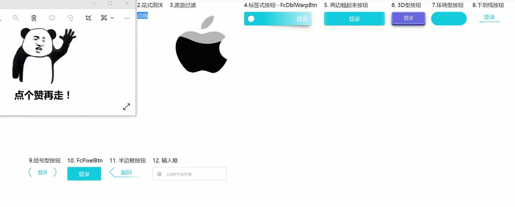
这是一个气泡的特效,为子元素添加散开的感觉。也可以自己做成点赞爱心那种,获得点击时候激活active为true然后填充颜色。再次点击取消爱心颜色。
<body>
<fc-bubbles click>
    <img src="./aixin.png">
</fc-bubbles>
</body>
<script type="module">
 import  FcBubbles  from 'https://unpkg.com/fancy-components'
  new FcBubbles()
 </script>
| css 属性 | 描述 | 默认值 |
|---|---|---|
| –width | 组件的宽度 | fit-content |
| –height | 组件的高度 | fit-content |
| –color | 填充颜色 | #1cd |
| 标签属性 | 描述 | 默认值 |
|---|---|---|
| active | 通过active属性来控制气泡动效的显隐(‘true’、‘false’) | false |
| click | 通过鼠标点击来控制气泡动效的显隐 | null |
2. FcWaveFilter

这个可以作为页面加载使用我觉得很好看,或者是获取不到资源的场景。
<body>
 <fc-wave-filter>
    <img src="./apple.png">
</fc-wave-filter>
</body>
<script type="module">
 import  FcWaveFilter from 'https://unpkg.com/fancy-components'
  new FcWaveFilter()
 </script>
css属性
| css 属性 | 描述 | 默认值 |
|---|---|---|
| –width | 组件的宽度 | fit-content |
| –height | 组件的高度 | fit-content |
| –color | 填充波浪的颜色 | blaack |
| 标签属性 | 描述 | 默认值 |
|---|---|---|
| color | 填充波浪的颜色 | blaack |
| amplitude | 波浪幅度(数字(原波浪幅的倍数)) | 1 |
| flag-stroke-color | 执行描边动画时的描边颜色 | red |
| delay | 填充后持续的时间 | 0s |
| dur | 整段动画的执行时间 | 6.6s |
| mode | 动画模式(‘alpha’(透明度)、‘luminance’(亮度)、‘img’(图片)、‘slideshow’(幻灯片)) | alpha |
| interval | 几秒一切换(适合幻灯片模式) | 0 |
3. FcWarpBtn

这个为一边翘起来的样子,感觉可以作为标签类的按钮还是很好看的。
<body>
<fc-warp-btn>
    登录
</fc-warp-btn>
</body>
<script type="module">
 import  FcWarpBtn from 'https://unpkg.com/fancy-components'
  new FcWarpBtn()
 </script>
| css 属性 | 描述 | 默认值 |
|---|---|---|
| –width | 组件的宽度 | 200px |
| –height | 组件的高度 | 40px |
| –color | 组件的背景色 | #1cd |
| –shadow-color | 组件阴影颜色 | rgba(0, 0, 0, .5) |
| 标签属性 | 描述 | 默认值 |
|---|---|---|
| text-align | 文本排列方式(‘left’、‘center’、‘right’) | right |
4.FcDblWarpBtn

这个按钮的样式相比前面一个没有孔,两头都翘起来。可以自己调节下阴影和背景色,替换绝大多数的按钮都很好看。
<body>
<fc-dbl-warp-btn>
  登录
</fc-dbl-warp-btn>
</body>
<script type="module">
 import  FcDblWarpBtn from 'https://unpkg.com/fancy-components'
  new FcDblWarpBtn()
 </script>
| css 属性 | 描述 | 默认值 |
|---|---|---|
| –width | 组件的宽度 | 180px |
| –height | 组件的高度 | 40px |
| –color | 组件的背景色 | #1cd |
| –shadow-color | 组件的颜色 | rgba(0, 0, 0, .5) |
5.Fc3DBtn
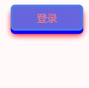
这个按钮看起来就很有立体的感觉了。可以根据自己的喜欢调色。
<body>
    <fc-3D-btn>
            登录
     </fc-3D-btn>
</body>
<style>
    fc-3D-btn
        color: salmon;
        --cover-color:rgb(17, 0, 255);
        --shadow-color:red;
        --inset-shadow-color:rgb(0, 195, 255);

</style>
<script type="module">
 import  FcDblWarpBtn from 'https://unpkg.com/fancy-components'
  new FcDblWarpBtn()
 </script>
| css 属性 | 描述 | 默认值 |
|---|---|---|
| –width | 组件的宽度 | 100px |
| –height | 组件的高度 | 36px |
| –color | 组件内字体的颜色 | #a69 |
| –shadow-color | 组件的阴影颜色 | #0008 |
| –cover-color | 组件凸起的那部分颜色 | #0005 |
| –inset-shadow-color | 组件内阴影颜色 | #fffc |
| –inset-shadow-color | 组件内阴影在按钮处于点击状态时的颜色 | var(–inset-shadow-color) |
6. FcRoundBtn

这是一个环绕形的动画的按钮。看起来很舒服。
<body>
 <fc-round-btn>
            登录
</fc-round-btn>
</body>
<script type="module">
 import  FcRoundBtn from 'https://unpkg.com/fancy-components'
  new FcRoundBtn()
 </script>
| css 属性 | 描述 | 默认值 |
|---|---|---|
| –width | 组件的宽度 | 100px |
| –height | 组件的高度 | 40px |
| –color | 组件的颜色 | #1cd |
7. FcUnderlineBtn

这是一个有下划线的按钮,但你的鼠标悬停的时候就会出现炫酷的动画。
<body>
<fc-underline-btn>
     登录
 </fc-underline-btn>
</body>
<script type="module">
 import  FcUnderlineBtn from 'https://unpkg.com/fancy-components'
  new FcUnderlineBtn()
 </script>
| css 属性 | 描述 | 默认值 |
|---|---|---|
| –width | 组件的宽度 | 100px |
| –height | 组件的高度 | 30px |
| –color | 组件的颜色 | #1cd |
8. FcParenthesesBtn

<body>
<fc-parentheses-btn>
            登录
</fc-parentheses-btn>
</body>
<script type="module">
 import  FcParenthesesBtn from 'https://unpkg.com/fancy-components'
  new FcParenthesesBtn()
 </script>
| css 属性 | 描述 | 默认值 |
|---|---|---|
| –width | 组件的宽度 | 80px |
| –height | 组件的高度 | 30px |
| –color | 组件的颜色 | #1cd |
9.FcPixelBtn

这个和FcRoundBtn种按钮有点像,但是动画的特效不一样。
<body>
<fc-pixel-btn>
            登录
</fc-pixel-btn>
</body>
<script type="module">
 import  FcPixelBtn from 'https://unpkg.com/fancy-components'
  new FcPixelBtn()
 </script>
| css 属性 | 描述 | 默认值 |
|---|---|---|
| –width | 组件的宽度 | 100px |
| –height | 组件的高度 | 40px |
| –color | 组件的颜色 | #1cd |
10. FcArrowBtn

这个按钮我感觉是最使用的了,返回足够有B格,哈哈。
<body>
 <fc-arrow-btn>
    返回
</fc-arrow-btn>
</body>
<script type="module">
 import  FcArrowBtn from 'https://unpkg.com/fancy-components'
  new FcArrowBtn()
 </script>
| css 属性 | 描述 | 默认值 |
|---|---|---|
| –width | 组件的宽度 | 100px |
| –height | 组件的高度 | 30px |
| –color | 组件的颜色 | #1cd |
11. FcTypingInput
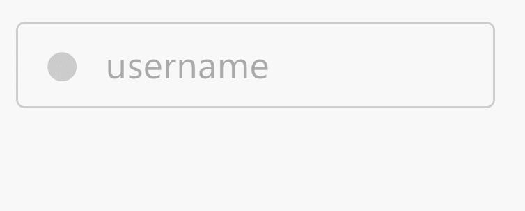
这个是我最喜欢的输入框了,我感觉瞬间高端霸气上档次了。简直爱不释手。
<body>
<fc-typing-input placeholder="username"></fc-typing-input>
</body>
<script type="module">
 import  FcTypingInput from 'https://unpkg.com/fancy-components'
  new FcTypingInput()
 </script>
| css 属性 | 描述 | 默认值 |
|---|---|---|
| –width | 组件的宽度 | 220px |
| –height | 组件的高度 | 40px |
| –color | 整体的颜色 | #caf |
| –border-color | 边框颜色 | #caf |
| –border-color-hover | hover状态下的边框颜色 | var(–color) |
| –border-color-focus | focus状态下的边框颜色 | var(–border-color-hover) |
| –border-radius | 圆角 | 4px |
| –box-shadow-focus | 在focus状态下的input框盒阴影 | 0 0 6px var(–border-color-focus) |
| –circle-color | input框在无值并且非focus状态时里面的那个小圆点的颜色 | #0003 |
| –circle-color-hover | input框在无值并处于hover状态下里面的那个小圆点的颜色 | var(–circle-color) |
| –placeholder-color | placeholder的颜色 | #0005 |
| –placeholder-color-focus | placeholder在input框处于focus状态时的颜色 | var(–border-color-focus) |
| –placeholder-animate-color | placeholder在input框内执行动画时的颜色 | red |
| –placeholder-animate-title-color | placeholder在input框的头上执行动画时的颜色 | #00ff6b |
| –placeholder-shadow | placeholder的文本阴影 | none |
| –stripe-color | input框在disabled状态时产生的条纹颜色 | #0003 |
| –stripe-deg | input框在disabled状态时产生的条纹角度 | 45 |
| –disabled-filter | input框在disabled状态时的滤镜 | opacity(80%) grayscale(100%) |
| 标签属性 | 描述 | 默认值 |
|---|---|---|
| white | input框的主题颜色为白色(适用于暗色背景) | 无(可写可不写) |
| red | input框的主题颜色为红色(适用于校验不通过时) | 无(可写可不写) |
写在最后
以上就是这个组件库了,我感觉还是很酷炫,而且使用起来非常的简单,方便。适应于最基本的html,和所有前端框架。大家快去使用吧。
这里给出仓库地址和文档fancy-components文档
本博客参考你们有没有什么花哨点的组件库给我参考一下?
祝大家1024节日快乐呀。

以上是关于分享给你一个酷炫的前端组件库,还不用起来?的主要内容,如果未能解决你的问题,请参考以下文章