如何为矩形的对角线设置动画?
Posted
tags:
篇首语:本文由小常识网(cha138.com)小编为大家整理,主要介绍了如何为矩形的对角线设置动画?相关的知识,希望对你有一定的参考价值。
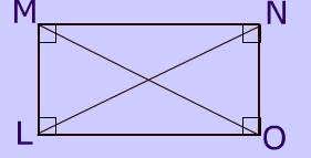
我正在尝试对角地添加动画。我知道的矩形高度和宽度(动态加起来)。现在尝试动画从N到L,或O到M或其他方式的线。我尝试使用svg并增加了行的x1,y1,x2,y2,但这变得越来越复杂。更简单或更简单的解决方案?
答案
你可以给你的线一个stroke-dashoffset并将其动画为0.为了计算stroke-dasharray和stroke-dashoffset的值,我使用了getTotalLength()方法来计算stroke-dasharray和stroke-dashoffset的值。我希望它有所帮助。
svg{background:#efefef;width:100vh}
rect,line{stroke:black; fill:none}

#om{stroke-dasharray:94.34px;
stroke-dashoffset:94.34px;
animation: om 1s linear forwards;}


@keyframes om {
  to {
    stroke-dashoffset: 0;
  }
}
<svg viewBox = "0 0 100 70">
<rect x="10" y="10" width="80" height="50" />
<line id="om" x1="90" y1="60" x2="10" y2="10" />
</svg>另一答案
这是一个背景着色的简单想法。你只需要增加background-size来绘制线条:
.box {
  width:200px;
  height:100px;
  border:2px solid;
  background:
    /*M - O*/
    linear-gradient(to top right,
      transparent calc(50% - 3px),red calc(50% - 2px),
      red calc(50% + 2px),transparent calc(50% + 3px)) top left,

    /*N - L*/
    linear-gradient(to bottom right,
      transparent calc(50% - 3px),#000 calc(50% - 2px),
      #000 calc(50% + 2px),transparent calc(50% + 3px)) bottom left;
  background-repeat:no-repeat;
  background-size:0 0;
  transition:1s linear;
}
.box:hover {
  background-size:100% 100%;
}
<div class="box">
</div>以上是关于如何为矩形的对角线设置动画?的主要内容,如果未能解决你的问题,请参考以下文章