当外部div的大小发生变化时,可滚动的div可以坚持到底部
Posted
tags:
篇首语:本文由小常识网(cha138.com)小编为大家整理,主要介绍了当外部div的大小发生变化时,可滚动的div可以坚持到底部相关的知识,希望对你有一定的参考价值。
这是一个示例聊天应用程序 - >
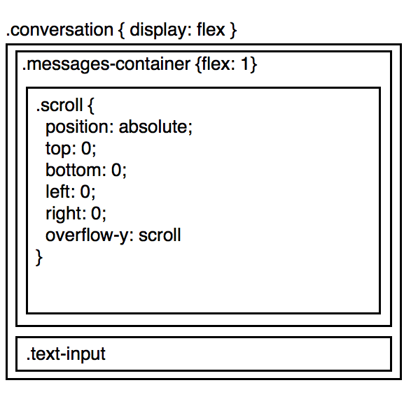
这里的想法是让.messages-container尽可能多地占据屏幕。在.messages-container中,.scroll保存消息列表,如果有更多消息,则屏幕大小滚动。
现在,考虑这种情况:
- 用户滚动到对话的底部
.text-input动态变大
现在,不是用户保持滚动到对话的底部,文本输入增加,他们不再看到底部。
一种解决方法,如果我们使用react,计算文本输入的高度,如果有任何变化,让.messages-container知道
componentDidUpdate() {
  window.setTimeout(_ => {
    const newHeight = this.calcHeight();
    if (newHeight !== this._oldHeight) {
      this.props.onResize();
    }
    this._oldHeight = newHeight;
  });
}
但是,这会导致可见的性能问题,并且像这样传递消息很难过。
有没有更好的办法?我可以用这种方式使用css来表达当.text-input-increase,我想基本上shift up所有的.messages-container
2:这个答案的修订版
你的朋友在这里是flex-direction: column-reverse;,你可以根据消息容器底部的消息对齐,就像Skype和许多其他聊天应用程序一样。
.chat-window{
  display:flex;
  flex-direction:column;
  height:100%;
}
.chat-messages{
  flex: 1;
  height:100%;
  overflow: auto;
  display: flex;
  flex-direction: column-reverse;
}

.chat-input { border-top: 1px solid #999; padding: 20px 5px }
.chat-input-text { width: 60%; min-height: 40px; max-width: 60%; }
flex-direction: column-reverse;的缺点是IE / Edge / Firefox中的一个错误,其中滚动条没有显示,您可以在这里阅读更多信息:Flexbox column-reverse and overflow in Firefox/IE
好处是你在移动设备/平板电脑上有大约90%的浏览器支持,在桌面上有大约65%的浏览器支持,并且随着bug的修复而计算......并且有一个解决方法。
// scroll to bottom
function updateScroll(el){
  el.scrollTop = el.scrollHeight;
}
// only shift-up if at bottom
function scrollAtBottom(el){
  return (el.scrollTop + 5 >= (el.scrollHeight - el.offsetHeight));
}
在下面的代码片段中,我添加了上面的2个函数,以使IE / Edge / Firefox以与flex-direction: column-reverse;相同的方式运行。
function addContent () {
  var msgdiv = document.getElementById('messages');
  var msgtxt = document.getElementById('inputs');
  var atbottom = scrollAtBottom(msgdiv);

  if (msgtxt.value.length > 0) {
    msgdiv.innerhtml += msgtxt.value + '<br/>';
    msgtxt.value = "";
  } else {
    msgdiv.innerHTML += 'Long long content ' + (tempCounter++) + '!<br/>';
  }

  /* if at bottom and is IE/Edge/Firefox */
  if (atbottom && (!isWebkit || isEdge)) {
    updateScroll(msgdiv);
  }
}

function resizeInput () {
  var msgdiv = document.getElementById('messages');
  var msgtxt = document.getElementById('inputs');
  var atbottom = scrollAtBottom(msgdiv);

  if (msgtxt.style.height == '120px') {
    msgtxt.style.height = 'auto';
  } else {
    msgtxt.style.height = '120px';
  }

  /* if at bottom and is IE/Edge/Firefox */
  if (atbottom && (!isWebkit || isEdge)) {
    updateScroll(msgdiv);
  }
}


/* fix for IE/Edge/Firefox */
var isWebkit = ('WebkitAppearance' in document.documentElement.style);
var isEdge = ('-ms-accelerator' in document.documentElement.style);
var tempCounter = 6;

function updateScroll(el){
  el.scrollTop = el.scrollHeight;
}
function scrollAtBottom(el){
  return (el.scrollTop + 5 >= (el.scrollHeight - el.offsetHeight));
}
html, body { height:100%; margin:0; padding:0; }
.chat-window{
display:flex;
flex-direction:column;
height:100%;
}
.chat-messages{
flex: 1;
height:100%;
overflow: auto;
display: flex;
flex-direction: column-reverse;
}
.chat-input { border-top: 1px solid #999; padding: 20px 5px }
.chat-input-text { width: 60%; min-height: 40px; max-width: 60%; }
/* temp. buttons for demo */
button { width: 12%; height: 44px; margin-left: 5%; vertical-align: top; }
/* begin - fix for hidden scrollbar in IE/Edge/Firefox */
.chat-messages-text{ overflow: auto; }
@media screen and (-webkit-min-device-pixel-ratio:0) {
.chat-messages-text{ overflow: visible; }
/* reset Edge as it identifies itself as webkit */
@supports (-ms-accelerator:true) { .chat-messages-text{ overflow: auto; } }
}
/* hide resize FF */
@-moz-document url-prefix() { .chat-input-text { resize: none } }
/* end - fix for hidden scrollbar in IE/Edge/Firefox */<div class="chat-window">
<div class="chat-messages">
<div class="chat-messages-text" id="messages">
Long long content 1!<br/>
Long long content 2!<br/>
Long long content 3!<br/>
Long long content 4!<br/>
Long long content 5!<br/>
</div>
</div>
<div class="chat-input">
<textarea class="chat-input-text" placeholder="Type your message here..." id="inputs"></textarea>
<button onclick="addContent();">Add msg</button>
<button onclick="resizeInput();">Resize input</button>
</div>
</div>您只需要一个CSS规则集:
.messages-container, .scroll {transform: scale(1,-1);}
就是这样,你完成了!
工作原理:首先,它垂直翻转容器元素,使顶部成为底部(给我们所需的滚动方向),然后翻转内容元素,使消息不会颠倒。
这种方法适用于所有现代浏览器。但它确实有一个奇怪的副作用:当你在消息框中使用鼠标滚轮时,滚动方向是相反的。这可以通过几行javascript修复,如下所示。
这是一个演示和fiddle玩:
//Reverse wheel direction
document.querySelector('.messages-container').addEventListener('wheel', function(e) {
  if(e.deltaY) {
    e.preventDefault();
    e.currentTarget.scrollTop -= parseFloat(getComputedStyle(e.currentTarget).getPropertyValue('font-size')) * (e.deltaY < 0 ? -1 : 1) * 2;
  }
});

//The rest of the JS just handles the test buttons and is not part of the solution
send = function() {
  var inp = document.querySelector('.text-input');
  document.querySelector('.scroll').insertAdjacentHTML('beforeend', '<p>' + inp.value);
  inp.value = '';
  inp.focus();
}
resize = function() {
  var inp = document.querySelector('.text-input');
  inp.style.height = inp.style.height === '50%' ? null : '50%';
}
html,body {height: 100%;margin: 0;}
.conversation {
display: flex;
flex-direction: column;
height: 100%;
}
.messages-container {
flex-shrink: 10;
height: 100%;
overflow: auto;
}
.messages-container, .scroll {transform: scale(1,-1);}
.text-input {resize: vertical;}<div class="conversation">
<div class="messages-container">
<div class="scroll">
<p>Message 1<p>Message 2<p>Message 3<p>Message 4<p>Message 5
<p>Message 6<p>Message 7<p>Message 8<p>Message 9<p>Message 10
</div>
</div>
<textarea class="text-input" autofocus>Your message</textarea>
<div>
<button id="send" onclick="send();">Send input</button>
<button id="resize" onclick="resize();">Resize input box</button>
</div>
</div>请尝试以下小提琴 - https://jsfiddle.net/Hazardous/bypxg25c/。虽然小提琴目前正在使用jQuery来增大/调整文本区域的大小,但关键在于用于消息容器和输入容器类的flex相关样式 -
.messages-container{
  order:1;
  flex:0.9 1 auto;
  overflow-y:auto;
  display:flex;
  flex-direction:row;
  flex-wrap:nowrap;
  justify-content:flex-start;
  align-items:stretch;
  align-content:stretch;
}

.input-container{
  order:2;
  flex:0.1 0 auto;
}
对于.messages-container,flex-shrink值设置为1,对于.input-container,设置为0。这可确保在重新分配大小时消息容器收缩。
我在text-input内移动了messages,绝对将它放在容器的底部,并给予messages足够的底部填充空间。
运行一些代码将类添加到conversation,它使用漂亮的CSS过渡动画更改text-input的高度和messages的底部填充。
JavaScript在运行CSS转换的同时运行“scrollTo”函数,以使滚动保持在底部。
当卷轴再次从底部退出时,我们将从conversation中删除该类
希望这可以帮助。
https://jsfiddle.net/cnvzLfso 以上是关于当外部div的大小发生变化时,可滚动的div可以坚持到底部的主要内容,如果未能解决你的问题,请参考以下文章