Bootstrap -- 插件: 提示工具弹出框 警告框消息
Posted chengwenhao
tags:
篇首语:本文由小常识网(cha138.com)小编为大家整理,主要介绍了Bootstrap -- 插件: 提示工具弹出框 警告框消息相关的知识,希望对你有一定的参考价值。
Bootstrap -- 插件: 提示工具、弹出框、 警告框消息
1. 提示工具(Tooltip)插件:根据需求生成内容和标记。
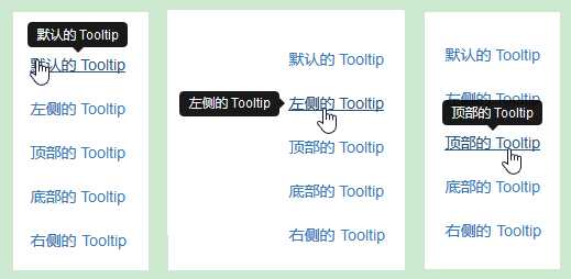
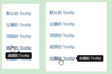
使用提示工具:


<!DOCTYPE html>
<html>
<head>
<meta http-equiv="Content-Type" content="text/html; charset=utf-8"/>
<title>My Test bootstrap</title>
    <link rel="stylesheet" href="https://cdn.staticfile.org/twitter-bootstrap/3.3.7/css/bootstrap.min.css">
    <script src="https://cdn.staticfile.org/jquery/2.1.1/jquery.min.js"></script>
    <script src="https://cdn.staticfile.org/twitter-bootstrap/3.3.7/js/bootstrap.min.js"></script>
    <script>
        $(function () { $("[data-toggle=‘tooltip‘]").tooltip(); });
    </script>
</head>
<body>
    <div align="center" style="margin-top:100px;">
        <a href="#" class="tooltip-test" data-toggle="tooltip" title="默认的 Tooltip">默认的 Tooltip</a><br/><br/>
        <a href="#" class="tooltip-test" data-toggle="tooltip" data-placement="left" title="左侧的 Tooltip">左侧的 Tooltip</a><br/><br/>
        <a href="#" data-toggle="tooltip" data-placement="top" title="顶部的 Tooltip">顶部的 Tooltip</a><br/><br/>
        <a href="#" data-toggle="tooltip" data-placement="bottom"title="底部的 Tooltip">底部的 Tooltip</a><br/><br/>
        <a href="#" data-toggle="tooltip" data-placement="right" title="右侧的 Tooltip">右侧的 Tooltip</a>
    </div>
</body>
</html>
样式效果:
2.弹出框(Popover)插件:根据需求生成内容和标记。
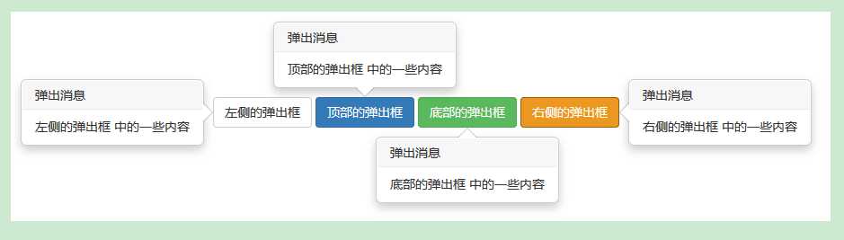
使用弹出框:
<!DOCTYPE html>
<html>
<head>
<meta http-equiv="Content-Type" content="text/html; charset=utf-8"/>
<title>My Test bootstrap</title>
    <link rel="stylesheet" href="https://cdn.staticfile.org/twitter-bootstrap/3.3.7/css/bootstrap.min.css">
    <script src="https://cdn.staticfile.org/jquery/2.1.1/jquery.min.js"></script>
    <script src="https://cdn.staticfile.org/twitter-bootstrap/3.3.7/js/bootstrap.min.js"></script>
    <script>
        $(function (){
            $("[data-toggle=‘popover‘]").popover();
        });
    </script>
</head>
<body>
    <div class="container" style="padding: 200px 200px 200px;" >
        <button type="button" class="btn btn-default" title="弹出消息"
                data-container="body" data-toggle="popover" data-placement="left"
                data-content="左侧的弹出框 中的一些内容">
            左侧的弹出框
        </button>
        <button type="button" class="btn btn-primary" title="弹出消息"
                data-container="body" data-toggle="popover" data-placement="top"
                data-content="顶部的弹出框 中的一些内容">
            顶部的弹出框
        </button>
        <button type="button" class="btn btn-success" title="弹出消息"
                data-container="body" data-toggle="popover" data-placement="bottom"
                data-content="底部的弹出框 中的一些内容">
            底部的弹出框
        </button>
        <button type="button" class="btn btn-warning" title="弹出消息"
                data-container="body" data-toggle="popover" data-placement="right"
                data-content="右侧的弹出框 中的一些内容">
            右侧的弹出框
        </button>
    </div>
</body>
</html>
样式效果:
3. 警告框(Alert)消息:大多是用来向终端用户显示诸如警告或确认消息的信息。
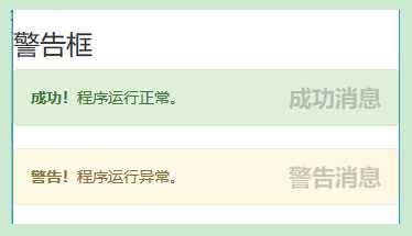
使用警告框消息:
<!DOCTYPE html>
<html>
<head>
<meta http-equiv="Content-Type" content="text/html; charset=utf-8"/>
<title>My Test bootstrap</title>
    <link rel="stylesheet" href="https://cdn.staticfile.org/twitter-bootstrap/3.3.7/css/bootstrap.min.css">
    <script src="https://cdn.staticfile.org/jquery/2.1.1/jquery.min.js"></script>
    <script src="https://cdn.staticfile.org/twitter-bootstrap/3.3.7/js/bootstrap.min.js"></script>
    <script>
        $(function(){
            $(".close").click(function(){
                $("#myAlert1").alert(‘close‘);
                $("#myAlert2").alert(‘close‘);
            });
        });
    </script>
</head>
<body>
    <h3>警告框</h3>
    <div id="myAlert1" class="alert alert-success">
        <a href="#" class="close" data-dismiss="alert">成功消息</a>
        <strong>成功!</strong>程序运行正常。
    </div>
    <div id="myAlert2" class="alert alert-warning">
        <a href="#" class="close" data-dismiss="alert">警告消息</a>
        <strong>警告!</strong>程序运行异常。
    </div>
</body>
</html>
样式效果:
以上是关于Bootstrap -- 插件: 提示工具弹出框 警告框消息的主要内容,如果未能解决你的问题,请参考以下文章