Matplotlib学习---用seaborn画直方图和核密度图(histogram & kdeplot)
Posted huzihu
tags:
篇首语:本文由小常识网(cha138.com)小编为大家整理,主要介绍了Matplotlib学习---用seaborn画直方图和核密度图(histogram & kdeplot)相关的知识,希望对你有一定的参考价值。
由于直方图受组距(bin size)影响很大,设置不同的组距可能会产生完全不同的可视化结果。因此我们可以用密度平滑估计来更好地反映数据的真实特征。具体可参见这篇文章:https://blog.csdn.net/unixtch/article/details/78556499。
还是用我们自己创建的一组符合正态分布的数据来画图。
准备工作:先导入matplotlib,seaborn和numpy,然后创建一个图像和一个坐标轴
import numpy as np
from matplotlib import pyplot as plt
import seaborn as sns
fig,ax=plt.subplots()
用seaborn画核密度图: sns.kdeplot(x,shade=True)
让我们在用matplotlib画好的直方图的基础上画核密度图:
import numpy as np
from matplotlib import pyplot as plt
import seaborn as sns
fig,ax=plt.subplots()

np.random.seed(4) #设置随机数种子
Gaussian=np.random.normal(0,1,1000) #创建一组平均数为0,标准差为1,总个数为1000的符合标准正态分布的数据
ax.hist(Gaussian,bins=25,histtype="stepfilled",normed=True,alpha=0.6)
sns.kdeplot(Gaussian,shade=True)

plt.show()
图像如下:
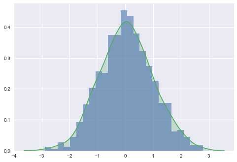
注意:导入seaborn包后,绘图风格自动变为seaborn风格。
另外,可以用distplot命令把直方图和KDE一次性画出来。
用seaborn画直方图和核密度图: sns.distplot(x)
代码如下:
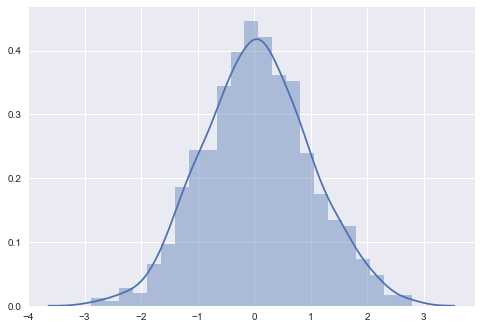
import numpy as np
from matplotlib import pyplot as plt
import seaborn as sns
fig,ax=plt.subplots()

np.random.seed(4) #设置随机数种子
Gaussian=np.random.normal(0,1,1000) #创建一组平均数为0,标准差为1,总个数为1000的符合标准正态分布的数据
sns.distplot(Gaussian)

plt.show()
图像和上面基本一致:
以上是关于Matplotlib学习---用seaborn画直方图和核密度图(histogram & kdeplot)的主要内容,如果未能解决你的问题,请参考以下文章