R绘图 第五篇:绘制点图(ggplot2)
Posted ljhdo
tags:
篇首语:本文由小常识网(cha138.com)小编为大家整理,主要介绍了R绘图 第五篇:绘制点图(ggplot2)相关的知识,希望对你有一定的参考价值。
点图,也可以叫做散点图,通过绘制散点来呈现数据的分布,使用geom_dotplot()函数来绘制点图:
geom_dotplot(mapping = NULL, data = NULL, position = "identity", ...,
  binwidth = NULL, binaxis = "x", method = "dotdensity",
  binpositions = "bygroup", stackdir = "up", stackratio = 1,
  dotsize = 1, stackgroups = FALSE, origin = NULL, right = TRUE,
  width = 0.9, drop = FALSE, na.rm = FALSE, show.legend = NA,
  inherit.aes = TRUE)
常用的参数注释:
- mapping:使用aes()来设置点图美学特征,参数x是因子,参数y是数值
- data:数据框对象
- method:默认值是dotdensity(点密度封箱),或者histodot,固定的封箱宽度,比如 stat_bin
- binwidth:bin是封箱的意思,该参数用于调整组距,该参数受到method参数的影响,如果method是dotdensity,那么binwidth指定最大的bin宽度;如果method是histodot,那么binwidth指定bin的宽度,默认值是数据范围(range of the data)的1/30。
- binaxis:沿着那个轴进行封箱,默认值是x
- stackdir:设置堆叠点的方向,默认值是up,有效值是down、center、centerwhole和up。
- stackratio:点堆叠的密集程度,默认值是1,值越小,堆集越密集;
- dotsize:点的大小,相对于binwidth的直径,默认值是1。
使用ToothGrowth数据来绘制点图:
ToothGrowth$dose <- as.factor(ToothGrowth$dose)
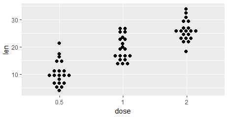
一,绘制散点图
绘制基本的点图
library(ggplot2)

p <- ggplot(ToothGrowth, aes(x=dose, y=len)) +
  geom_dotplot(binaxis=‘y‘, stackdir=‘center‘,
               stackratio=1.5, dotsize=1.2)
二,添加汇总数据
向点图中添加汇总数据,使用ggplot2包中的函数
stat_summary(mapping = NULL, data = NULL, geom = "pointrange",
  position = "identity", ..., fun.data = NULL, fun.y = NULL,
  fun.ymax = NULL, fun.ymin = NULL, fun.args = list(), na.rm = FALSE,
  show.legend = NA, inherit.aes = TRUE)
常用参数注释:
- fun.data:指定一个函数(function),返回带有变量ymin,y和ymax的数据框 或者,指定三个单独的函数,分别向每个函数传递一个向量,分别返回一个数字,用于表示ymin、y和ymax:
- fun.y:
- fun.ymax:
- fun.ymin:
- fun.args=list():可选的参数,用于指定传递给fun.xxx函数的参数
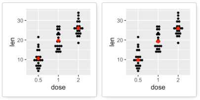
1,向点图中增加均值和中位数
# dot plot with mean points
p + stat_summary(fun.y=mean, geom="point", shape=18,
                 size=3, color="red")
# dot plot with median points
p + stat_summary(fun.y=median, geom="point", shape=18,
                 size=3, color="red")
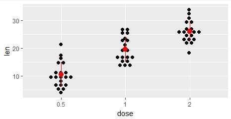
2,向点图中增加点范围
fun.low.mean <- function(x){mean(x)-sd(x)}
fun.up.mean <- function(x){mean(x)+sd(x)}

ggplot(ToothGrowth, aes(x=dose, y=len)) +
  geom_dotplot(binaxis=‘y‘, stackdir=‘center‘, stackratio=1.5, dotsize=1.2)+
  stat_summary(fun.y = mean, fun.ymin = fun.low.mean, fun.ymax = fun.up.mean, colour = "red", size = 0.7)
3,使用fun.data向点图中增加点范围
data_summary <- function(x) {
  m <- mean(x)
  ymin <- m-sd(x)
  ymax <- m+sd(x)
  return(c(y=m,ymin=ymin,ymax=ymax))
}

ggplot(ToothGrowth, aes(x=dose, y=len)) +
  geom_dotplot(binaxis=‘y‘, stackdir=‘center‘, stackratio=1.5, dotsize=1.2)+
  stat_summary(fun.data =  data_summary, colour = "red", size = 0.7)
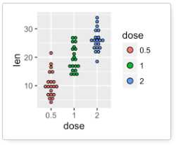
三,按照分组改变点图的颜色
首先要对点图分组,这通过aes(fill=dose)来实现,然后,使用scale_fill_manual()来设置每个分组的颜色:
ggplot(ToothGrowth, aes(x=dose, y=len, fill=dose)) +
  geom_dotplot(binaxis=‘y‘, stackdir=‘center‘)+
  scale_fill_manual(values=c("#999999", "#E69F00", "#56B4E9"))
四,添加点图的说明
通过theme函数向点图中增加说明,通过legend.position来控制说明的位置
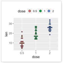
ggplot(ToothGrowth, aes(x=dose, y=len, fill=dose)) +
  geom_dotplot(binaxis=‘y‘, stackdir=‘center‘)+
  scale_fill_manual(values=c("#999999", "#E69F00", "#56B4E9"))+
  theme(legend.position="top")
五,向点图中增加标题和轴的标签
通过labs()来添加标题和坐标轴的标签
ggplot(ToothGrowth, aes(x=dose, y=len, fill=dose)) +
  geom_dotplot(binaxis=‘y‘, stackdir=‘center‘)+
  scale_fill_manual(values=c("#999999", "#E69F00", "#56B4E9"))+
  labs(title="Plot of length  by dose",x="Dose (mg)", y = "Length")+
  theme_classic()

参考文档:
ggplot2 dot plot : Quick start guide - R software and data visualization
以上是关于R绘图 第五篇:绘制点图(ggplot2)的主要内容,如果未能解决你的问题,请参考以下文章