flex布局常见的一些案例
Posted 前端纸飞机
tags:
篇首语:本文由小常识网(cha138.com)小编为大家整理,主要介绍了flex布局常见的一些案例相关的知识,希望对你有一定的参考价值。
风华正茂的年纪遇到你,是我最大的幸运,谢谢你,靠近我,了解我,治愈我,陪着我,谢谢你来爱我。
flex是啥:是一种弹性布局方式。(注意这个弹)
flex属性值大全:https://blog.csdn.net/qq_32442973/article/details/121141562
flex的属性虽然较多,但实际常用的就那么几个,会以下几个布局,就能完成99%的布局问题了。
下面的案例为了更好的理解,需要都设置重置样式:
*
  padding: 0;
  margin: 0;
1. flex设置元素 垂直、水平 居中对齐
<template>
  <div id="app">
    <div class="demo">
      <div class="inner">
        <p>这是一个测试</p>
      </div>
    </div>
  </div>
</template>

<style lang="scss">
.demo
  width: 500px;
  height: 300px;
  border: 1px solid purple;
  display: flex; /*设置为flex布局*/
  justify-content: center; /*水平居中*/
  align-items: center; /*垂直居中*/

.inner
  width: 160px;
  height: 160px;
  font-size: 26px;
  border: 1px solid red;

</style>

demo => innder => p 一共三层结构,demo设置了flex,并未影响到p,这就是我和你讲的flex只影响他的下一级的展现点。
2.用flex布局制作导航栏
以前在写导航栏的时候,总是用float或者display:inline-block实现,但是这两种方法都会有各种问题,比如浮动会影响父元素以及兄弟元素的样式,需要清除浮动。
现在用flex会很方便,并且是弹性布局。
<template>
  <div id="app">
    <ul>
      <li>音乐</li>
      <li>影视</li>
      <li>旅游</li>
    </ul>
  </div>
</template>

<style lang="scss">
ul
  display: flex;

li
  flex: 1;/*让元素占据剩余空间,如果每个都是1,则平分*/
  text-align: center;
  line-height: 100px;
  cursor: pointer;
  background: #999;
  border: 1px solid #fff;
  box-sizing: border-box;

</style>

我再加两个li:

看,仍就是被平分的。
3.有时候需要做成左图右文字的样式,如下图所示:
记住一件事:布局无非就是上中下,左中右。拿到ui图第一件事就是把ui图拆成上中下或者左中右的形式。
左图又文:

<template>
  <div id="app">
    <div class="demo">
      <div class="left"></div>
      <div class="right">
          <p>Iphone7 PLUS XXXXXXXXXX</p>
          <span>总人数99</span>
          <span>剩余人数33</span>
          <div class="btn">立即参与</div>
      </div>
    </div>
  </div>
</template>

<style lang="scss">
.demo
  display: flex;/*设置为flex布局*/
  justify-content: space-between;//左右布局

.left
  width: 100px;
  height: 100px;
  background: #d4cdcd;

.right
  flex: 1;
  width: 380px;
  height: 100px;
  padding: 10px 15px;
  background: #fff;
  p
    margin-bottom: 10px;

  .btn
    margin-top: 10px;
    background: blue;
    padding: 5px;
    width: 100px;
    text-align: center;
    color: #fff;


</style>
甚至可以多列布局:

<template>
  <div id="app">
    <div class="demo">
      <div class="left"></div>
      <div class="mid">
        <p>description</p>
        <p>description</p>
        <p>description</p>
      </div>
      <div class="right">
          <div class="btn">确认</div>
          <div class="btn">取消</div>
      </div>
    </div>
  </div>
</template>

<style lang="scss">
.demo
  display: flex;/*设置为flex布局*/
  justify-content: space-between;//左右布局

.left
  width: 100px;
  height: 100px;
  background: #d4cdcd;

.mid
  background: #fff;
  flex: 1;/*中间的让他占据剩余宽度 */
  padding: 10px 10px;

.right
  width: 120px;
  height: 100px;
  padding: 10px 15px;
  background: #fff;
  p
    margin-bottom: 10px;

  .btn
    margin-top: 10px;
    background: blue;
    padding: 5px;
    width: 100px;
    text-align: center;
    color: #fff;


</style>
4.固定百分比布局:
(1)等分布局

<template>
  <div id="app">
    <div class="demo">
      <div class="item item1">1/4</div>
      <div class="item item2">2/4</div>
      <div class="item item3">3/4</div>
      <div class="item item4">4/4</div>
    </div>
  </div>
</template>

<style lang="scss">
.demo
  display: flex;

.item
  flex: 1;
  background: #fff;
  border: 1px solid #999;
  box-sizing: border-box;
  height: 40px;

</style>
(2)某一个固定

<template>
  <div id="app">
    <div class="demo">
      <div class="item item1">auto</div>
      <div class="item item2">1/2</div>
      <div class="item item3">auto</div>
      <div class="item item4">auto</div>
    </div>
  </div>
</template>

<style lang="scss">
.demo
  display: flex;

.item
  height: 40px;
  background: #fff;
  border: 1px solid #999;

.item
  flex: 1;

.item2
  flex: 0 0 50%;

</style>
(3)某两个固定
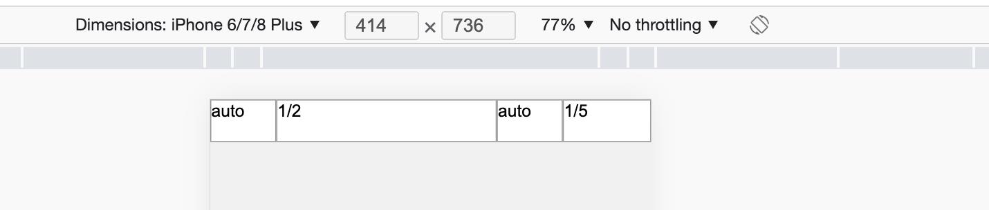
<template>
  <div id="app">
    <div class="demo">
      <div class="item item1">auto</div>
      <div class="item item2">1/2</div>
      <div class="item item3">auto</div>
      <div class="item item4">1/5</div>
    </div>
  </div>
</template>

<style lang="scss">
.demo
  display: flex;

.item
  height: 40px;
  background: #fff;
  border: 1px solid #999;
  flex: 1;

.item2
  flex: 0 0 50%;

.item4
  flex: 0 0 20%;

</style>
(4)三个固定

<template>
  <div id="app">
    <div class="demo">
      <div class="item item1">1/10</div>
      <div class="item item2">1/2</div>
      <div class="item item3">auto</div>
      <div class="item item4">1/5</div>
    </div>
  </div>
</template>

<style lang="scss">
.demo
  display: flex;

.item
  height: 40px;
  background: #fff;
  border: 1px solid #999;
  flex: 1;

.item1
  flex: 0 0 10%;

.item2
  flex: 0 0 50%;

.item4
  flex: 0 0 20%;

</style>
5.圣杯布局,如图所示

<template>
  <div class="demo">
    <div class="header">头部</div>
    <div class="body">
      <div class="left">left</div>
      <div class="center">center</div>
      <div class="right">right</div>
    </div>
    <div class="footer">底部</div>
  </div>
</template>

<style lang="scss">
.demo
  display: flex;
  flex-direction: column;
  height: 100vh;

.demo div
  flex: 1;

.body
  display: flex;

.header,.footer,.left,.right
  flex: 0 0 20%!important;


.header
  background: #999;

.body
  .left
    background: gainsboro;

  .center
    background: pink;

  .right
    background: peachpuff;


.footer
  background: #999;

</style>
6.输入框布局
有时需要在输入框的前部添加提示,或者后部添加按钮,如图所示:
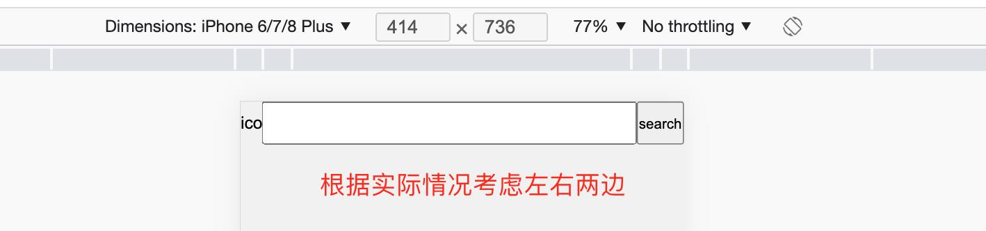
<template>
<div class="demo">
<span class="tip">icon</span>
<input type="text" name="" />
<button>search</button>
</div>
</template>
<style lang="scss">
.demo
display: flex;
height: 40px;
.tip
width: 20px;
height: 100%;
line-height: 40px;
text-align: center;
input