纯CSS实现网页悬浮菜单
Posted 水星记_
tags:
篇首语:本文由小常识网(cha138.com)小编为大家整理,主要介绍了纯CSS实现网页悬浮菜单相关的知识,希望对你有一定的参考价值。
前言
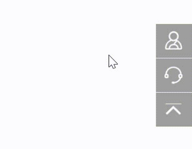
平时我们在浏览网页时,如下图的导航栏已经屡见不鲜了,当鼠标放上去时,右侧隐藏的内容就会慢慢平滑展开,非常美观且实用,那你知道这种效果是怎么实现的吗?下面我们就一起实践一下。
如图所示:
实现思路
- 首先我们需要把所有的导航栏通过
fixed属性定位到网页的右下角; - 设置
transition属性将所有导航栏添加平滑的过渡效果; - 利用
right属性将所有导航栏向右偏移; - 当鼠标触摸某一个导航栏时,运用
hover属性,将right的值设置为0px,配合之前说到的transition属性让其右侧内容平滑的展示出来即可。
话不多说,下面直接看源码
完整源码
<template>
  <div class="parentBox">
    <div class="contantsBox">
      <div>
        <span><img src="../assets/yuyue.png" /></span>
        <span>预约体验</span>
      </div>
      <div>
        <span><img src="../assets/kefu.png" /></span>
        <span>联系客服</span>
      </div>
      <div>
        <span><img src="../assets/fhdb.png" /></span>
        <span>回到顶部</span>
      </div>
    </div>
  </div>
</template>
<style lang="scss" scoped>
.parentBox
  height: 100%;
  background: gainsboro;
  overflow: hidden;
  overflow-y: auto;
  .contantsBox
    div
      transition: all 0.7s;
      position: fixed;
      right: -127px;
      width: 180px;
      background: rgba(96, 96, 96, 0.6);
      color: #fff;
      padding: 8px 10px;
      cursor: pointer;
      display: flex;
      align-items: center;
      span:last-child
        margin-left: 16px;

      img
        width: 32px;
        height: 32px;
        vertical-align: middle;


    div:nth-child(1)
      bottom: 197px;

    div:nth-child(2)
      bottom: 148px;

    div:nth-child(3)
      bottom: 100px;

    div:hover
      right: 0px;
      cursor: auto;
      span
        cursor: pointer;


    div:not(:last-child)
      border-bottom: 1px solid #fff;


// 隐藏浏览器滚动条
::-webkit-scrollbar
  display: none;

</style>
拓展延伸
当然,上面实现的操作只是一种展现形式,类似的功能在效果上可能大相径庭,接下来带大家一起看看下面这几个案例实现的效果。
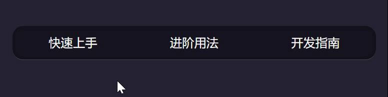
案例1
完整源码
<template>
  <div class="parentBox">
    <div class="menusBox">
      <p><span data-text='快速上手'>快速上手</span></p>
      <p><span data-text="进阶用法">进阶用法</span></p>
      <p><span data-text="开发指南">开发指南</span></p>
    </div>
  </div>
</template>
<style lang="less" scoped>
.parentBox
  padding: 50px;
  height: 100%;
  background: rgb(37, 34, 51);
  .menusBox
    background: rgba(0, 0, 0, 0.4);
    border-bottom: 1px solid rgba(241, 241, 241, 0.25);
    box-shadow: 0 0 8px rgba(0, 0, 0, 0.4) inset;
    border-radius: 16px;
    width: 30%;
    display: flex;
    justify-content: space-around;
    height: 50px;
    margin: 0 auto;
    overflow: hidden;
    p
      cursor: pointer;
      span
        text-transform: uppercase;
        color: #fff;
        margin-top: -50px;
        transition: 0.3s cubic-bezier(0.1, 0.1, 0.5, 1.4);

      span:before
        content: attr(data-text);
        /*直接使用data-text属性的值*/
        display: block;
        color: rgb(173, 255, 43);

      span:hover
        margin-top: 0;


    p *
      display: inline-block;
      font-size: 18px;
      line-height: 50px;


</style>
效果图
案例2
完整源码
<template>
  <div class="parentBox">
    <div class="navBox">
      <p>导航菜单</p>
      <ul class="menuBox">
        <li><span class="contnatBox">A</span></li>
        <li><span class="contnatBox">B</span></li>
        <li><span class="contnatBox">C</span></li>
        <li><span class="contnatBox">D</span></li>
        <li><span class="contnatBox">E</span></li>
        <li><span class="contnatBox">F</span></li>
        <li><span class="contnatBox">G</span></li>
        <li><span class="contnatBox">H</span></li>
        <li><span class="contnatBox">I</span></li>
      </ul>
    </div>
  </div>
</template>
<style lang="less" scoped>
.parentBox
  height: 100%;
  background: #74777b;
  padding: 100px 0;
  transform: translate3d(0, 0, 0);
  *:after,
  *:before
    -webkit-box-sizing: border-box;
    -moz-box-sizing: border-box;
    box-sizing: border-box;

  span
    color: rgba(255, 255, 255, 0.6);
    outline: none;
    text-decoration: none;
    -webkit-transition: 0.2s;
    transition: 0.2s;

  span:hover,
  span:focus
    cursor: pointer;
    color: #74777b;
    text-decoration: none;

  .navBox
    width: 150px;
    height: 150px;
    line-height: 150px;
    border-radius: 50%;
    background: #fff;
    margin: 70px auto;
    position: relative;
    cursor: pointer;
    text-align: center;
    font-size: 1.75em;
    font-weight: bold;
    color: cornflowerblue;
    transition: 0.24s 0.2s;
    .menuBox
      list-style: none;
      padding: 0;
      margin: 0;
      position: absolute;
      top: -75px;
      left: -75px;
      border: 150px solid transparent;
      cursor: default;
      border-radius: 50%;
      transform: scale(0);
      transition: transform 1.4s 0.07s;
      z-index: -1;

    .menuBox li
      position: absolute;
      top: -100px;
      left: -100px;
      transform-origin: 100px 100px;
      transition: all 0.5s 0.1s;

    .menuBox li span
      width: 45px;
      height: 45px;
      line-height: 45px;
      border-radius: 50%;
      background: #fff;
      position: absolute;
      font-size: 60%;
      color: cornflowerblue;
      transition: 0.6s;

    .menuBox li span:hover
      background: rgba(255, 255, 255, 0.7);


  .navBox:hover
    background: rgba(255, 255, 255, 0.8);


  .navBox:hover .menuBox
    transition: transform 0.4s 0.08s, z-index 0s 0.5s;
    transform: scale(1);
    z-index: 1;


  .navBox:hover .menuBox li
    transition: all 0.6s;


  .navBox:hover .menuBox li:nth-child(1)
    transition-delay: 0.02s;
    transform: rotate(85deg);


  .navBox:hover .menuBox li:nth-child(1) span
    transition-delay: 0.04s;
    transform: rotate(635deg);


  .navBox:hover .menuBox li:nth-child(2)
    transition-delay: 0.04s;
    transform: rotate(125deg);


  .navBox:hover .menuBox li:nth-child(2) span
    transition-delay: 0.08s;
    transform: rotate(595deg);


  .navBox:hover .menuBox li:nth-child(3)
    transition-delay: 0.06s;
    transform: rotate(165deg);


  .navBox:hover .menuBox li:nth-child(3) span
    transition-delay: 0.12s;
    transform: rotate(555deg);


  .navBox:hover .menuBox li:nth-child(4)
    transition-delay: 0.08s;
    transform: rotate(205deg);


  .navBox:hover .menuBox li:nth-child(4) span
    transition-delay: 0.16s;
    transform: rotate(515deg);


  .navBox:hover .menuBox li:nth-child(5)
    transition-delay: 0.1s;
    transform: rotate(245deg);


  .navBox:hover .menuBox li:nth-child(5) span
    transition-delay: 0.2s;
    transform: rotate(475deg);


  .navBox:hover .menuBox li:nth-child(6)
    transition-delay: 0.12s;
    transform: rotate(285deg);


  .navBox:hover .menuBox li:nth-child(6) span
    transition-delay: 0.24s;
    transform: rotate(435deg);


  .navBox:hover .menuBox li:nth-child(7)
    transition-delay: 0.14s;
    transform: rotate(325deg);


  .navBox:hover .menuBox li:nth-child(7) span
    transition-delay: 0.28s;
    transform: rotate(395deg);


  .navBox:hover .menuBox li:nth-child(8)
    transition-delay: 0.16s;
    transform: rotate(365deg);


  .navBox:hover .menuBox li:nth-child(8) span
    transition-delay: 0.32s;
    transform: rotate(355deg);


  .navBox:hover .menuBox li:nth-child(9)
    transition-delay: 0.18s;
    transform: rotate(405deg);


  .navBox:hover .menuBox li:nth-child(9) span
    transition-delay: 0.36s;
    transform: rotate(315deg);


</style>
效果图

以上是关于纯CSS实现网页悬浮菜单的主要内容,如果未能解决你的问题,请参考以下文章