python写入excel(xlswriter)--生成图表
Posted 张_俊_杰
tags:
篇首语:本文由小常识网(cha138.com)小编为大家整理,主要介绍了python写入excel(xlswriter)--生成图表相关的知识,希望对你有一定的参考价值。
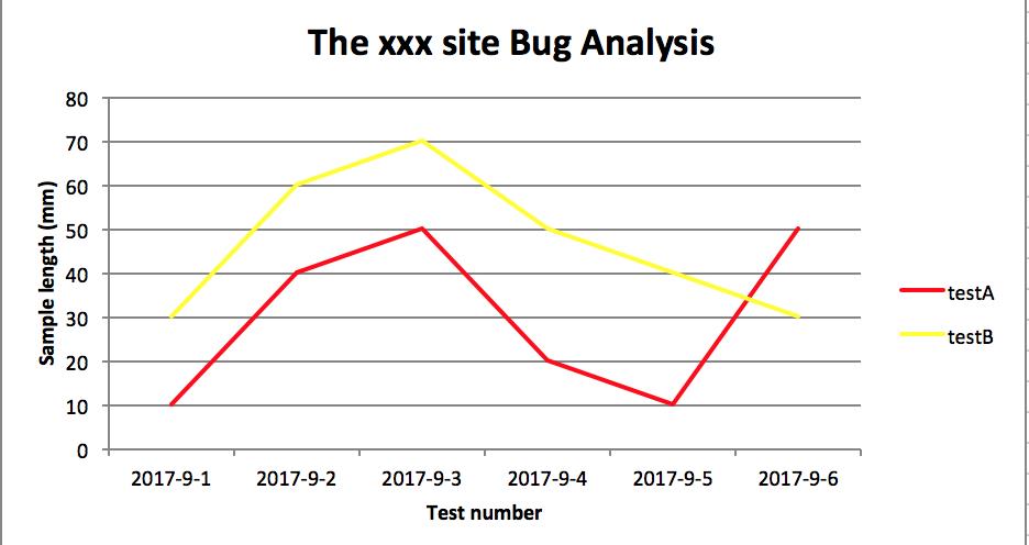
一、折线图:

# -*- coding:utf-8 -*-

import xlsxwriter

# 创建一个excel
workbook = xlsxwriter.Workbook("chart_line.xlsx")
# 创建一个sheet
worksheet = workbook.add_worksheet()
# worksheet = workbook.add_worksheet("bug_analysis")

# 自定义样式,加粗
bold = workbook.add_format({\'bold\': 1})

# --------1、准备数据并写入excel---------------
# 向excel中写入数据,建立图标时要用到
headings = [\'Number\', \'testA\', \'testB\']
data = [
    [\'2017-9-1\', \'2017-9-2\', \'2017-9-3\', \'2017-9-4\', \'2017-9-5\', \'2017-9-6\'],
    [10, 40, 50, 20, 10, 50],
    [30, 60, 70, 50, 40, 30],
]

# 写入表头
worksheet.write_row(\'A1\', headings, bold)

# 写入数据
worksheet.write_column(\'A2\', data[0])
worksheet.write_column(\'B2\', data[1])
worksheet.write_column(\'C2\', data[2])

# --------2、生成图表并插入到excel---------------
# 创建一个柱状图(line chart)
chart_col = workbook.add_chart({\'type\': \'line\'})

# 配置第一个系列数据
chart_col.add_series({
    # 这里的sheet1是默认的值,因为我们在新建sheet时没有指定sheet名
    # 如果我们新建sheet时设置了sheet名,这里就要设置成相应的值
    \'name\': \'=Sheet1!$B$1\',
    \'categories\': \'=Sheet1!$A$2:$A$7\',
    \'values\':   \'=Sheet1!$B$2:$B$7\',
    \'line\': {\'color\': \'red\'},
})

# 配置第二个系列数据
chart_col.add_series({
    \'name\': \'=Sheet1!$C$1\',
    \'categories\':  \'=Sheet1!$A$2:$A$7\',
    \'values\':   \'=Sheet1!$C$2:$C$7\',
    \'line\': {\'color\': \'yellow\'},
})

# 配置第二个系列数据(用了另一种语法)
# chart_col.add_series({
#     \'name\': [\'Sheet1\', 0, 2],
#     \'categories\': [\'Sheet1\', 1, 0, 6, 0],
#     \'values\': [\'Sheet1\', 1, 2, 6, 2],
#     \'line\': {\'color\': \'yellow\'},
# })

# 设置图表的title 和 x,y轴信息
chart_col.set_title({\'name\': \'The xxx site Bug Analysis\'})
chart_col.set_x_axis({\'name\': \'Test number\'})
chart_col.set_y_axis({\'name\':  \'Sample length (mm)\'})

# 设置图表的风格
chart_col.set_style(1)

# 把图表插入到worksheet并设置偏移
worksheet.insert_chart(\'A10\', chart_col, {\'x_offset\': 25, \'y_offset\': 10})

workbook.close()
效果图:
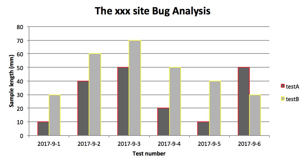
二、柱状图:
# -*- coding:utf-8 -*-

import xlsxwriter

# 创建一个excel
workbook = xlsxwriter.Workbook("chart_column.xlsx")
# 创建一个sheet
worksheet = workbook.add_worksheet()
# worksheet = workbook.add_worksheet("bug_analysis")

# 自定义样式,加粗
bold = workbook.add_format({\'bold\': 1})

# --------1、准备数据并写入excel---------------
# 向excel中写入数据,建立图标时要用到
headings = [\'Number\', \'testA\', \'testB\']
data = [
    [\'2017-9-1\', \'2017-9-2\', \'2017-9-3\', \'2017-9-4\', \'2017-9-5\', \'2017-9-6\'],
    [10, 40, 50, 20, 10, 50],
    [30, 60, 70, 50, 40, 30],
]

# 写入表头
worksheet.write_row(\'A1\', headings, bold)

# 写入数据
worksheet.write_column(\'A2\', data[0])
worksheet.write_column(\'B2\', data[1])
worksheet.write_column(\'C2\', data[2])

# --------2、生成图表并插入到excel---------------
# 创建一个柱状图(column chart)
chart_col = workbook.add_chart({\'type\': \'column\'})

# 配置第一个系列数据
chart_col.add_series({
    # 这里的sheet1是默认的值,因为我们在新建sheet时没有指定sheet名
    # 如果我们新建sheet时设置了sheet名,这里就要设置成相应的值
    \'name\': \'=Sheet1!$B$1\',
    \'categories\': \'=Sheet1!$A$2:$A$7\',
    \'values\':   \'=Sheet1!$B$2:$B$7\',
    \'line\': {\'color\': \'red\'},
})

# 配置第二个系列数据(用了另一种语法)
chart_col.add_series({
    \'name\': \'=Sheet1!$C$1\',
    \'categories\':  \'=Sheet1!$A$2:$A$7\',
    \'values\':   \'=Sheet1!$C$2:$C$7\',
    \'line\': {\'color\': \'yellow\'},
})

# 配置第二个系列数据(用了另一种语法)
# chart_col.add_series({
#     \'name\': [\'Sheet1\', 0, 2],
#     \'categories\': [\'Sheet1\', 1, 0, 6, 0],
#     \'values\': [\'Sheet1\', 1, 2, 6, 2],
#     \'line\': {\'color\': \'yellow\'},
# })

# 设置图表的title 和 x,y轴信息
chart_col.set_title({\'name\': \'The xxx site Bug Analysis\'})
chart_col.set_x_axis({\'name\': \'Test number\'})
chart_col.set_y_axis({\'name\':  \'Sample length (mm)\'})

# 设置图表的风格
chart_col.set_style(1)

# 把图表插入到worksheet以及偏移
worksheet.insert_chart(\'A10\', chart_col, {\'x_offset\': 25, \'y_offset\': 10})

workbook.close()
效果图:
PS:
其实前面两个图只变动一点:把 line 个性为 column
chart_col = workbook.add_chart({\'type\': \'column\'})
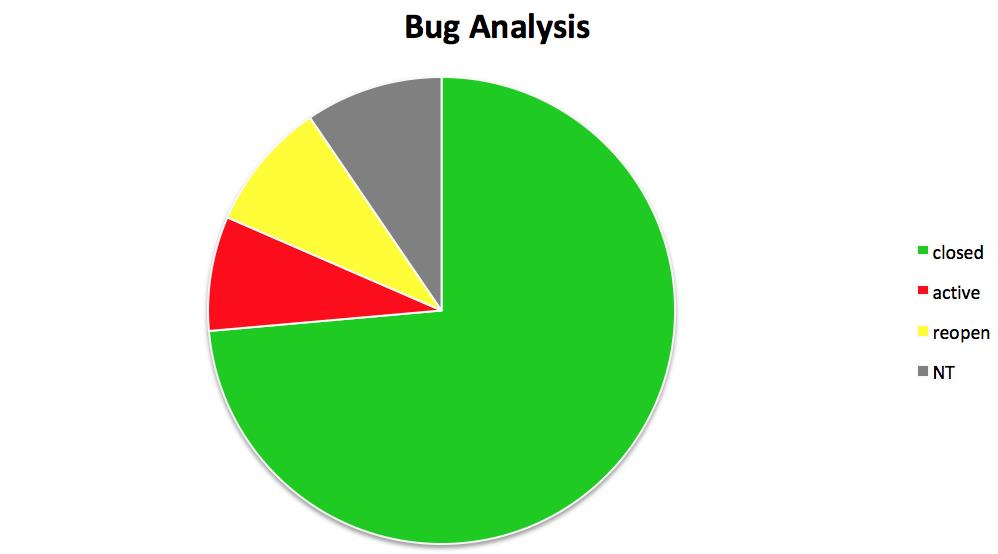
三、饼图:
# -*- coding:utf-8 -*-

import xlsxwriter

# 创建一个excel
workbook = xlsxwriter.Workbook("chart_pie.xlsx")
# 创建一个sheet
worksheet = workbook.add_worksheet()

# 自定义样式,加粗
bold = workbook.add_format({\'bold\': 1})

# --------1、准备数据并写入excel---------------
# 向excel中写入数据,建立图标时要用到
data = [
    [\'closed\', \'active\', \'reopen\', \'NT\'],
    [1012, 109, 123, 131],
]

# 写入数据
worksheet.write_row(\'A1\', data[0], bold)
worksheet.write_row(\'A2\', data[1])

# --------2、生成图表并插入到excel---------------
# 创建一个柱状图(pie chart)
chart_col = workbook.add_chart({\'type\': \'pie\'})

# 配置第一个系列数据
chart_col.add_series({
    \'name\': \'Bug Analysis\',
    \'categories\': \'=Sheet1!$A$1:$D$1\',
    \'values\': \'=Sheet1!$A$2:$D$2\',
    \'points\': [
        {\'fill\': {\'color\': \'#00CD00\'}},
        {\'fill\': {\'color\': \'red\'}},
        {\'fill\': {\'color\': \'yellow\'}},
        {\'fill\': {\'color\': \'gray\'}},
    ],

})

# 设置图表的title 和 x,y轴信息
chart_col.set_title({\'name\': \'Bug Analysis\'})

# 设置图表的风格
chart_col.set_style(10)

# 把图表插入到worksheet以及偏移
worksheet.insert_chart(\'B10\', chart_col, {\'x_offset\': 25, \'y_offset\': 10})
workbook.close()
效果图:
参考资料:
以上是关于python写入excel(xlswriter)--生成图表的主要内容,如果未能解决你的问题,请参考以下文章