Python 金融数据可视化(两列数据的提取//分别画//双坐标轴//双图//两种不同的图)
Posted 嘟嘟小冰
tags:
篇首语:本文由小常识网(cha138.com)小编为大家整理,主要介绍了Python 金融数据可视化(两列数据的提取//分别画//双坐标轴//双图//两种不同的图)相关的知识,希望对你有一定的参考价值。
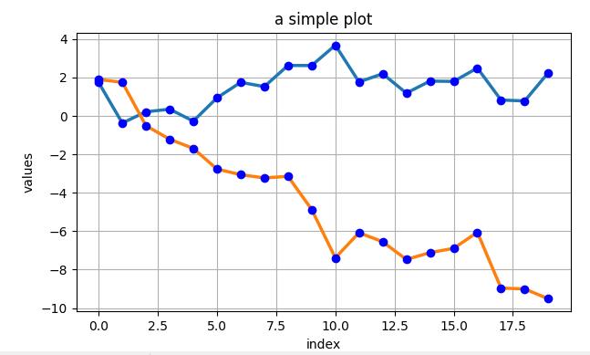
import matplotlib as mpl
import numpy as np
import matplotlib.pyplot as plt

np.random.seed(2000)
y = np.random.standard_normal((20,2))
# print(y)

\'\'\'
不同的求和
print(y.cumsum())
print(y.sum(axis=0))
print(y.cumsum(axis=0))
\'\'\'

# 绘图
plt.figure(figsize=(7,4))
plt.plot(y.cumsum(axis=0),linewidth=2.5)
plt.plot(y.cumsum(axis=0),\'bo\')

plt.grid(True)
plt.axis("tight")

plt.xlabel(\'index\')
plt.ylabel(\'values\')
plt.title(\'a simple plot\')

plt.show()
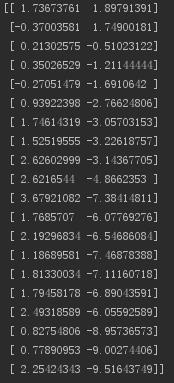
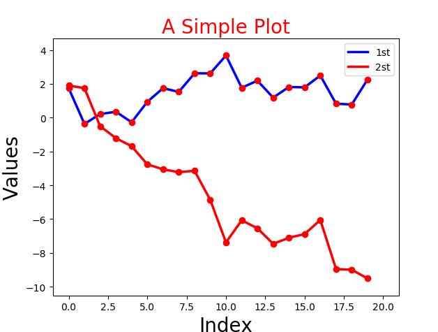
2.下面分别提取两组数据,进行绘图。
import matplotlib as mpl
import numpy as np
import matplotlib.pyplot as plt

np.random.seed(2000)
date = np.random.standard_normal((20,2))
y = date.cumsum(axis=0)

print(y)

# 重点下面两种情况的区别
print(y[1])      # 取得是 第1行的数据 [-0.37003581  1.74900181]
print(y[:,0])    # 取得是 第1列的数据 [ 1.73673761 -0.37003581  0.21302575  0.35026529 ...

# 绘图
plt.plot(y[:,0],lw=2.5,label="1st",color=\'blue\')
plt.plot(y[:,1],lw=2.5,label="2st",color=\'red\')
plt.plot(y,\'ro\')

# 添加细节
plt.title("A Simple Plot",size=20,color=\'red\')
plt.xlabel(\'Index\',size=20)
plt.ylabel(\'Values\',size=20)

# plt.axis(\'tight\')
plt.xlim(-1,21)
plt.ylim(np.min(y)-1,np.max(y)+1)

# 添加图例
plt.legend(loc=0)

plt.show()
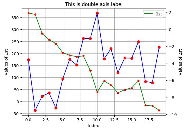
3.双坐标轴。
import matplotlib as mpl
import numpy as np
import matplotlib.pyplot as plt

np.random.seed(2000)
date = np.random.standard_normal((20,2))
y = date.cumsum(axis=0)

y[:,0]=y[:,0]*100

fig,ax1 = plt.subplots()
plt.plot(y[:,0],\'b\',label="1st")
plt.plot(y[:,0],\'ro\')

plt.grid(True)
plt.axis(\'tight\')
plt.xlabel("Index")
plt.ylabel(\'Values of 1st\')
plt.title("This is double axis label")

plt.legend(loc=0)

ax2=ax1.twinx()
plt.plot(y[:,1],\'g\',label="2st")
plt.plot(y[:,1],\'r*\')
plt.ylabel("Values of 2st")
plt.legend(loc=0)

plt.show()
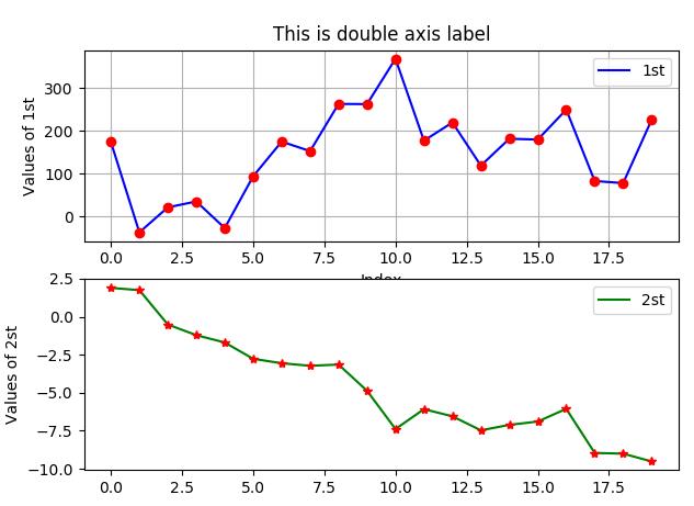
4. 分为两个图绘画。
import matplotlib as mpl
import numpy as np
import matplotlib.pyplot as plt

np.random.seed(2000)
date = np.random.standard_normal((20,2))
y = date.cumsum(axis=0)

y[:,0]=y[:,0]*100

plt.figure(figsize=(7,5))       # 确定图片大小
plt.subplot(211)                # 确定第一个图的位置 (行,列,第几个)两行一列第一个图

plt.plot(y[:,0],\'b\',label="1st")
plt.plot(y[:,0],\'ro\')

plt.grid(True)
plt.axis(\'tight\')
plt.xlabel("Index")
plt.ylabel(\'Values of 1st\')
plt.title("This is double axis label")

plt.legend(loc=0)

plt.subplot(212)               # 确定第一个图的位置
plt.plot(y[:,1],\'g\',label="2st")
plt.plot(y[:,1],\'r*\')
plt.ylabel("Values of 2st")
plt.legend(loc=0)

plt.show()
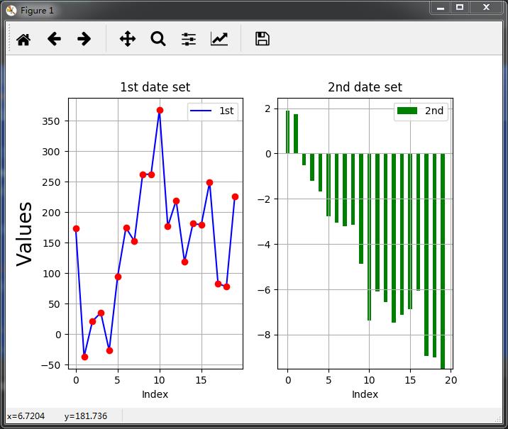
5.在两个图层中绘制两种不同的图(直线图立方图)
import matplotlib as mpl
import numpy as np
import matplotlib.pyplot as plt

np.random.seed(2000)
date = np.random.standard_normal((20,2))
y = date.cumsum(axis=0)

y[:,0]=y[:,0]*100

plt.figure(figsize=(7,5))       # 确定图片大小
plt.subplot(121)                # 确定第一个图的位置

plt.plot(y[:,0],\'b\',label="1st")
plt.plot(y[:,0],\'ro\')

plt.grid(True)
plt.axis(\'tight\')
plt.xlabel("Index")
plt.ylabel(\'Values\',size=20)
plt.title("1st date set")

plt.legend(loc=0)

plt.subplot(122)               # 确定第一个图的位置
plt.bar(np.arange(len(y[:,1])),y[:,1],width = 0.5,color=\'g\',label="2nd")  # 直方图的画法
plt.grid(True)
plt.xlabel("Index")
plt.title(\'2nd date set\')
plt.legend(loc=0)

plt.show()
以上是关于Python 金融数据可视化(两列数据的提取//分别画//双坐标轴//双图//两种不同的图)的主要内容,如果未能解决你的问题,请参考以下文章