vue实现修改title提示框-默认样式两种方式
Posted 水香木鱼
tags:
篇首语:本文由小常识网(cha138.com)小编为大家整理,主要介绍了vue实现修改title提示框-默认样式两种方式相关的知识,希望对你有一定的参考价值。
博主介绍
📢点击下列内容可跳转对应的界面,查看更多精彩内容!
文章目录
简介:这是一篇有关【vue实现修改title提示框-默认样式【两种方式】】的文章,博主用
最精简的语言去表达给前端读者们。
1、方式一:使用 &:hover:after、&:after 修改样式
鼠标悬浮展示内容

Ⅰ、html
    <div class="box" v-for="item in list" :key="item.id">
      <!-- 判断名称是否超过3位,如果超过3位,第四位后显示为省略号 item.name.length > 3 ? item.name.slice(0, 3) + "..." : item.name -->
      <p class="title" :data-title="item.name">
         item.name.length > 3 ? item.name.slice(0, 3) + "..." : item.name
      </p>
    </div>
Ⅱ、css
/*修改提示框*/
.title[data-title]
  position: relative;
  // 样式:
  &:hover:after
    opacity: 1;
    transition: all 0.1s ease 0.5s;
    visibility: visible;

  // 背景的样式 位置 字体等
  &:after
    content: attr(data-title);
    position: absolute;
    padding: 1px 10px;
    left: 50px;
    bottom: -1.5em;
    border-radius: 4px;
    color: #fff;
    background-color: rgba(80, 79, 79, 0.8);
    box-shadow: 0 0 4px rgba(0, 0, 0, 0.16);
    font-size: 14px;
    white-space: nowrap;
    visibility: hidden;
    opacity: 0;
2、方式二:封装提示框组件
Ⅰ、tooltip.vue
<!--提示框组件-->
<template>
  <transition name="fade">
    <div
      ref="tooltip"
      class="m-tooltip"
      v-show="showTooltip"
      @mouseenter="onShow"
      @mouseleave="onHide"
      :style="`max-width: $maxWidthpx; top: $toppx; left: $leftpx;`"
    >
      <div class="u-tooltip-content">
        <slot>暂无内容</slot>
      </div>
      <!-- 底部三角形 -->
      <div class="u-tooltip-arrow"></div>
    </div>
  </transition>
</template>
<script>
export default
  name: "Tooltip",
  props:
    maxWidth:
      // 提示框内容最大宽度
      type: Number,
      default: 120,
    ,
  ,
  data()
    return
      showTooltip: false,
      hideTimer: null,
      top: 0, // 提示框top定位
      left: 0, // 提示框left定位
    ;
  ,
  methods:
    show(target)
      clearTimeout(this.hideTimer);
      const rect = target.getBoundingClientRect();
      const targetTop = rect.top + window.pageYOffset;
      const targetLeft = rect.left + window.pageXOffset;
      const targetWidth = rect.width;
      this.showTooltip = true;
      this.$nextTick(() =>
        const tipWidth = this.$refs.tooltip.offsetWidth; // 提示框元素宽度
        const tipHeight = this.$refs.tooltip.offsetHeight; // 提示框元素高度
        this.top = targetTop - tipHeight;
        this.left = targetLeft - (tipWidth - targetWidth) / 2;
      );
    ,
    onShow()
      clearTimeout(this.hideTimer);
      this.showTooltip = true;
    ,
    onHide()
      this.hideTimer = setTimeout(() =>
        this.showTooltip = false;
      , 100);
    ,
  ,
;
</script>
<style lang="less" scoped>
// 渐变过渡效果
.fade-enter-active,
.fade-leave-active
  transition: all 0.3s;

.fade-enter,
.fade-leave-to
  opacity: 0;
  transform: scale(0.8); // 缩放变换
  -ms-transform: scale(0.8); /* IE 9 */
  -webkit-transform: scale(0.8); /* Safari and Chrome */

// 滑动渐变过渡效果
.slide-fade-enter-active
  transition: all 0.3s ease;

.slide-fade-leave-active
  transition: all 0.3s ease;

.slide-fade-enter,
.slide-fade-leave-to
  transform: translateY(6px); // 滑动变换
  -ms-transform: translateY(6px); /* IE 9 */
  -webkit-transform: translateY(6px); /* Safari and Chrome */
  opacity: 0;

.m-tooltip
  position: absolute;
  z-index: 999;
  padding-bottom: 6px;
  .u-tooltip-content
    padding: 10px;
    margin: 0 auto;
    word-break: break-all;
    word-wrap: break-word;
    border-radius: 4px;
    font-weight: 400;
    font-size: 14px;
    background: #ffffff;//背景颜色
    box-shadow: 0px 2px 8px 0px rgba(0, 121, 221, 0.3);//修改阴影显示

  .u-tooltip-arrow
    margin: 0 auto;
    width: 0;
    height: 0;
    border-left: 2px solid transparent;
    border-right: 2px solid transparent;
    border-top: 4px solid #fff;


</style>
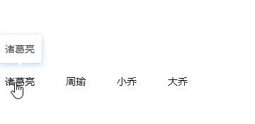
Ⅱ、页面使用
mouseentermouseleave
<template>
  <div>
    <div
      class="u-tag"
      @mouseenter="onShowTip($event, item.name)"
      @mouseleave="onHideTip"
      v-for="item in list"
      :key="item.id"
    >
       item.name
    </div>
    <!-- 提示框组件 -->
    <Tooltip ref="tooltip" :maxWidth="240">
      <div class="u-content" v-if="content"> content </div>
    </Tooltip>
  </div>
</template>
<script>
import Tooltip from "../components/Tooltip";//引入组件
export default
  components:
    Tooltip,
  ,
  data()
    return
      list: [

          id: 1,
          name: "诸葛亮",
        ,

          id: 2,
          name: "周瑜",
        ,

          id: 3,
          name: "小乔",
        ,

          id: 4,
          name: "大乔",
        ,
      ],
      content: "",
    ;
  ,
  methods:
    onShowTip(e, content)
      this.content = content;
      this.$refs.tooltip.show(e.target);
    ,
    onHideTip()
      this.$refs.tooltip.onHide();
    ,
  ,
;
</script>
<style lang="less" scoped>
.u-content
  // 自定义设置tooltip提示框内容样式
  color: #333;

.u-tag
  margin-top: 200px;
  margin-right: 20px;
  display: inline-block;
  padding: 6px 12px;
  border-radius: 15px;
  height: 20px;
  font-size: 14px;
  font-weight: 400;
  line-height: 20px;
  cursor: pointer;

</style>
相关推荐
⭐前端vue实现卡片翻转效果【css3实现】
⭐前端css3实现角标【二维式与立体式角标实现】
⭐前端vue项目最强优化-美化浏览器右侧滚动条样式与el-scrollbar
⭐vue实现隐藏浏览器右侧滚动条功能
⭐vue封装全屏组件【无插件操作】
以上是关于vue实现修改title提示框-默认样式两种方式的主要内容,如果未能解决你的问题,请参考以下文章