React-Native之flexbox布局篇
Posted showCar
tags:
篇首语:本文由小常识网(cha138.com)小编为大家整理,主要介绍了React-Native之flexbox布局篇相关的知识,希望对你有一定的参考价值。
这篇博客稍微讲解下React-Native中的布局。比较简单。RN的而布局是用css中的flexbox布局,所以布局起来与android传统的布局样式有点像。接下来就结合图片一起来看看。
常用属性讲解
RN的flexbox主要有以下几个属性alignItems,alignSelf,flex,flexDirection,flexWrap,justifyContent。
flexDirection
该属性用于指定主轴的方向。即指定子view的布局方向。它有两个值可设置。
- row:横向布局。
- column:纵向布局。
这个属性很简单,先看row的代码段:
render:function()
return(
<View style=styles.flexStyle>
<View style= styles.flexSub/>
<View style= styles.flexSub/>
<View style= styles.flexSub/>
<View style= styles.flexSub/>
</View>
);
…………
var styles = StyleSheet.create(
flexStyle:
height:600,
flexDirection:'row',
,
flexSub:
flex:1,
height:300,
backgroundColor:'#333333',
marginRight:10,
,
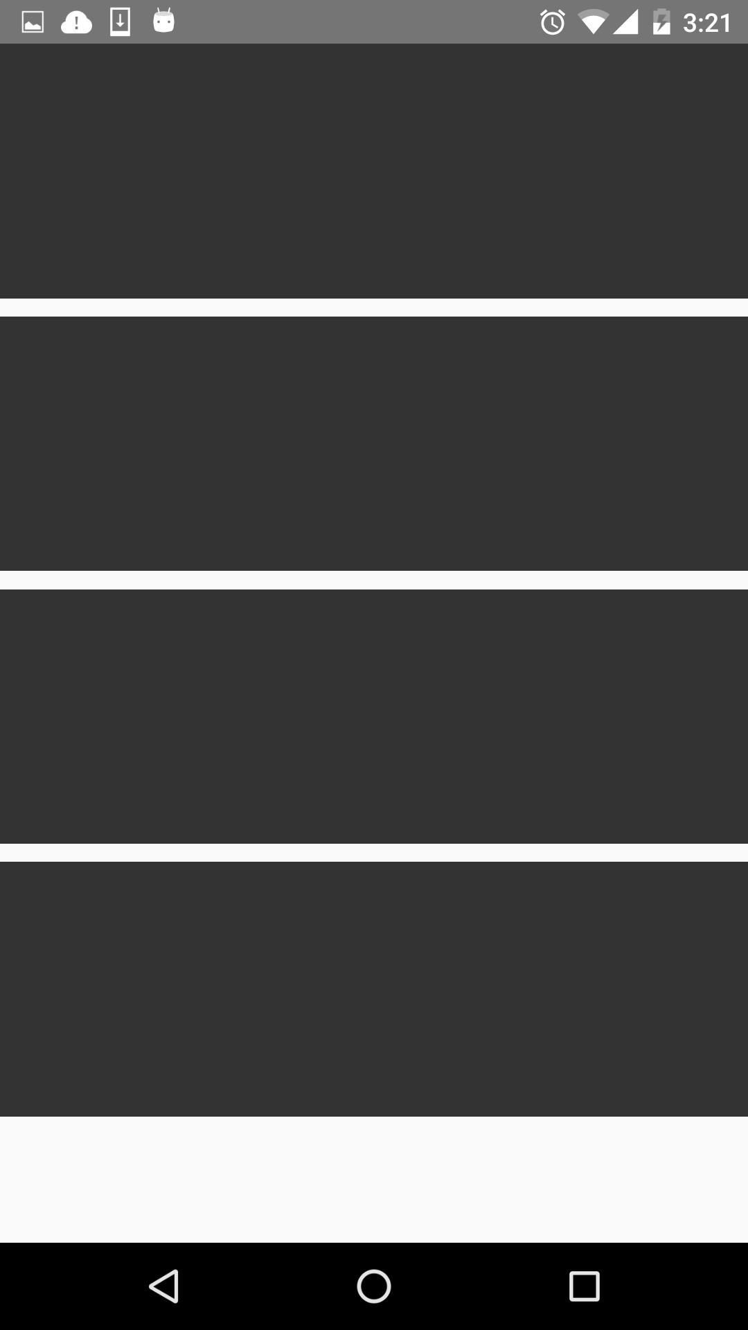
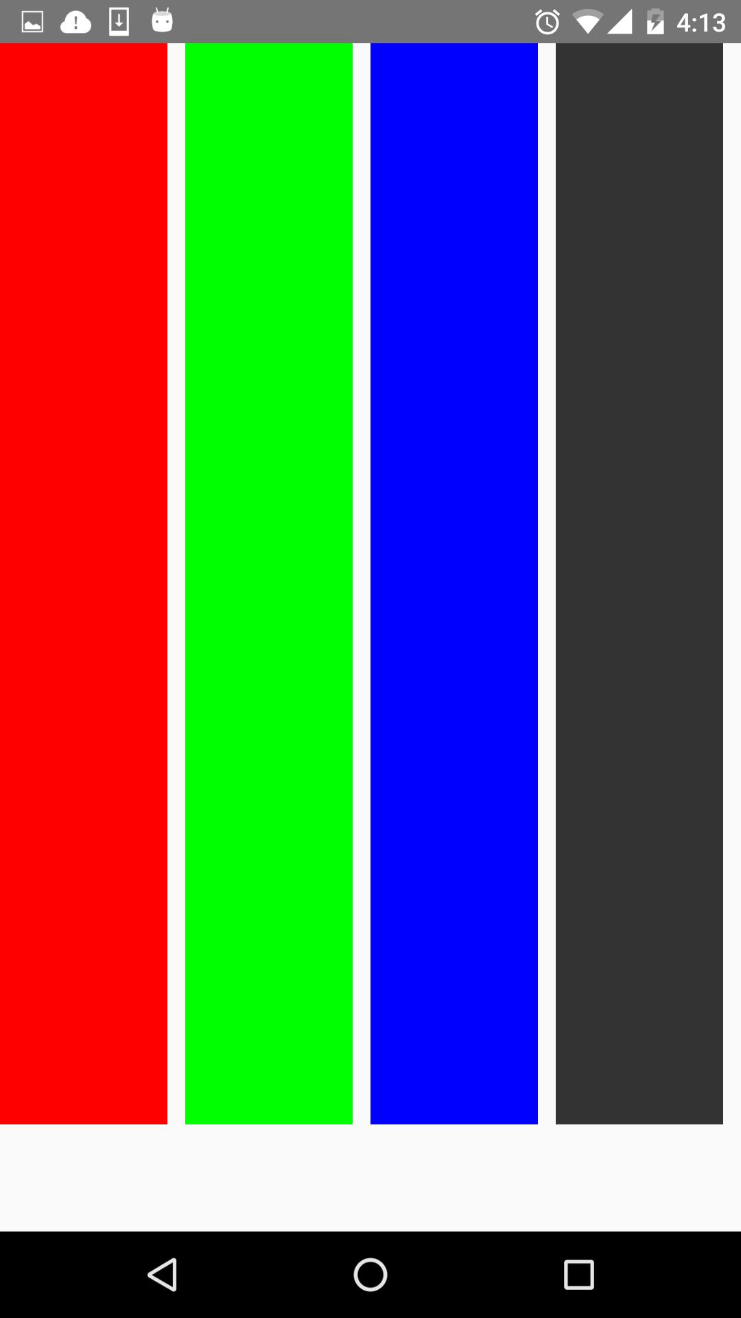
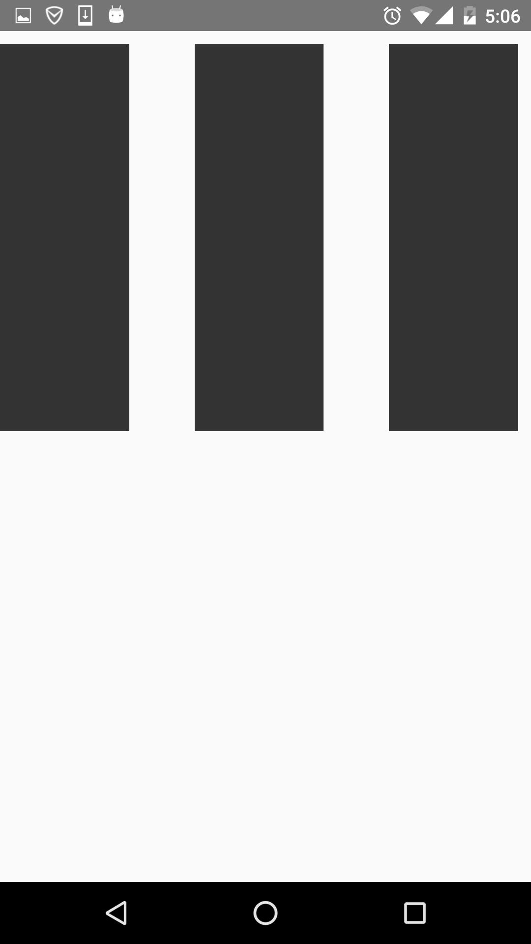
)一个View里有四个小View,小View的底色是黑的,看下效果图:

可以看到,四个view横向的进行布局。那改成column呢,样式修改如下:
var styles = StyleSheet.create(
   flexStyle:
    height:600,
    flexDirection:'column',
  ,
  flexSub:
    flex:1,
    height:100,
      backgroundColor:'#333333',
      marginBottom:10,
  ,
)
看下效果图:
就是纵向布局。
alignItems
用于定义子组件在垂直方向上的对齐方式。有四个属性可设置:flex-start,flex-end,center,stretch。
- flex-start:与父组件的顶部对齐。
- flex-end:与父组件的底部对齐。
- center:处于父容器的中间位置。
- stretch:竖直上填充整个容器。
首先来看下flex-start,顺便改了下子组件的颜色,代码如下:
return(
    <View style=styles.flexStyle>
    <View style= styles.flexSelf1/>
    <View style= styles.flexSelf2/>
    <View style= styles.flexSelf3/>
    <View style= styles.flexSelf4/>
    </View>
  );
  ……
var styles = StyleSheet.create(

  flexStyle:
    height:600,
    flexDirection: 'row',
      alignItems:'flex-start',
  ,
  flexSub:
    flex:1,
    height:300,
      backgroundColor:'#333333',
      marginBottom:10,
  ,
  flexSelf1:
    flex:1,
    height:300,
      backgroundColor:'#ff0000',
      marginRight:10,
  ,
  flexSelf2:
    flex:1,
    height:300,
      backgroundColor:'#00ff00',
      marginRight:10,
  ,
  flexSelf3:
    flex:1,
      height:300,
      backgroundColor:'#0000ff',
      marginRight:10,
  ,
  flexSelf4:
    flex:1,
    height:300,
      backgroundColor:'#333333',
      marginRight:10,

);
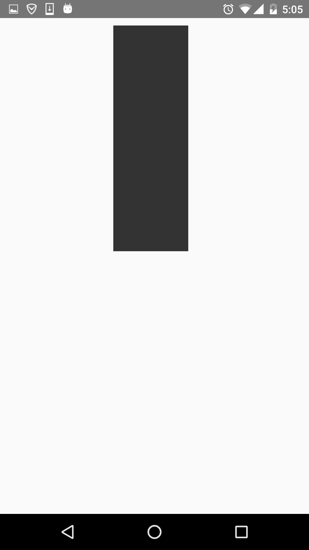
看下效果图:
就是和父容器顶部对齐。
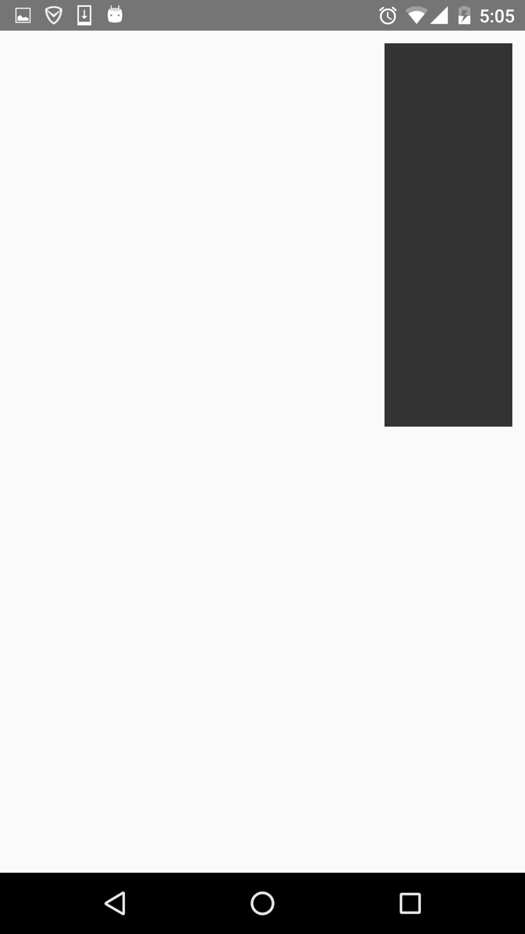
看下flex-end属性,代码就不贴出来了,只要改alignItems属性就好了。效果图如下:
可以看到,和底部对齐了。
再看下center,这个可以说是用的最多的属性,它会让子组件位于父容器的中间位置,看下效果图:
stretch就是竖直填充,前提是子组件没有设置height属性。看下效果图:
justifyContent
有竖直就水平。justifyContent和alignItems是相对的。它有五个属性可以设置,分别是flex-start,flex-end,center,space-between,space-around。
* flex-start:伸缩项目与父容器左端靠齐。
* flex-end:与父容器右端靠齐。
* center:水平居中。
* space-between:第一个子组件位于父容器左端,最后一个子组件位于父容器最右端。然后平均分配在父容器水平方向上。
* space-around:所有子组件平均分配在父容器的水平方向上,左右都有留空隙。
先看水平居中(center)的,先看下代码:
return(
<View style=styles.flexStyle>
<View style= styles.flexSub/>
</View>
);
……
var styles = StyleSheet.create(
flexStyle:
height:600,
width:400,
flexDirection: 'row',
alignItems:'center',
justifyContent:'center',
,
flexSub:
width:100,
height:300,
backgroundColor:'#333333',
marginBottom:10,
,
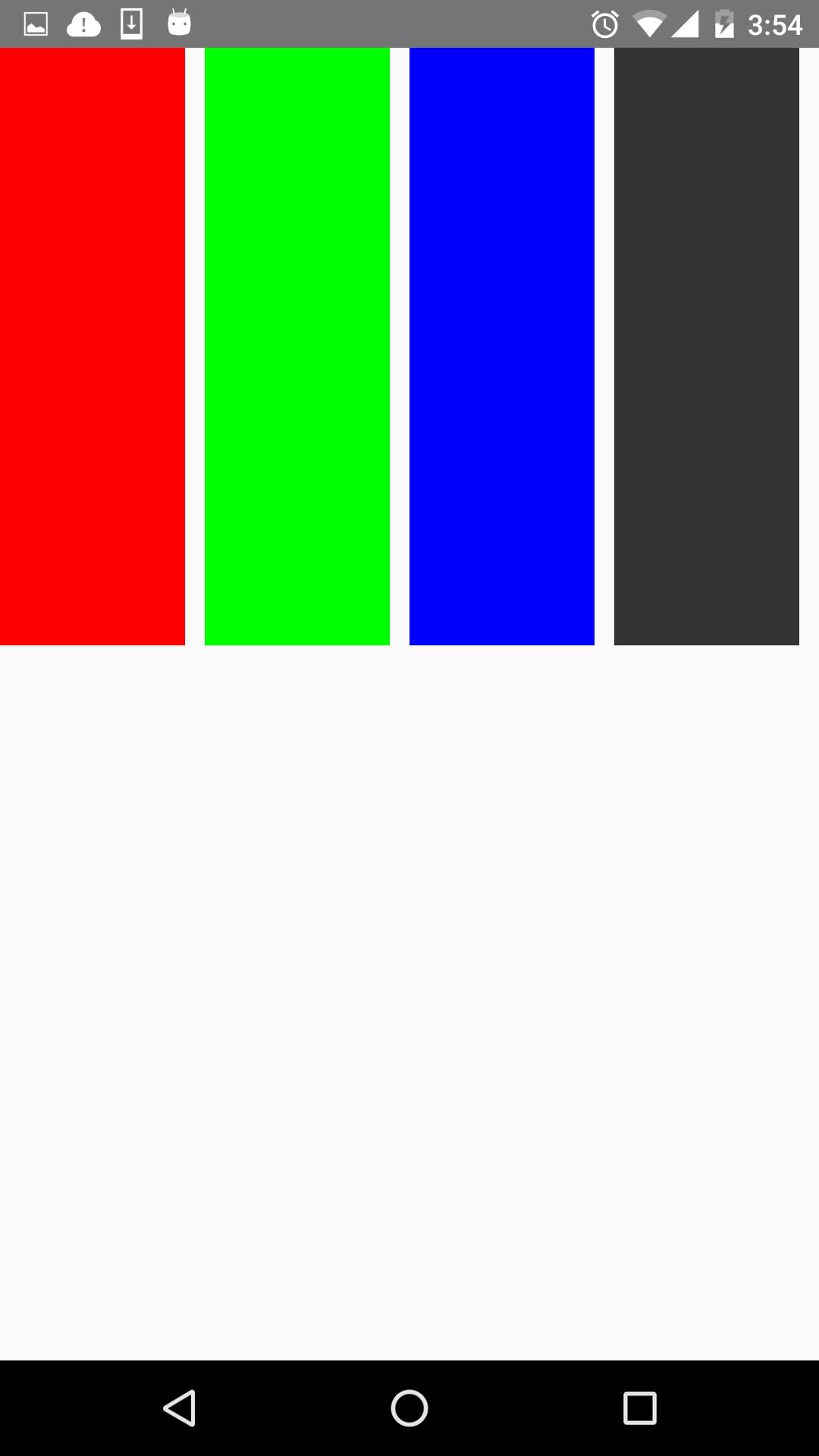
);父容器设置了justifyContent:’center’属性,所以理论上子组件应该会水平剧中,来看下是否正确。如下:
justifyContent:’flex-start’,水平居左:
justifyContent:’flex-end’,水平居右:
这些都挺简单的,来看下space-between和space-around的区别,先看下space-between的效果图:
可以看到它左右都不留空隙。均匀分布。
再看下space-around的效果图:

它左右都留有空隙,是平均的位于整个界面的水平方向上。
alignSelf
该属性用来设置单独组件的竖直对齐方式,与alignItem有点像。有五个属性可以设置,auto,flex-start,flex-end,center,streth。
* auto:按照自身设置的宽高来显示,如果没设置,效果跟streth一样。
* flex-start:与父容器顶部对齐。
* flex-end:与父容器底部对齐。
* center:位于垂直位置。
* streth:垂直拉伸。
这个用法跟上面的很像,只是它用于单个组件,如本例子的子View中,看下代码:
return(
<View style=styles.flexStyle>
<View style= styles.flexSelf1/>
<View style= styles.flexSelf2/>
<View style= styles.flexSelf3/>
<View style= styles.flexSelf4/>
</View>
);
……
var styles = StyleSheet.create(
flexStyle:
height:600,
flexDirection:'row',
,
flexSelf1:
flex:1,
alignSelf:'flex-start',
height:300,
backgroundColor:'#ff0000',
marginRight:10,
,
flexSelf2:
flex:1,
alignSelf:'flex-end',
height:300,
backgroundColor:'#00ff00',
marginRight:10,
,
flexSelf3:
flex:1,
alignSelf:'stretch',
backgroundColor:'#0000ff',
marginRight:10,
,
flexSelf4:
flex:1,
alignSelf:'auto',
height:300,
backgroundColor:'#333333',
marginRight:10,
,
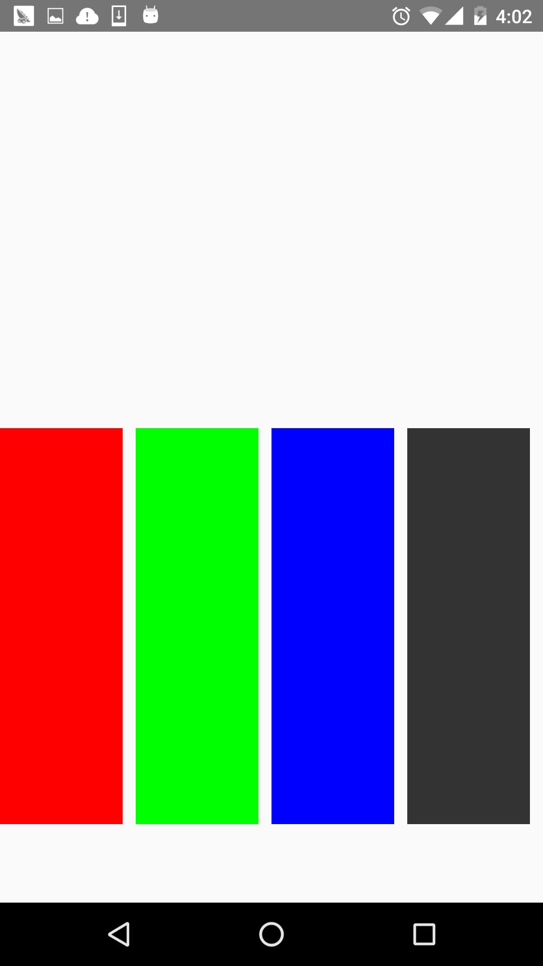
)以上几个子View设置了不同的样式 ,看下效果图:
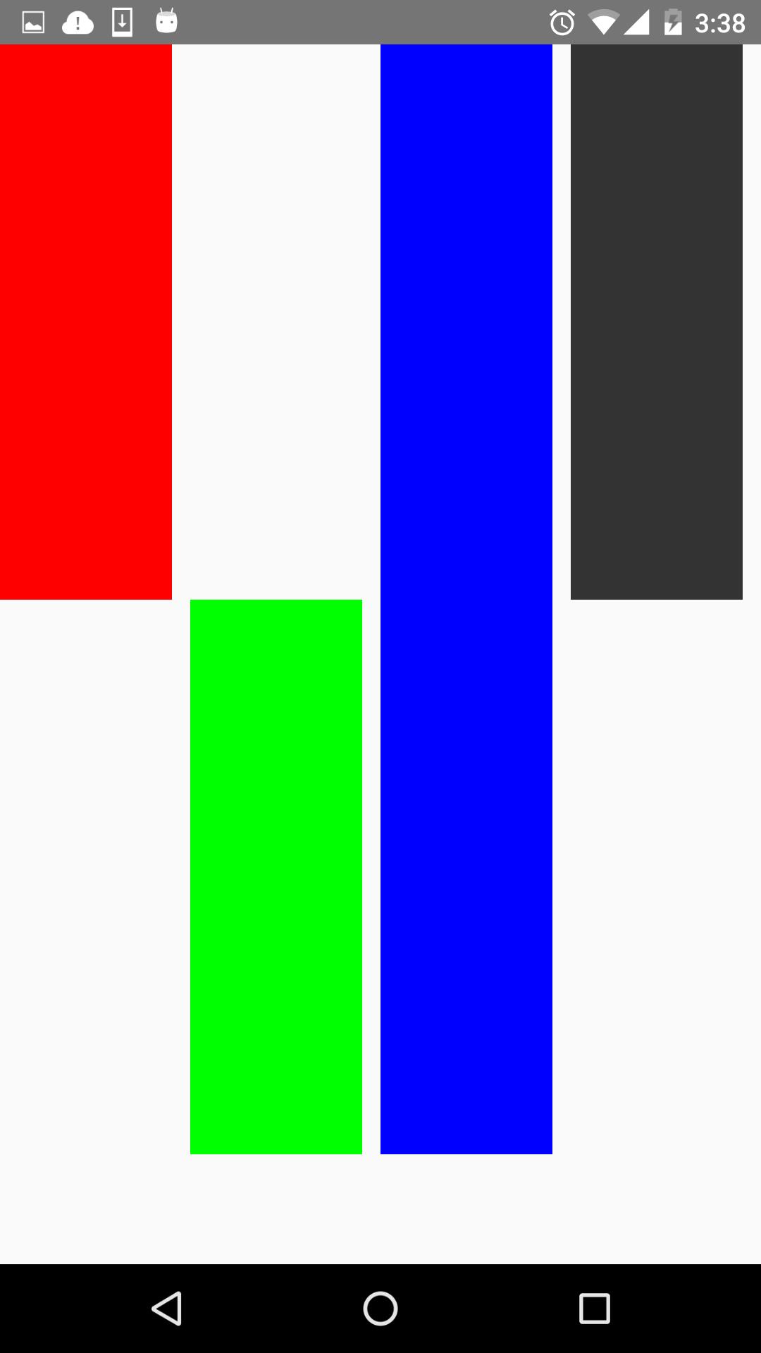
看到了,flex-start就是顶部对齐,flex-end就是与底部对齐。第三个View是streth,垂直拉伸了。第四个View是auto,因为设置了高度,所以显示如图所示。没有显示center,但它的效果可想而知,就不再演示啦。
flex
flex指设置伸缩项目的伸缩样式,可以把它类比成android中的weight属性。
看一个代码就清楚它的用法了。
return(
<View style=styles.flexStyle>
<View style= styles.flexSelf1/>
<View style= styles.flexSelf1/>
<View style= styles.flexSelf2/>
<View style= styles.flexSelf3/>
</View>
);
……
var styles = StyleSheet.create(
flexStyle:
height:600,
flexDirection: 'row',
flex:1,
,
flexSub:
height:300,
backgroundColor:'#333333',
marginBottom:10,
,
flexSelf1:
flex:1,
backgroundColor:'#ff0000',
marginRight:10,
,
flexSelf2:
flex:2,
backgroundColor:'#00ff00',
marginRight:10,
,
flexSelf3:
flex:4,
backgroundColor:'#0000ff',
marginRight:10,
,
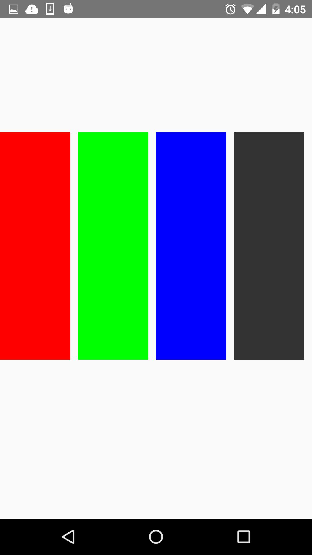
);效果图如下:
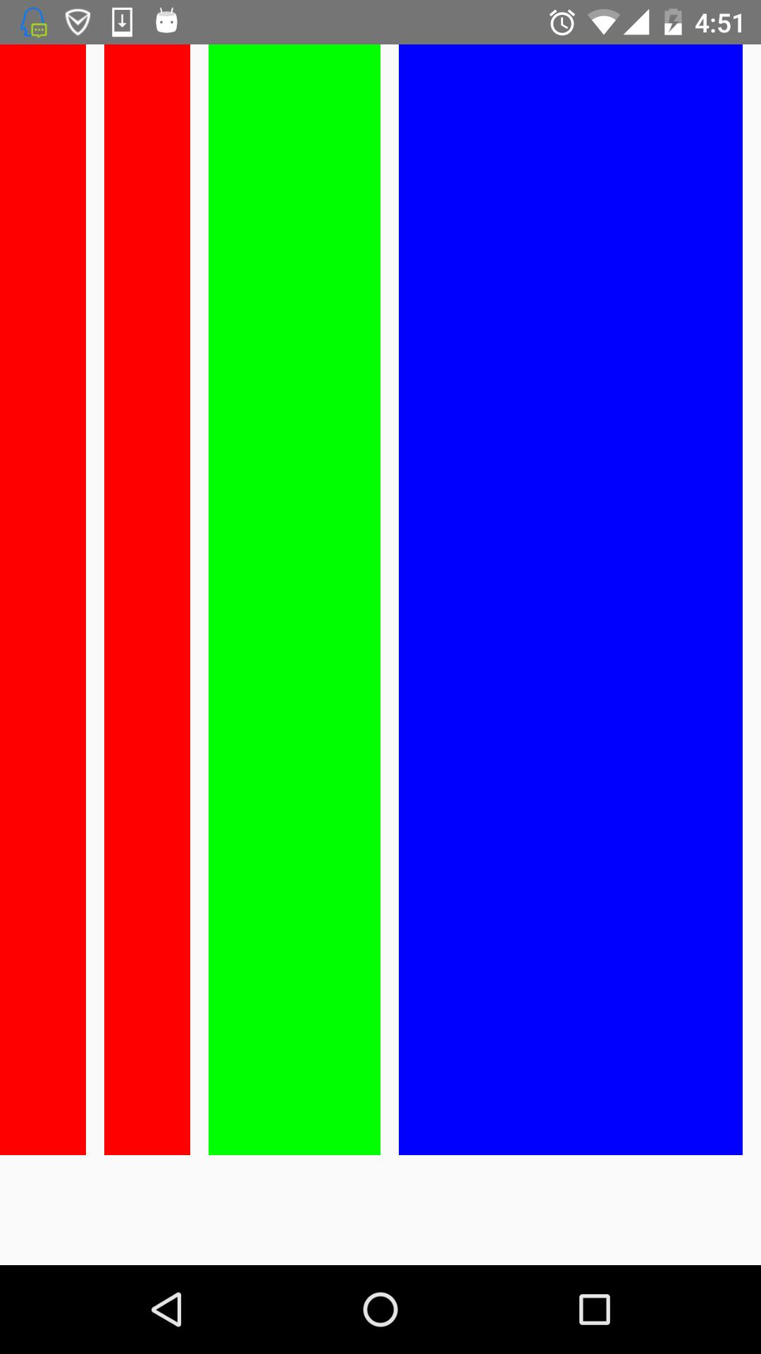
可以看到,flex为2的组件宽度为flex为1宽度的两倍,flex为4组件宽度则为flex为1的组件宽度的4倍。
flexWrap
其实这些属性都是CSS原有的属性,只是RN只支持了部分的属性。flexWrap用于设置是否可换行,有两个属性可设置nowrap和wrap。
- nowrap:即使空间不够也不换行。
- wrap:空间不够的话自动换行。
如设置成wrap时,空间不够效果图如下:
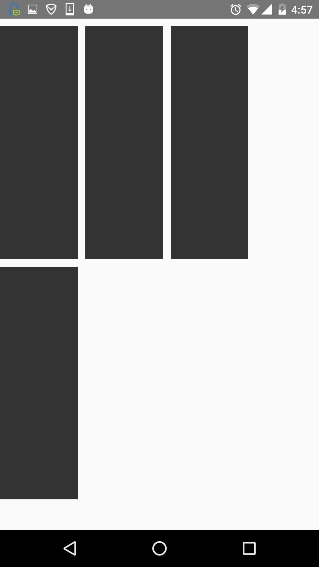
第四个放不下,就换行了。
这篇博客对RN的flexbox进行一个介绍,内容很简单,也是对自己学的东西的一个巩固。
以上是关于React-Native之flexbox布局篇的主要内容,如果未能解决你的问题,请参考以下文章