MPAndroidChart 开发使用总结及采坑记录
Posted 小羊子说
tags:
篇首语:本文由小常识网(cha138.com)小编为大家整理,主要介绍了MPAndroidChart 开发使用总结及采坑记录相关的知识,希望对你有一定的参考价值。
文章目录
背景
本文介绍了MPandroidChart 使用时中通用的参数设置和三种图标的实现案例思路和采坑总结,供你参考。
一. MPAndroidChart 之柱状图开发总结
1.1 设置不同的图表
-
折线图 LineChart
-
条形图 BarChart
-
条形折线图 Combined-Chart
-
圆饼图 PieChart
-
雷达图 ScatterChart
-
K线图 CandleStickChart
-
泡泡图 BubbleChart
-
网状图 RadarChart
1.2 BarChart 的使用流程
使用流程如下:
- 得到BarChart对象 并初始化
- 得到BarEntry对象,此处添加(X,Y)值
- 得到BarDataSet对象,添加BarEntry对象
- 得到BarData对象,添加BarDaraSet对象
- 显示柱状图 BarChart.setData(BarData)
常用的参数设置相关 API:
1.3 Chart 的基础设置
       // 设置是否绘制背景
        mChart.setDrawGridBackground(false);
        // 设置是否绘制边框
        mChart.setDrawBorders(false);
        // 设置是否可以缩放图表
        mChart.setScaleEnabled(true);
        // 设置是否可以用手指移动图表
        mChart.setDragEnabled(false);

				// 设置没有数据的展示样式
        mChart.setNoDataText(“没有数据”)
        mChart.setNoDataTextColor(Color.parseColor("#FFFFFFFF")
1.4 图表描述相关设置
// 不显示描述数据
mChart.getDescription().setEnabled(false);
// 设置描述
 mChart.getDescription().setText("desc");
1.5 是否显示右侧 y 轴
 mChart.getAxisRight().setEnabled(false);
 mChart.getAxisLeft().setEnabled(false); //同理,是否显示左侧 y 轴
设置 为 false 后 y 轴和相关的刻度数值一起消失。
1.6 图例相关设置
    Legend legend = mChart.getLegend();
   //是否显示
    legend.setEnabled(true);
    //图例样式:有圆点,正方形,短线 几种样式
    legend.setForm(Legend.LegendForm.CIRCLE);
    // 图例显示的位置:如下2行代码设置图例显示在左下角
    legend.setHorizontalAlignment(Legend.LegendHorizontalAlignment.LEFT);
    legend.setVerticalAlignment(Legend.LegendVerticalAlignment.BOTTOM);
    // 图例的排列方式:水平排列和竖直排列2种
    legend.setOrientation(Legend.LegendOrientation.HORIZONTAL);
    // 图例距离x轴的距离
    legend.setXEntrySpace(10f);
    //图例距离y轴的距离
    legend.setYEntrySpace(10f);
     //图例的大小
     legend.setFormSize(7f);
     // 图例描述文字大小
     legend.setTextSize(10);
在项目中一般是隐藏处理,不显示。
1.7 x 轴设置
   XAxis xAxis = mChart.getXAxis();
		// 是否显示 x 轴线
    xAxis.setDrawAxisLine(true);
    // 设置 x 轴线的颜色(第一条)
    xAxis.setAxisLineColor(Color.parseColor("#FFFFFFFF"));
    // 是否绘制 x 方向网格线
    xAxis.setDrawGridLines(false);
    // x 方向网格线的颜色
    xAxis.setGridColor(Color.parseColor("#FFFFFFFF"));

		// 背景用虚线表格来绘制  给整成虚线
    xAxis.enableGridDashedLine(5f, 5f, 0f)

    // 设置x轴数据的位置
    xAxis.setPosition(XAxis.XAxisPosition.BOTTOM);
    // 设置x轴文字的大小
    xAxis.setTextSize(12);

    // 设置x轴数据偏移量
    xAxis.setYOffset(5);

    final List<String> labels = mLabels;
    // 显示 x 轴标签
    IAxisValueFormatter formatter = new IAxisValueFormatter()

        @Override
        public String getFormattedValue(float value, AxisBase axis)
            int index = (int) value;
            if (index < 0 || index >= labels.size())
                return "";

            return labels.get(index);


    ;
    // 引用标签 (X轴的标签自定义)
    xAxis.setValueFormatter(formatter);
    // 设置x轴文字颜色
    xAxis.setTextColor(Color.parseColor("#FFFFFFFF"));
    // 设置x轴每最小刻度 interval
    xAxis.setGranularity(1f);
1.8 Y 轴设置
       YAxis yAxis = mChart.getAxisLeft();
        //设置 x 轴的最大值
        yAxis.setAxisMaximum(yMax);
        // 设置 y 轴的最大值
        yAxis.setAxisMinimum(yMin);
        // 不显示 y 轴
        yAxis.setDrawAxisLine(false);
        // 设置 y 轴数据的位置
        yAxis.setPosition(YAxis.YAxisLabelPosition.OUTSIDE_CHART);
        // 不从 y 轴发出横向直线
        yAxis.se tDrawGridLines(false);
        // 是否显示 y 轴坐标线
        yAxis.setDrawZeroLine(true);
        // 设置 y 轴的文字颜色
        yAxis.setTextColor(mChart.getResources().getColor(R.color.char_text_color));
        // 设置 y 轴文字的大小
        yAxis.setTextSize(12);
        // 设置y轴数据偏移量

        yAxis.setXOffset(15);
        // 设置y轴label 数量
        yAxis.setLabelCount(5, false);
        // 设置y轴的最小刻度
        yAxis.setGranularity(5);
其他设置,后期根据项目使用情况继续完善。
二、BarChart 开发实例
2.1 实现某一水平的高亮柱状图
实现效果:

- 布局使用
<com.github.mikephil.charting.charts.BarChart
    android:id="@+id/levelBarChart"
    android:layout_width="match_parent"
    android:layout_height="match_parent"/>
- 初始化
private fun initLevelChart()
     barChart = binding.levelBarChart
        barChart.apply
            // 添加 padding 防止某些情景显示不完整
            extraTopOffset = 50f
            extraBottomOffset = 5f
            // 隐藏右下角英文
            description.isEnabled = false
            setTouchEnabled(false)
            setScaleEnabled(false)
            legend.isEnabled = false
            setBackgroundColor(Color.TRANSPARENT)
            // 不显示与图表网格线
            setDrawGridBackground(false)

            isClickable = false
            isEnabled = false

            setPinchZoom(true)
            data = BarData()
            // 边界
            setDrawBorders(false)
           // 没有数据时的文本设置
            setNoDataText(“暂无数据”)
            setNoDataTextColor(Color.White)


        // x 轴样式设置
        barChart.xAxis.apply
            // 不显示 x 轴网格线
            setDrawGridLines(false)
            // 不显示 X 轴线条
            setDrawAxisLine(false)
						// 背景用虚线表格来绘制  给整成虚线
            enableGridDashedLine(5f, 5f, 0f)

            // x 轴的颜色第一条颜色隐藏
            axisLineColor = R.color.transparent

            setLabelCount(8, true)

            axisLineWidth = 1f
            // 最小间距
            granularity = 1f
            // X 轴坐标的个数
            labelCount = 7
            // X 轴的位置 默认为上面
            position = XAxis.XAxisPosition.BOTTOM
            // X 轴上字的颜色值(eg: 小白、新手……)
            textColor = R.color.transparent
            textSize = 10f

            // 设置字体
            typeface = xTf
            valueFormatter = object : ValueFormatter()
                // X 轴自定义坐标
                override fun getFormattedValue(value: Float): String
                    return trainingLevel[value.toInt()]


        // y 轴样式设置
        barChart.axisLeft.apply
            // 显示 y 轴值
            isEnabled = false
            // 不显示 X 轴 Y轴线条
            setDrawAxisLine(false)
            // 设置背景表格线的颜色
            gridColor = R.color.white
            textColor = R.color.white
            textSize = 8f
            setPosition(YAxis.YAxisLabelPosition.OUTSIDE_CHART)
            // 默认宽度 避免不同值 UI 变化(xx%显示的宽度)
            minWidth = 28f
            // 保证 Y 轴从 0 开始,不然会上移一点
            axisMinimum = 0f
            setLabelCount(4, false)
            valueFormatter = object : ValueFormatter()
                // Y 轴自定义坐标
                override fun getFormattedValue(value: Float): String
                    return "$value.toInt() %"


        // 隐藏右侧 Y 轴   默认是左右两侧都有 Y 轴
        barChart.axisRight.isEnabled = false
-
更新数据,显示图表
private fun setChartData(list: ArrayList<Int>)
       if (list.isEmpty())
            barChart.clear()
            return

        var yAxisMaximum = 40
        val entries = ArrayList<BarEntry>()

        list.forEachIndexed  index, i ->
            entries.add(BarEntry(index.toFloat(), i.toFloat()))
            yAxisMaximum = max(i, yAxisMaximum)


        // 避免超出越界
        barChart.axisLeft.axisMaximum = yAxisMaximum.toFloat() * 1.1f
        barChart.xAxis.labelCount = recordsList.size

        if (barChart.data != null && barChart.data.dataSetCount > 0)
            // 更新
            val barDataSet = barChart.data.getDataSetByIndex(0) as BarDataSet
            barDataSet.values = entries
            barChart.data.notifyDataChanged()
            barChart.notifyDataSetChanged()
         else
            BarDataSet(entries, "").apply
                barChart.data = BarData(listOf(this)).apply
                    // 柱宽 百分比
                    barWidth = 0.9f
                    this.isHighlightEnabled = true

                // 设置柱状的颜色值
                color = R.color.white
                // 设置选中的颜色
                highLightColor = R.color.white
                setDrawValues(false)


        // 设置高亮 第 x 个位置显示高亮
        val highlight = Highlight(highlightPos.toFloat(), 0f, 0)
        barChart.highlightValue(highlight, false)

        barChart.animateY(1500)
        barChart.invalidate()
注意点:
- 当没没有图表数据时 调用
barChart.clear()即可,此时会根据初始化中显示没有数据数据的样式。此处无需再调用barChart.invalidate(),
网上有文章介绍说再调用一次
barChart.invalidate,根据源码分析,此处多余。源码如下:public void clear() this.mData = null; this.mOffsetsCalculated = false; this.mIndicesToHighlight = null; this.mChartTouchListener.setLastHighlighted((Highlight)null); this.invalidate();-
在想要某个柱状图高亮时的处理:
// 1. 在BarDataSet数据中设置是否高亮
BarDataSet.setDrawValues(false)
 //2.设置高亮的颜色值
BarDataSet.color = R.color.white

// 3.高亮的位置
val highlight = Highlight(highlightPos.toFloat(), 0f, 0)
 barChart.highlightValue(highlight, false)
- 当没没有图表数据时 调用
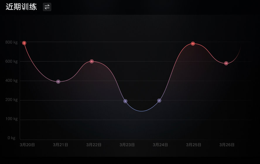
2.2 实现训练的曲线图
-
初始化的流程,略
-
更新数据
    private void updateChart(List<MuscleRecord> records)
        final ArrayList<Entry> entryList = new ArrayList<>();
        int maxWeight = 100;

        for (int i = 0; i < records.size(); i++)
            maxWeight = Math.max(records.get(i).weight, maxWeight);
            // x 的值根据获取到服务器返回的时间戳去计算当前的 在最近一个月中的位置 0 - 30
            String time = DateTimeUtil.getMonthAndDay(records.get(i).trainingDate);
            int dayNum = getXValueDayNum(time);

            Entry entry = new Entry();
            if (dayNum >= MIN_LATELY_DAY && dayNum <= MAX_LATELY_DAY)
                // 查询成功设置 x为当前的位置,查询失败 则默认生成x的位置。
                entry.setX(dayNum);

            entry.setY(records.get(i).weight);
          // 设置坐标背景图
            entry.setIcon(ContextCompat.getDrawable(AppContext.getContext(),
                    xxx.getPointBackground(i)));
            entryList.add(entry);

        // 注意:倒序日期显示时 前一个坐标值必须小于后一个坐标值,故升序处理
        Collections.sort(entryList, new EntryXComparator());
        updateLineChart(maxWeight, entryList);


    private void updateLineChart(int maxWeight, ArrayList<Entry> entryList)
        LogUtil.d(TAG, "updateLineChart,maxWeight: " + maxWeight + ",entryList size: " + entryList.size());
        mLeftAxis.setAxisMaximum((float) (maxWeight * 1.1));
        mDataSet.setValues(entryList);

        LineData data = new LineData();
        data.addDataSet(mDataSet);
        mLineChart.setData(data);
        // 更新界面绘制
        mLineChart.invalidate();


    private String getTimeFormat(int value)
        return mLastListDays.get(value);


    /**
     * 根据时间得到对应 x 坐标值的位置
     * @param time 时间
     * @return 当前所在时间列表中的位置
     */
    private int getXValueDayNum(String time)
        for (int dayNum = 0; dayNum < mLastListDays.size(); dayNum++)
            if (time.equals(mLastListDays.get(dayNum)))
                return dayNum;


        return -1;


    /**
     * 获取最近 30 天的日期列表
     */
    private void initLatelyDays()
        DateTime dateTime = new DateTime();
        for (int dayNum = 30; dayNum >= 0; dayNum--)
            String time = dateTime.minusDays(dayNum).getMonthOfYear() + "月"
                    + dateTime.minusDays(dayNum).getDayOfMonth() + “日”;
            mLastListDays.add(time);
- 实现思路关键点小结:
1. 日历的时间:倒序 3.26 --> 4.26   list size: 30
2. x 坐标的顺序:0 - 30  --> 转换成 getFormat(value):  第0个: 3.26  第 30 个: 4.26
3. x 顺序 3.26 --><以上是关于MPAndroidChart 开发使用总结及采坑记录的主要内容,如果未能解决你的问题,请参考以下文章