CSS 之 渐变色边框
Posted 努力的小朱同学
tags:
篇首语:本文由小常识网(cha138.com)小编为大家整理,主要介绍了CSS 之 渐变色边框相关的知识,希望对你有一定的参考价值。
一、渐变色边框
如果我们前端最亲爱的UI设计师,让我们给盒子绘制一个渐变色的边框,而且盒子的宽高还需要随着内容变化而变化,那我们就不能通过切图来解决问题,所以我们可以这么说:

但是我相信优秀的你肯定不会说做不了,所以我下面列举三种方案来帮你排忧解难:
1、 border-image(看需求)
该属性与background-image属性类似,需要结合linear-gradient()属性,但是在这属性后面还多了一个属性值border-image-slice 表示从linear-gradient()生成的渐变色图片从外到内裁切多少距离的图片渲染到对应的边框位置,一般设置成与border-width相同即可。
但这种方法有一个很致命的缺点: 盒子设置border-radius属性是无效的。
图示:

代码:
<style>
    .box1
      width: 100px;
      height: 100px;
      margin: 100px auto;
      border: 5px solid;
      border-image: linear-gradient(to right, red, #578aef) 4;

</style>

<div class="box1"></div>
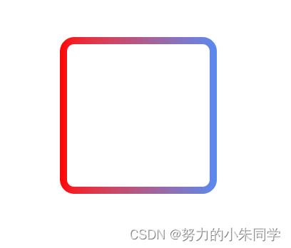
2、 伪元素+透明边框(推荐)
这种方法是指给目标盒子创建一个before伪元素(写一个子元素div效果相同,但是伪元素看起来更优雅),设置其背景颜色为渐变背景,并使用定位使其位于当前盒子的下层。然后我们再通过设置目标盒子的边框为透明,以及通过background-clip: padding-box;属性设置元素颜色渲染区域不包括边框。
然后我们就实现了渐变色边框,而且可以准确的设置border-radius属性。
图示:
代码:
<style>
    .box6
      position: relative;
      width: 100px;
      height: 100px;
      margin: 100px auto;
      border-radius: 10px;
      background: #fff;
      background-clip: padding-box;
      border: 5px solid transparent;

    .box6::before
      content: '';
      position: absolute;
      top: 0;
      right: 0;
      left: 0;
      bottom: 0;
      z-index: -1;
      margin: -5px;
      border-radius: 10px;
      background: linear-gradient(to right, red, #578aef);

</style>

<div class="box2"></div>
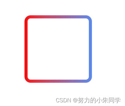
3、 background-image+background-clip+background-origin(推荐)
这种方法是个人最推荐的一种方式,因为只需要目标盒子单个元素即可。为其分别设置 background-image(背景图片) 、background-clip(背景的绘制区域)、background-origin(背景的展示区域)这三个属性,每个属性设置两个值,按照css规范第一个值未覆盖的区域会由第二个值进行填充,所以第一个值设置的是内容区域的背景,第二个值设置的是边框区域的渐变背景。
这种方法目前还没有发现什么弊端。
图示:
代码:
<style>
    .box3
      width: 100px;
      height: 100px;
      margin: 100px auto;
      border: 5px solid transparent;
      border-radius: 10px;
      background-clip: padding-box, border-box;
      background-origin: padding-box, border-box;
      background-image: linear-gradient(to right, #fff, #fff), linear-gradient(to right, red, #578aef);

</style>

<div class="box3"></div>
android shape的使用详解以及常用效果(渐变色分割线边框半透明阴影效果等)
shape使用、渐变色、分割线、边框、半透明、半透明阴影效果。
首先简单了解一下shape中常见的属性。(详细介绍参看 api文档 )
转载请注明:Rflyee_大飞: http://blog.csdn.net/rflyee/article/details/20785495
<?xml version="1.0" encoding="utf-8"?>
<shape    xmlns:android="http://schemas.android.com/apk/res/android"
    android:shape=["rectangle" | "oval" | "line" | "ring"] >   --- 默认为rectangle
    <corners  -- shape=“rectangle”时使用,
        android:radius="integer"-- 半径,会被下边的属性覆盖,默认为1dp,
        android:topLeftRadius="integer"
        android:topRightRadius="integer"
        android:bottomLeftRadius="integer"
        android:bottomRightRadius="integer" />
    <gradient  -- 渐变
        android:angle="integer"
        android:centerX="integer"
        android:centerY="integer"
        android:centerColor="integer"
        android:endColor="color"
        android:gradientRadius="integer"
        android:startColor="color"
        android:type=["linear" | "radial" | "sweep"]
        android:useLevel=["true" | "false"] />
    <padding        android:left="integer"
        android:top="integer"
        android:right="integer"
        android:bottom="integer" />
    <size    -- 指定大小,一般用在imageview配合scaleType属性使用。大小一般会适配滴
        android:width="integer"
        android:height="integer" />
    <solid    -- 填充颜色,可是是十六进制颜色。(比如想设置半透明效果,直接使用十六就只就OK)
        android:color="color" />
    <stroke    -- 指定边框,border,dashWidth和dashGap有一个为0dp则为实线
        android:width="integer"
        android:color="color"
        android:dashWidth="integer"    -- 虚线宽度
        android:dashGap="integer" />    -- 虚线间隔宽度
</shape>
ImageView , you can restrict scaling by setting the android:scaleType to "center"举个栗子:
1、渐变色
res/drawable/gradient_box.xml :
<?xml version="1.0" encoding="utf-8"?><shapexmlns:android="http://schemas.android.com/apk/res/android"android:shape="rectangle"><gradientandroid:startColor="#FFFF0000"android:endColor="#80FF00FF"android:angle="45"/><paddingandroid:left="7dp"android:top="7dp"android:right="7dp"android:bottom="7dp"/><cornersandroid:radius="8dp"/></shape>

<?xml version="1.0" encoding="utf-8"?>
<shape xmlns:android="http://schemas.android.com/apk/res/android"
    android:shape="rectangle" >
    <corners android:radius="16dp" />
    <!-- 这是半透明,还可以设置全透明,那就是白色边框的效果了 -->
    <solid android:color="#80065e8d" />
    <stroke
        android:dashGap="0dp"
        android:width="4dp"
        android:color="@android:color/white" />
</shape>


<?xml version="1.0" encoding="utf-8"?>
<shape xmlns:android="http://schemas.android.com/apk/res/android"
    android:shape="line" >
    <stroke
        android:width="4dp"
        android:color="@android:color/black" />
</shape>

<?xml version="1.0" encoding="utf-8"?>
<shape android:shape="rectangle" xmlns:android="http://schemas.android.com/apk/res/android">

    <corners
        android:topLeftRadius="5dp"
        android:topRightRadius="5dp"
        android:bottomLeftRadius="30dp"
        android:bottomRightRadius="30dp"/>

    <!-- 这是半透明,还可以设置全透明,那就是白色边框的效果了 -->
    <solid android:color="#ff065e8d" />

    <stroke
        android:dashGap="0dp"
        android:width="4dp"
        android:color="@android:color/white" />

</shape>
如图:

android shape的使用详解以及常用效果(渐变色、分割线、边框、半透明阴影效果等)
以上是关于CSS 之 渐变色边框的主要内容,如果未能解决你的问题,请参考以下文章