CSS垂直居中的11种实现方式
Posted web_hwg
tags:
篇首语:本文由小常识网(cha138.com)小编为大家整理,主要介绍了CSS垂直居中的11种实现方式相关的知识,希望对你有一定的参考价值。
转载地址[http://www.cnblogs.com/zhouhuan/p/vertical_center.html]
① 使用绝对定位和负外边距对块级元素进行垂直居中:
<div id="box">
    <div id="child">我是测试DIV</div>
</div>
#box
width: 300px;
height: 300px;
background: #ddd;
position: relative;
#child
width: 150px;
height: 100px;
background: orange;
position: absolute;
top: 50%;
margin: -50px 0 0 0;
line-height: 100px;
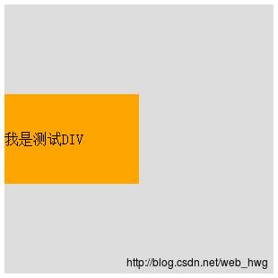
注解:这个方法兼容性不错,但是有一个小缺点:必须提前知道被居中块级元素的尺寸,否则无法准确实现垂直居中。
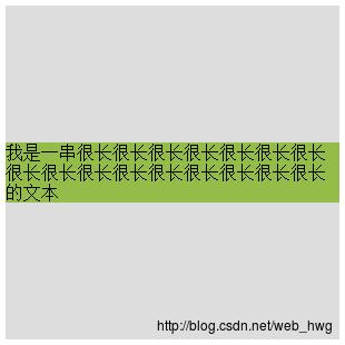
② 使用绝对定位和transform:
<div id="child">
    我是一串很长很长很长很长很长很长很长很长很长很长很长很长很长很长很长很长的文本
</div>
#box
width: 300px;
height: 300px;
background: #ddd;
position: relative;
#child
background: #93BC49;
position: absolute;
top: 50%;
transform: translate(0, -50%);
注解:
这种方法有一个非常明显的好处就是不必提前知道被居中元素的尺寸了,因为transform中translate偏移的百分比就是相对于元素自身的尺寸而言的。
③另外一种使用绝对定位和负外边距进行垂直居中的方式:
<div id="box">
    <div id="child">我也是个测试DIV</div>
</div>
#box
width: 300px;
height: 300px;
background: #ddd;
position: relative;
#child
width: 50%;
height: 30%;
background: pink;
position: absolute;
top: 50%;
margin: -15% 0 0 0;
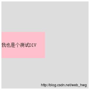
注解:
这种方式的原理实质上和前两种相同。补充的一点是:margin的取值也可以是百分比,这时这个值规定了该元素基于父元素尺寸的百分比,可以根据实际的使用场景来决定是用具体的数值还是用百分比。
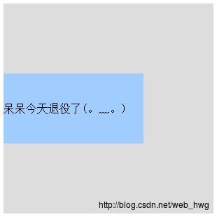
④绝对定位结合margin: auto:
<div id="box">
    <div id="child">呆呆今天退役了(。﹏。)</div>
</div>
#box
width: 300px;
height: 300px;
background: #ddd;
position: relative;
#child
width: 200px;
height: 100px;
background: #A1CCFE;
position: absolute;
top: 0;
bottom: 0;
margin: auto;
line-height: 100px;
注解:
这种实现方式的两个核心是:把要垂直居中的元素相对于父元素绝对定位,top和bottom设为相等的值,我这里设成了0,当然你也可以设为99999px或者-99999px无论什么,只要两者相等就行,这一步做完之后再将要居中元素的margin设为auto,这样便可以实现垂直居中了。
被居中元素的宽高也可以不设置,但不设置的话就必须是图片这种自身就包含尺寸的元素,否则无法实现。
⑤使用padding实现子元素的垂直居中:
<div id="box">
    <div id="child">今天西安的霾严重的吓人,刚看了一眼PM2.5是422</div>
</div>
#box
width: 300px;
background: #ddd;
padding: 100px 0;
#child
width: 200px;
height: 100px;
background: #F7A750;
line-height: 50px;

注解:
这种实现方式非常简单,就是给父元素设置相等的上下内边距,则子元素自然是垂直居中的,当然这时候父元素是不能设置高度的,要让它自动被填充起来,除非设置了一个正好等于上内边距+子元素高度+下内边距的值,否则无法精确的垂直居中。
这种方式看似没有什么技术含量,但其实在某些场景下也是非常好用的。
⑥设置第三方基准:
<div id="box">
    <div id="base"></div>
    <div id="child">今天写了第一篇博客,希望可以坚持写下去!</div>
</div>
#box
width: 300px;
height: 300px;
background: #ddd;
#base
height: 50%;
background: #AF9BD3;
#child
height: 100px;
background: rgba(131, 224, 245, 0.6);
line-height: 50px;
margin-top: -50px;

注解:
这种方式也非常简单,首先设置一个高度等于父元素高度一半的第三方基准元素,那么此时该基准元素的底边线自然就是父元素纵向上的中分线,做完这些之后再给要垂直居中的元素设置一个margin-top,值的大小是它自身高度的一半取负,则实现垂直居中。
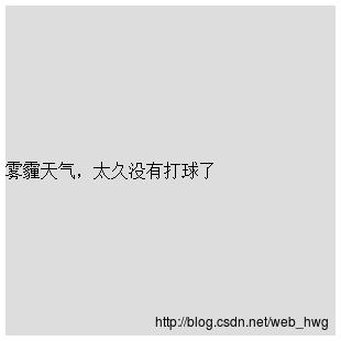
⑦使用flex布局:
<div id="box">雾霾天气,太久没有打球了</div>#box
width: 300px;
height: 300px;
background: #ddd;
display: flex;
align-items: center;
这种方式同样适用于块级元素:
<div id="box">
    <div id="child">
        程序员怎么才能保护好眼睛?
    </div>
</div>
#box
width: 300px;
height: 300px;
background: #ddd;
display: flex;
align-items: center;
#child
width: 300px;
height: 100px;
background: #8194AA;
line-height: 100px;

注解:
flex布局,推荐学习阮一峰老师的博客http://www.ruanyifeng.com/blog/2015/07/flex-grammar.html
⑧第二种使用弹性布局的方式
<div id="box">
    <div id="child">
        答案当然是多用绿色的背景哈哈
    </div>
</div>
#box
width: 300px;
height: 300px;
background: #ddd;
display: flex;
flex-direction: column;
justify-content: center;
#child
width: 300px;
height: 100px;
background: #08BC67;
line-height: 100px;
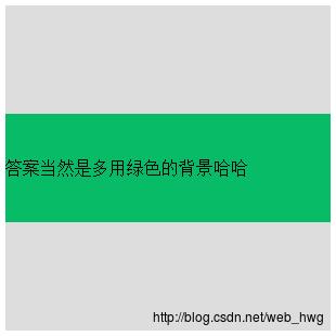
注解:
这种方式也是首先给父元素设置display:flex,设置好之后改变主轴的方向flex-direction: column
⑨还有一种在前面已经见到过很多次的方式就是使用 line-height 对单行文本进行垂直居中:
<div id="box">
    我是一段测试文本
</div>
#box
width: 300px;
height: 300px;
background: #ddd;
line-height: 300px;
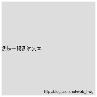
注解:
这里有一个小坑需要大家注意,line-height(行高) 的值不能设为100%,我们来看看官方文档中给出的关于line-height取值为百分比时候的描述:基于当前字体尺寸的百分比行间距。所以大家就明白了,这里的百分比并不是相对于父元素尺寸而言,而是相对于字体尺寸来讲的。
⑩使用 line-height 和 vertical-align 对图片进行垂直居中:
<div id="box">
    <img src="duncan.jpeg">
</div>
#box
width: 300px;
height: 300px;
background: #ddd;
line-height: 300px;
#box img
vertical-align: middle;

⑪使用 display 和 vertical-align 对容器里的文字进行垂直居中:
<div id="box">
    <div id="child">我也是一段测试文本</div>
</div>
#box
width: 300px;
height: 300px;
background: #ddd;
display: table;
#child
display: table-cell;
vertical-align: middle;

注解:
这里关于vertical-align啰嗦两句:vertical-align属性只对拥有valign特性的html元素起作用,例如表格元素中的等等,而像
valign属性规定单元格中内容的垂直排列方式,语法:,value的可能取值有四种:
top:对内容进行上对齐
middle:对内容进行居中对齐
bottom:对内容进行下对齐
baseline:基线对齐
关于baseline值:基线是一条虚构的线。在一行文本中,大多数字母以基线为基准。baseline 值设置行中的所有表格数据都分享相同的基线。该值的效果常常与 bottom 值相同。不过,如果文本的字号各不相同,那么 baseline 的效果会更好。
以上是关于CSS垂直居中的11种实现方式的主要内容,如果未能解决你的问题,请参考以下文章