手把手教你做出数据可视化项目可视化图表配置
Posted diviner_s
tags:
篇首语:本文由小常识网(cha138.com)小编为大家整理,主要介绍了手把手教你做出数据可视化项目可视化图表配置相关的知识,希望对你有一定的参考价值。
数据可视化前言:https://blog.csdn.net/diviner_s/article/details/115933789
项目最终效果图:
此篇博客为自己学习pink老师的课后完成的项目的总结与记录,仅供交流参考。版权所有,转载请标注原作者!
使用echarts技术做的可视图,此外其项目包含 的技术有html、css、js、jquerry、ajax、websocket、koa等。

此章节使用的是echarts技术,详情进传送门:
echarts简介
echarts图表总结
文章目录
可视化图表配置
0-1 echarts图表基础配置
需要了解的echarts图表主要配置:
seriesxAxisyAxisgridtooltiptitlelegendcolor
-
series
- 系列列表。每个系列通过
type决定自己的图表类型 - 大白话:图标数据,指定什么类型的图标,可以多个图表重叠。
- 系列列表。每个系列通过
-
xAxis:直角坐标系 grid 中的 x 轴
- boundaryGap: 坐标轴两边留白策略 true,这时候刻度只是作为分隔线,标签和数据点都会在两个刻度之间的带(band)中间。
-
yAxis:直角坐标系 grid 中的 y 轴
-
grid:直角坐标系内绘图网格。
-
title:标题组件
-
tooltip:提示框组件
-
legend:图例组件
-
color:调色盘颜色列表
0-2 echarts图表实现
-
引入echarts插件文件到html页面中
-
准备一个具备大小的DOM容器
<div id="main" style="width: 600px;height:400px;"></div> -
初始化echarts实例对象
var myChart = echarts.init(document.getElementById('main')); -
指定配置项和数据(option)
// 2. 指定配置项和数据 option = // color设置我们线条的颜色 注意后面是个数组 color: ['pink', 'red', 'green', 'skyblue'], // 设置图表的标题 title: text: '折线图堆叠123' , // 图表的提示框组件 tooltip: // 触发方式 trigger: 'axis' , // 图例组件 legend: // series里面有了 name值则 legend里面的data可以删掉 , // 网格配置 grid可以控制线形图 柱状图 图表大小 grid: left: '3%', right: '4%', bottom: '3%', // 是否显示刻度标签 如果是true 就显示 否则反之 containLabel: true , // 工具箱组件 可以另存为图片等功能 toolbox: feature: saveAsImage: , // 设置x轴的相关配置 xAxis: type: 'category', // 是否让我们的线条和坐标轴有缝隙 boundaryGap: false, data: ['星期一', '周二', '周三', '周四', '周五', '周六', '周日'] , // 设置y轴的相关配置 yAxis: type: 'value' , // 系列图表配置 它决定着显示那种类型的图表 series: [ name: '邮件营销', type: 'line', data: [120, 132, 101, 134, 90, 230, 210] , name: '联盟广告', type: 'line', data: [220, 182, 191, 234, 290, 330, 310] , name: '视频广告', type: 'line', data: [150, 232, 201, 154, 190, 330, 410] , name: '直接访问', type: 'line', data: [320, 332, 301, 334, 390, 330, 320] ] ; -
将配置项设置给echarts实例对象
myChart.setOption(option);
1-1 左上角柱状图配置
实现后效果:
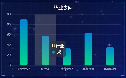
数据来源:采用Ajax的get(url,function())请求获取数据
这里需要注意的是:function是回调函数需要获取数据后存放在ret后,在done中进行数据的解析。
  // 柱状图模块1   首页左上角柱状图
  (function ()
    //--------------------------------ajax---------------------------------

    $.get("http://127.0.0.1:8888/api/text2", function (ret)
    ).done(ret =>
      var Name2 = []
      var Value2 = []
      for (var i = 0; i < ret.length; i++)
        var name = ret[i].name
        var value = ret[i].value
        console.log(name + " " + value)
        Name2.push(name)
        Value2.push(value)

      // 1实例化对象
      var myChart1 = echarts.init(document.querySelector(".bar .chart"));
      // 2. 指定配置项和数据
      option =
        color: new echarts.graphic.LinearGradient(0, 0, 0, 1, [
          offset: 0,
          color: '#0184d5'
        ,
          offset: 1,
          color: '#00d887'
        ]),
        tooltip:
          trigger: "axis",
          axisPointer:
            // 坐标轴指示器,坐标轴触发有效
            type: "shadow" // 默认为直线,可选为:'line' | 'shadow'

        ,
        // 修改图表的大小
        grid:
          left: "0%",
          top: "10px",
          right: "0%",
          bottom: "4%",
          containLabel: true
        ,
        xAxis: [

            type: "category",
            data: Name2,
            axisTick:
              alignWithLabel: true
            ,
            // 修改刻度标签 相关样式
            axisLabel:
              color: "rgba(255,255,255,.6) ",
              fontSize: "10"
            ,
            // 不显示x坐标轴的样式
            axisLine:
              show: false


        ],
        yAxis: [

            type: "value",
            // 修改刻度标签 相关样式
            axisLabel:
              color: "rgba(255,255,255,.6) ",
              fontSize: 10
            ,
            // y轴的线条改为了 2像素
            axisLine:
              lineStyle:
                color: "rgba(255,255,255,.1)",
                width: 2

            ,
            // y轴分割线的颜色
            splitLine:
              lineStyle:
                color: "rgba(255,255,255,.1)"


        ],
        series: [

            name: "",
            type: "bar",
            barWidth: "35%",
            // data: [108, 6, 11, 8, 16],
            data: Value2,
            itemStyle:
              // 修改柱子圆角
              barBorderRadius: 5


        ]
      ;
      // 3. 把配置项给实例对象
      myChart1.setOption(option)
      // 4. 让图表跟随屏幕自动的去适应
      window.addEventListener("resize", function ()
        myChart1.resize();
      );
    );

  )();
1-2 左中角雷达图配置
 // 雷达图 左中
  (function ()

    // 1实例化对象
    var myChart = echarts.init(document.querySelector(".radar .chart"));
    // 2. 指定配置项和数据
    var lineStyle =
      normal:
        width: 1,
        opacity: 0.5

    ;
    var option =
      legend:
        orient: "vertical",
        top: "bottom",
        left: "right",
        textStyle:
          color: '#fff',
          fontSize: 12
        ,
        selectedMode: 'single'
      ,
      grid:
        top: ""
      ,
      radar:
        indicator: [
           name: '城市', max: 100 ,
           name: '岗位', max: 100 ,
           name: '工作时间', max: 100 ,
           name: '兴趣', max: 100 ,
           name: '薪资', max: 100 ,
           name: '工作环境', max: 100
        ],
        shape: 'circle',
        splitNumber: 5,  //指示器轴的分割段数。
        name:
          textStyle:
            color: 'rgb(238, 197, 102)'

        ,
        splitLine:
          lineStyle:
            color: [
              'rgba(238, 197, 102, 0.1)', 'rgba(238, 197, 102, 0.2)',
              'rgba(238, 197, 102, 0.4)', 'rgba(238, 197, 102, 0.6)',
              'rgba(238, 197, 102, 0.8)', 'rgba(238, 197, 102, 1)'
            ].reverse()

        ,
        splitArea:
          show: false
        ,
        axisLine:
          lineStyle:
            color: 'rgba(238, 197, 102, 0.5)'


      ,
      series: [

          name: "16数媒01",
          type: 'radar',
          lineStyle: lineStyle,
          symbol: 'none',
          itemStyle:
            color: '#F9713C'
          ,
          areaStyle:
            opacity: 0.1

        ,

          name: "16数媒02",
          type: 'radar',
          lineStyle: lineStyle,
          symbol: 'none',
          itemStyle:
            color: '#B3E4A1'
          ,
          areaStyle:
            opacity: 0.05

        ,

          name: "16数媒03",
          type: 'radar',
          lineStyle: lineStyle,
          symbol: 'none',
          itemStyle:
            color: 'rgb(238, 197, 102)'
          ,
          areaStyle:
            opacity: 0.05

        ,

          name: "18数媒(升本)01",
          type: 'radar',
          lineStyle: lineStyle,
          symbol: 'none',
          itemStyle:
            color: 'rgb(182, 87, 203)'
          ,
          areaStyle:
            opacity: 0.05  //图形透明度


      ]
    ;
    // 3. 把配置项给实例对象
    myChart.setOption(option);

    SocketService.Instance.registerCallBack('leftcenterData', ret =>
      console.log("leftcenter:")
      console.log(ret);
      var classname = [];
      var classdata = [];
      for (var i = 0; i < ret.length; i++)
        classname.push(ret[i].name);
        classdata.push(ret[i].student);

      //数据
      myChart.setOption(
        legend:
          data: classname,
        ,
        series: [

            name: "16数媒01",
            data: classdata[0]

          ,

            name: "16数媒02",
            data: classdata[1]
          ,

            name: "16数媒03",
            data: classdata[2]
          ,

            name: "18数媒(升本)01",
            data: classdata[3]

        ]
      );
    );

    SocketService.Instance.send(
      action: 'getData',
      socketType: 'leftcenterData',
      chartName: 'leftcenter',
      value: ''
    )


    // 4. 让图表跟随屏幕自动的去适应
    window.addEventListener("resize", function ()
      myChart.resize();
    );

  )();
1-3 左下角饼状图配置
  // 饼形图1  首页左下角
  (function ()

    // 1. 实例化对象
    var myChart = echarts.init(document.querySelector(".pie .chart"));
    // 2.指定配置
    var option =
      color: ["#FE642E", "#FE9A2E", "#F4FA58", "#01DFD7", "#8258FA"],
      tooltip:
        trigger: "item",
        formatter: "a <br/>b: c (d%)"
      ,

      legend:
        bottom: "0%",
        // 修改小图标的大小
        itemWidth: 10,
        itemHeight: 10,
        // 修改图例组件的文字为 12px
        textStyle:
          color: "rgba(255,255,255,.5)",
          fontSize: "15"

      ,
      series: [

          name: "工作地点",
          type: "pie",
          // 这个radius可以修改饼形图的大小
          // radius 第一个值是内圆的半径 第二个值是外圆的半径
          radius: ["35%", "60%"],
          center: ["50%", "45%"],
          avoidLabelOverlap: false,
          itemStyle:
            borderRadius: 20//图形边缘弧度大小
          ,
          // 图形上的文字
          label:
            show: true
          ,
          // 连接文字和图形的线是否显示
          labelLine:
            show: true


      ]
    ;

    // 使用刚指定的配置项显示图表。
    myChart.setOption(option);
    var dataLen = 1

    SocketService.Instance.registerCallBack('text3Data', ret =>
      console.log("text3:")
      console.log(ret);
      //数据
      myChart.setOption(
        series: [

            name: "工作地点",
            data: ret,

        ]
      );
      dataLen = ret.length
    );

    SocketService.Instance.send(
      action: 'getData',
      socketType: 'text3Data',
      chartName: 'text3',
      value: ''
    )

    /*******高亮显示开始**********/
    var _this2 = this
    var isSet2 = true // 为了做判断:当鼠标移动上去的时候,自动高亮就被取消
    var currentIndex2 = 0

    // 2、鼠标移动上去的时候的高亮动画
    myChart.on('mouseover', function (param)
      isSet2 = false
      clearInterval(_this2.startCharts)
      // 取消之前高亮的图形
      myChart.dispatchAction(
        type: 'downplay',
        seriesIndex: 0,
        dataIndex: currentIndex2
      )
      // 高亮当前图形
      myChart.dispatchAction(
        type: 'highlight',
        seriesIndex: 0,
        dataIndex: param.dataIndex
      )
      // 显示 tooltip
      myChart.dispatchAction(
        type: 'showTip',
        seriesIndex: 0,
        dataIndex: param.dataIndex
      )
    )
    // 3、自动高亮展示
    chartHover = function ()
      // 取消之前高亮的图形
      myChart.dispatchAction(
        type: 'downplay',
        seriesIndex: 0以上是关于手把手教你做出数据可视化项目可视化图表配置的主要内容,如果未能解决你的问题,请参考以下文章