CSS核心知识点
Posted 在奋斗的大道
tags:
篇首语:本文由小常识网(cha138.com)小编为大家整理,主要介绍了CSS核心知识点相关的知识,希望对你有一定的参考价值。
目录

1、什么是CSS
- CSS 指层叠样式表 (Cascading Style Sheets)
- 样式定义如何显示 html 元素
- 样式通常存储在样式表中
- 把样式添加到 HTML 4.0 中,是为了解决内容与表现分离的问题
- 外部样式表可以极大提高工作效率
- 外部样式表通常存储在 CSS 文件中
- 多个样式定义可层叠为一个
1.1 快速入门
<!DOCTYPE html>
<html lang="en">
<head>
    <meta charset="UTF-8">
    <title>Title</title>
    <!--规范,<style>可以编写CSS的代码,每一个声明最好以“;”结尾
	语法:
		选择器
				声明1;
				声明2;
				声明3;


-->
    <style>
        h1
            color: crimson;

    </style>

</head>
<body>
    <h1>CSS 核心知识点</h1>
</body>
</html>
1.2 CSS 导入三种方式
<!DOCTYPE html>
<html lang="en">
<head>
    <meta http-equiv="Content-Type" content="text/html; charset=gbk" />
    <title>Title</title>

    <!--内部样式-->
    <style>
        h1
            color: green;

    </style>

    <!--外部样式-->
    <link rel="stylesheet" href="css_one.css" />
</head>
<body>

<!--优先级:就近原则-->
<!--行内样式:在标签元素中,编写一个style属性,编写样式即可-->
<h1 style="color: red">H1 标签</h1>
</body>
</html>
css_one.css
h1
            color: yellow;
- 链接式
    <!--外部样式-->
<link rel="stylesheet" href="css_one.css" />- 导入式
温馨提示:@import是CSS2.1特有的
<!--导入式-->
    <style>
        @import url("css_one.css");
    </style>
2、选择器
作用:选择页面上的某一个后者某一类元素
2.1、基本选择器
1、标签选择器:选择一类标签 标签
<!DOCTYPE html>
<html lang="en">
<head>
    <meta charset="UTF-8">
    <title>Title</title>
    <style>
        h1
            color: orange;
            background: blue;
            border-radius: 10px;

    </style>
</head>
<body>
<h1>标签选择器</h1>
</body>
</html>
2、类 选择器class:选择所有class一致的标签,跨标签,格式:.类名
<!DOCTYPE html>
<html lang="en">
<head>
    <meta charset="UTF-8">
    <title>Title</title>

    <style>
        /*类选择器的格式 .class的名称
            好处:可以多个标签归类,是同一个class,可以复用
        */
        .demo1
            color: blue;

        .demo2
            color: red;

        .demo3
            color: aqua;

    </style>
</head>
<body>
<h1 class = "demo1">类选择器:demo1</h1>
<h1 class="demo2">类选择器:demo2</h1>
<h1 class="demo3">类选择器:demo3</h1>
</body>
</html>
3、id 选择器:全局唯一,格式:#id名
<!DOCTYPE html>
<html lang="en">
<head>
    <meta charset="UTF-8">
    <title>Title</title>
    <style>
        /*id选择器:id必须保证全局唯一
            #id名称
            不遵循就近原则,优先级是固定的
            id选择器 > 类选择器  >  标签选择器
        */
        #demo1
            color: aqua;

        .demo2
            color: red;

        #demo2
            color: orange;

        h1
            color: blue;

    </style>
</head>
<body>

<h1 id="demo1">id选择器:demo1</h1>
<h1 class="demo2" id = "demo2">id选择器:demo2</h1>
<h1 class="demo2">id选择器:demo3</h1>
<h1>id选择器:demo4</h1>
<h1>id选择器:demo5</h1>
</body>
</html>
知识拓展:优先级:id > class > 标签
<!DOCTYPE html>
<html lang="en">
<head>
    <meta http-equiv="Content-Type" content="text/html; charset=gbk" />
    <title>Title</title>

    <!--内部样式-->
    <style>
	    #one
			color: red;

		.one
			color:blue;

        h1
            color: green;

    </style>
</head>
<body>

<!--优先级:id > class > 标签-->
<h1 id="one" class="one">H1 标签</h1>
</body>
</html>
2.2、层次选择器
- 后代选择器:在某个元素的后面
/*后代选择器*/
<style>
body p
	background:red;

</style>
<!DOCTYPE html>
<html lang="en">
<head>
    <meta http-equiv="Content-Type" content="text/html; charset=gbk" />
    <title>Title</title>

    <!--内部样式-->
    <style>
		body p
			background:red;

	</style>
</head>
<body>
<p>P标签一</p>
<p>P标签二</p>
</body>
</html>
- 子选择器,一代
/*子选择器*/
<style>
body>p
	background:orange;

</style>
<!DOCTYPE html>
<html lang="en">
<head>
    <meta http-equiv="Content-Type" content="text/html; charset=gbk" />
    <title>Title</title>

    <!--内部样式-->
    <style>
		body>p
			background:orange;

	</style>
</head>
<body>
<p>P标签一</p>
<p>P标签二</p>
</body>
</html>
- 相邻的兄弟选择器 同辈
/*相邻兄弟选择器:只有一个,相邻(向下)*/
<style>
.active+p
background: red

</style>
<!DOCTYPE html>
<html lang="en">
<head>
    <meta http-equiv="Content-Type" content="text/html; charset=gbk" />
    <title>Title</title>

    <!--内部样式-->
    <style>
		.active+p
			background:orange;

	</style>
</head>
<body>
<p class="active">P标签一</p>
<p>P标签二</p>
</body>
</html>
- 通用选择器
<style>
/*通用兄弟选择器,当前选中元素的向下的所有兄弟元素*/
	.active~p
	background:red;

</style>
<!DOCTYPE html>
<html lang="en">
<head>
<meta http-equiv="Content-Type" content="text/html; charset=gbk" />
<title>Title</title>
<!--内部样式-->
<style>
.active~p
background:red;
</style>
</head>
<body>
<p class="active">P标签一</p>
<p>P标签二</p>
</body>
</html>
2.3、结构伪类选择器
伪类:
    <style>
        /*ul的第一个子元素*/
        ul li:first-child
            background: aqua;


        /*ul的最后一个子元素*/
        ul li:last-child
            background: blue;

        /*选中p1:定位到父元素,选择当前的第一个元素
            选择当前p元素 的父级元素,选中父级元素的第一个,并且是当前元素才生效!
        */
        p:nth-child(1)
            background: orange;


        /*选中父元素下的,第2个p元素*/
        p:nth-of-type(2)
            background: red;

    </style>
实例:
<!DOCTYPE html>
<html lang="en">
<head>
    <meta http-equiv="Content-Type" content="text/html; charset=gbk" />
    <title>Title</title>

    <style>
        /*ul的第一个子元素*/
        ul li:first-child
            background: aqua;


        /*ul的最后一个子元素*/
        ul li:last-child
            background: blue;

        /*选中p1:定位到父元素,选择当前的第一个元素
            选择当前p元素 的父级元素,选中父级元素的第一个,并且是当前元素才生效!
        */
        p:nth-child(1)
            background: orange;


        /*选中父元素下的,第2个p元素*/
        p:nth-of-type(2)
            background: red;

    </style>


</head>
<body>
		<p>p0</p>
		<p >p1</p>
		<p>p2</p>


		<p>
			<h4>手机厂商列表:</h4>
			<ul>
			 <li>Apples</li>
			 <li>华为</li>
			 <li>小米</li>
			 <li>Opper</li>
			</ul>
		</p>
		<p>
			<h4>电动厂商列表:</h4>
			<ul>
			 <li>比亚迪</li>
			 <li>长安</li>
			 <li>吉利</li>
			 <li>广汽</li>
			</ul>
		</p>

</body>
</html>
2.4、属性选择器(常用)
ID + Class/标签 结合使用
实例:
<!DOCTYPE html>
<html lang="en">
<head>
    <meta charset="UTF-8">
    <title>Title</title>
    <style>
         .demo a
            display: block;
            height: 50px;
            width: 50px;
            float:left;
            border-radius: 10px;
            background: blue;
            text-align: center;
            color: beige;
            text-decoration: none;
            margin-right: 5px;
            font: bold 20px/50px Arial;

         /*属性名,属性名=属性值(正则)
         =表示绝对等于
         *=表示包含
         ^=表示以...开头
         $=表示以...结尾
         存在id属性的元素  a[]
         */
        /* a[id]
             background: red;
         */

         /*id=first的元素*/
       /* a[id=first]
            background: aqua;
        */

        /*class中有links元素*/
       /* a[class = "links item2 first2"]
            background: orange;
        */
        /*a[class*="links"]
            background: black ;
        */
        /*选中href中以http开头的元素*/
        a[href^="http"]
            background: orange;

    </style>

</head>
<body>
<p class="demo">
    <a href="http://www.baidu.com" class="links item first" id="first">1</a>
    <a href="/adad/faf" class="links item2 first2" >2</a>
    <a href="qwe123" class="links item3 first3" >3</a>
    <a href="eweqe" class="links item4 first4" >4</a>
    <a href="rrrrr" class="links item5 first5" >5</a>
    <a href="ttt" class="links item6 first6" >6</a>
    <a href="yyy" class="links item7 first7" >7</a>
</p>
</body>
</html>
3、美化网页元素
3.1、为什么要美化网页
- 有效的传递页面信息
- 美化网页,页面漂亮才能吸引客户
- 凸显页面的主题
- 提高用户的体验
span标签:重点要突出的字,使用span标签套起来
<!DOCTYPE html>
<html lang="en">
<head>
    <meta charset="UTF-8">
    <title>Title</title>
    <style>
        #title1
            font-size: 50px;

    </style>
</head>
<body>

学习语言<span id="title1">JAVA</span>
</body>
</html>
font-family:字体
font-size:字体大小
font-weight:字体粗细
 <style>
	body
		font-family:楷体;
		color:red;

	h1
		font-size: 50px;

    .p1
		font-weight:blod;


</style>
3.2、字体样式
font-weight:bolder;/*也可以填px,但不能超过900,相当于bloder*/
/*常用写法:*/
font:oblique bloder 12px "楷体"
3.3、文本样式
- 颜色–>color
- 文本对齐方式–>text-align:center
- 首行缩进–>text-indent:2em
- 行高–>line-height:300px;
- 下划线–>text-decoration
text-decoration:underline/*下划线*/
text-decoration:line-through/*中划线*/
text-decoration:overline/*上划线*/
text-decoration:none/*超链接去下划线*/
- 图片、文字水平对齐
img,spanvetical-align:middle
实例:
<!DOCTYPE html>
<html lang="en">
<head>
    <meta http-equiv="Content-Type" content="text/html; charset=gbk" />
    <title>Title</title>
<!--    颜色:
            单词
            RGB
            RGBA A透明度 A:0-1
            text-align:排版  。居中
            text-indent:2em 段落首行缩进
            height: 300px;
            line-height:300px
            行高,和 块的高度一直,就可以上下居中
-->
    <style>
        h1
            color:  rgba(0,255,255,0.8);
            text-align: center;

        .p1
            text-indent:2em;

        .p2
            background: crimson;
            height: 300px;
            line-height: 300px;

        /*下划线*/
        .l1
            text-decoration: underline;

        /*中划线*/
        .l2
            text-decoration: line-through;

        /*上划线*/
        .l3
            text-decoration: overline;

        /*超链接去下划线*/
        a
            text-decoration:none;

    </style>
</head>
<body>

<a href="">123</a>

<p class="l1">123123</p>
<p class="l2">123123</p>
<p class="l3">123123</p>


<h1>故事介绍</h1>
<p class="p1">有一天,从城里来了一只野猫。动物们见了,一起围着问长问短,想请它说说城市的事情。野猫可得意啦。它摇晃着脑袋,东瞧瞧、西看看,然后皱着眉头说:“城市太大了,我怎么能用嘴巴讲得清楚呢?
</p>
<p>忽然,它拍拍脑门,“有了,让我来比划给你们看吧!” 野猫先让斑马躺在了地上。它告诉动物们,城市有许多马路,人们过马路要踩着斑马线走。接着,它就带领所有的动物从斑马的身上走了过去。斑马躺在地上觉得受不了,站起来踢踢脚,说:“看来城市是一个很疼的地方。”
</p>

<p class="p2">Let me not to the marriage of true mindsAdmit impediments. Love is not loveWhich alters when it alteration finds,Or bends with the remover to remove:
</p>
</body>
</html>
<!DOCTYPE html>
<html lang="en">
<head>
    <meta http-equiv="Content-Type" content="text/html; charset=gbk" />
    <title>Title</title>
<!--水平对齐~ 参照物, a,b-->
    <style>
        img,span
            vertical-align: middle;

    </style>
</head>
<body>


<p>
    <img src="1.png" alt="">
    <span> 12345646</span>
</p>


</body>
</html>
3.4、文本,阴影和超链接伪类
<style>
        /*默认的颜色*/
        a
            text-decoration: none;
            color: #000000;

		/*按照顺序写link visited hover active*/
        /*未访问链接*/
        a:link
            color: cyan;

        /*已访问链接*/
        a:visited
            color: #e20a46;

        /*鼠标悬浮的颜色状态 须记住*/
        a:hover
            color: orange;
            font-size:50px;

        /*鼠标按住未释放的颜色状态*/
        a:active
            color: #bf1be3;

        /*text-shadow:阴影颜色,水平偏移,垂直偏移,阴影半径*/
        #price
            text-shadow: #4506bb 10px -10px 2px;

    </style>
阴影:
/*	第一个参数:表示水平偏移
	第二个参数:表示垂直偏移
	第三个参数:表示模糊半径
	第四个参数:表示颜色
*/
text-shadow:5px 5px 5px 颜色
实例:
<!DOCTYPE html>
<html lang="en">
<head>
    <meta http-equiv="Content-Type" content="text/html; charset=gbk" />
    <title>Title</title>
    <style>
        /*默认的颜色*/
        a
            text-decoration: none;
            color: #000000;

		/*按照顺序写link visited hover active*/
        /*未访问链接*/
        a:link
            color: cyan;

        /*已访问链接*/
        a:visited
            color: #e20a46;

        /*鼠标悬浮的颜色状态 须记住*/
        a:hover
            color: orange;
            font-size:50px;

        /*鼠标按住未释放的颜色状态*/
        a:active
            color: #bf1be3;

        /*text-shadow:阴影颜色,水平偏移,垂直偏移,阴影半径*/
        #price
            text-shadow: #4506bb 10px -10px 2px;

    </style>
</head>
<body>


<a href="#">
    <img src="text.png" alt="">
</a>
<p>
    <a href="#">敏捷高效:Java开发手册</a>
</p>
<p>
    <a href="">作者: ***</a>
</p>
<p id="price">
  ¥99
</p>
</body>
</html>
3.6、列表ul li
/*ul  li*/
/*
list-style:
none; 去掉圆点
circle 空心圆
decimal 数字
square 正方形
*/
/*ul*/
/*    background: #e3c4c4;*/
/**/
ul li
    height: 30px;
    list-style: none;
    text-indent: 1em;

a
text-decoration: none;
    font-size: 15px;
    background: #d7a9e7;

a:hover
    color: orange;
    text-decoration: underline;
实例:
<!DOCTYPE html>
<html lang="en">
<head>
<meta http-equiv="Content-Type" content="text/html; charset=gbk" />
<title>列表样式</title>
<link href="style.css" rel="stylesheet" href="text/css">
</head>
<body>
<div id="nav">
<h2 class="title">全部商品分类</h2>
<ul>
<li><a href="#">图书</a> <a href="#">音像</a> <a href="#">数字商品</a></li>
<li><a href="#">家用电器</a> <a href="#">手机</a> <a href="#">数码</a></li>
<li><a href="#">电脑</a> <a href="#">办公</a></li>
<li><a href="#">家居</a> <a href="#">家装</a> <a href="#">厨具</a></li>
<li><a href="#">服饰鞋帽</a> <a href="#">个护化妆</a></li>
<li><a href="#">礼品箱包</a> <a href="#">钟表</a> <a href="#">珠宝</a></li>
<li><a href="#">食品饮料</a> <a href="#">保健食品</a></li>
<li><a href="#">彩票</a> <a href="#">旅行</a> <a href="#">充值</a> <a href="#">【票务</a></li>
</ul>
</div>
</body>
</html>
style.css
#nav
width: 300px;
    background:#e3c4c4 ;

.title
    font-size: 20px;
    font-weight:bold;
    text-indent: 1em;
    line-height: 35px;
    background: red;

/*ul  li*/
/*
list-style:
none; 去掉圆点
circle 空心圆
decimal 数字
square 正方形
*/
/*ul*/
/*    background: #e3c4c4;*/
/**/
ul li
    height: 30px;
    list-style: none;
    text-indent: 1em;

a
text-decoration: none;
    font-size: 15px;
    background: #d7a9e7;

a:hover
    color: orange;
    text-decoration: underline;
3.7、背景
- 背景颜色:background
- 背景图片
background-image:url("");/*默认是全部平铺的*/
background-repeat:repeat-x/*水平平铺*/
background-repeat:repeat-y/*垂直平铺*/
background-repeat:no-repeat/*不平铺*/
实例:
<!DOCTYPE html>
<html lang="en">
<head>
   <meta http-equiv="Content-Type" content="text/html; charset=gbk" />
    <title>Title</title>
    <style>
        div
            width: 1000px;
            height: 700px;
            border: 1px solid red;
            background-image: url("text.png");
        /*默认是全部铺平*/

        /*x轴方向全部平铺*/
        .div1
            background-repeat: repeat-x ;

        /*y轴方向全部平铺*/
        .div2
            background-repeat: repeat-y;

        /*不平铺*/
        .div3
            background-repeat: no-repeat;

    </style>
</head>
<body>
<div class="div1"></div>
<div class="div2"></div>
<div class="div3"></div>
</body>
</html>
- 综合使用
background:red url("图片相对路劲") 270px 10px no-repeat
background-position:/*定位:背景位置*/
针对: 列表ul li 优化调整

style.css
#nav
width: 300px;
    background:#e3c4c4 ;

.title
    font-size: 20px;
    font-weight:bold;
    text-indent: 1em;
    line-height: 35px;
    background: red;
	/*颜色 图片 图片位置 平铺方式*/
    background: red url("text.png") 270px 10px no-repeat;

/*ul  li*/
/*
list-style:
none; 去掉圆点
circle 空心圆
decimal 数字
square 正方形
*/
/*ul*/
/*    background: #e3c4c4;*/
/**/
ul li
    height: 30px;
    list-style: none;
    text-indent: 1em;
	background-image: url("text.png");
    background-repeat: no-repeat;
    background-position: 230px 2px;

a
text-decoration: none;
    font-size: 15px;
    background: #d7a9e7;

a:hover
    color: orange;
    text-decoration: underline;
3.8渐变
background-color: #4158D0;
background-image: linear-gradient(235deg, #4158D0 0%, #C850C0 46%, #FFCC70 100%);
四.盒子模型
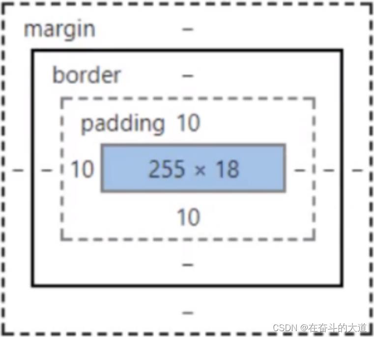
4.1什么是盒子模型
- margin:外边距
- padding:内边距
- border:边框
4.2、边框
border:粗细 样式 颜色
- 边框的粗细
- 边框的样式
- 边框的颜色
实例:
<!DOCTYPE html>
<html lang="en">
<head>
   <meta http-equiv="Content-Type" content="text/html; charset=gbk" />
    <title>Title</title>

    <style>
        /*body总有一个默认的外边距margin:0  常见操作*/
        /*h1,ul,li,a,body
            margin:0;
            padding: 0;
            text-decoration: none;
        */
        /* border:粗细 样式  颜色*/
        ul,h1,li,a,body
            margin:0;
            padding: 0;
            text-decoration: none;


        #box
            width: 300px;
            border:1px solid red ;


        h2
            font-size: 16px;
        background: cornflowerblue;
        line-height:30px;
            margin: 0;
            color: white;

        form
            background: coral;

        div:nth-of-type(1)>input
            border: 3px solid blue;

        div:nth-of-type(2) input
            border: 3px dashed green;

        div:nth-of-type(3) input
            border: 3px dashed purple;

    </style>
</head>
<body>

<div id="box">
    <h2>会员登录</h2>
    <form action="#">
        <div>
            <span>用户名</span>
            <input type="text">
        </div>
        <div>
            <span>密码</span>
            <input type="text">
        </div>
        <div>
            <span>邮箱</span>
            <input type="text">
        </div>

</form>


</div>
</body>
</html>
4.3、外边距----妙用:居中
margin-left/right/top/bottom–>表示四边,可分别设置,也可以同时设置如下
margin:0 0 0 0/*分别表示上、右、下、左;从上开始顺时针*/
/*例1:居中*/
margin:0 auto /*auto表示左右自动*/
/*例2:*/
margin:4px/*表示上、右、下、左都为4px*/
/*例3*/
margin:10px 20px 30px/*表示上为10px,左右为20px,下为30px*/
示例:
<!DOCTYPE html>
<html lang="en">
<head>
    <meta http-equiv="Content-Type" content="text/html; charset=gbk" />
    <title>Title</title>
    <!--外边距的妙用 : 居中元素-->
    <!-- margin: 0 auto; 居中-->
    <style>

        #box
            width: 300px;
            border:1px solid red ;
            /*顺时针上右下左*/
            margin: 0 auto;


        /*  margin: 0;
            margin: 0 1px;   上下、左右
            margin: 0 1px 2px 2px;  上右下左
          */
        h2
            font-size: 16px;
            background: cornflowerblue;
            line-height:30px;
            margin: 0 1px 2px 2px;
            color: white;

        form
            background: coral;

        input
            border: 1px solid red;

        div:nth-of-type(1)
            border: 1px solid red;
            padding: 10px 2px;


    </style>
</head>
<body>

<div id="box">
    <h2>会员登录</h2>
    <form action="#">
        <div>
            <span>用户名</span>
            <input type="text">
        </div>
        <div>
            <span>密码</span>
            <input type="text">
        </div>
        <div>
            <span>邮箱</span>
            <input type="text">
        </div>

    </form>


</div>
</body>
</html>
盒子计算方式:
margin+border+padding+内容的大小
总结:
body总有一个默认的外边距 margin:0
常见操作:初始化
margin:0;
padding:0;
text-decoration:none;
4.4、圆角边框----border-radius
border-radius有四个参数(顺时针),左上开始
圆圈:圆角=半径
示例:
<!DOCTYPE html>
<html lang="en">
<head>
    <meta http-equiv="Content-Type" content="text/html; charset=gbk" />
    <title>Title</title>
    <style>
        div
            width: 100px;
            height: 100px;
            border: 10px solid red;
            border-radius: 100px  100px 0px 0px;

        img
            border-radius: 25px;

    </style>
</head>
<body>
	<div></div>
    <img src="text.png" alt="">

</body>
4.5盒子阴影
示例:
<!DOCTYPE html>
<html lang="en">
<head>
     <meta http-equiv="Content-Type" content="text/html; charset=gbk" />
    <title>Title</title>
<!--margin:0 auto;居中
要求: 块元素,块元素有固定的宽度
    -->
    <style>
        div
            width: 100px;
            height: 100px;
            border: 10px solid red;
            box-shadow: 10px 10px 1px yellow;


        img
            /*margin:0 auto;*/
            border-radius:50px ;
            box-shadow: 10px 10px 1px green;
            vertical-align: center;

    </style>
</head>
<body>
<div style="width: 200px ;height: 100px">
    <img src="text.png" alt="">
</div>

</body>
</html>
5、浮动
5.1标准文档流

块级元素:独占一行
h1~h6 p div 列表。。。
行内元素:不占一行
span a img strong…行内元素可以被包含块级元素中,反之不可以。
5.2 display
- block:块元素
- inline:行内元素
- inline-block:是块元素,但是可以内联,在一行
- none:消失
这是一种实现行内元素排列的方式,但是我们很多情况用float
示例:
<!DOCTYPE html>
<html lang="en">
<head>
    <meta http-equiv="Content-Type" content="text/html; charset=gbk" />
    <title>Title</title>
<!--
 block,块元素
 inline,行内元素
 inline-block 是块元素,但是可以是内联,在一行!
 none
-->
    <style>
        div
            width: 100px;
            height: 100px;
            border: 1px solid red;
            display: inline;

        span
            width: 100px;
            height: 100px;
            border: 1px solid red;
            display: inline-block;

    </style>
</head>
<body>
<div>div块元素</div>
<span>span行内元素</span>
</body>
</html>
QQ会员导航页面

<!DOCTYPE html>
<html lang="en">
<head>
   <meta http-equiv="Content-Type" content="text/html; charset=gbk" />
    <title>QQ会员</title>
    <link rel="stylesheet" href="qq.css" />
</head>
<body>
<div class="wrap">
    <!--头部-->
    <header class="nav-header">
        <div class="head-contain">
            <a href="" class="top-logo"><img src="logo.png" width="145" height="90" /></a>
            <nav class="top-nav">
                <ul>
                    <li><a href="">功能特权</a> </li>
                    <li><a href="">游戏特权</a> </li>
                    <li><a href="">生活特权</a> </li>
                    <li><a href="">会员特权</a> </li>
                    <li><a href="">成长体系</a> </li>
                    <li><a href="">年费专区</a> </li>
                    <li><a href="">超级会员</a> </li>
                </ul>
            </nav>
            <div class="top-right">
                <a href="">登录</a>
                <a href="">开通超级会员</a>
            </div>
        </div>
    </header>
</div>
</body>
</html>
qq.css
*
    padding:0;
    margin: 0;

a
    text-decoration: none;

.nav-header
    height: 90px;
    width: 100%;
    background: rgba(0,0,0,.6);

.head-contain
    width: 1180px;
    height: 90px;
    margin: 0 auto;
    text-align: center;

.top-logo,.top-nav,.top-nav li,.top-right
    height: 90px;
    display: inline-block;
    vertical-align: top;

.top-nav
    margin: 0 48px;

.top-nav li
    line-height: 90px;
    width: 90px;

.top-nav li a
    display: block;
    text-align: center;
    font-size: 16px;
    color: #fff;

.top-nav li a:hover
    color: blue;


.top-right a
    display: inline-block;
    font-size: 16px;
    text-align: center;
    margin-top: 25px;
    border-radius: 35px;

.top-right a:first-of-type
    width: 93px;
    height: 38px;
    line-height: 38px;
    color: #fad65c;
    border: 1px #fad65c solid;

.top-right a:first-of-type:hover
    color: #986b0d;
    background: #fad65c;

.top-right a:last-of-type
    width: 140px;
    height: 40px;
    font-weight: 700;
    line-height: 40px;
    background: #fad65c;
    color: #986b0d;

.top-right a:last-of-type:hover
    background: #fddc6c;
图片资源:

5.3、float
float:left:左浮动
flota:right:右浮动
clear:both 清除左右浮动
示例:

<!DOCTYPE html>
<html lang="en">
<head>
   <meta http-equiv="Content-Type" content="text/html; charset=gbk" />
    <title>浮动</title>
    <style>
		div
			margin: 10px;
			padding: 5px;

		#father
			border: 1px #000000 solid;

		.layer01
			border: 1px #FF0000 dashed;
			display: inline-block;
			float: right;

		.layer02
			border: 1px #0000FF dashed;
			display: inline-block;
			float: right;

		.layer03
			border: 1px #0000FF dashed;
			display: inline-block;
			float: right;

		.layer04
			border: 1px #0000FF dashed;
			font-size: 12px;
			line-height: 50px;
			display: inline-block;
			float: right;
			clear: both;


	</style>
</head>
<body>
<div id="father" style="width:100%;height:140px;">
	<div class="layer01" style="width:120px; height:42px;">layer01</div>
	<div class="layer02" style="width:120px; height:42px;">layer02</div>
	<div class="layer03" style="width:120px; height:42px;">layer03</div>
	<div class="layer04" style="width:120px; height:42px;">layer04</div>
</div>
</body>
</html>
5.4、overflow及父级边框塌陷问题
clear 属性取值范围
/*
clear:right 右侧不允许有浮动元素
clear:left  左侧不允许有浮动元素
clear:both  两侧不允许有浮动元素
clear:none  不允许有浮动元素
*/
解决塌陷问题方案:
页面塌陷示例:

<!DOCTYPE html>
<html lang="en">
<head>
   <meta http-equiv="Content-Type" content="text/html; charset=gbk" />
    <title>浮动</title>
    <style>
		div
			margin: 10px;
			padding: 5px;

		#father
			border: 1px #000000 solid;

		.layer01
			border: 1px #FF0000 dashed;
			display: inline-block;
			float: right;

		.layer02
			border: 1px #0000FF dashed;
			display: inline-block;
			float: right;


	</style>
</head>
<body>
<div id="father" style="width:100%;">
	<div class="layer01" style="width:120px;">
		<span>浮动文字</span>
	</div>
	<div class="layer02" style="width:140px;">
		<img src="text.png">
	</div>
</div>
</body>
</html>
方案一:增加父级元素的高度;
		#father
			border: 1px #000000 solid;
			height:200px; #解决塌陷问题之增加父级元素高度
方案二:增加一个空的div标签,清除浮动
style 片段

        /*
		* 基于clear:both属性
		*/
		.clear
			clear:both;
			margin:0;
			padding:0;


HTML 片段
    <!-- 添加div,解决父级元素塌陷 -->
	<div class="clear"></div>
<!DOCTYPE html>
<html lang="en">
<head>
<meta http-equiv="Content-Type" content="text/html; charset=gbk" />
<title>浮动</title>
<style>
div
margin: 10px;
padding: 5px;
#father
border: 1px #000000 solid;
.layer01
border: 1px #FF0000 dashed;
display: inline-block;
float: right;
.layer02
border: 1px #0000FF dashed;
display: inline-block;
float: right;
/*
* 基于clear:both属性
*/
.clear
clear:both;
margin:0;
padding:0;
</style>
</head>
<body>
<div id="father" style="width:100%;">
<div class="layer01" style="width:120px;">
<span>浮动文字</span>
</div>
<div class="layer02" style="width:140px;">
<img src="text.png">
</div>
<!-- 添加div,解决父级元素塌陷 -->
<div class="clear"></div>
</div>
</body>
</html>
效果截图:
方案三:在父级元素中增加一个overflow:hidden
		#father
			border: 1px #000000 solid;
			overflow:hidden; /*解决父级元素塌陷问题*/
方案四:父类添加一个伪类:after
        #father:after
			content:'';
			display:block;
			clear:both;
总结:
- 浮动元素增加空div----》简单、代码尽量避免空div
- 设置父元素的高度-----》简单,元素假设没有了固定的高度,就会超出
- overflow----》简单,下拉的一些场景避免使用
- 父类添加一个伪类:after(推荐)----》写法稍微复杂,但是没有副作用,推荐使用
5.5、display与float对比
- display:方向不可以控制
- float:浮动起来的话会脱离标准文档流,所以要解决父级边框塌陷的问题。
6、定位
6.1 默认
示例:
<!DOCTYPE html>
<html lang="en">
<head>
   <meta http-equiv="Content-Type" content="text/html; charset=gbk" />
    <title>定位</title>
    <style>
        div
            margin: 10px;
            padding:5px ;
            font-size: 12px;
            line-height: 25px;

        #father
            border:1px solid #666666;
            padding: 0;

        #first
            background-color: #dc6b6b;
            border:1px dashed #e32c2c;

        #second
            background-color: #7edb87;
            border:1px dashed #30d50b;

        #third
            background-color: #3ed7c5;
            border:1px dashed #3537c1;

    </style>
</head>
<body>
<div id="father">
    <div id="first">第一个盒子</div>
    <div id="second">第二个盒子</div>
    <div id="third">第三个盒子</div>

</div>
</body>
</html>
6.2、相对定位
相对定位:positon:relstive;
相对于原来的位置,进行指定的偏移,相对定位的话,它仍然在标准文档流中,原来的位置会被保留
top:-20px;
left:20px;
bottom:-10px;
right:20px;
示例:
<!DOCTYPE html>
<html lang="en">
<head>
   <meta http-equiv="Content-Type" content="text/html; charset=gbk" />
    <title>定位</title>
    <!--    相对定位相对于自己原来的位置进行偏移-->
    <style>
        body
            padding: 20px;

        div
            margin: 10px;
            padding:5px ;
            font-size: 12px;
            line-height: 25px;

        #father
            border:1px solid #666666;
            padding: 0;

        #first
            background-color: #dc6b6b;
            border:1px dashed #e32c2c;
            position: relative;/*相对定位: 上下左右*/
            top: -10px;
            left: 20px;


        #second
            background-color: #7edb87;
            border:1px dashed #30d50b;

        #third
            background-color: #3ed7c5;
            border:1px dashed #3537c1;
            bottom: -10px;
            right: 20px;

    </style>
</head>
<body>
<div id="father">
    <div id="first">第一个盒子</div>
    <div id="second">第二个盒子</div>
    <div id="third">第三个盒子</div>

</div>
</body>
</html>
练习题:连接卡
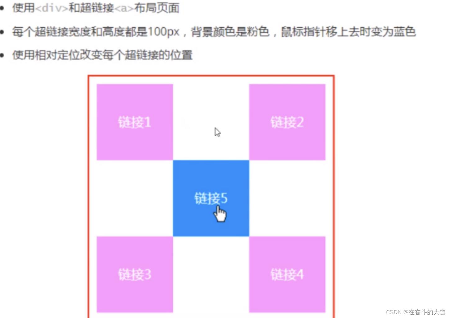
示例:
<!DOCTYPE html>
<html lang="en">
<head>
    <meta http-equiv="Content-Type" content="text/html; charset=gbk" />
    <title>Title</title>
    <style>
        #father

            padding: 10px;
            border: 2px solid red;
            width: 300px;
            height:300px;

       a
           width: 100px;
           height: 100px;
           text-decoration: none;
           background: #f55fc2;
           line-height: 100px;
           text-align: center;
           color: white;
           display: block;

       a:hover
           background-color: blue;

       .second,.fourth
           position: relative;
           left:200px;
           top: -100px;


       /*.fourth*/
       /*    position: relative;*/
       /*    left: 200px;*/
       /*    top: -100px;*/
       /**/
       .fifth
           position: relative;
           left: 100px;
           top: -300px;


    </style>
</head>
<body>
<div id="father">
    <a class="first" href="#">链接一</a>
    <a class="second" href="#">链接二 </a>
    <a class="third" href="#">链接三</a>
    <a class="fourth" href="#">链接四</a>
    <a class="fifth" href="#">链接五</a>

</div>

</body>
</html>
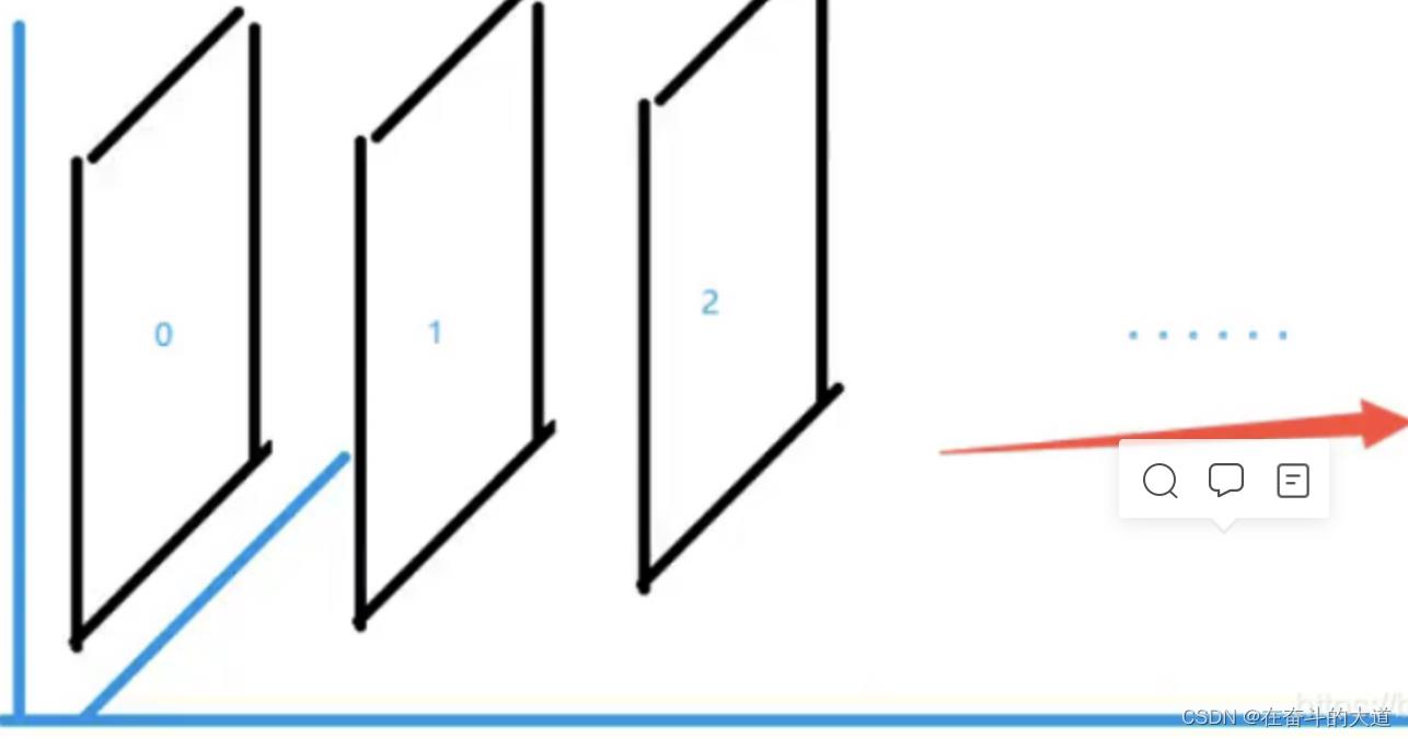
6.3、绝对定位-absolute
定位:基于xxx定位,上下左右~
1、没有父级元素定位的前提下,相对于浏览器定位
2、假设父级元素存在定位,我们通常会相对于父级元素进行偏移
3、在父级元素范围内移动
总结:相对一父级或浏览器的位置,进行指定的偏移,绝对定位的话,它不在标准文档流中,原来的位置不会被保留
<!DOCTYPE html>
<html lang="en">
<head>
    <meta http-equiv="Content-Type" content="text/html; charset=gbk" />
    <title>绝对定位</title>
    <style>
        div
            margin: 10px;
            padding:5px ;
            font-size: 12px;
            line-height: 25px;

        #father
            border:1px solid #666666;
            padding: 0;
            position: relative;

        #first
            background-color: #dc6b6b;
            border:1px dashed #e32c2c;

        #second
            background-color: #7edb87;
            border:1px dashed #30d50b;
            position:absolute ;
            right: 20px;
            top: -10px;


        #third
            background-color: #3ed7c5;
            border:1px dashed #3537c1;

    </style>
</head>
<body>
<div id="father">
    <div id="first">第一个盒子</div>
    <div id="second">第二个盒子</div>
    <div id="third">第三个盒子</div>

</div>
</body>
</html>
6.4、固定定位-fixed
<!DOCTYPE html>
<html lang="en">
<head>
    <meta http-equiv="Content-Type" content="text/html; charset=gbk" />
    <title>固定定位</title>
    <style>
        body
            height: 1000px;

         div:nth-of-type(1)/*绝对定位:没有相对的父级元素,所以相对于浏览器*/
             width: 100px;
             height: 100px;
             background:red;
             position: absolute;
             right: 0;
             bottom: 0;

        div:nth-of-type(2)
            width: 50px;
            height: 50px;
            background: yellow;
            position: fixed;
            right: 0;
            bottom: 0;

    </style>
</head>
<body>

<div>div1</div>
<div>div2</div>
</body>
</html>
6.5、z-index
图层~
z-index:默认是0,最高无限~999
示例:
<!DOCTYPE html>
<html lang="en">
<head>
    <meta http-equiv="Content-Type" content="text/html; charset=gbk" />
    <title>Z-index</title>
    <link rel="stylesheet" href="css/style.css">
</head>
<body>
<div id="app">
    <ul>
        <li><img src="logo.png" alt=""></li>
        <li class="tipText">微服务,Spring Alibaba cloud</li>
        <li class="tipBg"></li>
        <li>时间:2022-11-12</li>
        <li>地点:杭州</li>
    </ul>
</div>
</body>
</html>
#content
    width: 380;
    padding: 0px;
    margin: 0px;
    overflow: hidden;
    font-size: 12px;
    line-height: 25px;
    border: 1px solid yellow;

ul,li
    padding: 0px;
    margin: 0px;
    list-style: none;

/*父级元素相对定位*/
#content ul
    position: relative;

.tipText,.tipBg
    position: absolute;
    width: 380px;
    height: 25px;
    top:216px

.tipText
    color: white;
    z-index: 999;

.tipBg
    background: orange;
    opacity: 0.5;/*背景透明度*/
    filter: alpha(opacity=50);
7.动画
以上是关于CSS核心知识点的主要内容,如果未能解决你的问题,请参考以下文章