CSS display 属性
Posted 知其黑、受其白
tags:
篇首语:本文由小常识网(cha138.com)小编为大家整理,主要介绍了CSS display 属性相关的知识,希望对你有一定的参考价值。
阅读目录
display 属性规定元素应该生成的框的类型。
CSS display 全部属性
| 值 | 描述 |
|---|---|
| none | 此元素不会被显示。 |
| block | 此元素将显示为块级元素,此元素前后会带有换行符。 |
| inline | 默认。此元素会被显示为内联元素,元素前后没有换行符。 |
| inline-block | 行内块元素。(CSS2.1 新增的值) |
| list-item | 此元素会作为列表显示。 |
| run-in | 此元素会根据上下文作为块级元素或内联元素显示。 |
| compact | CSS 中有值 compact,不过由于缺乏广泛支持,已经从 CSS2.1 中删除。 |
| marker | CSS 中有值 marker,不过由于缺乏广泛支持,已经从 CSS2.1 中删除。 |
| table | 此元素会作为块级表格来显示(类似 <table>),表格前后带有换行符。 |
| inline-table | 此元素会作为内联表格来显示(类似 <table>),表格前后没有换行符。 |
| table-row-group | 此元素会作为一个或多个行的分组来显示(类似 <tbody>)。 |
| table-header-group | 此元素会作为一个或多个行的分组来显示(类似 <thead>)。 |
| table-footer-group | 此元素会作为一个或多个行的分组来显示(类似 <tfoot>)。 |
| table-row | 此元素会作为一个表格行显示(类似 <tr>)。 |
| table-column-group | 此元素会作为一个或多个列的分组来显示(类似 <colgroup>)。 |
| table-column | 此元素会作为一个单元格列显示(类似 <col>) |
| table-cell | 此元素会作为一个表格单元格显示(类似 <td> 和 <th>) |
| table-caption | 此元素会作为一个表格标题显示(类似 <caption>) |
| inherit | 规定应该从父元素继承 display 属性的值。 |
table-cell 布局
display:table-cell 属性简介
display:table-cell;会使元素表现的类似一个表格中的单元格 td,利用这个特性可以实现文字的垂直居中效果。
同时它也会破坏一些CSS属性,使用 table-cell 时最好不要与 float 以及 position: absolute 一起使用。
设置了 table-cell 的元素对高度和宽度高度敏感,对 margin 值无反应,可以响应 padding 的设置,表现几乎类似一个 td 元素。
小结:
1. 不要与 float:left; position:absolute; 一起使用
2. 可以实现大小不固定元素的垂直居中
3. margin 设置无效,响应 padding 设置
4. 对高度和宽度高度敏感
5. 不要对 display:table-cell 使用百分比设置宽度和高度
1 高度不固定内容水平垂直居中
文字水平垂直居中

<!DOCTYPE html>
<html>
<head>
    <meta charset="utf-8">
    <title></title>
    <style>
        .table-wrap
            display: table-cell;
            height: 200px;
            width: 100px;
            padding: 20px;
            vertical-align: middle;
            text-align: center;
            border: 1px solid red;

    </style>
</head>
<body>

<div  class="table-wrap">
    我是一大推文字,我想要垂直居中,这是省略这是省略这是省略这是省略
</div>

</body>
</html>
关键在于设置了 display:cell; 后,vertical-align:middle 使文字内容垂直居中。
图片水平垂直居中

<!DOCTYPE html>
<html>
<head>
    <meta charset="utf-8">
    <title></title>
    <style>
        .outerdisplay: table;width: 100%;
        .table-wrap
            display: table-cell;
            height: 200px;
            width: 100px;
            padding: 20px;
            vertical-align: middle;
            text-align: center;
            border: 1px solid red;

    </style>
</head>
<body>

<div class="outer">
    <div  class="table-wrap">
        <img src="3.jpg" alt="logo" />
    </div>
</div>

</body>
</html>
中间的图片会随着外层容器的大小而自动水平垂直居中,其实原理和文字水平垂直居中一模一样的。
2 元素两端垂直对齐
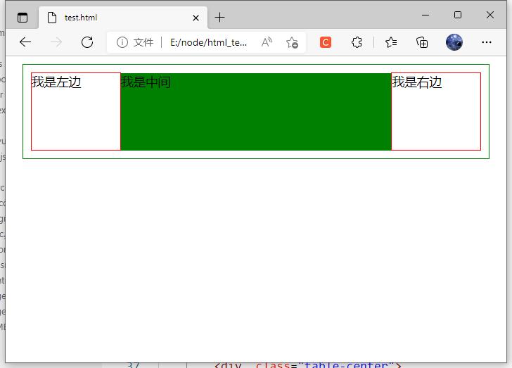
其中 table-center 的顶部没有与左右两侧对齐,原因是 teble-left 中的 <p> 有一个 margin-top, 而表格布局中默认是文字顶部对齐的,所以 table-center 会向下移动到首行文字基线对齐,解决办法是为 table-center 添加与左右两侧中 margin-top 较大者等值的 padding-top即可。
<!DOCTYPE html>
<html>
<head>
    <meta charset="utf-8">
    <title></title>
    <style>
        *
            margin: 0;
            padding: 0;

        .outer
            display: table;
            width: 90%;
            margin: 10px auto;
            padding: 10px;
            border: 1px solid green;

        .table-left,
        .table-right
            display: table-cell;
            width: 20%;
            border: 1px solid red;


        .table-center
            height: 100px;
            background-color: green;

    </style>
</head>
<body>

    <div class="outer">
        <div class="table-left">
            <p>我是左边</p>
        </div>
        <div  class="table-center">
            我是中间
        </div>
        <div class="table-right">
            <p>我是右边</p>
        </div>
    </div>

</body>
</html>
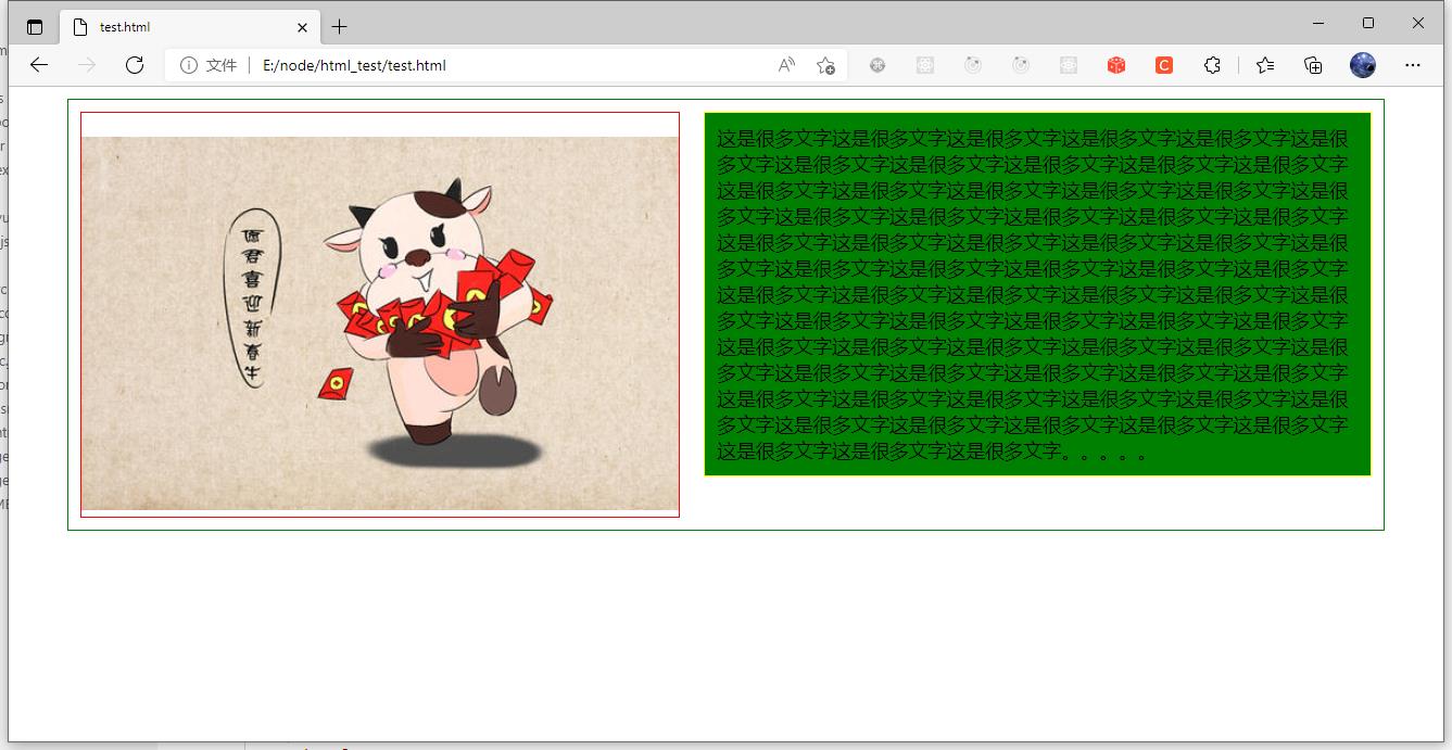
3 等高布局
拉伸宽度,会发现左右两侧始终保持高度一致。
<!DOCTYPE html>
<html>
<head>
    <meta charset="utf-8">
    <title></title>
    <style>
        *
            margin: 0;
            padding: 0;

        .outer
            display: table;
            width: 90%;
            margin: 10px auto;
            padding: 10px;
            border: 1px solid green;

        .table-left
            display: table-cell;
            width: 150px;
            padding-top: 20px;
            border: 1px solid red;
            vertical-align: top;
            text-align: center;

        .table-right
            border: 1px solid yellow;
            background-color: green;
            margin-left: 20px;
            padding: 10px;

    </style>
</head>
<body>

<div class="outer">
    <div class="table-left">
        <img src="3.jpg" alt="logo" />
    </div>
    <div class="table-right">
        <span>这是很多文字这是很多文字这是很多文字这是很多文字这是很多文字这是很多文字这是很多文字这是很多文字这是很多文字这是很多文字这是很多文字这是很多文字这是很多文字这是很多文字这是很多文字这是很多文字这是很多文字这是很多文字这是很多文字这是很多文字这是很多文字这是很多文字这是很多文字这是很多文字这是很多文字这是很多文字这是很多文字这是很多文字这是很多文字这是很多文字这是很多文字这是很多文字这是很多文字这是很多文字这是很多文字这是很多文字这是很多文字这是很多文字这是很多文字这是很多文字这是很多文字这是很多文字这是很多文字这是很多文字这是很多文字这是很多文字这是很多文字这是很多文字这是很多文字这是很多文字这是很多文字这是很多文字这是很多文字这是很多文字这是很多文字这是很多文字这是很多文字这是很多文字这是很多文字这是很多文字这是很多文字这是很多文字这是很多文字这是很多文字这是很多文字这是很多文字这是很多文字这是很多文字这是很多文字。。。。。</span>
    </div>
</div>

</body>
</html>
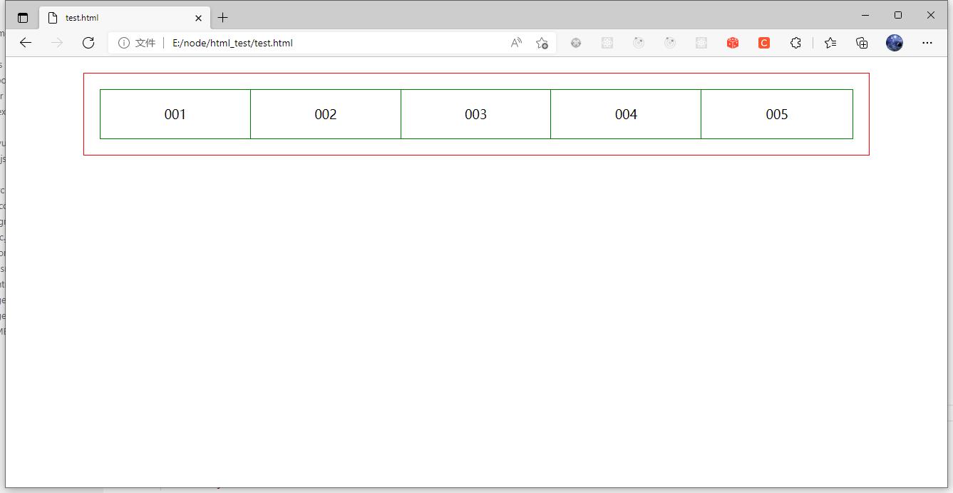
4 均分列表布局
以前进行类似的布局我都会使用 display:inline-block; 的方式,需要在ul上设置 font-size: 0; 来清除每一个小块之间的间隙,还需要为每一个项写一个百分比宽度。
使用 table-cell 后,不需要写百分比宽度,也不需要清除小块间的间隙。
而且添加额外项时,会自动平均分配宽度。
<!DOCTYPE html>
<html>
<head>
    <meta charset="utf-8">
    <title></title>
    <style>
        *
            margin: 0;
            padding: 0;

        .table-wrap
            display: table;
            width: 80%;
            margin: 20px auto;
            border: 1px solid red;
            padding: 20px;

        .table-wrap li
            display: table-cell;
            padding: 20px;
            border: 1px solid green;
            border-right: none;
            text-align: center;
            vertical-align: middle;

        .table-wrap li:last-child
            border-right: 1px solid green;

    </style>
</head>
<body>

    <ul class="table-wrap">
        <li>001</li>
        <li>002</li>
        <li>003</li>
        <li>004</li>
        <li>005</li>
    </ul>

</body>
</html>
5 两栏自适应布局
即左侧宽度固定,右侧自动分配剩余空间。
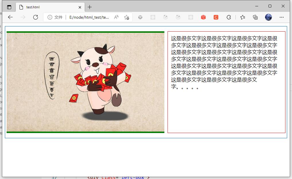
左侧宽度固定,右侧宽度自适应。
布局原理也可以用 BFC 来解释,左侧和右侧都是 BFC 块,BFC 块是不会和 float 块发生重叠的。
<!DOCTYPE html>
<html>
<head>
    <meta charset="utf-8">
    <title></title>
    <style>
        *
            box-sizing: border-box;

        .content
            display: table;
            border: 1px solid #06c;
            padding: 15px 5px;
            max-width: 1000px;
            margin: 10px auto;
            min-width: 320px;
            width: 100%;

        .left-box
            float: left;
            background-color: green;
            margin-right: 10px;
            padding-top: 5px;

        .right-box
            display: table-cell;
            border: 1px solid red;
            padding: 10px;
            vertical-align: top;

    </style>
</head>
<body>

    <div class="content">
        <div class="left-box">
            <img src="3.jpg" alt="logo" />
        </div>
        <div class="right-box">
            <span>这是很多文字这是很多文字这是很多文字这是很多文字这是很多文字这是很多文字这是很多文字这是很多文字这是很多文字这是很多文字这是很多文字这是很多文字这是很多文字这是很多文字这是很多文字这是很多文字这是很多文字这是很多文字这是很多文字这是很多文字这是很多文字这是很多文字这是很多文字这是很多文字。。。。。</span>
        </div>
    </div>

</body>
</html>
display:table 的用法
IE8支持很多新的 CSS display 属性值,包括与表格相关的属性值:table、table-row 和 table-cell,它也是最后一款支持这些属性值的主流浏览器。
它标志着复杂CSS布局技术的结束,同时也给了HTML表格布局致命一击。
最终,使用CSS布局来制作出类似于 table 布局的栅格将会变得十分迅速和简单。
为什么不用table元素?
目前,在大多数开发环境中已经不用 table 元素来做网页布局了,取而代之的是 div+css,那么为什么不用table元素呢?
1、用DIV+CSS编写出来的文件 k 数比用 table 写出来的要小。
2、table 必须在页面完全加载后才显示,没有加载完毕前,table 为一片空白,也就是说,需要页面完毕才显示,而div是逐行显示,不需要页面完全加载完毕,就可以一边加载一边显示。
3、非表格内容用 table 来装,不符合标签语义化要求,不利于SEO。
4、table 的嵌套性太多,用DIV代码会比较简洁。
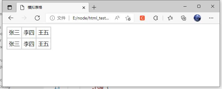
1 div 模拟表格:
<!DOCTYPE html>
<html>
<head lang="en">
    <meta charset="UTF-8">
    <title>模拟表格</title>
    <style type="text/css" rel="stylesheet">
        .table
            display: table;
            border: 1px solid #cccccc;
            margin: 5px;
            /*display: table时padding会失效*/

        .row
            display: table-row;
            border: 1px solid #cccccc;
            /*display: table-row时margin、padding同时失效*/

        .cell
            display: table-cell;
            border: 1px solid #cccccc;
            padding: 5px;
            /*display: table-cell时margin会失效*/

    </style>
</head>
<body>

<div class="table">
    <div class="row">
        <div class="cell">张三</div>
        <div class="cell">李四</div>
        <div class="cell">王五</div>
    </div>
    <div class="row">
        <div class="cell">张三</div>
        <div class="cell">李四</div>
        <div class="cell">王五</div>
    </div>
</div>

</body>
</html>
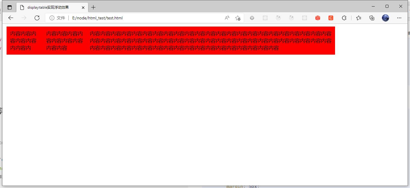
2 实现浮动效果
<!DOCTYPE html>
<html>
<head lang="en">
    <meta charset="UTF-8">
    <title>display:table实现浮动效果</title>
</head>
<body>
<style type="text/css" rel="stylesheet">
    .table
        display: table;
        margin: 5px;
        width: 1000px;

    .row
        display: table-row;


    .cell
        display: table-cell;
        padding: 10px;
        background-color: red;

</style>

<div class="table">
    <div class=以上是关于CSS display 属性的主要内容,如果未能解决你的问题,请参考以下文章