学习 Bootstrap 5 之 Sizing 和 Spacing
Posted _DiMinisH
tags:
篇首语:本文由小常识网(cha138.com)小编为大家整理,主要介绍了学习 Bootstrap 5 之 Sizing 和 Spacing相关的知识,希望对你有一定的参考价值。
学习 Bootstrap 5 之 尺寸 和 间距
尺寸 (Sizing)
1. 相对于父类的尺寸 (Relative to the parent)
(1). 宽度 class = “w-N”
N的值为 25, 50, 75, 100, auto, 表示占其父元素宽度的百分比, 默认情况下是auto
对比
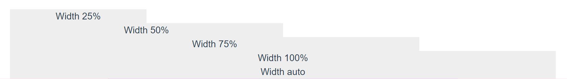
  <div class = "container">
    <div class="w-25" style="background-color: #eee;">Width 25%</div>
    <div class="w-50" style="background-color: #eee;">Width 50%</div>
    <div class="w-75" style="background-color: #eee;">Width 75%</div>
    <div class="w-100" style="background-color: #eee;">Width 100%</div>
    <div class="w-auto" style="background-color: #eee;">Width auto</div>
  </div>
(2). 高度 class = “h-N”
N的值为 25, 50, 75, 100, auto, 表示占其父元素高度的百分比, 默认情况下是auto
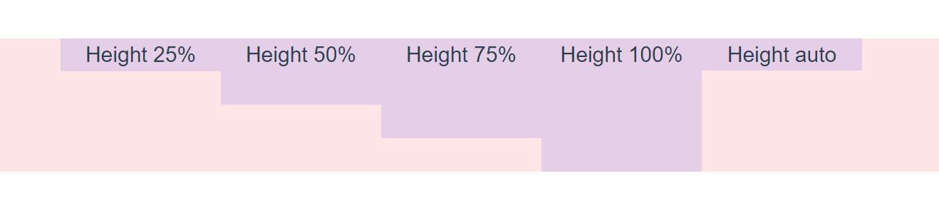
  <div style="height: 100px; background-color: rgba(255,0,0,0.1);">
    <div class="h-25 d-inline-block" style="width: 120px; background-color: rgba(0,0,255,.1)">Height 25%</div>
    <div class="h-50 d-inline-block" style="width: 120px; background-color: rgba(0,0,255,.1)">Height 50%</div>
    <div class="h-75 d-inline-block" style="width: 120px; background-color: rgba(0,0,255,.1)">Height 75%</div>
    <div class="h-100 d-inline-block" style="width: 120px; background-color: rgba(0,0,255,.1)">Height 100%</div>
    <div class="h-auto d-inline-block" style="width: 120px; background-color: rgba(0,0,255,.1)">Height auto</div>
  </div>
(3). 设置最大宽度和高度
最大宽度 class = “mw-100”
最大高度 class = “mh-100”
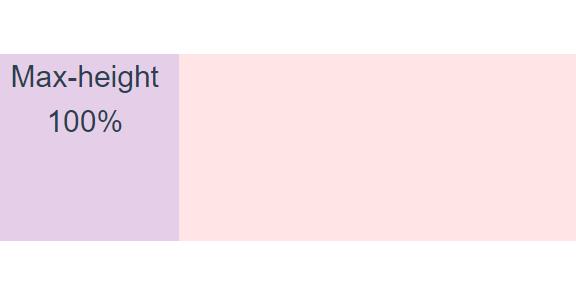
  <div style="height: 100px; background-color: rgba(255,0,0,.1);">
    <div class="mh-100" style="width: 100px; height: 200px; background-color: rgba(0,0,255,.1);">Max-height 100%</div>
  </div>
2. 相对于视口的尺寸 (Relative to the viewport)
在css中, 可以使用“width:100vw;”样式来设置宽为100vw, width属性可以设置元素的宽度, vw是一个视口单位, 是指相对于视口的宽度; 1vw等于视口宽度的1%, 比如浏览器的宽度为1920px则“1vw=19.2px”。
<div class="min-vw-100">Min-width 100vw</div>
<div class="min-vh-100">Min-height 100vh</div>
<div class="vw-100">Width 100vw</div>
<div class="vh-100">Height 100vh</div>
间距 (Spacing)
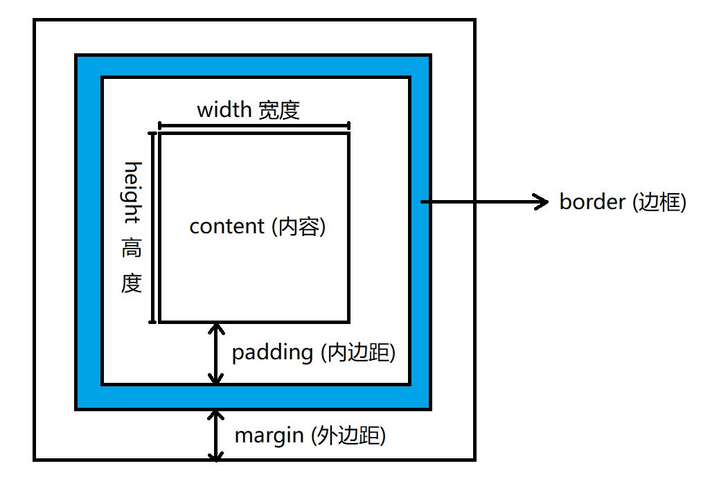
1. 盒子模型
2. Bootstrap 间距类 (Notation)
(1). 视口宽度xs 属性边-尺寸
(2). 其他视口宽度 属性边-断点-尺寸
(3). 属性取值
1). 外边距 (margin) m
用m表示外边距
例如:
m边-尺寸
m边-断点-尺寸
2). 内边距 (padding) p
用p表示内边距
例如:
p边-尺寸
p边-断点-尺寸
(4). 边取值
| 值 | 效果 |
|---|---|
| t | 上 |
| b | 底 |
| s | 左 |
| e | 右 |
| x | 左 和 右 |
| y | 顶 和 底 |
| blank | 上下左右四个位置 |
(5). 尺寸取值
| 值 | 代表尺寸 |
|---|---|
| 0 | 0 (边距为0) |
| 1 | 0.25rem |
| 2 | 0.5rem |
| 3 | 1rem |
| 4 | 1.5rem |
| 5 | 3rem |
| auto | auto (自动) |
(6). 使用
rem
rem (font size of the root element) 是指相对于根元素的字体大小的单位, 注意是根元素, 不是父元素, 根节点标签是html, 默认情况下, 浏览器的font-size是16px, 因此, 1rem = 16px
间距类的使用
属性边-尺寸
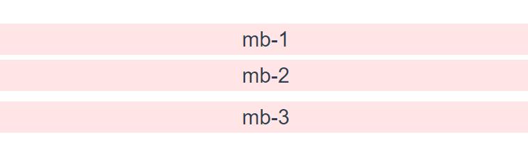
  <div class = "mb-1" style="background-color: rgba(255,0,0,.1);">
    mb-1
  </div>
  <div class = "mb-2" style=" background-color: rgba(255,0,0,.1);">
    mb-2
  </div>
  <div class = "mb-3" style="background-color: rgba(255,0,0,.1);">
    mb-3
  </div>
  <div style="background-color: rgba(255,0,0,.1);">
  </div>
mb-1表示: 下外边距是0.25rem
m表示: 外边距
b表示: 下(底)
1表示: 0.25rem
以上是关于学习 Bootstrap 5 之 Sizing 和 Spacing的主要内容,如果未能解决你的问题,请参考以下文章