肝了3天,整理了65个Matplotlib案例,这能不收藏?
Posted 大数据v
tags:
篇首语:本文由小常识网(cha138.com)小编为大家整理,主要介绍了肝了3天,整理了65个Matplotlib案例,这能不收藏?相关的知识,希望对你有一定的参考价值。

导读:Matplotlib 作为 Python 家族当中最为著名的画图工具,基本的操作还是要掌握的,今天就来分享一波。
文章很长,高低要忍一下,如果忍不了,那就收藏吧,总会用到的。
作者:周萝卜
来源:萝卜大杂烩(ID:luobodazahui)

启用和检查交互模式
在 Matplotlib 中绘制折线图
绘制带有标签和图例的多条线的折线图
在 Matplotlib 中绘制带有标记的折线图
改变 Matplotlib 中绘制的图形的大小
在 Matplotlib 中设置轴限制
使用 Python Matplotlib 显示背景网格
使用 Python Matplotlib 将绘图保存到图像文件
将图例放在 plot 的不同位置
绘制具有不同标记大小的线条
用灰度线绘制折线图
以高 dpi 绘制 PDF 输出
绘制不同颜色的多线图
语料库创建词云
使用特定颜色在 Matplotlib Python 中绘制图形
NLTK 词汇色散图
绘制具有不同线条图案的折线图
更新 Matplotlib 折线图中的字体外观
用颜色名称绘制虚线和点状图
以随机坐标绘制所有可用标记
绘制一个非常简单的条形图
在 X 轴上绘制带有组数据的条形图
具有不同颜色条形的条形图
使用 Matplotlib 中的特定值改变条形图中每个条的颜色
在 Matplotlib 中绘制散点图
使用单个标签绘制散点图
用标记大小绘制散点图
在散点图中调整标记大小和颜色
在 Matplotlib 中应用样式表
自定义网格颜色和样式
在 Python Matplotlib 中绘制饼图
在 Matplotlib 饼图中为楔形设置边框
在 Python Matplotlib 中设置饼图的方向
在 Matplotlib 中绘制具有不同颜色主题的饼图
在 Python Matplotlib 中打开饼图的轴
具有特定颜色和位置的饼图
在 Matplotlib 中绘制极坐标图
在 Matplotlib 中绘制半极坐标图
Matplotlib 中的极坐标等值线图
绘制直方图
在 Matplotlib 直方图中选择 bins
在 Matplotlib 中绘制没有条形的直方图
使用 Matplotlib 同时绘制两个直方图
绘制具有特定颜色、边缘颜色和线宽的直方图
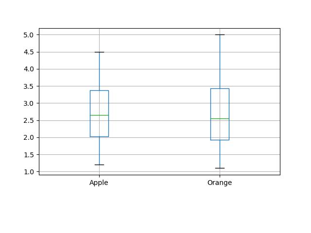
用颜色图绘制直方图
更改直方图上特定条的颜色
箱线图
箱型图按列数据分组
更改箱线图中的箱体颜色
更改 Boxplot 标记样式、标记颜色和标记大小
用数据系列绘制水平箱线图
箱线图调整底部和左侧
使用 Pandas 数据在 Matplotlib 中生成热图
带有中间颜色文本注释的热图
热图显示列和行的标签并以正确的方向显示数据
将 NA cells 与 HeatMap 中的其他 cells 区分开来
在 matplotlib 中创建径向热图
在 Matplotlib 中组合两个热图
使用 Numpy 和 Matplotlib 创建热图日历
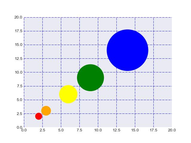
在 Python 中创建分类气泡图
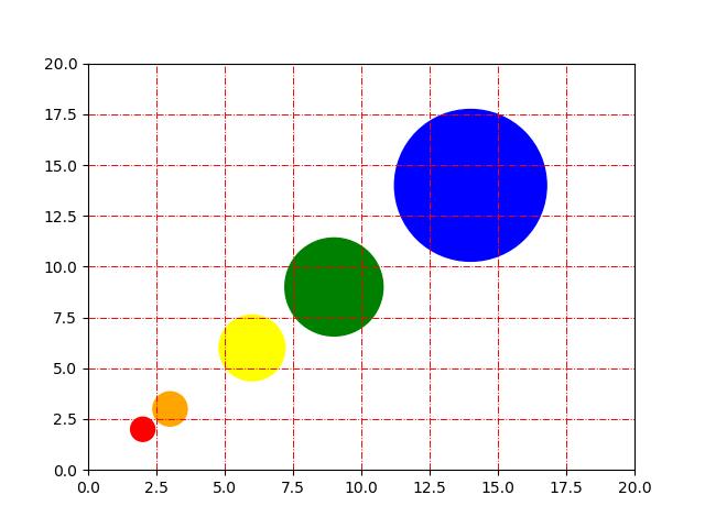
使用 Numpy 和 Matplotlib 创建方形气泡图
使用 Numpy 和 Matplotlib 创建具有气泡大小的图例
使用 Matplotlib 堆叠条形图
在同一图中绘制多个堆叠条
Matplotlib 中的水平堆积条形图
01 启用和检查交互模式
import matplotlib as mpl
import matplotlib.pyplot as plt

# Set the interactive mode to ON
plt.ion()

# Check the current status of interactive mode
print(mpl.is_interactive())
Output:
True02 在 Matplotlib 中绘制折线图
import matplotlib.pyplot as plt

#Plot a line graph
plt.plot([5, 15])

# Add labels and title
plt.title("Interactive Plot")
plt.xlabel("X-axis")
plt.ylabel("Y-axis")
plt.show()
Output:
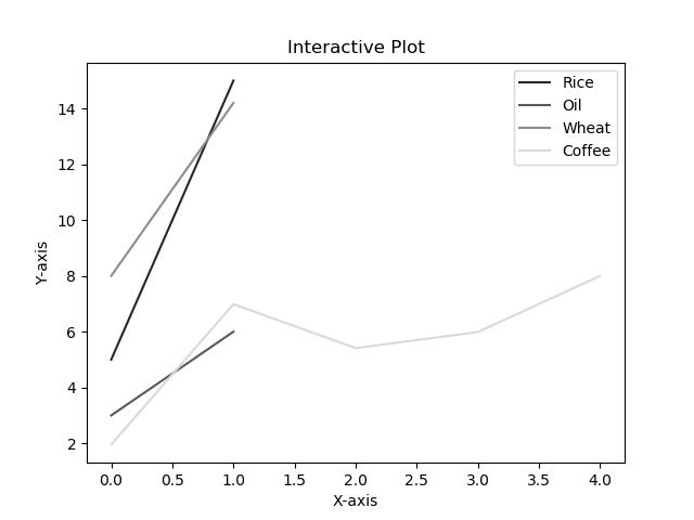
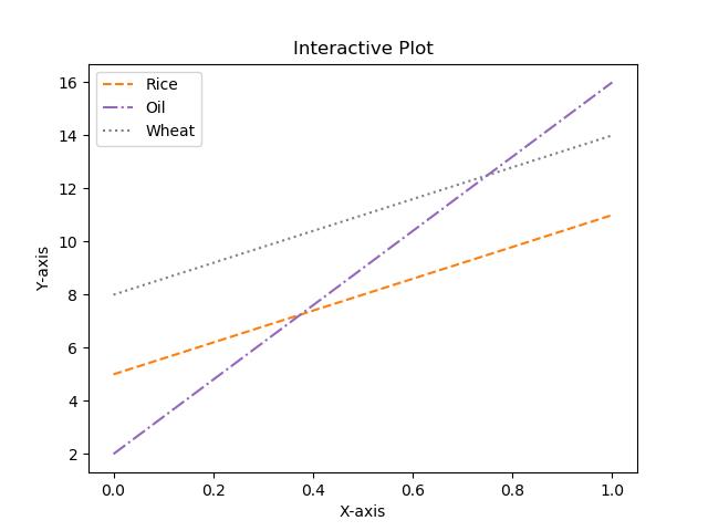
03 绘制带有标签和图例的多条线的折线图
import matplotlib.pyplot as plt

#Plot a line graph
plt.plot([5, 15], label='Rice')
plt.plot([3, 6], label='Oil')
plt.plot([8.0010, 14.2], label='Wheat')
plt.plot([1.95412, 6.98547, 5.41411, 5.99, 7.9999], label='Coffee')

# Add labels and title
plt.title("Interactive Plot")
plt.xlabel("X-axis")
plt.ylabel("Y-axis")

plt.legend()
plt.show()
Output:

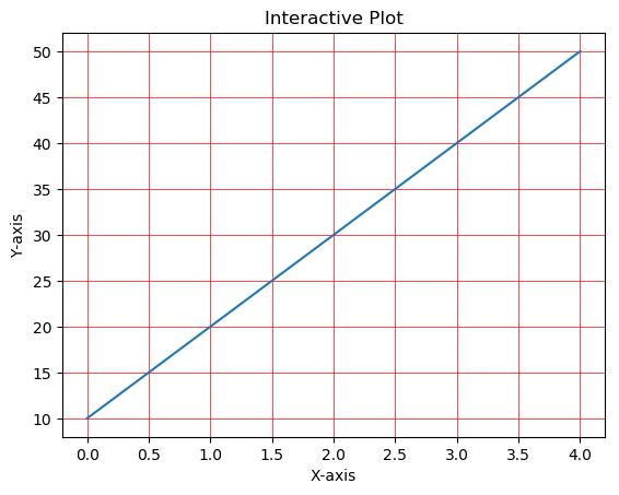
04 在 Matplotlib 中绘制带有标记的折线图
import matplotlib.pyplot as plt

# Changing default values for parameters individually
plt.rc('lines', linewidth=2, linestyle='-', marker='*')
plt.rcParams['lines.markersize'] = 25
plt.rcParams['font.size'] = '10.0'

#Plot a line graph
plt.plot([10, 20, 30, 40, 50])
# Add labels and title
plt.title("Interactive Plot")
plt.xlabel("X-axis")
plt.ylabel("Y-axis")

plt.show()
Output:

05 改变 Matplotlib 中绘制的图形的大小
import matplotlib.pyplot as plt

# Changing default values for parameters individually
plt.rc('lines', linewidth=2, linestyle='-', marker='*')

plt.rcParams["figure.figsize"] = (4, 8)

# Plot a line graph
plt.plot([10, 20, 30, 40, 50, 60, 70, 80])
# Add labels and title
plt.title("Interactive Plot")
plt.xlabel("X-axis")
plt.ylabel("Y-axis")

plt.show()
Output:

06 在 Matplotlib 中设置轴限制
import matplotlib.pyplot as plt

data1 = [11, 12, 13, 14, 15, 16, 17]
data2 = [15.5, 12.5, 11.7, 9.50, 12.50, 11.50, 14.75]

# Add labels and title
plt.title("Interactive Plot")
plt.xlabel("X-axis")
plt.ylabel("Y-axis")

# Set the limit for each axis
plt.xlim(11, 17)
plt.ylim(9, 16)

# Plot a line graph
plt.plot(data1, data2)

plt.show()
Output:
07 使用 Python Matplotlib 显示背景网格
import matplotlib.pyplot as plt

plt.grid(True, linewidth=0.5, color='#ff0000', linestyle='-')

#Plot a line graph
plt.plot([10, 20, 30, 40, 50])
# Add labels and title
plt.title("Interactive Plot")
plt.xlabel("X-axis")
plt.ylabel("Y-axis")

plt.show()
Output:
08 使用 Python Matplotlib 将绘图保存到图像文件
import matplotlib.pyplot as plt

plt.grid(True, linewidth=0.5, color='#ff0000', linestyle='-')

#Plot a line graph
plt.plot([10, 20, 30, 40, 50])
# Add labels and title
plt.title("Interactive Plot")
plt.xlabel("X-axis")
plt.ylabel("Y-axis")

plt.savefig("foo.png", bbox_inches='tight')
Output:
09 将图例放在 plot 的不同位置
import matplotlib.pyplot as plt

#Plot a line graph
plt.plot([5, 15], label='Rice')
plt.plot([3, 6], label='Oil')
plt.plot([8.0010, 14.2], label='Wheat')
plt.plot([1.95412, 6.98547, 5.41411, 5.99, 7.9999], label='Coffee')

# Add labels and title
plt.title("Interactive Plot")
plt.xlabel("X-axis")
plt.ylabel("Y-axis")

plt.legend(bbox_to_anchor=(1.1, 1.05))

plt.show()
Output:

10 绘制具有不同标记大小的线条
import matplotlib.pyplot as plt

y1 = [12, 14, 15, 18, 19, 13, 15, 16]
y2 = [22, 24, 25, 28, 29, 23, 25, 26]
y3 = [32, 34, 35, 38, 39, 33, 35, 36]
y4 = [42, 44, 45, 48, 49, 43, 45, 46]
y5 = [52, 54, 55, 58, 59, 53, 55, 56]


# Plot lines with different marker sizes
plt.plot(y1, y2, label = 'Y1-Y2', lw=2, marker='s', ms=10) # square
plt.plot(y1, y3, label = 'Y1-Y3', lw=2, marker='^', ms=10) # triangle
plt.plot(y1, y4, label = 'Y1-Y4', lw=2, marker='o', ms=10) # circle
plt.plot(y1, y5, label = 'Y1-Y5', lw=2, marker='D', ms=10) # diamond
plt.plot(y2, y5, label = 'Y2-Y5', lw=2, marker='P', ms=10) # filled plus sign

plt.legend()
plt.show()
Output:

11 用灰度线绘制折线图
import matplotlib.pyplot as plt

# Plot a line graph with grayscale lines
plt.plot([5, 15], label='Rice', c='0.15')
plt.plot([3, 6], label='Oil', c='0.35')
plt.plot([8.0010, 14.2], label='Wheat',  c='0.55')
plt.plot([1.95412, 6.98547, 5.41411, 5.99, 7.9999], label='Coffee',  c='0.85')

# Add labels and title
plt.title("Interactive Plot")
plt.xlabel("X-axis")
plt.ylabel("Y-axis")

plt.legend()
plt.show()
Output:
12 以高 dpi 绘制 PDF 输出
import matplotlib.pyplot as plt

#Plot a line graph
plt.plot([5, 15], label='Rice')
plt.plot([3, 6], label='Oil')
plt.plot([8.0010, 14.2], label='Wheat')
plt.plot([1.95412, 6.98547, 5.41411, 5.99, 7.9999], label='Coffee')

# Add labels and title
plt.title("Interactive Plot")
plt.xlabel("X-axis")
plt.ylabel("Y-axis")

plt.savefig('output.pdf', dpi=1200, format='pdf', bbox_inches='tight')
Output:
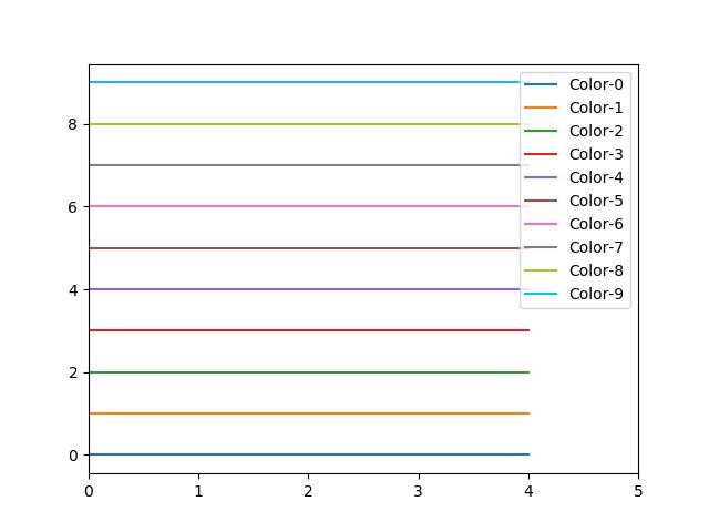
生成带有图片的pdf文件13 绘制不同颜色的多线图
import matplotlib.pyplot as plt

for i in range(10):
    plt.plot([i]*5, c='C'+str(i), label='C'+str(i))

# Plot a line graph
plt.xlim(0, 5)

# Add legend
plt.legend()

# Display the graph on the screen
plt.show()
Output:
14 语料库创建词云
import nltk
from nltk.corpus import webtext
from nltk.probability import FreqDist
from wordcloud import WordCloud
import matplotlib.pyplot as plt

nltk.download('webtext')
wt_words = webtext.words('testing.txt')  # Sample data
data_analysis = nltk.FreqDist(wt_words)

filter_words = dict([(m, n) for m, n in data_analysis.items() if len(m) > 3])

wcloud = WordCloud().generate_from_frequencies(filter_words)

# Plotting the wordcloud
plt.imshow(wcloud, interpolation="bilinear")

plt.axis("off")
(-0.5, 399.5, 199.5, -0.5)
plt.show()
Output:

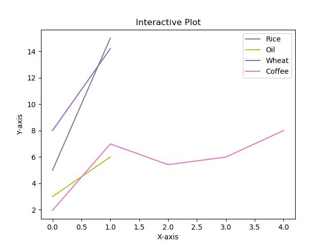
15 使用特定颜色在 Matplotlib Python 中绘制图形
import matplotlib.pyplot as plt

#Plot a line graph with specific colors
plt.plot([5, 15], label='Rice', c='C7')
plt.plot([3, 6], label='Oil', c='C8')
plt.plot([8.0010, 14.2], label='Wheat',  c='C4')
plt.plot([1.95412, 6.98547, 5.41411, 5.99, 7.9999], label='Coffee',  c='C6')

# Add labels and title
plt.title("Interactive Plot")
plt.xlabel("X-axis")
plt.ylabel("Y-axis")

plt.legend()
plt.show()
Output
16 NLTK 词汇色散图
import nltk
from nltk.corpus import webtext
from nltk.probability import FreqDist
from wordcloud import WordCloud
import matplotlib.pyplot as plt

words = ['data', 'science', 'dataset']

nltk.download('webtext')
wt_words = webtext.words('testing.txt')  # Sample data

points = [(x, y) for x in range(len(wt_words))
          for y in range(len(words)) if wt_words[x] == words[y]]

if points:
    x, y = zip(*points)
else:
    x = y = ()

plt.plot(x, y, "rx", scalex=.1)
plt.yticks(range(len(words)), words, color="b")
plt.ylim(-1, len(words))
plt.title("Lexical Dispersion Plot")
plt.xlabel("Word Offset")
plt.show()
Output:

17 绘制具有不同线条图案的折线图
import matplotlib.pyplot as plt

# Plot a line graph with grayscale lines
plt.plot([5, 11], label='Rice', c='C1', ls='--')
plt.plot([2, 16], label='Oil', c='C4', ls='-.')
plt.plot([8, 14], label='Wheat', c='C7', ls=':')

# Add labels and title
plt.title("Interactive Plot")
plt.xlabel("X-axis")
plt.ylabel("Y-axis")

plt.legend()
plt.show()
Output:
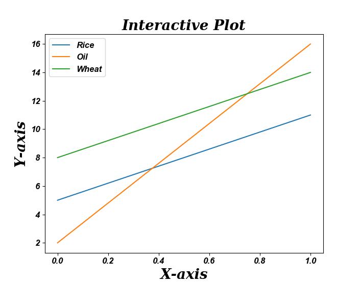
18 更新 Matplotlib 折线图中的字体外观
import matplotlib.pyplot as plt

fontparams = 'font.size': 12, 'font.weight':'bold',
              'font.family':'arial', 'font.style':'italic'

plt.rcParams.update(fontparams)

# Plot a line graph with specific font style
plt.plot([5, 11], label='Rice')
plt.plot([2, 16], label='Oil')
plt.plot([8, 14], label='Wheat')

labelparams = 'size': 20, 'weight':'semibold',
              'family':'serif', 'style':'italic'

# Add labels and title
plt.title("Interactive Plot", labelparams)
plt.xlabel("X-axis", labelparams)
plt.ylabel("Y-axis", labelparams)

plt.legend()
plt.show()
Output:
19 用颜色名称绘制虚线和点状图
import matplotlib.pyplot as plt

x = [2, 4, 5, 8, 9, 13, 15, 16]
y = [1, 3, 4, 7, 10, 11, 14, 17]

# Plot a line graph with dashed and maroon color
plt.plot(x, y, label='Price', c='maroon', ls=('dashed'), lw=2)

# Plot a line graph with dotted and teal color
plt.plot(y, x, label='Rank', c='teal', ls=('dotted'), lw=2)

plt.legend()
plt.show()
Output:

20 以随机坐标绘制所有可用标记
import numpy as np
import matplotlib.pyplot as plt
from matplotlib.lines import Line2D

# Prepare 50 random numbers to plot
n1 = np.random.rand(50)
n2 = np.random.rand(50)

markerindex = np.random.randint(0, len(Line2D.markers), 50)

for x, y in enumerate(Line2D.markers):
    i = (markerindex == x)
    plt.scatter(n1[i], n2[i], marker=y)

plt.show()
Output:

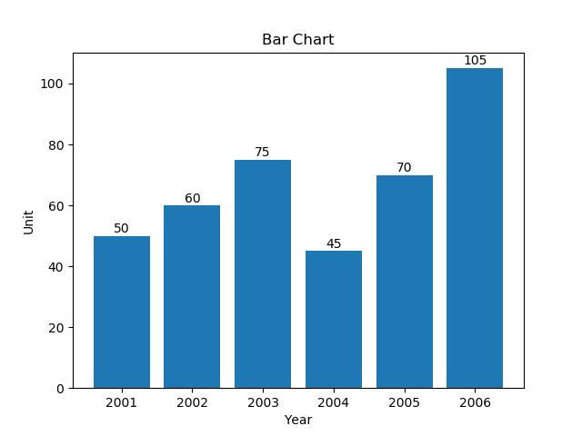
21 绘制一个非常简单的条形图
import matplotlib.pyplot as plt

year = [2001, 2002, 2003, 2004, 2005, 2006]
unit = [50, 60, 75, 45, 70, 105]

# Plot the bar graph
plot = plt.bar(year, unit)

# Add the data value on head of the bar
for value in plot:
    height = value.get_height()
    plt.text(value.get_x() + value.get_width()/2.,
             1.002*height,'%d' % int(height), ha='center', va='bottom')

# Add labels and title
plt.title("Bar Chart")
plt.xlabel("Year")
plt.ylabel("Unit")

# Display the graph on the screen
plt.show()
Output:
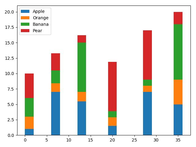
22 在 X 轴上绘制带有组数据的条形图
import pandas as pd
import matplotlib.pyplot as plt

df = pd.DataFrame([[1, 2, 3, 4], [7, 1.4, 2.1, 2.8], [5.5, 1.5, 8, 1.2],
                   [1.5, 1.4, 1, 8], [7, 1, 1, 8], [5, 4, 9, 2]],
                  columns=['Apple', 'Orange', 'Banana', 'Pear'],
                  index=[1, 7, 13, 20, 28, 35])
width = 2
bottom = 0

for i in df.columns:
    plt.bar(df.index, df[i], width=width, bottom=bottom)
    bottom += df[i]

plt.legend(df.columns)
plt.tight_layout()

# Display the graph on the screen
plt.show()
Output:
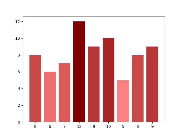
23 具有不同颜色条形的条形图
import matplotlib.pyplot as plt
import matplotlib as mp
import numpy as np

data = [8, 6, 7, 12, 9, 10, 5, 8, 9]

# Colorize the graph based on likeability:
likeability_scores = np.array(data)

data_normalizer = mp.colors.Normalize()
color_map = mp.colors.LinearSegmentedColormap(
    "my_map",

        "red": [(0, 1.0, 1.0),
                (1.0, .5, .5)],
        "green": [(0, 0.5, 0.5),
                  (1.0, 0, 0)],
        "blue": [(0, 0.50, 0.5),
                 (1.0, 0, 0)]

)

# Map xs to numbers:
N = len(data)
x_nums = np.arange(1, N+1)

# Plot a bar graph:
plt.bar(
    x_nums,
    data,
    align="center",
    color=color_map(data_normalizer(likeability_scores))
)

plt.xticks(x_nums, data)
plt.show()
Output:
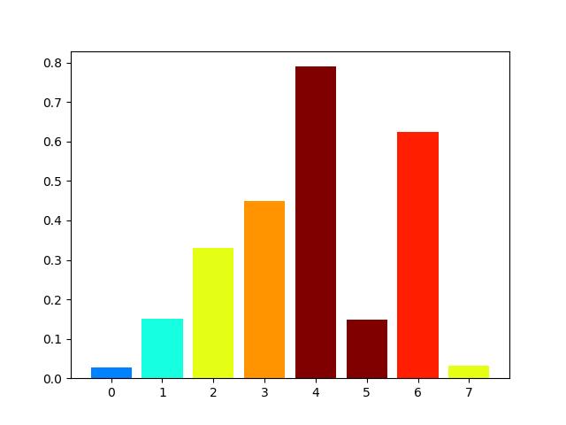
24 使用 Matplotlib 中的特定值改变条形图中每个条的颜色
import matplotlib.pyplot as plt
import matplotlib.cm as cm
from matplotlib.colors import Normalize
from numpy.random import rand

data = [2, 3, 5, 6, 8, 12, 7, 5]
fig, ax = plt.subplots(1, 1)

# Get a color map
my_cmap = cm.get_cmap('jet')

# Get normalize function (takes data in range [vmin, vmax] -> [0, 1])
my_norm = Normalize(vmin=0, vmax=8)

ax.bar(range(8), rand(8), color=my_cmap(my_norm(data)))
plt.show()
Output:
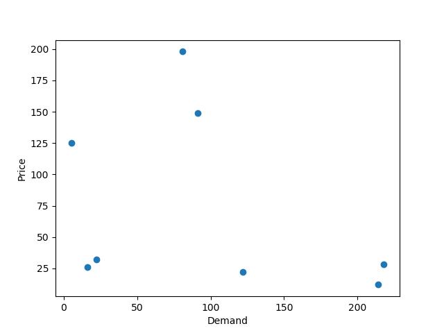
25 在 Matplotlib 中绘制散点图
import matplotlib.pyplot as plt

x1 = [214, 5, 91, 81, 122, 16, 218, 22]
x2 = [12, 125, 149, 198, 22, 26, 28, 32]

plt.scatter(x1, x2)

# Set X and Y axis labels
plt.xlabel('Demand')
plt.ylabel('Price')

#Display the graph
plt.show()
Output:
26 使用单个标签绘制散点图
import numpy as np
import matplotlib.pyplot as plt

N = 6
data = np.random.random((N, 4))
labels = ['point0'.format(i) for i in range(N)]

plt.subplots_adjust(bottom=0.1)
plt.scatter(
    data[:, 0], data[:, 1], marker='o', c=data[:, 2], s=data[:, 3] * 1500,
    cmap=plt.get_cmap('Spectral'))

for label, x, y in zip(labels, data[:, 0], data[:, 1]):
    plt.annotate(
        label,
        xy=(x, y), xytext=(-20, 20),
        textcoords='offset points', ha='right', va='bottom',
        bbox=dict(boxstyle='round,pad=0.5', fc='yellow', alpha=0.5),
        arrowprops=dict(arrowstyle='->', connectionstyle='arc3,rad=0'))

plt.show()
Output:

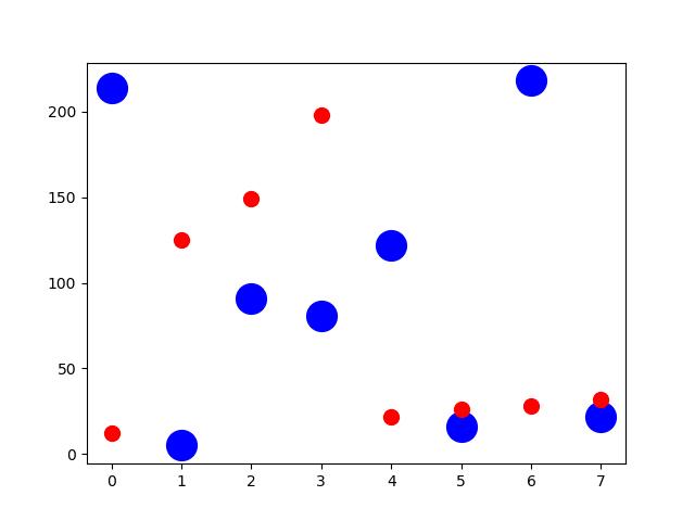
27 用标记大小绘制散点图
import matplotlib.pyplot as plt

x1 = [214, 5, 91, 81, 122, 16, 218, 22]
x2 = [12, 125, 149, 198, 22, 26, 28, 32]

plt.figure(1)
# You can specify the marker size two ways directly:
plt.plot(x1, 'bo', markersize=20)  # blue circle with size 10
plt.plot(x2, 'ro', ms=10,)  # ms is just an alias for markersize
plt.show()
Output:
28 在散点图中调整标记大小和颜色
import matplotlib.pyplot as plt
import matplotlib.colors

# Prepare a list of integers
val = [2, 3, 6, 9, 14]

# Prepare a list of sizes that increases with values in val
sizevalues = [i**2*50+50 for i in val]

# Prepare a list of colors
plotcolor = ['red','orange','yellow','green','blue']

# Draw a scatter plot of val points with sizes in sizevalues and
# colors in plotcolor
plt.scatter(val, val, s=sizevalues, c=plotcolor)

# Set axis limits to show the markers completely
plt.xlim(0, 20)
plt.ylim(0, 20)

plt.show()
Output:

29 在 Matplotlib 中应用样式表
import matplotlib.pyplot as plt
import matplotlib.colors
import matplotlib as mpl

mpl.style.use('seaborn-darkgrid')

# Prepare a list of integers
val = [2, 3, 6, 9, 14]

# Prepare a list of sizes that increases with values in val
sizevalues = [i**2*50+50 for i in val]

# Prepare a list of colors
plotcolor = ['red','orange','yellow','green','blue']

# Draw a scatter plot of val points with sizes in sizevalues and
# colors in plotcolor
plt.scatter(val, val, s=sizevalues, c=plotcolor)

# Draw grid lines with red color and dashed style
plt.grid(color='blue', linestyle='-.', linewidth=0.7)

# Set axis limits to show the markers completely
plt.xlim(0, 20)
plt.ylim(0, 20)

plt.show()
Output:
30 自定义网格颜色和样式
import matplotlib.pyplot as plt
import matplotlib.colors

# Prepare a list of integers
val = [2, 3, 6, 9, 14]

# Prepare a list of sizes that increases with values in val
sizevalues = [i**2*50+50 for i in val]

# Prepare a list of colors
plotcolor = ['red','orange','yellow','green','blue']

# Draw a scatter plot of val points with sizes in sizevalues and
# colors in plotcolor
plt.scatter(val, val, s=sizevalues, c=plotcolor)

# Draw grid lines with red color and dashed style
plt.grid(color='red', linestyle='-.', linewidth=0.7)

# Set axis limits to show the markers completely
plt.xlim(0, 20)
plt.ylim(0, 20)

plt.show()
Output:
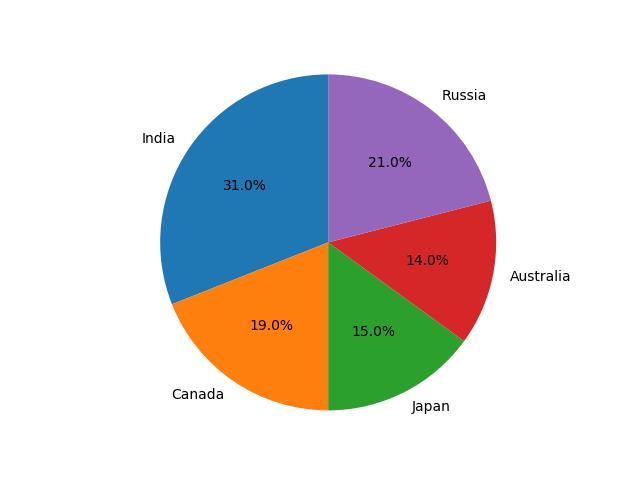
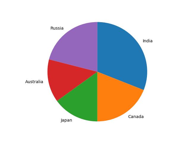
31 在 Python Matplotlib 中绘制饼图
import matplotlib.pyplot as plt

labels = ['India', 'Canada', 'Japan', 'Australia', 'Russia']
sizes = [31, 19, 15, 14, 21]  # Add upto 100%

# Plot the pie chart
plt.pie(sizes, labels=labels, autopct='%1.1f%%', startangle=90)

# Equal aspect ratio ensures that pie is drawn as a circle.
plt.axis('equal')

# Display the graph onto the screen
plt.show()
Output:
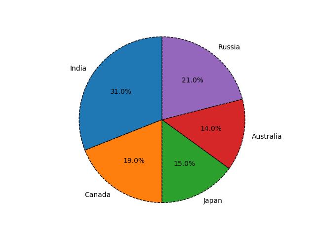
32 在 Matplotlib 饼图中为楔形设置边框
import matplotlib.pyplot as plt

labels = ['India', 'Canada', 'Japan', 'Australia', 'Russia']
sizes = [31, 19, 15, 14, 21]  # Add upto 100%

# Plot the pie chart
plt.pie(sizes, labels=labels, autopct='%1.1f%%', startangle=90,
        wedgeprops="edgecolor":"0",'linewidth': 1,
                    'linestyle': 'dashed', 'antialiased': True)

# Equal aspect ratio ensures that pie is drawn as a circle.
plt.axis('equal')

# Display the graph onto the screen
plt.show()
Output:
33 在 Python Matplotlib 中设置饼图的方向
import matplotlib.pyplot as plt

labels = ['India', 'Canada', 'Japan', 'Australia', 'Russia']
sizes = [31, 19, 15, 14, 21]  # Add upto 100%

# Plot the pie chart
plt.pie(sizes, labels=labels, counterclock=False, startangle=90)

# Equal aspect ratio ensures that pie is drawn as a circle.
plt.axis('equal')

# Display the graph onto the screen
plt.show()
Output:
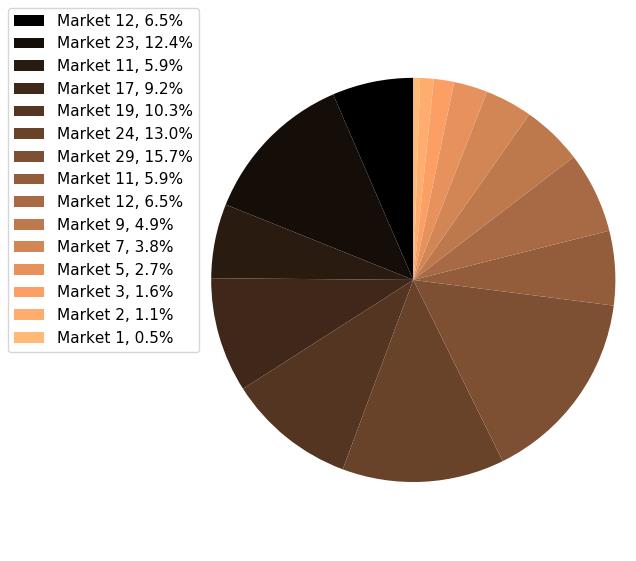
34 在 Matplotlib 中绘制具有不同颜色主题的饼图
import matplotlib.pyplot as plt

sizes = [12, 23, 11, 17, 19, 24, 29, 11, 12, 9, 7, 5, 3, 2, 1]
labels = ["Market %s" % i for i in sizes]

fig1, ax1 = plt.subplots(figsize=(5, 5))
fig1.subplots_adjust(0.3, 0, 1, 1)

theme = plt.get_cmap('copper')
ax1.set_prop_cycle("color", [theme(1. * i / len(sizes))
                             for i in range(len(sizes))])

_, _ = ax1.pie(sizes, startangle=90, radius=1800)

ax1.axis('equal')

total = sum(sizes)
plt.legend(
    loc='upper left',
    labels=['%s, %1.1f%%' % (
        l, (float(s) / total) * 100)
            for l, s in zip(labels, sizes)],
    prop='size': 11,
    bbox_to_anchor=(0.0, 1),
    bbox_transform=fig1.transFigure
)

plt.show()
Output:
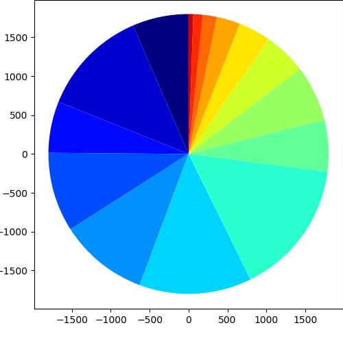
35 在 Python Matplotlib 中打开饼图的轴
import matplotlib.pyplot as plt

sizes = [12, 23, 11, 17, 19, 24, 29, 11, 12, 9, 7, 5, 3, 2, 1]
labels = ["Market %s" % i for i in sizes]

fig1, ax1 = plt.subplots(figsize=(5, 5))
fig1.subplots_adjust(0.1, 0.1, 1, 1)

theme = plt.get_cmap('jet')
ax1.set_prop_cycle("color", [theme(1. * i / len(sizes))
                             for i in range(len(sizes))])

_, _ = ax1.pie(sizes, startangle=90, radius=1800, frame=True)

ax1.axis('equal')
plt.show()
Output:
36 具有特定颜色和位置的饼图
import numpy as np
import matplotlib.pyplot as plt

fig =plt.figure(figsize = (4,4))
ax11 = fig.add_subplot(111)
# Data to plot
labels = 'Python', 'C++', 'Ruby', 'Java'
sizes = [250, 130, 75, 200]
colors = ['gold', 'yellowgreen', 'lightcoral', 'lightskyblue']

# Plot
w,l,p = ax11.pie(sizes,  labels=labels, colors=colors,
                 autopct='%1.1f%%', startangle=140, pctdistance=1, radius=0.5)

pctdists = [.8, .5, .4, .2]

for t,d in zip(p, pctdists):
    xi,yi = t.get_position()
    ri = np.sqrt(xi**2+yi**2)
    phi = np.arctan2(yi,xi)
    x = d*ri*np.cos(phi)
    y = d*ri*np.sin(phi)
    t.set_position((x,y))

plt.axis('equal')
plt.show()
Output:

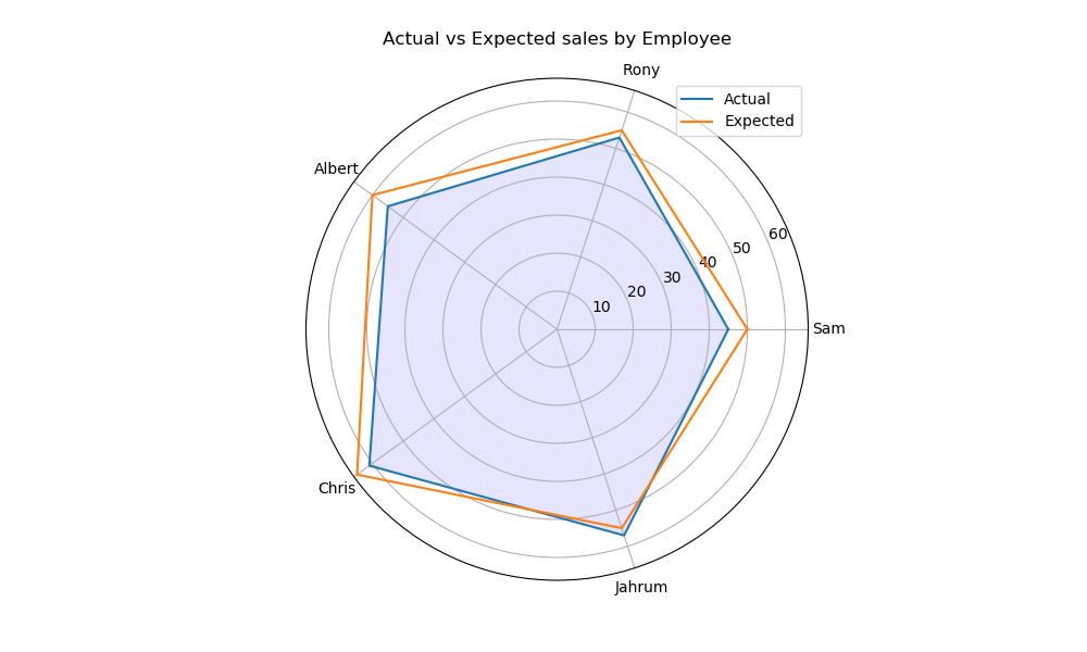
37 在 Matplotlib 中绘制极坐标图
import matplotlib.pyplot as plt
import numpy as np

employee = ["Sam", "Rony", "Albert", "Chris", "Jahrum"]
actual = [45, 53, 55, 61, 57, 45]
expected = [50, 55, 60, 65, 55, 50]

# Initialise the spider plot by setting figure size and polar projection
plt.figure(figsize=(10, 6))
plt.subplot(polar=True)

theta = np.linspace(0, 2 * np.pi, len(actual))

# Arrange the grid into number of sales equal parts in degrees
lines, labels = plt.thetagrids(range(0, 360, int(360/len(employee))), (employee))

# Plot actual sales graph
plt.plot(theta, actual)
plt.fill(theta, actual, 'b', alpha=0.1)

# Plot expected sales graph
plt.plot(theta, expected)

# Add legend and title for the plot
plt.legend(labels=('Actual', 'Expected'), loc=1)
plt.title("Actual vs Expected sales by Employee")

# Dsiplay the plot on the screen
plt.show()
Output:
38 在 Matplotlib 中绘制半极坐标图
import matplotlib.pyplot as plt
import numpy as np

theta = np.linspace(0, np.pi)
r = np.sin(theta)

fig = plt.figure()
ax = fig.add_subplot(111, polar=True)
c = ax.scatter(theta, r, c=r, s=10, cmap='hsv', alpha=0.75)

ax.set_thetamin(0)
ax.set_thetamax(180)

plt.show()
Output:

39 Matplotlib 中的极坐标等值线图
import numpy as np
import matplotlib.pyplot as plt

# Using linspace so that the endpoint of 360 is included
actual = np.radians(np.linspace(0, 360, 20))
expected = np.arange(0, 70, 10)

r, theta = np.meshgrid(expected, actual)
values = np.random.random((actual.size, expected.size))

fig, ax = plt.subplots(subplot_kw=dict(projection='polar'))
ax.contourf(theta, r, values)

plt.show()
Output:

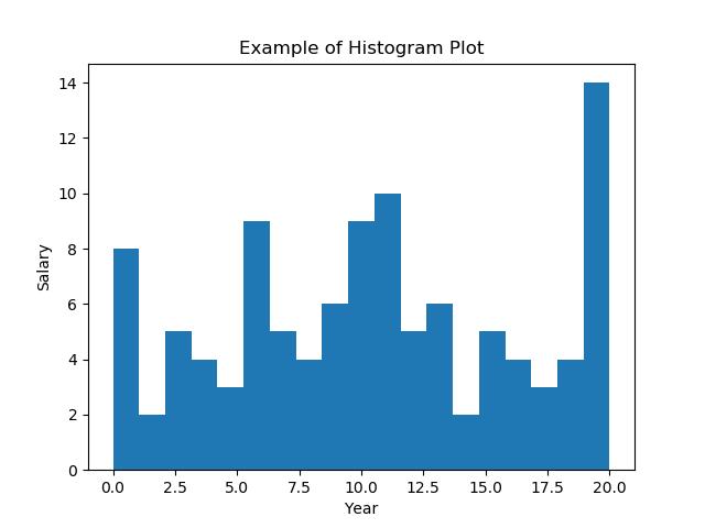
40 绘制直方图
import numpy as np
import matplotlib.pyplot as plt

# Data in numpy array
exp_data = np.array([12, 15, 13, 20, 19, 20, 11, 19, 11, 12, 19, 13,
                    12, 10, 6, 19, 3, 1, 1, 0, 4, 4, 6, 5, 3, 7,
                    12, 7, 9, 8, 12, 11, 11, 18, 19, 18, 19, 3, 6,
                    5, 6, 9, 11, 10, 14, 14, 16, 17, 17, 19, 0, 2,
                    0, 3, 1, 4, 6, 6, 8, 7, 7, 6, 7, 11, 11, 10,
                    11, 10, 13, 13, 15, 18, 20, 19, 1, 10, 8, 16,
                    19, 19, 17, 16, 11, 1, 10, 13, 15, 3, 8, 6, 9,
                    10, 15, 19, 2, 4, 5, 6, 9, 11, 10, 9, 10, 9,
                    15, 16, 18, 13])

# Plot the distribution of numpy data
plt.hist(exp_data, bins = 19)

# Add axis labels
plt.xlabel("Year")
plt.ylabel("Salary")
plt.title("Example of Histogram Plot")

plt.show()
Output:
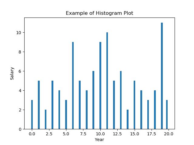
41 在 Matplotlib 直方图中选择 bins
import numpy as np
import matplotlib.pyplot as plt

# Data in numpy array
data = np.array([12, 15, 13, 20, 19, 20, 11, 19, 11, 12, 19, 13,
                    12, 10, 6, 19, 3, 1, 1, 0, 4, 4, 6, 5, 3, 7,
                    12, 7, 9, 8, 12, 11, 11, 18, 19, 18, 19, 3, 6,
                    5, 6, 9, 11, 10, 14, 14, 16, 17, 17, 19, 0, 2,
                    0, 3, 1, 4, 6, 6, 8, 7, 7, 6, 7, 11, 11, 10,
                    11, 10, 13, 13, 15, 18, 20, 19, 1, 10, 8, 16,
                    19, 19, 17, 16, 11, 1, 10, 13, 15, 3, 8, 6, 9,
                    10, 15, 19, 2, 4, 5, 6, 9, 11, 10, 9, 10, 9,
                    15, 16, 18, 13])

# Plot the distribution of numpy data
ax = plt.hist(data, bins=np.arange(min(data), max(data) + 0.25, 0.25), align='left')
# Add axis labels
plt.xlabel("Year")
plt.ylabel("Salary")
plt.title("Example of Histogram Plot")

plt.show()
Output:
42 在 Matplotlib 中绘制没有条形的直方图
import numpy as np
import matplotlib.pyplot as plt

# Data in numpy array
data = np.array([12, 15, 13, 20, 19, 20, 11, 19, 11, 12, 19, 13,
                 12, 10, 6, 19, 3, 1, 1, 0, 4, 4, 6, 5, 3, 7,
                 12, 7, 9, 8, 12, 11, 11, 18, 19, 18, 19, 3, 6,
                 5, 6, 9, 11, 10, 14, 14, 16, 17, 17, 19, 0, 2,
                 0, 3, 1, 4, 6, 6, 8, 7, 7, 6, 7, 11, 11, 10,
                 11, 10, 13, 13, 15, 18, 20, 19, 1, 10, 8, 16,
                 19, 19, 17, 16, 11, 1, 10, 13, 15, 3, 8, 6, 9,
                 10, 15, 19, 2, 4, 5, 6, 9, 11, 10, 9, 10, 9,
                 15, 16, 18, 13])

bins, edges = np.histogram(data, 21, normed=1)
left, right = edges[:-1], edges[1:]
X = np.array([left, right]).T.flatten()
Y = np.array([bins, bins]).T.flatten()

plt.plot(X, Y)
plt.show()
Output:

43 使用 Matplotlib 同时绘制两个直方图
import numpy as np
import matplotlib.pyplot as plt

age = np.random.normal(loc=1, size=100) # a normal distribution
salaray = np.random.normal(loc=-1, size=10000) # a normal distribution

_, bins, _ = plt.hist(age, bins=50, range=[-6, 6], density=True)
_ = plt.hist(salaray, bins=bins, alpha=0.5, density=True)
plt.show()
Output:

44 绘制具有特定颜色、边缘颜色和线宽的直方图
import numpy as np
import matplotlib.pyplot as plt

# Data in numpy array
exp_data = np.array([12, 15, 13, 20, 19, 20, 11, 19, 11, 12, 19, 13,
                    12, 10, 6, 19, 3, 1, 1, 0, 4, 4, 6, 5, 3, 7,
                    12, 7, 9, 8, 12, 11, 11, 18, 19, 18, 19, 3, 6,
                    5, 6, 9, 11, 10, 14, 14, 16, 17, 17, 19, 0, 2,
                    0, 3, 1, 4, 6, 6, 8, 7, 7, 6, 7, 11, 11, 10,
                    11, 10, 13, 13, 15, 18, 20, 19, 1, 10, 8, 16,
                    19, 19, 17, 16, 11, 1, 10, 13, 15, 3, 8, 6, 9,
                    10, 15, 19, 2, 4, 5, 6, 9, 11, 10, 9, 10, 9,
                    15, 16, 18, 13])

# Plot the distribution of numpy data
plt.hist(exp_data, bins=21, align='left', color='b', edgecolor='red',
              linewidth=1)

# Add axis labels
plt.xlabel("Year")
plt.ylabel("Salary")
plt.title("Example of Histogram Plot")

plt.show()
Output:

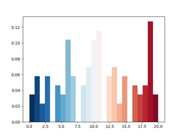
45 用颜色图绘制直方图
import numpy as np
import matplotlib.pyplot as plt

# Data in numpy array
data = np.array([12, 15, 13, 20, 19, 20, 11, 19, 11, 12, 19, 13,
                    12, 10, 6, 19, 3, 1, 1, 0, 4, 4, 6, 5, 3, 7,
                    12, 7, 9, 8, 12, 11, 11, 18, 19, 18, 19, 3, 6,
                    5, 6, 9, 11, 10, 14, 14, 16, 17, 17, 19, 0, 2,
                    0, 3, 1, 4, 6, 6, 8, 7, 7, 6, 7, 11, 11, 10,
                    11, 10, 13, 13, 15, 18, 20, 19, 1, 10, 8, 16,
                    19, 19, 17, 16, 11, 1, 10, 13, 15, 3, 8, 6, 9,
                    10, 15, 19, 2, 4, 5, 6, 9, 11, 10, 9, 10, 9,
                    15, 16, 18, 13])

cm = plt.cm.RdBu_r

n, bins, patches = plt.hist(data, 25, normed=1, color='green')
for i, p in enumerate(patches):
    plt.setp(p, 'facecolor', cm(i/25)) # notice the i/25

plt.show()
Output:
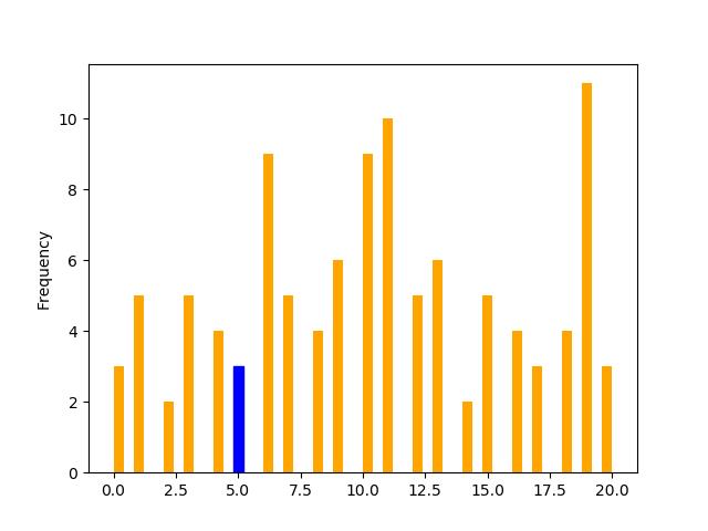
46 更改直方图上特定条的颜色
import pandas as pd
import matplotlib.pyplot as plt

s = pd.Series([12, 15, 13, 20, 19, 20, 11, 19, 11, 12, 19, 13,
                    12, 10, 6, 19, 3, 1, 1, 0, 4, 4, 6, 5, 3, 7,
                    12, 7, 9, 8, 12, 11, 11, 18, 19, 18, 19, 3, 6,
                    5, 6, 9, 11, 10, 14, 14, 16, 17, 17, 19, 0, 2,
                    0, 3, 1, 4, 6, 6, 8, 7, 7, 6, 7, 11, 11, 10,
                    11, 10, 13, 13, 15, 18, 20, 19, 1, 10, 8, 16,
                    19, 19, 17, 16, 11, 1, 10, 13, 15, 3, 8, 6, 9,
                    10, 15, 19, 2, 4, 5, 6, 9, 11, 10, 9, 10, 9,
                    15, 16, 18, 13])

p = s.plot(kind='hist', bins=50, color='orange')

bar_value_to_label = 5

min_distance = float("inf")  # initialize min_distance with infinity
index_of_bar_to_label = 0
for i, rectangle in enumerate(p.patches):  # iterate over every bar
    tmp = abs(  # tmp = distance from middle of the bar to bar_value_to_label
        (rectangle.get_x() +
            (rectangle.get_width() * (1 / 2))) - bar_value_to_label)
    if tmp < min_distance:  # we are searching for the bar with x cordinate
                            # closest to bar_value_to_label
        min_distance = tmp
        index_of_bar_to_label = i
p.patches[index_of_bar_to_label].set_color('b')

plt.show()
Output:
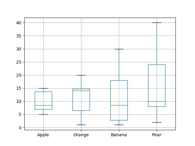
47 箱线图
import matplotlib.pyplot as plt
import pandas as pd

df = pd.DataFrame([[10, 20, 30, 40], [7, 14, 21, 28], [15, 15, 8, 12],
                   [15, 14, 1, 8], [7, 1, 1, 8], [5, 4, 9, 2]],
                  columns=['Apple', 'Orange', 'Banana', 'Pear'],
                  index=['Basket1', 'Basket2', 'Basket3', 'Basket4',
                         'Basket5', 'Basket6'])

df.boxplot(['Apple', 'Orange', 'Banana', 'Pear'])
plt.show()
Output:
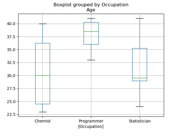
48 箱型图按列数据分组
import matplotlib.pyplot as plt
import pandas as pd

employees = pd.DataFrame(
    'EmpCode': ['Emp001', 'Emp002', 'Emp003', 'Emp004', 'Emp005', 'Emp006'
                , 'Emp007', 'Emp008', 'Emp009', 'Emp010', 'Emp011', 'Emp012'
                , 'Emp013', 'Emp014', 'Emp015', 'Emp016', 'Emp017', 'Emp018'
                , 'Emp019', 'Emp020'],
    'Occupation': ['Chemist', 'Statistician', 'Statistician', 'Statistician',
                   'Programmer', 'Chemist', 'Statistician', 'Statistician',
                   'Statistician', 'Programmer', 'Chemist', 'Statistician',
                   'Statistician', 'Statistician', 'Programmer', 'Chemist',
                   'Statistician', 'Statistician', 'Statistician', 'Programmer'
                   ],
    'Age': [23, 24, 34, 29, 40, 25, 26, 29, 40, 41, 40, 35, 41, 29, 33, 35,
            29, 30, 36, 37])

employees.boxplot(column=['Age'], by=['Occupation'])

plt.show()
Output:
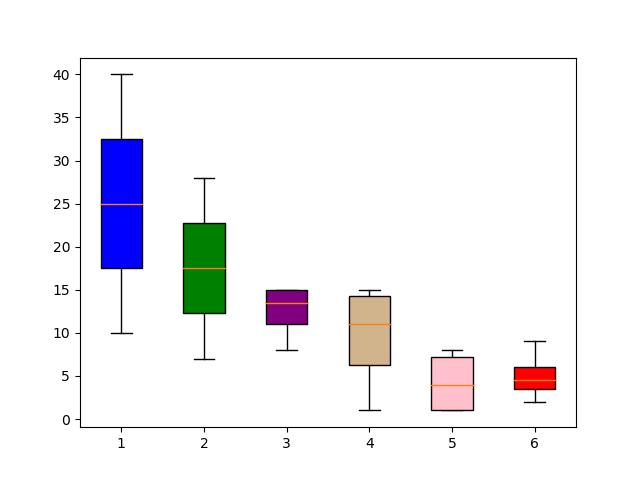
49 更改箱线图中的箱体颜色
import matplotlib.pyplot as plt
import pandas as pd

df = pd.DataFrame([[10, 20, 30, 40], [7, 14, 21, 28], [15, 15, 8, 12],
                   [15, 14, 1, 8], [7, 1, 1, 8], [5, 4, 9, 2]],
                  columns=['Apple', 'Orange', 'Banana', 'Pear'],
                  index=['Basket1', 'Basket2', 'Basket3', 'Basket4',
                         'Basket5', 'Basket6'])

box = plt.boxplot(df, patch_artist=True)

colors = ['blue', 'green', 'purple', 'tan', 'pink', 'red']

for patch, color in zip(box['boxes'], colors):
    patch.set_facecolor(color)

plt.show()
Output:
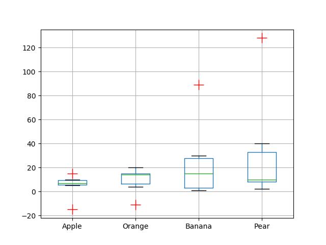
50 更改 Boxplot 标记样式、标记颜色和标记大小
import matplotlib.pyplot as plt
import pandas as pd

df = pd.DataFrame([[10, 20, 30, 40], [7, 14, 21, 128], [15, 15, 89, 12],
                   [-15, 14, 1, 8], [7, -11, 1, 8], [5, 4, 9, 2]],
                  columns=['Apple', 'Orange', 'Banana', 'Pear'],
                  index=['Basket1', 'Basket2', 'Basket3', 'Basket4',
                         'Basket5', 'Basket6'])


flierprops = dict(marker='+', markerfacecolor='g', markersize=15,
                  linestyle='none', markeredgecolor='r')

df.boxplot(['Apple', 'Orange', 'Banana', 'Pear'], flierprops=flierprops)


plt.show()
Output:
51 用数据系列绘制水平箱线图
import matplotlib.pyplot as plt

data = [-12, 15, 13, -20, 19, 20, 11, 19, -11, 12, 19, 10,
                    12, 10, 6, 19, 3, 1, 1, 0, 4, 49, 6, 5, 3, 7,
                    12, 77, 9, 8, 12, 11, 11, 18, 19, 18, 19, 3, 6,
                    5, 6, 9, 11, 10, 18, 14, 16, 17, 17, 19, 0, 2,
                    0, 3, 1, 4, 6, 6, 8, 7, 7, 69, 79, 11, 11, 10,
                    11, 10, 13, 13, 15, 18, 20, 19, 1, 11, 8, 16,
                    19, 89, 17, 16, 11, 1, 110, 13, 15, 3, 8, 6, 99,
                    10, 15, 19, 2, 4, 5, 6, 9, 11, 10, 9, 10, 99,
                    15, 16, 18, 13]

fig = plt.figure(figsize=(7, 3), dpi=100)
ax = plt.subplot(2, 1,2)

ax.boxplot(data, False, sym='rs', vert=False, whis=0.75, positions=[0], widths=[0.5])

plt.tight_layout()
plt.show()
Output:

52 箱线图调整底部和左侧
import matplotlib.pyplot as plt
import pandas as pd

x = [[1.2, 2.3, 3.0, 4.5],
     [1.1, 2.2, 2.9, 5.0]]

df = pd.DataFrame(x, index=['Apple', 'Orange'])
df.T.boxplot()

plt.subplots_adjust(bottom=0.25)

plt.show()
Output:
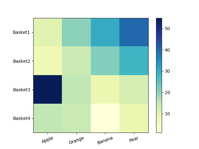
53 使用 Pandas 数据在 Matplotlib 中生成热图
import matplotlib.pyplot as plt
import pandas as pd

df = pd.DataFrame([[10, 20, 30, 40], [7, 14, 21, 28], [55, 15, 8, 12],
                    [15, 14, 1, 8]],
                  columns=['Apple', 'Orange', 'Banana', 'Pear'],
                  index=['Basket1', 'Basket2', 'Basket3', 'Basket4']
                  )

plt.imshow(df, cmap="YlGnBu")
plt.colorbar()
plt.xticks(range(len(df)),df.columns, rotation=20)
plt.yticks(range(len(df)),df.index)
plt.show()
Output:
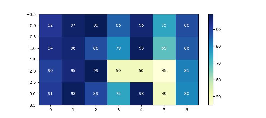
54 带有中间颜色文本注释的热图
import pandas as pd
import matplotlib.pyplot as plt

data =
        'Basket1': [90, 95, 99, 50, 50, 45, 81],
        'Basket2': [91, 98, 89, 75, 98, 49, 80],
        'Basket3': [92, 97, 99, 85, 96, 75, 88],
        'Basket4': [94, 96, 88, 79, 98, 69, 86]


fig, ax = plt.subplots(figsize=(9, 4))
df = pd.DataFrame.from_dict(data, orient='index')

im = ax.imshow(df.values, cmap="YlGnBu")
fig.colorbar(im)

# Loop over data dimensions and create text annotations
textcolors = ["k", "w"]
threshold = 55
for i in range(len(df)):
    for j in range(len(df.columns)):
        text = ax.text(j, i, df.values[i, j],
                       ha="center", va="center",
                       color=textcolors[df.values[i, j] > threshold])

plt.show()
Output:
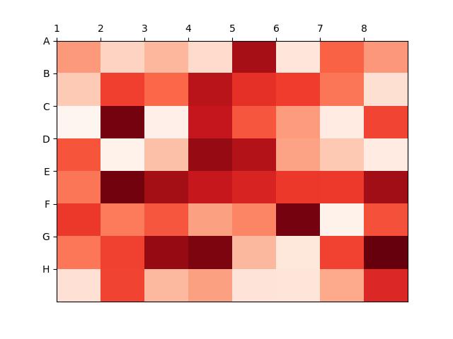
55 热图显示列和行的标签并以正确的方向显示数据
import matplotlib.pyplot as plt
import numpy as np

column_labels = list('ABCDEFGH')
row_labels = list('12345678')

data = np.random.rand(8, 8)

fig, ax = plt.subplots()
heatmap = ax.pcolor(data, cmap=plt.cm.Reds)

# Put the major ticks at the middle of each cell
ax.set_xticks(np.arange(data.shape[0]), minor=False)
ax.set_yticks(np.arange(data.shape[0]), minor=False)

# Want a more natural, table-like display
ax.invert_yaxis()
ax.xaxis.tick_top()

ax.set_xticklabels(row_labels, minor=False)
ax.set_yticklabels(column_labels, minor=False)

plt.show()
Output:
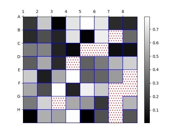
56 将 NA cells 与 HeatMap 中的其他 cells 区分开来
import matplotlib.pyplot as plt
import matplotlib.patches as patches

import numpy as np

column_labels = list('ABCDEFGH')
row_labels = list('12345678')

data = np.random.rand(8, 8)
data = np.ma.masked_greater(data, 0.8)

fig, ax = plt.subplots()
heatmap = ax.pcolor(data, cmap=plt.cm.gray, edgecolors='blue', linewidths=1,
                   antialiased=True)

fig.colorbar(heatmap)
ax.patch.set(hatch='..', edgecolor='red')

# Put the major ticks at the middle of each cell
ax.set_xticks(np.arange(data.shape[0]), minor=False)
ax.set_yticks(np.arange(data.shape[0]), minor=False)

# Want a more natural, table-like display
ax.invert_yaxis()
ax.xaxis.tick_top()

ax.set_xticklabels(row_labels, minor=False)
ax.set_yticklabels(column_labels, minor=False)


plt.show()
Output:
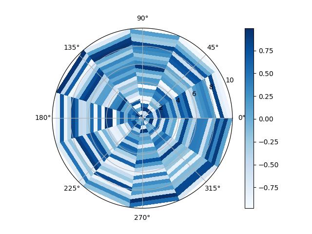
57 在 matplotlib 中创建径向热图
import matplotlib.pyplot as plt
from mpl_toolkits.mplot3d import Axes3D
import numpy as np

fig = plt.figure()
ax = Axes3D(fig)

n = 12
m = 24
rad = np.linspace(0, 10, m)
a = np.linspace(0, 2 * np.pi, n)
r, th = np.meshgrid(rad, a)

z = np.random.uniform(-1, 1, (n,m))
plt.subplot(projection="polar")

plt.pcolormesh(th, r, z, cmap = 'Blues')

plt.plot(a, r, ls='none', color = 'k')
plt.grid()
plt.colorbar()
plt.show()
Output: