EdNet数据集分析
Posted sereasuesue
tags:
篇首语:本文由小常识网(cha138.com)小编为大家整理,主要介绍了EdNet数据集分析相关的知识,希望对你有一定的参考价值。
https://edudata.readthedocs.io/en/latest/build/blitz/EdNet_KT1/EdNet_KT1.html https://edudata.readthedocs.io/en/latest/build/blitz/EdNet_KT1/EdNet_KT1.html知识追踪数据集介绍_sereasuesue的博客-CSDN博客_知识追踪数据集最近准备用这个数据集进行跑数据,但发现对这个数据集不够了解,花费了很多时间,最近偶然发现了几篇介绍文章特整理
| Field | Annotation |
|---|---|
| user_id | student’s id |
| timestamp | the moment the question was given, represented as Unix timestamp in milliseconds |
| solving_id | represents each learning session of students corresponds to each bunle. It is a form of single integer, starting from 1 |
| question_id | the ID of the question that given to student, which is a form of qinteger |
| user_answer | the answer that the student submitted, recorded as a character between a and d inclusively |
| elapsed_time | the time that the students spends on each question in milliseconds |
We randomly selected 5000 tables from all the students for analysis,which accounted for about 0.64% of the total data set, and added a column named user_id to the original table
import os
path=r'D:\\EdNet-KT1\\KT1'
d=[]
table_list=[]
s=pd.Series(os.listdir(path))
file_selected=s.sample(5000).to_numpy()
for file_name in file_selected:
    data_raw=pd.read_csv(path+'\\\\'+file_name,encoding = "ISO-8859-15")
    data_raw['user_id']=pd.Series([file_name[:-4]]*len(data_raw))
    d.append([file_name[:-4],len(data_raw)])
    data=pd.DataFrame(data_raw,columns=['user_id']+data_raw.columns.to_list()[:-1])
    table_list.append(data)
df=pd.concat(table_list)
pd.set_option('display.max_rows',10)
df=df.reset_index(drop=True)
df| user_id | timestamp | solving_id | question_id | user_answer | elapsed_time | |
|---|---|---|---|---|---|---|
| 0 | u717875 | 1565332027449 | 1 | q4862 | d | 45000 |
| 1 | u717875 | 1565332057492 | 2 | q6747 | d | 24000 |
| 2 | u717875 | 1565332085743 | 3 | q326 | c | 25000 |
| 3 | u717875 | 1565332116475 | 4 | q6168 | a | 27000 |
| 4 | u717875 | 1565332137148 | 5 | q847 | a | 17000 |
| ... | ... | ... | ... | ... | ... | ... |
| 574251 | u177603 | 1530371808931 | 15 | q6984 | b | 44250 |
| 574252 | u177603 | 1530372197614 | 16 | q7335 | c | 95750 |
| 574253 | u177603 | 1530372198181 | 16 | q7336 | a | 95750 |
| 574254 | u177603 | 1530372198879 | 16 | q7337 | c | 95750 |
| 574255 | u177603 | 1530372199425 | 16 | q7338 | b | 95750 |
574256 rows × 6 columns
General Feature
df.describe()
| timestamp | solving_id | elapsed_time | |
|---|---|---|---|
| count | 5.742560e+05 | 574256.000000 | 5.742560e+05 |
| mean | 1.546425e+12 | 875.902859 | 2.599017e+04 |
| std | 2.019656e+10 | 1941.978009 | 3.376126e+04 |
| min | 1.494451e+12 | 1.000000 | 0.000000e+00 |
| 25% | 1.531720e+12 | 77.000000 | 1.600000e+04 |
| 50% | 1.548410e+12 | 311.000000 | 2.100000e+04 |
| 75% | 1.564817e+12 | 900.000000 | 3.000000e+04 |
| max | 1.575306e+12 | 18039.000000 | 7.650000e+06 |
len(df.question_id.unique())
11838
This shows there are totally 11838 questions.
Missing Value
print('Part of missing values for every column')
print(df.isnull().sum() / len(df))
Part of missing values for every column user_id 0.000000 timestamp 0.000000 solving_id 0.000000 question_id 0.000000 user_answer 0.000556 elapsed_time 0.000000 dtype: float64
This indicates that there are no missing values in all columns except user_answer. A missing value in user_answer indicates that some students did not choose an option.
df.fillna('not choose',inplace=True)Fill in not choose in the position of the missing value
Sort user_id
user_count_table=pd.DataFrame(d,columns=['user_id','count'])
ds=user_count_table.sort_values(by=['count'],axis=0).tail(40)
fig = px.bar(
    ds,
    x = 'count',
    y = 'user_id',
    orientation='h',
    title='Top 40 active students'
)

fig.show("svg")
We use the number of questions that students have done as an indicator of whether a student is active. This figure shows the 40 most active students.
ds=df.loc[:,['user_id','elapsed_time']].groupby('user_id').mean()
ds=ds.reset_index(drop=False)
ds.columns=['user_id','avg_elapsed_time']
ds_tail=ds.sort_values(by=['avg_elapsed_time'],axis=0).tail(40)

fig_tail = px.bar(
    ds_tail,
    x = 'avg_elapsed_time',
    y = 'user_id',
    orientation='h',
    title='Bottom 40 fast-solving students '
)
fig_tail.show("svg")
ds_head=ds.sort_values(by=['avg_elapsed_time'],axis=0).head(40)
fig_head = px.bar(
    ds_head,
    x = 'avg_elapsed_time',
    y = 'user_id',
    orientation='h',
    title='Top 40 fast-solving students'
)
fig_head.show("svg")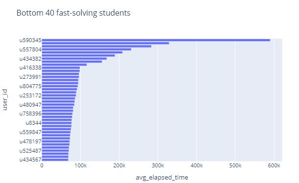
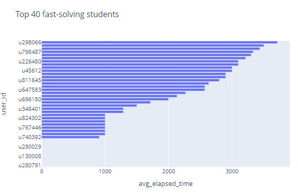 We take the average time it takes students to do a question as an indicator of how fast students do it. These two figures respectively show the fastest and slowest students among the 5000 students, and the average time they spent doing the problems
Note that some students spend very little time doing the questions, and the time is almost zero. We can almost judge that these students did not do the questions at all, and they chose blindly. We remove these students and rearrange them
bound=5000 # If the average time of doing the topic is less than 5000, it means that the student is most likely to be bad
ds=df.loc[:,['user_id','elapsed_time']].groupby('user_id').mean()
ds=ds.reset_index(drop=False)
ds.columns=['user_id','avg_elapsed_time']
bad_user_ids=ds[ds['avg_elapsed_time']<bound]['user_id'].to_list()
df_drop=df.drop(df[df['user_id'].isin(bad_user_ids)].index)
print('bad students number is ',len(bad_user_ids))
print('length of table after dropping is ',len(df_drop))
bad students number is 61 length of table after dropping is 567778
After dropping
ds=df_drop['user_id'].value_counts().reset_index(drop=False)
ds.columns=['user_id','count']
ds_tail=ds.sort_values(by=['count'],axis=0).tail(40)
fig_tail = px.bar(
    ds_tail,
    x = 'count',
    y = 'user_id',
    orientation='h',
    title='Top 40 active students after dropping some students'
)
fig_tail.show("svg")
This figure shows the 40 most active students after dropping some bad students.
ds=df_drop.loc[:,['user_id','elapsed_time']].groupby('user_id').mean()
ds=ds.reset_index(drop=False)
ds.columns=['user_id','avg_elapsed_time']

ds_head=ds.sort_values(by=['avg_elapsed_time'],axis=0).head(40)
fig_head = px.bar(
    ds_head,
    x = 'avg_elapsed_time',
    y = 'user_id',
    orientation='h',
    title='Top 40 fast-solving students after dropping some students'
)
fig_head.show("svg")
This figure respectively show the more reasonable fastest students among the 5000 students than before, and the average time they spent doing the problems.
Sort question_id
ds=df.loc[:,['question_id','elapsed_time']].groupby('question_id').mean()
ds=ds.reset_index(drop=False)
ds_tail=ds.sort_values(by=['elapsed_time'],axis=0).tail(40)
fig_tail = px.bar(
    ds_tail,
    x = 'elapsed_time',
    y = 'question_id',
    orientation='h',
    title='Top 40 question_id by the average of elapsed_time'
)
fig_tail.show("svg")
ds_head=ds.sort_values(by=['elapsed_time'],axis=0).head(40)
fig_head = px.bar(
    ds_head,
    x = 'elapsed_time',
    y = 'question_id',
    orientation='h',
    title='Bottom 40 question_id by the average of elapsed_time'
)
fig_head.show("svg")
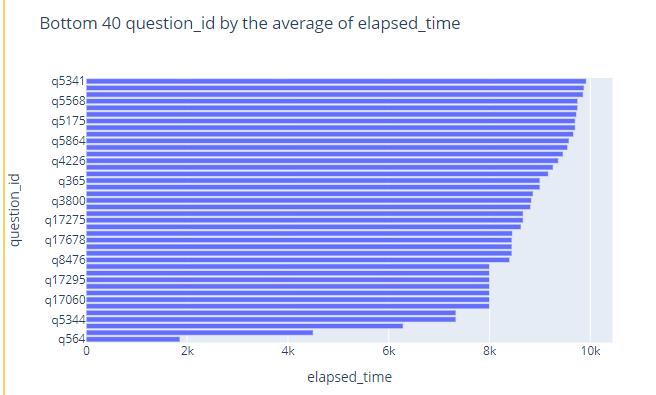
We can judge the difficulty of this question from the average time spent on a question.
These two figures reflect the difficulty of the questions and shows the ids of the 40 most difficult and 40 easiest questions.s
Appearence of Questions
ds=df['question_id'].value_counts().reset_index(drop=False)
ds.columns=['question_id','count']
ds_tail=ds.sort_values(by=['count'],axis=0).tail(40)
fig_tail = px.bar(
ds_tail,
x = 'count',
y = 'question_id',
orientation='h',
title='Top 40 question_id by the number of appearance'
)
fig_tail.show("svg")
ds_head=ds.sort_values(by=['count'],axis=0).head(40)
fig_head = px.bar(
ds_head,
x = 'count',
y = 'question_id',
orientation='h',
title='Bottom 40 question_id by the number of appearance'
)
fig_head.show("svg")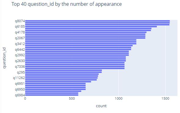 These two images reflect the 40 questions that were drawn the most frequently and the 40 questions that were drawn the least frequently
ds2=df['question_id'].value_counts().reset_index(drop=False)
ds2.columns=['question_id','count']
def convert_id2int(x):
    return pd.Series(map(lambda t:int(t[1:]),x))
ds2['question_id']=convert_id2int(ds2['question_id'])
ds2.sort_values(by=['question_id'])
fig = px.histogram(
    ds2,
    x = 'question_id',
    y = 'count',
    title='question distribution'
)
fig.show("svg")
Question’s Option Selected Most Frequently
ds=df.loc[:,['question_id','user_answer','user_id']].groupby(['question_id','user_answer']).count()

most_count_dict=
for id in df.question_id.unique():
    most_count=ds.loc[id].apply(lambda x:x.max())[0]
    most_count_dict[id]=most_count
ds2=ds.apply(lambda x:x-most_count_dict[x.name[0]],axis=1)
ds2=ds2[ds2.user_id==0]
ds2=ds2.reset_index(drop=False).loc[:,['question_id','user_answer']]
ds2.columns=['question_id','most_answer']
ds2.index=ds2['question_id']
ds2['most_answer']
question_id
q1 b
q10 d
q100 c
q1000 c
q10000 b
..
q9995 d
q9996 a
q9997 d
q9998 a
q9999 b
Name: most_answer, Length: 12215, dtype: object
This shows the most selected options (including not choose) for each question.
Note that if there are multiple options for a question to be selected most frequently, the table will also contain them.
Choices Distribution
ds = df['user_answer'].value_counts().reset_index(drop=False)
ds.columns = ['user_answer', 'percent']

ds['percent']=ds['percent']/len(df)
ds = ds.sort_values(by=['percent'])

fig = px.pie(
    ds,
    names = ds['user_answer'],
    values = 'percent',
    title = 'Percent of Choice'
)

fig.show("svg")
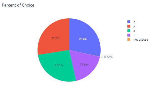
We use a pie chart to show the distribution of the proportions of a, b, c, d and not choose among the options selected by the 5000 students.
 Sort By Time Stamp
import time
import datetime
df_time=df.copy()
columns=df.columns.to_list()
columns[1]='time'
df_time.columns=columns
df_time['time'] /= 1000
df_time['time']=pd.Series(map(datetime.datetime.fromtimestamp,df_time['time']))
df_time| user_id | time | solving_id | question_id | user_answer | elapsed_time | |
|---|---|---|---|---|---|---|
| 0 | u717875 | 2019-08-09 14:27:07.449 | 1 | q4862 | d | 45000 |
| 1 | u717875 | 2019-08-09 14:27:37.492 | 2 | q6747 | d | 24000 |
| 2 | u717875 | 2019-08-09 14:28:05.743 | 3 | q326 | c | 25000 |
| 3 | u717875 | 2019-08-09 14:28:36.475 | 4 | q6168 | a | 27000 |
| 4 | u717875 | 2019-08-09 14:28:57.148 | 5 | q847 | a | 17000 |
| ... | ... | ... | ... | ... | ... | ... |
| 574251 | u177603 | 2018-06-30 23:16:48.931 | 15 | q6984 | b | 44250 |
| 574252 | u177603 | 2018-06-30 23:23:17.614 | 16 | q7335 | c | 95750 |
| 574253 | u177603 | 2018-06-30 23:23:18.181 | 16 | q7336 | a | 95750 |
| 574254 | u177603 | 2018-06-30 23:23:18.879 | 16 | q7337 | c | 95750 |
| 574255 | u177603 | 2018-06-30 23:23:19.425 | 16 | q7338 | b | 95750 |
574256 rows × 6 columns
This table shows the result of converting unix timestamp to datetime format
question distribution by time
ds_time_question=df_time.loc[:,['time','question_id']]
ds_time_question=ds_time_question.sort_values(by=['time'])
ds_time_question| time | question_id | |
|---|---|---|
| 503014 | 2017-05-11 05:17:10.922 | q129 |
| 503015 | 2017-05-11 05:17:34.561 | q8058 |
| 503016 | 2017-05-11 05:17:56.806 | q8120 |
| 503017 | 2017-05-11 05:18:22.591 | q157 |
| 503018 | 2017-05-11 05:18:43.085 | q52 |
| ... | ... | ... |
| 108215 | 2019-12-03 00:48:27.437 | q776 |
| 108216 | 2019-12-03 00:59:38.437 | q10847 |
| 108217 | 2019-12-03 00:59:38.437 | q10844 |
| 108218 | 2019-12-03 00:59:38.437 | q10845 |
| 108219 | 2019-12-03 00:59:38.437 | q10846 |
574256 rows × 2 columns
This table shows the given questions in chronological order.And we can see that the earliest question q127 is on May 11, 2017, and the latest question q10846 is on December 3, 2019.
ds_time_question['year']=pd.Series(map(lambda x :x.year,ds_time_question['time']))
ds_time_question['month']=pd.Series(map(lambda x :x.month,ds_time_question['time']))
ds=ds_time_question.loc[:,['year','month']].value_counts()

years=ds_time_question['year'].unique()
years.sort()
fig=make_subplots(
    rows=2,
    cols=2,
    start_cell='top-left',
    subplot_titles=tuple(map(str,years))
)
traces=[
    go.Bar(
        x=ds[year].reset_index().sort_values(by=['month'],axis=0)['month'].to_list(),
        y=ds[year].reset_index().sort_values(by=['month'],axis=0)[0].to_list(),
        name='Year: '+str(year),
        text=[ds[year][month] for month in ds[year].reset_index().sort_values(by=['month'],axis=0)['month'].to_list()],
        textposition='auto'
    ) for year in years
]
for i in range(len(traces)):
    fig.append_trace(traces[i],(i//2)+1,(i%2)+1)

fig.update_layout(title_text='Bar of the distribution of the number of question solved in  years'.format(len(traces)))
fig.show('svg')
-
These three figures show the distribution of the number of problems solved in each month of 2017, 2018, and 2019.
-
And the number of questions solved is gradually increasing.
-
And the number of questions solved in March, 4, May, and June is generally small.
user distribution by time
ds_time_user=df_time.loc[:,['user_id','time']]
ds_time_user=ds_time_user.sort_values(by=['time'])
ds_time_user| user_id | time | |
|---|---|---|
| 503014 | u21056 | 2017-05-11 05:17:10.922 |
| 503015 | u21056 | 2017-05-11 05:17:34.561 |
| 503016 | u21056 | 2017-05-11 05:17:56.806 |
| 503017 | u21056 | 2017-05-11 05:18:22.591 |
| 503018 | u21056 | 2017-05-11 05:18:43.085 |
| ... | ... | ... |
| 108215 | u9476 | 2019-12-03 00:48:27.437 |
| 108216 | u9476 | 2019-12-03 00:59:38.437 |
| 108217 | u9476 | 2019-12-03 00:59:38.437 |
| 108218 | u9476 | 2019-12-03 00:59:38.437 |
| 108219 | u9476 | 2019-12-03 00:59:38.437 |
574256 rows × 2 columns
This table shows the students who did the questions in order of time.And we can see that the first student who does the problem is u21056, and the last student who does the problem is u9476.
ds_time_user=df_time.loc[:,['user_id','time']]
ds_time_user=ds_time_user.sort_values(by=['time'])
ds_time_user['year']=pd.Series(map(lambda x :x.year,ds_time_user['time']))
ds_time_user['month']=pd.Series(map(lambda x :x.month,ds_time_user['time']))
ds_time_user.drop(['time'],axis=1,inplace=True)
ds=ds_time_user.groupby(['year','month']).nunique()

years=ds_time_user['year'].unique()
years.sort()
fig=make_subplots(
    rows=2,
    cols=2,
    start_cell='top-left',
    subplot_titles=tuple(map(str,years))
)
traces=[
    go.Bar(
        x=ds.loc[year].reset_index()['month'].to_list(),
        y=ds.loc[year].reset_index()['user_id'].to_list(),
        name='Year: '+str(year),
        text=[ds.loc[year].loc[month,'user_id'] for month in ds.loc[year].reset_index()['month'].to_list()],
        textposition='auto'
    ) for year in years
]
for i in range(len(traces)):
    fig.append_trace(traces[i],(i//2)+1,(i%2)+1)

fig.update_layout(title_text='Bar of the distribution of the number of active students in  years'.format(len(traces)))
fig.show('svg')-
These three graphs respectively show the number of students active on the system in each month of 2017, 2018, and 2019.
-
And we can see that the number of active students in 2019 is generally more than that in 2018, and there are more in 2018 than in 2017, indicating that the number of users of the system is gradually increasing.
-
Note that the number of students is not repeated here
以上是关于EdNet数据集分析的主要内容,如果未能解决你的问题,请参考以下文章