WPF开发登录窗口之——添加文本输入框用户控件
Posted dotNET跨平台
tags:
篇首语:本文由小常识网(cha138.com)小编为大家整理,主要介绍了WPF开发登录窗口之——添加文本输入框用户控件相关的知识,希望对你有一定的参考价值。

WPF开发者QQ群: 340500857 | 微信群 目前人数太多,暂不开放

窗口开发完成后,接下来就是开发客户区中的输入框控件,但在开发之前,我们先开发一个输入框基类,然后通过继承的方式去实现文本输入框与密码输入框。
01
—
代码如下
一、添加类在“CustomControl”文件夹中添加“InputBoxBase.cs”,继承自“UserControl”:
sing System;
using System.Windows;
using System.Windows.Controls;
using System.Windows.Media.Imaging;
public class InputBoxBase : UserControl
{


}
二、由于输入框基类无法直接将属性应用至控件对象上,所以需要使用抽象方法让派生类去实现为控件应用属性。一共需要三个方法:
与此同时,类也需要添加“abstract”修饰符。
/// <summary>应用文本</summary>
protected abstract void ApplyText();


/// <summary>应用占位文本</summary>
protected abstract void ApplyPlaceHolder();


/// <summary>应用图标</summary>
protected abstract void ApplyIcon(BitmapImage icon);
三、添加依赖项属我设计的输入框需要三个依赖项属性:文本、占位文本、图标。使用Visual Studio自带的代码片段功能,在编辑器中输入“propdp”后按两次“Tab”键可快速完成依赖项属性的添加。
添加文本依赖项属性:
在属性变更时,获取输入框对象,并应用文本。
public string Text
{
    get => (string)GetValue(TextProperty);
    set => SetValue(TextProperty, value);
}
public static readonly DependencyProperty TextProperty =
    DependencyProperty.Register("Text", typeof(string), typeof(InputBoxBase), new PropertyMetadata("", OnTextChanged));
private static void OnTextChanged(DependencyObject sender, DependencyPropertyChangedEventArgs e)
{
    InputBoxBase control = sender as InputBoxBase;
    control.ApplyText();
}
四、添加占位文本依赖项属性文本依赖项属性同理:
与
public string PlaceHolder
{
    get => (string)GetValue(PlaceHolderProperty);
    set => SetValue(PlaceHolderProperty, value);
}
public static readonly DependencyProperty PlaceHolderProperty =
    DependencyProperty.Register("PlaceHolder", typeof(string), typeof(InputBoxBase), new PropertyMetadata("", OnPlaceHolderChanged));
private static void OnPlaceHolderChanged(DependencyObject sender, DependencyPropertyChangedEventArgs e)
{
    InputBoxBase control = sender as InputBoxBase;
    control.ApplyPlaceHolder();
}
五、添加图标依赖项属性,如果路径为空,应用空图标;图标加载异常,也应用空图标:
public string Icon
{
    get => (string)GetValue(IconProperty);
    set => SetValue(IconProperty, value);
}
public static readonly DependencyProperty IconProperty =
    DependencyProperty.Register("Icon", typeof(string), typeof(InputBoxBase), new PropertyMetadata("", OnIconChanged));
private static void OnIconChanged(DependencyObject sender, DependencyPropertyChangedEventArgs e)
{
    InputBoxBase control = sender as InputBoxBase;
    if (control.Icon == "") control.ApplyIcon(null);
    else
    {
        try
        {
            control.ApplyIcon(new BitmapImage(new Uri("pack://application:,,,/" + control.Icon)));
        }
        catch (Exception ex)
        {
            Console.WriteLine(ex.Message);
            control.ApplyIcon(null);
        }
    }
}
六、添加样式在开发控件之前,先要添加一个控件中用到的样式。
在“TextBoxStyle.xaml”中添加以下样式:
<Style x:Key="TextBoxStyle" TargetType="TextBox">
    <!-- 选中底色 -->
    <Setter Property="SelectionBrush" Value="#4370F5"/>
    <!-- 选中底色透明度 -->
    <Setter Property="SelectionOpacity" Value="1"/>
    <!-- 选中文本色 -->
    <Setter Property="SelectionTextBrush" Value="White"/>
    <!-- 文本色 -->
    <Setter Property="Foreground" Value="Black"/>
    <!-- 文本垂直居中 -->
    <Setter Property="VerticalContentAlignment" Value="Center"/>
    <!-- 模板 -->
    <Setter Property="Template">
        <Setter.Value>
            <ControlTemplate TargetType="TextBox">
                <!-- 外观 -->
                <Border x:Name="border" BorderBrush="#D9D9D9" BorderThickness="1" Background="Transparent">
                    <ScrollViewer x:Name="PART_ContentHost" HorizontalScrollBarVisibility="Hidden" VerticalScrollBarVisibility="Hidden"/>
                </Border>
                <!-- 触发器 -->
                <ControlTemplate.Triggers>
                    <!-- 禁用 -->
                    <Trigger Property="IsEnabled" Value="false">
                        <Setter Property="Opacity" TargetName="border" Value="0.4"/>
                    </Trigger>
                    <!-- 鼠标悬停 -->
                    <Trigger Property="IsMouseOver" Value="true">
                        <Setter Property="BorderBrush" TargetName="border" Value="#B4B4B4"/>
                    </Trigger>
                    <!-- 获取焦点 -->
                    <Trigger Property="IsKeyboardFocused" Value="true">
                        <Setter Property="BorderBrush" TargetName="border" Value="#4370F5"/>
                    </Trigger>
                </ControlTemplate.Triggers>
            </ControlTemplate>
        </Setter.Value>
    </Setter>
</Style>
七、创建用户控件在“CustomControl”文件夹中添加一个用户控件,
命名为“TextInputBox”:

打开“TextInputBox.xaml.cs”,修改继承为“InputBoxBase”:
namespace LoginWindow.CustomControl
{
    public partial class TextInputBox : InputBoxBase
    {
        public TextInputBox()
        {
            InitializeComponent();
        }
    }
}
同时修改“TextInputBox.xaml”的“UserControl”为“local:InputBoxBase”
并设置一个合适的大小:
<local:InputBoxBase x:Class="LoginWindow.CustomControl.TextInputBox"
             xmlns="http://schemas.microsoft.com/winfx/2006/xaml/presentation"
             xmlns:x="http://schemas.microsoft.com/winfx/2006/xaml"
             xmlns:mc="http://schemas.openxmlformats.org/markup-compatibility/2006"
             xmlns:d="http://schemas.microsoft.com/expression/blend/2008"
             xmlns:local="clr-namespace:LoginWindow.CustomControl"
             mc:Ignorable="d"
             d:DesignHeight="40" d:DesignWidth="300">
    <Grid>


    </Grid>
</local:InputBoxBase>
八、实现接口
protected override void ApplyText()
{
    TextBox01.Text = Text;
}


protected override void ApplyPlaceHolder()
{
    Hint.Text = PlaceHolder;
}


protected override void ApplyIcon(BitmapImage icon)
{
    ImageIcon.Source = icon;
}
九、控件布局
<Grid Background="Transparent">
    <!-- 提示文本 -->
    <TextBlock x:Name="Hint" Foreground="#3F000000" FontFamily="NSimSun" FontSize="13" VerticalAlignment="Center" Padding="39,0"/>
    <!-- 图标 -->
    <Image x:Name="ImageIcon" HorizontalAlignment="Left" Width="16" VerticalAlignment="Center" Margin="12,0,0,0"/>
    <!-- 文本框 -->
    <TextBox x:Name="TextBox01" Style="{StaticResource TextBoxStyle}" Padding="36,0"/>
    <!-- 清除文本按钮 -->
    <Button x:Name="Clear" Width="40" Height="40" HorizontalAlignment="Right" Visibility="Hidden" Click="Clear_Click" Focusable="False">
        <Button.Template>
            <ControlTemplate TargetType="Button">
                <Image Source="Image/Clear.png" Width="40"/>
            </ControlTemplate>
        </Button.Template>
    </Button>
</Grid>
处理文本变更事件
当文本框内容变更时,需要将文本框的文本赋值给“Text”属性,并根据文本内容显示或隐藏占位文本与清除按钮。
为文本框添加事件处理:
<!-- 文本框 -->
<TextBox x:Name="TextBox01" Style="{StaticResource TextBoxStyle}" Padding="36,0" TextChanged="TextBox01_TextChanged"/>
编辑方法
private void TextBox01_TextChanged(object sender, TextChangedEventArgs e)
{
    Text = TextBox01.Text;
    // 显示或隐藏“清除按钮”与“占位文本”
    Clear.Visibility = Text == "" ? Visibility.Hidden : Visibility.Visible;
    Hint.Visibility = Text == "" ? Visibility.Visible : Visibility.Hidden;
}
最后放置控件
<Grid>
    <StackPanel VerticalAlignment="Top" Margin="40,40,40,0">
        <!-- 邮箱输入框 -->
        <cc:TextInputBox Height="40" PlaceHolder="邮箱" Icon="Assets/Mail.png"/>
    </StackPanel>
</Grid>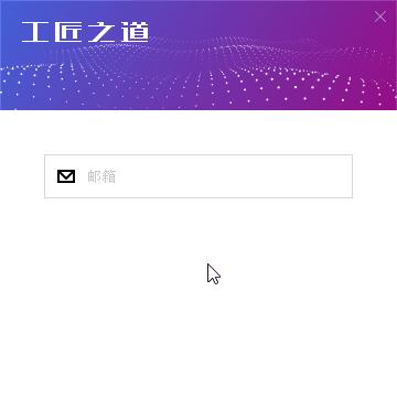
后记
在运行过程中,我发现右上角的关闭按钮有些模糊,放大后的效果(左):

右侧为理想效果
最终发现是因为窗口中的“SnapsToDevicePixels”属性设置为“True”导致的,但如果直接设置为“False”,又会导致高Dpi下控件之间会产生缝隙。最后的解决方案是为关闭按钮设置了“SnapsToDevicePixels”属性。
源码地址如下
github:https://github.com/yanjinhuagood/WPFDevelopers.git
gitee:https://gitee.com/yanjinhua/WPFDevelopers.git
WPF开发者QQ群: 340500857
blogs: https://www.cnblogs.com/yanjinhua
Github:https://github.com/yanjinhuagood
出处:https://www.cnblogs.com/yanjinhua
版权:本作品采用「署名-非商业性使用-相同方式共享 4.0 国际」许可协议进行许可。
转载请著名作者 出处 https://github.com/yanjinhuagood

扫一扫关注我们,

更多技能早知道!

点击阅读原文可跳转至源代码
以上是关于WPF开发登录窗口之——添加文本输入框用户控件的主要内容,如果未能解决你的问题,请参考以下文章
QT软件开发之基础控件--2.4.1 lineEdit单行文本编辑器