sklearn可视化不同数据划分方法的差异:KFold, ShuffleSplit,StratifiedKFold, GroupKFold, StratifiedShuffleSplit.......
Posted Data+Science+Insight
tags:
篇首语:本文由小常识网(cha138.com)小编为大家整理,主要介绍了sklearn可视化不同数据划分方法的差异:KFold, ShuffleSplit,StratifiedKFold, GroupKFold, StratifiedShuffleSplit.......相关的知识,希望对你有一定的参考价值。
sklearn可视化不同数据划分方法的差异:TimeSeriesSplit, KFold, ShuffleSplit,StratifiedKFold, GroupShuffleSplit,GroupKFold, StratifiedShuffleSplit
目录
选择合适的交叉验证对象是正确拟合模型的关键部分。为了避免模型过拟合、规范测试集中的组数等,有许多方法可以将数据拆分为训练集和测试集。
#包导入
from sklearn.model_selection import (TimeSeriesSplit, KFold, ShuffleSplit,
                                     StratifiedKFold, GroupShuffleSplit,
                                     GroupKFold, StratifiedShuffleSplit)
import numpy as np
import matplotlib.pyplot as plt
from matplotlib.patches import Patch
np.random.seed(1338)
cmap_data = plt.cm.Paired
cmap_cv = plt.cm.coolwarm
n_splits = 4
首先,我们必须了解我们数据的结构。它有100个随机生成的输入数据样本,3个类在样本上不均匀地分布,数据中的10个组在数据上均匀地分布。
正如我们将看到的,一些交叉验证对象对标记的数据执行特定的操作,其他的对分组的数据执行不同的操作,而其他的则不使用这些分组信息。
#仿真数据集
# Generate the class/group data
n_points = 100
X = np.random.randn(100, 10)

percentiles_classes = [.1, .3, .6]
y = np.hstack([[ii] * int(100 * perc)
               for ii, perc in enumerate(percentiles_classes)])

# Evenly spaced groups repeated once
groups = np.hstack([[ii] * 10 for ii in range(10)])


def visualize_groups(classes, groups, name):
    # Visualize dataset groups
    fig, ax = plt.subplots()
    ax.scatter(range(len(groups)),  [.5] * len(groups), c=groups, marker='_',
               lw=50, cmap=cmap_data)
    ax.scatter(range(len(groups)),  [3.5] * len(groups), c=classes, marker='_',
               lw=50, cmap=cmap_data)
    ax.set(ylim=[-1, 5], yticks=[.5, 3.5],
           yticklabels=['Data\\ngroup', 'Data\\nclass'], xlabel="Sample index")


visualize_groups(y, groups, 'no groups')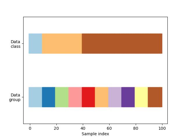
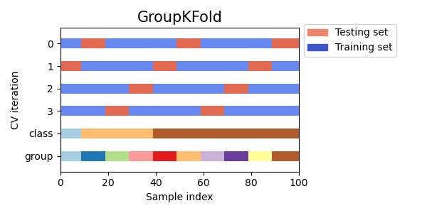
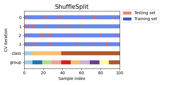
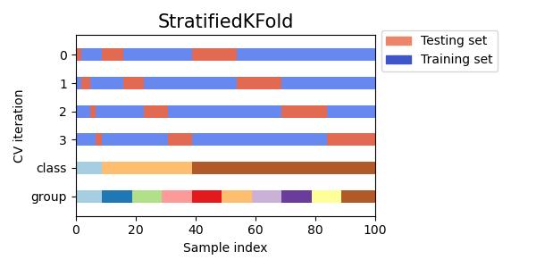
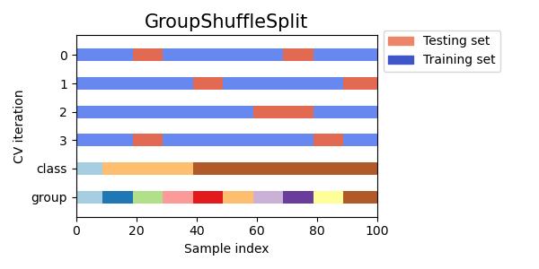
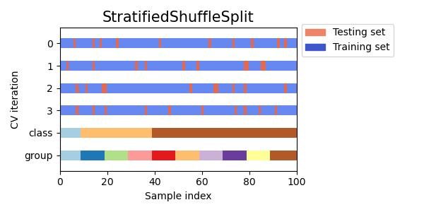
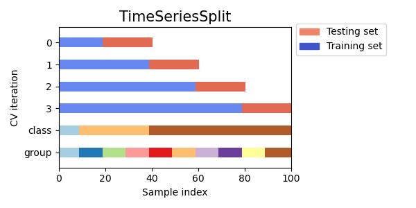
#定义查看不同交叉验证数据划分形式的函数
def plot_cv_indices(cv, X, y, group, ax, n_splits, lw=10):
    """Create a sample plot for indices of a cross-validation object."""

    # Generate the training/testing visualizations for each CV split
    for ii, (tr, tt) in enumerate(cv.split(X=X, y=y, groups=group)):
        # Fill in indices with the training/test groups
        indices = np.array([np.nan] * len(X))
        indices[tt] = 1
        indices[tr] = 0

        # Visualize the results
        ax.scatter(range(len(indices)), [ii + .5] * len(indices),
                   c=indices, marker='_', lw=lw, cmap=cmap_cv,
                   vmin=-.2, vmax=1.2)

    # Plot the data classes and groups at the end
    ax.scatter(range(len(X)), [ii + 1.5] * len(X),
               c=y, marker='_', lw=lw, cmap=cmap_data)

    ax.scatter(range(len(X)), [ii + 2.5] * len(X),
               c=group, marker='_', lw=lw, cmap=cmap_data)

    # Formatting
    yticklabels = list(range(n_splits)) + ['class', 'group']
    ax.set(yticks=np.arange(n_splits+2) + .5, yticklabels=yticklabels,
           xlabel='Sample index', ylabel="CV iteration",
           ylim=[n_splits+2.2, -.2], xlim=[0, 100])
    ax.set_title('{}'.format(type(cv).__name__), fontsize=15)
    return ax
#KFold交叉验证数据划分
fig, ax = plt.subplots()
cv = KFold(n_splits)
plot_cv_indices(cv, X, y, groups, ax, n_splits)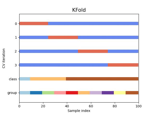
#StratifiedKFold交叉验证数据划分
fig, ax = plt.subplots()
cv = StratifiedKFold(n_splits)
plot_cv_indices(cv, X, y, groups, ax, n_splits)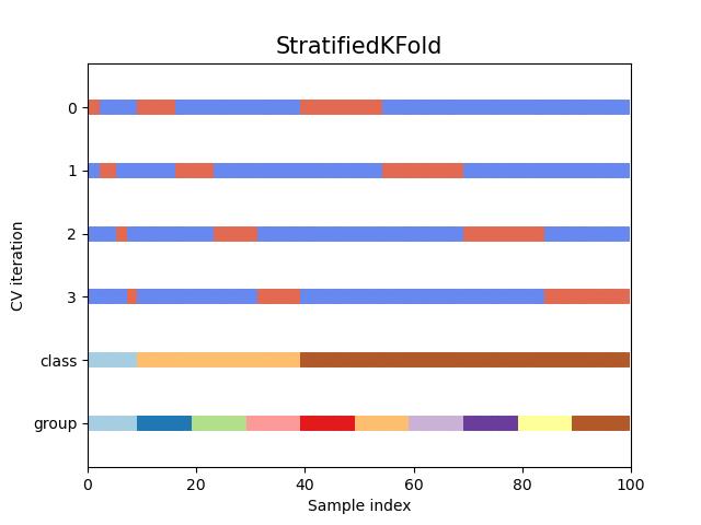
#同时查看KFold, GroupKFold, ShuffleSplit, StratifiedKFold,GroupShuffleSplit, StratifiedShuffleSplit, TimeSeriesSplit交叉验证数据划分
cvs = [KFold, GroupKFold, ShuffleSplit, StratifiedKFold,
       GroupShuffleSplit, StratifiedShuffleSplit, TimeSeriesSplit]


for cv in cvs:
    this_cv = cv(n_splits=n_splits)
    fig, ax = plt.subplots(figsize=(6, 3))
    plot_cv_indices(this_cv, X, y, groups, ax, n_splits)

    ax.legend([Patch(color=cmap_cv(.8)), Patch(color=cmap_cv(.02))],
              ['Testing set', 'Training set'], loc=(1.02, .8))
    # Make the legend fit
    plt.tight_layout()
    fig.subplots_adjust(right=.7)
plt.show()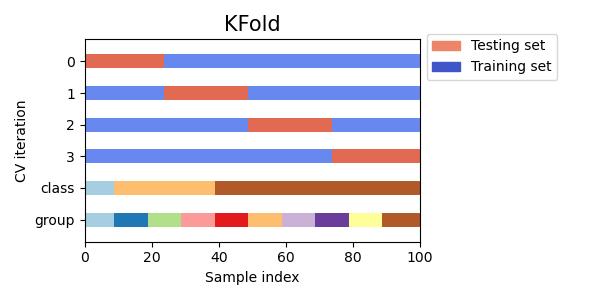
参考:sklearn
参考:Visualizing cross-validation behavior in scikit-learn
以上是关于sklearn可视化不同数据划分方法的差异:KFold, ShuffleSplit,StratifiedKFold, GroupKFold, StratifiedShuffleSplit.......的主要内容,如果未能解决你的问题,请参考以下文章