Pandas一行代码绘制25种美图
Posted 大数据v
tags:
篇首语:本文由小常识网(cha138.com)小编为大家整理,主要介绍了Pandas一行代码绘制25种美图相关的知识,希望对你有一定的参考价值。

导读:今天介绍一下,如何用Pandas的一行代码绘制 25 种美图。
作者 / 来源:pythonic生物人
本文涉及:
单组折线图、多组折线图、单组条形图、多组条形图、堆积条形图、水平堆积条形图、直方图、分面直方图、箱图、面积图、堆积面积图、散点图、单组饼图、多组饼图、分面图、hexbin图、andrews_curves图、核密度图、parallel_coordinates图、autocorrelation_plot图、radviz图、bootstrap_plot图、子图(subplot)、子图任意排列、图中绘制数据表格
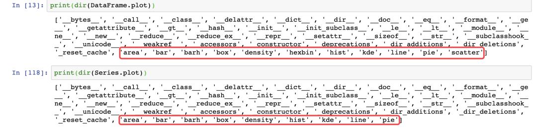
Pandas可视化主要依赖下面两个函数:
pandas.DataFrame.plot
https://pandas.pydata.org/pandas-docs/stable/reference/api/pandas.DataFrame.plot.html?highlight=plot#pandas.DataFrame.plot
pandas.Series.plot
https://pandas.pydata.org/pandas-docs/stable/reference/api/pandas.Series.plot.html?highlight=plot#pandas.Series.plot
可绘制下面几种图,注意Dataframe和Series的细微差异:'area', 'bar', 'barh', 'box', 'density', 'hexbin', 'hist', 'kde', 'line', 'pie', 'scatter'
导入依赖包
import matplotlib.pyplot as plt
import numpy as np
import pandas as pd
from pandas import DataFrame,Series
plt.style.use('dark_background')#设置绘图风格
01 单组折线图
np.random.seed(0)#使得每次生成的随机数相同
ts = pd.Series(np.random.randn(1000), index=pd.date_range("1/1/2000", periods=1000))
ts1 = ts.cumsum()#累加
ts1.plot(kind="line")#默认绘制折线图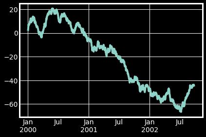
02 多组折线图
np.random.seed(0)
df = pd.DataFrame(np.random.randn(1000, 4), index=ts.index, columns=list("ABCD"))
df = df.cumsum()
df.plot()#默认绘制折线图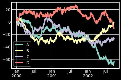
03 单组条形图
df.iloc[5].plot(kind="bar")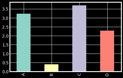
04 多组条形图
df2 = pd.DataFrame(np.random.rand(10, 4), columns=["a", "b", "c", "d"])
df2.plot.bar()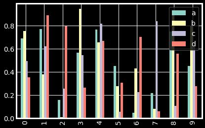
05 堆积条形图
df2.plot.bar(stacked=True)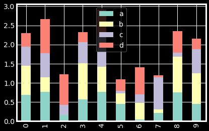
06 水平堆积条形图
df2.plot.barh(stacked=True)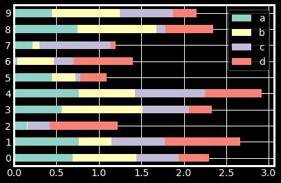
07 直方图
df4 = pd.DataFrame(
    {
        "a": np.random.randn(1000) + 1,
        "b": np.random.randn(1000),
        "c": np.random.randn(1000) - 1,
    },
    columns=["a", "b", "c"],
)
df4.plot.hist(alpha=0.8)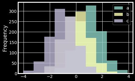
08 分面直方图
df.diff().hist(color="r", alpha=0.9, bins=50)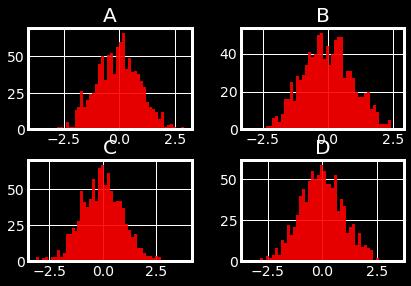
09 箱图
df = pd.DataFrame(np.random.rand(10, 5), columns=["A", "B", "C", "D", "E"])
df.plot.box()
10 面积图
df = pd.DataFrame(np.random.rand(10, 4), columns=["a", "b", "c", "d"])
df.plot.area()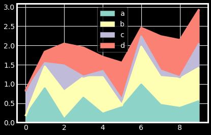
11 堆积面积图
df.plot.area(stacked=False)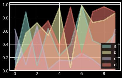
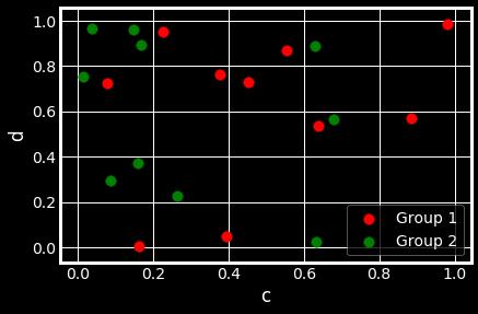
12 散点图
ax = df.plot.scatter(x="a", y="b", color="r", label="Group 1",s=90)
df.plot.scatter(x="c", y="d", color="g", label="Group 2", ax=ax,s=90)
13 单组饼图
series = pd.Series(3 * np.random.rand(4), index=["a", "b", "c", "d"], name="series")
series.plot.pie(figsize=(6, 6))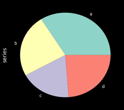
14 多组饼图
df = pd.DataFrame(
    3 * np.random.rand(4, 2), index=["a", "b", "c", "d"], columns=["x", "y"]
)
df.plot.pie(subplots=True, figsize=(8, 4))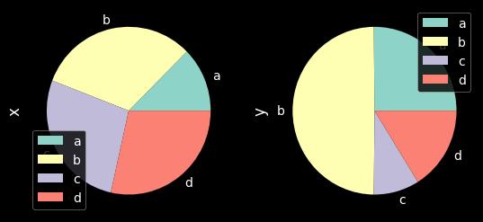
15 分面图
import matplotlib as mpl
mpl.rc_file_defaults()
plt.style.use('fivethirtyeight')
from pandas.plotting import scatter_matrix
df = pd.DataFrame(np.random.randn(1000, 4), columns=["a", "b", "c", "d"])
scatter_matrix(df, alpha=0.2, figsize=(6, 6), diagonal="kde")
plt.show()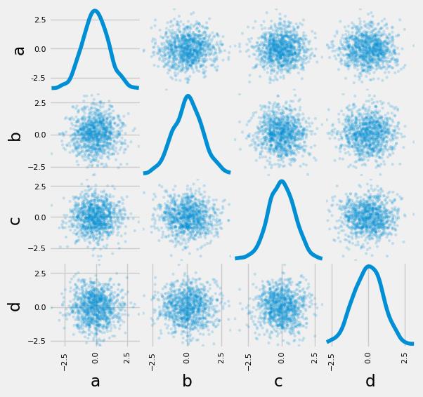
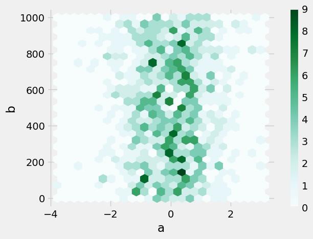
16 hexbin图
df = pd.DataFrame(np.random.randn(1000, 2), columns=["a", "b"])
df["b"] = df["b"] + np.arange(1000)
df.plot.hexbin(x="a", y="b", gridsize=25)
17 andrews_curves图
from pandas.plotting import andrews_curves
mpl.rc_file_defaults()
data = pd.read_csv("iris.data.txt")
plt.style.use('dark_background')
andrews_curves(data, "Name")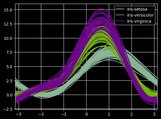
18 核密度图
ser = pd.Series(np.random.randn(1000))
ser.plot.kde()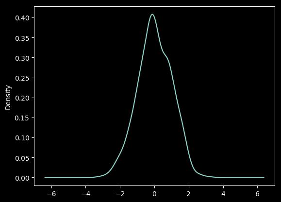
19 parallel_coordinates图
from pandas.plotting import parallel_coordinates
data = pd.read_csv("iris.data.txt")
plt.figure()
parallel_coordinates(data, "Name")
20 autocorrelation_plot图
from pandas.plotting import autocorrelation_plot
plt.figure();
spacing = np.linspace(-9 * np.pi, 9 * np.pi, num=1000)
data = pd.Series(0.7 * np.random.rand(1000) + 0.3 * np.sin(spacing))
autocorrelation_plot(data)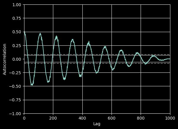
21 radviz图
from pandas.plotting import radviz
data = pd.read_csv("iris.data.txt")
plt.figure()
radviz(data, "Name")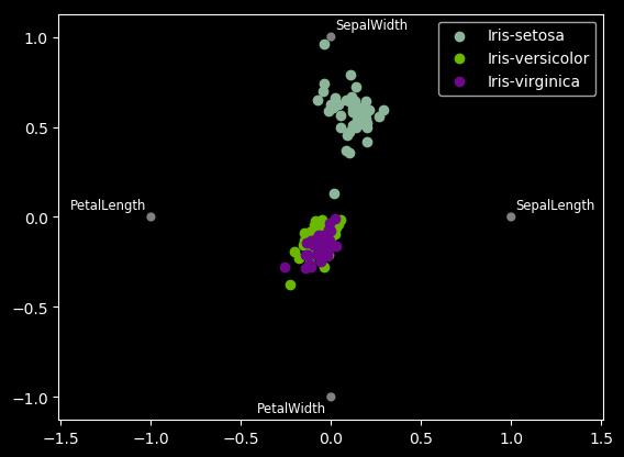
22 bootstrap_plot图
from pandas.plotting import bootstrap_plot
data = pd.Series(np.random.rand(1000))
bootstrap_plot(data, size=50, samples=500, color="grey")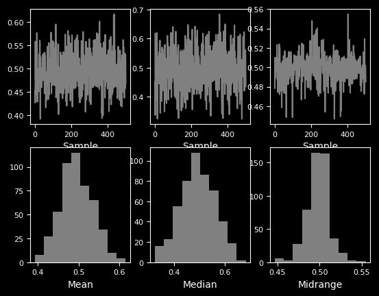
23 子图(subplot)
df = pd.DataFrame(np.random.randn(1000, 4), index=ts.index, columns=list("ABCD"))
df.plot(subplots=True, figsize=(6, 6))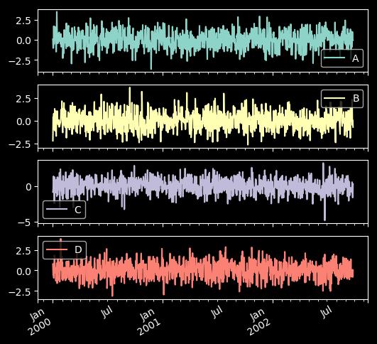
24 子图任意排列
df.plot(subplots=True, layout=(2, 3), figsize=(6, 6), sharex=False)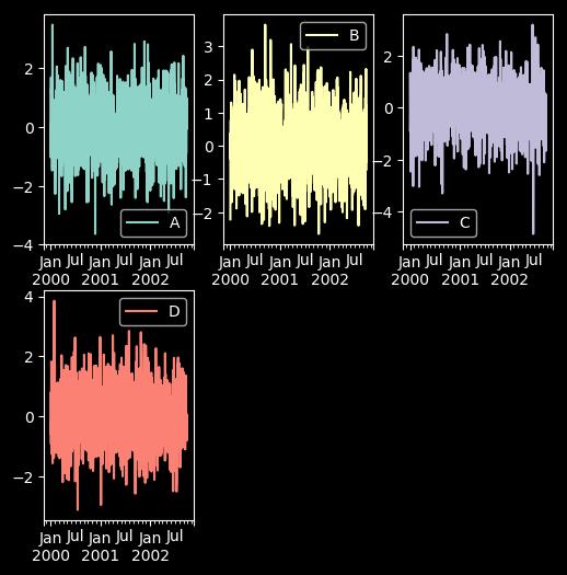
fig, axes = plt.subplots(4, 4, figsize=(9, 9))
plt.subplots_adjust(wspace=0.5, hspace=0.5)
target1 = [axes[0][0], axes[1][1], axes[2][2], axes[3][3]]
target2 = [axes[3][0], axes[2][1], axes[1][2], axes[0][3]]
df.plot(subplots=True, ax=target1, legend=False, sharex=False, sharey=False);
(-df).plot(subplots=True, ax=target2, legend=False, sharex=False, sharey=False)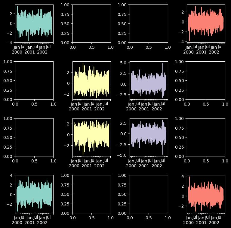
25 图中绘制数据表格
from pandas.plotting import table
mpl.rc_file_defaults()
#plt.style.use('dark_background')
fig, ax = plt.subplots(1, 1)
table(ax, np.round(df.describe(), 2), loc="upper right", colWidths=[0.2, 0.2, 0.2]);
df.plot(ax=ax, ylim=(0, 2), legend=None);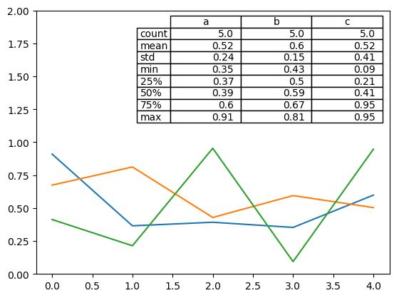
更多pandas可视化精进资料:
https://pandas.pydata.org/pandas-docs/stable/user_guide/cookbook.html#cookbook-plotting

延伸阅读????

延伸阅读《深入浅出Pandas》
干货直达????
更多精彩????
在公众号对话框输入以下关键词
查看更多优质内容!
读书 | 书单 | 干货 | 讲明白 | 神操作 | 手把手
大数据 | 云计算 | 数据库 | Python | 爬虫 | 可视化
AI | 人工智能 | 机器学习 | 深度学习 | NLP
5G | 中台 | 用户画像 | 数学 | 算法 | 数字孪生
据统计,99%的大咖都关注了这个公众号
????
以上是关于Pandas一行代码绘制25种美图的主要内容,如果未能解决你的问题,请参考以下文章