Python轻松制作精美表格
Posted qq_21478261
tags:
篇首语:本文由小常识网(cha138.com)小编为大家整理,主要介绍了Python轻松制作精美表格相关的知识,希望对你有一定的参考价值。
分享一个Python工具plottable,轻松制作高度个性化的表格,底层为Matplotlib。
例如这样的,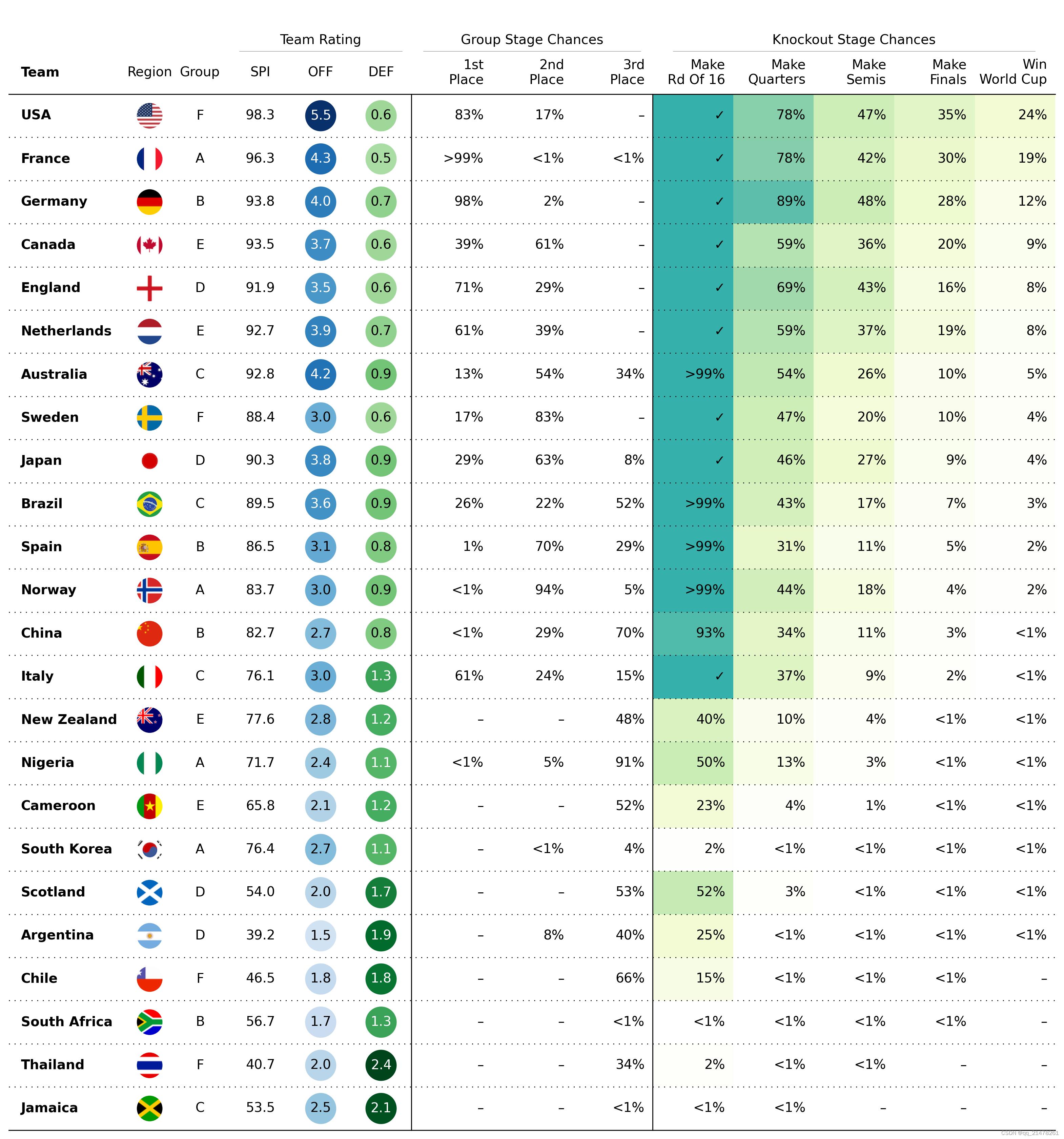
或者这样的, 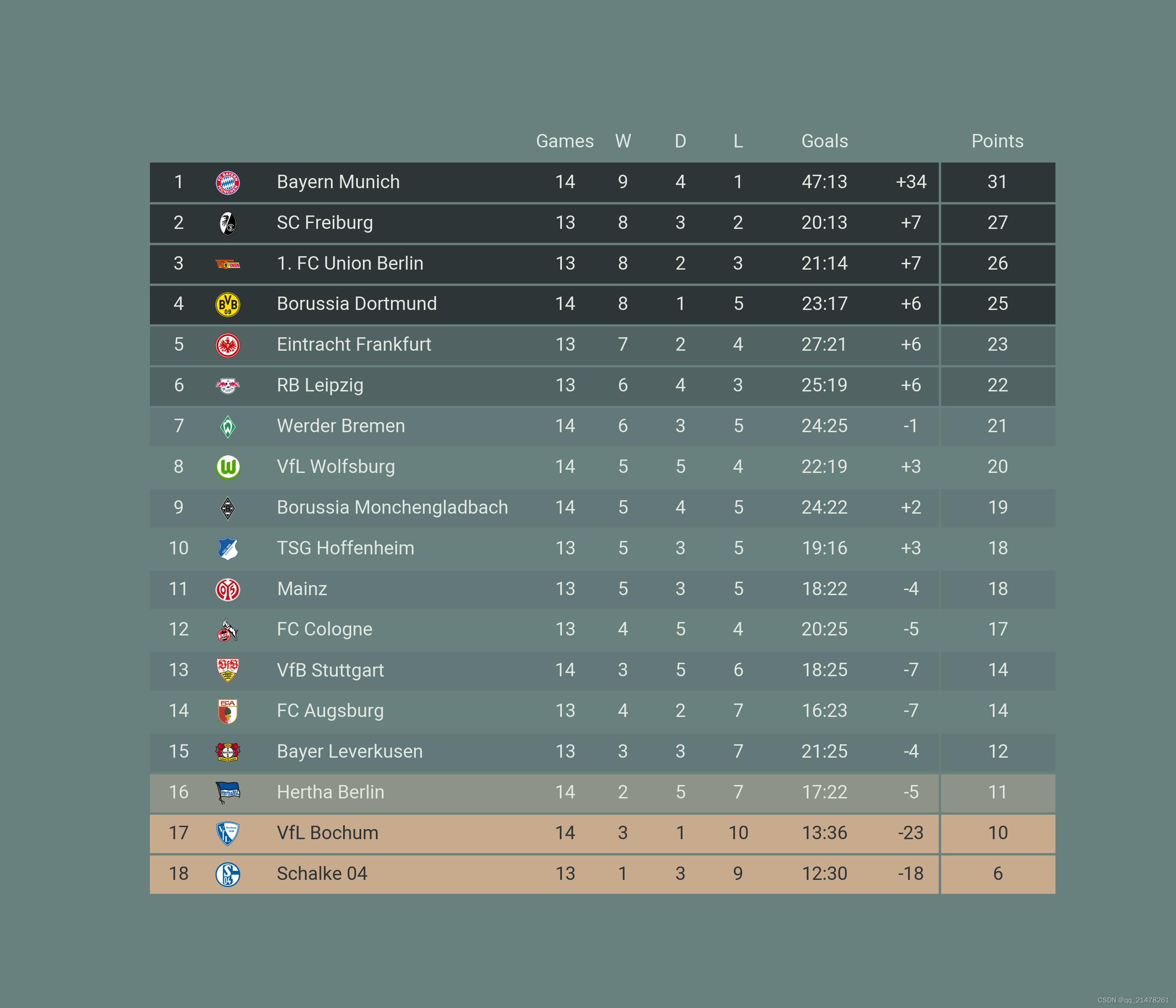
第一张图详细代码:
# 导入相关包
from pathlib import Path

import matplotlib
import matplotlib.pyplot as plt
import numpy as np
import pandas as pd
from matplotlib.colors import LinearSegmentedColormap

from plottable import ColumnDefinition, Table
from plottable.cmap import normed_cmap
from plottable.formatters import decimal_to_percent
from plottable.plots import circled_image

plt.rcParams["font.family"] = ["DejaVu Sans"]
plt.rcParams["savefig.bbox"] = "tight"

# demo数据准备
cols = [
    "team",
    "points",
    "group",
    "spi",
    "global_o",
    "global_d",
    "group_1",
    "group_2",
    "group_3",
    "make_round_of_16",
    "make_quarters",
    "make_semis",
    "make_final",
    "win_league",
]

df = pd.read_csv(
    "data/wwc_forecasts.csv",
    usecols=cols,
)

colnames = [
    "Team",
    "Points",
    "Group",
    "SPI",
    "OFF",
    "DEF",
    "1st Place",
    "2nd Place",
    "3rd Place",
    "Make Rd Of 16",
    "Make Quarters",
    "Make Semis",
    "Make Finals",
    "Win World Cup",
]

col_to_name = dict(zip(cols, colnames))

flag_paths = list(Path("country_flags").glob("*.png"))
country_to_flagpath = p.stem: p for p in flag_paths

df[["spi", "global_o", "global_d"]] = df[["spi", "global_o",
                                          "global_d"]].round(1)

df = df.rename(col_to_name, axis=1)
df = df.drop("Points", axis=1)
df.insert(0, "Flag", df["Team"].apply(lambda x: country_to_flagpath.get(x)))

df = df.set_index("Team")

# colormap准备
cmap = LinearSegmentedColormap.from_list(
    name="bugw",
    colors=["#ffffff", "#f2fbd2", "#c9ecb4", "#93d3ab", "#35b0ab"],
    N=256)

team_rating_cols = ["SPI", "OFF", "DEF"]
group_stage_cols = ["1st Place", "2nd Place", "3rd Place"]
knockout_stage_cols = list(df.columns[-5:])

# table列个性化list,例如列名、列宽、字体、磅值等等
col_defs = ([
    ColumnDefinition(
        name="Flag",
        title="Region",
        textprops="ha": "center",
        width=0.5,
        plot_fn=circled_image,
    ),
    ColumnDefinition(
        name="Team",
        textprops=
            "ha": "left",
            "weight": "bold"
        ,
        width=1.5,
    ),
    ColumnDefinition(
        name="Group",
        textprops="ha": "center",
        width=0.75,
    ),
    ColumnDefinition(
        name="SPI",
        group="Team Rating",
        textprops="ha": "center",
        width=0.75,
    ),
    ColumnDefinition(
        name="OFF",
        width=0.75,
        textprops=
            "ha": "center",
            "bbox":
                "boxstyle": "circle",
                "pad": 0.35
            ,
        ,
        cmap=normed_cmap(df["OFF"], cmap=matplotlib.cm.Blues, num_stds=2.5),
        group="Team Rating",
    ),
    ColumnDefinition(
        name="DEF",
        width=0.75,
        textprops=
            "ha": "center",
            "bbox":
                "boxstyle": "circle",
                "pad": 0.35
            ,
        ,
        cmap=normed_cmap(df["DEF"], cmap=matplotlib.cm.Greens, num_stds=2.5),
        group="Team Rating",
    ),
] + [
    ColumnDefinition(
        name=group_stage_cols[0],
        title=group_stage_cols[0].replace(" ", "\\n", 1),
        formatter=decimal_to_percent,
        group="Group Stage Chances",
        border="left",
    )
] + [
    ColumnDefinition(
        name=col,
        title=col.replace(" ", "\\n", 1),
        formatter=decimal_to_percent,
        group="Group Stage Chances",
    ) for col in group_stage_cols[1:]
] + [
    ColumnDefinition(
        name=knockout_stage_cols[0],
        title=knockout_stage_cols[0].replace(" ", "\\n", 1),
        formatter=decimal_to_percent,
        cmap=cmap,
        group="Knockout Stage Chances",
        border="left",
    )
] + [
    ColumnDefinition(
        name=col,
        title=col.replace(" ", "\\n", 1),
        formatter=decimal_to_percent,
        cmap=cmap,
        group="Knockout Stage Chances",
    ) for col in knockout_stage_cols[1:]
])

# plottable的Table方法制作表格

fig, ax = plt.subplots(figsize=(20, 22))
table = Table(
    df,
    column_definitions=col_defs,
    row_dividers=True,
    footer_divider=True,
    ax=ax,
    textprops=
        "fontsize": 14
    ,
    row_divider_kw=
        "linewidth": 1,
        "linestyle": (0, (1, 5))
    ,
    col_label_divider_kw=
        "linewidth": 1,
        "linestyle": "-"
    ,
    column_border_kw=
        "linewidth": 1,
        "linestyle": "-"
    ,
).autoset_fontcolors(colnames=["OFF", "DEF"])
更多干货,👇👇
以上是关于Python轻松制作精美表格的主要内容,如果未能解决你的问题,请参考以下文章